Using parameters in calculated fields
A parameter is a variable that can substitute constant values in calculated fields.
You will learn how to manage visualizations using parameters:
- Create parameters at the dataset level and chart level.
- Work with formulas and visualizations in charts using parameters.
- Edit a parameter value on a dashboard using selectors with manual input.
You will use a direct connection to a demo ClickHouse® database as your data source.
To visualize and explore data, set up DataLens and follow the steps below:
- Create a connection.
- Create a dataset.
- Add parameters to the dataset.
- Create a chart with configurable grouping by date.
- Create a chart with a configurable visualization dimension.
- Create a dashboard.
- Add charts to the dashboard.
- Add selectors to the dashboard.
Getting started
To get started with DataLens:
- Log in to your Yandex account. If you do not have an account, create one.
- Open the DataLens home page.
- Click Start in cloud.
- Confirm that you have read the Terms of use and click Log in.
-
Log in to your Yandex account.
-
Open the DataLens home page.
-
Click Start in cloud.
-
Select one of these options:
-
If you already have an organization, select it from the drop-down menu in the Organizations tab and click DataLens.
Note
To activate a DataLens instance, the user must have the
adminorownerrole. For more information about roles, see Access management in Yandex Identity Hub. -
If you have a cloud but no organization, click Add new DataLens. In the window that opens, enter a name and description for your organization and click Create organization and DataLens. For more information about working with organizations, see Getting started with organizations.
-
If you encounter a technical issue with the service, contact Yandex Cloud support. To ask for advice, discuss a solution to your issue, or explore current best practices, join the DataLens chat in Telegram.
Create a connection
Warning
If you use the new DataLens object model with workbooks and collections:
- Go to the DataLens home page. In the left-hand panel, select Collections and workbooks.
- Open the workbook, click Create in the top-right corner, and select the object you need.
Proceed with this guide from Step 3.
-
Go to the connections page.
-
Click Create connection.
-
Select the ClickHouse connection.
-
In the window that opens, specify the connection parameters:
- Connection type: Specify manually.
- Host name:
rc1a-ckg8nrosr2lim5iz.mdb.yandexcloud.net. - HTTP interface port:
8443(default). - Username:
samples_ro. - Password:
MsgfcjEhJk.
-
Enable the SQL to read option.
-
Check the connection and click Create connection.
-
Enter the connection name:
Sample ClickHouse. -
Click Create.
-
Wait for the connection to be saved.
Create a dataset
-
In the top-right corner, click Create dataset.
-
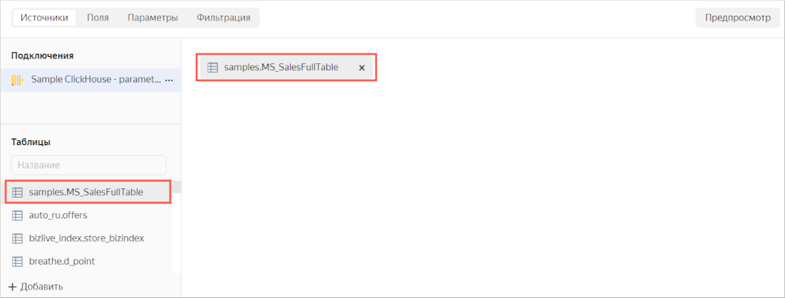
Drag the MS_SalesFullTable table to the workspace.
-
Navigate to the Fields tab.
-
Create an order date field named OrderDate.
-
Duplicate the OrderDatetime field.
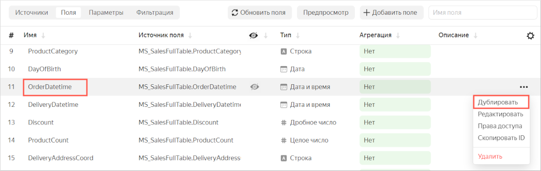
-
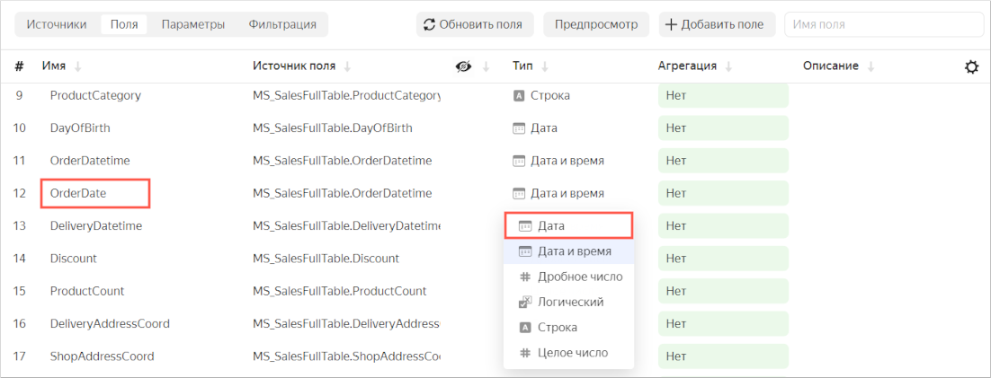
Rename the OrderDatetime (1) duplicate field to OrderDate: click the row name, delete the current name, and enter the new one.
-
Change the data type from Date and time to Date.
-
-
In the Aggregation column, select Sum for the Sales field.
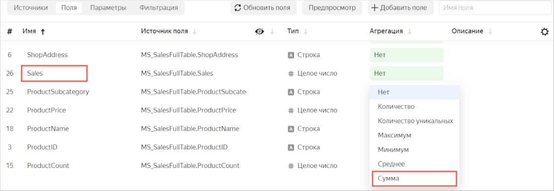
The aggregation field will become a measure and change its color to blue.
-
In the top-right corner, click Save.
-
Enter Moscow Sales dataset with parameters for the dataset name, then click Create.
Add parameters to the dataset
-
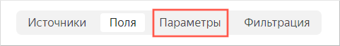
Go to the Parameters tab.
-
Add the
scaleanddimensionparameters:-
Click Add. Then, in the window that opens, enter:
- Name:
scale. - Type:
String. - Default value:
month.
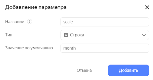
Click Add.
- Name:
-
Click Add. Then, in the window that opens, enter:
- Name:
dimension. - Type:
String. - Default value:
Status.
Click Add.
- Name:
-
-
Click Save.
Create a chart with configurable grouping by date
-
In the top-right corner of the dataset, click Create chart.
-
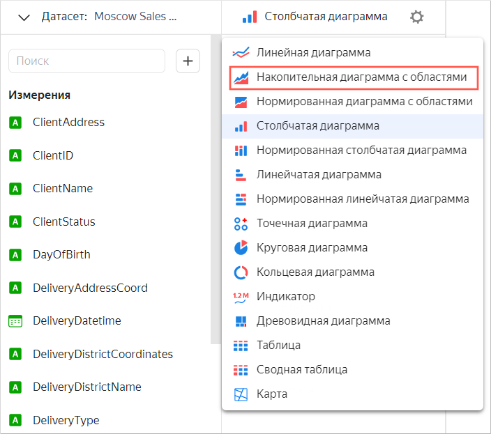
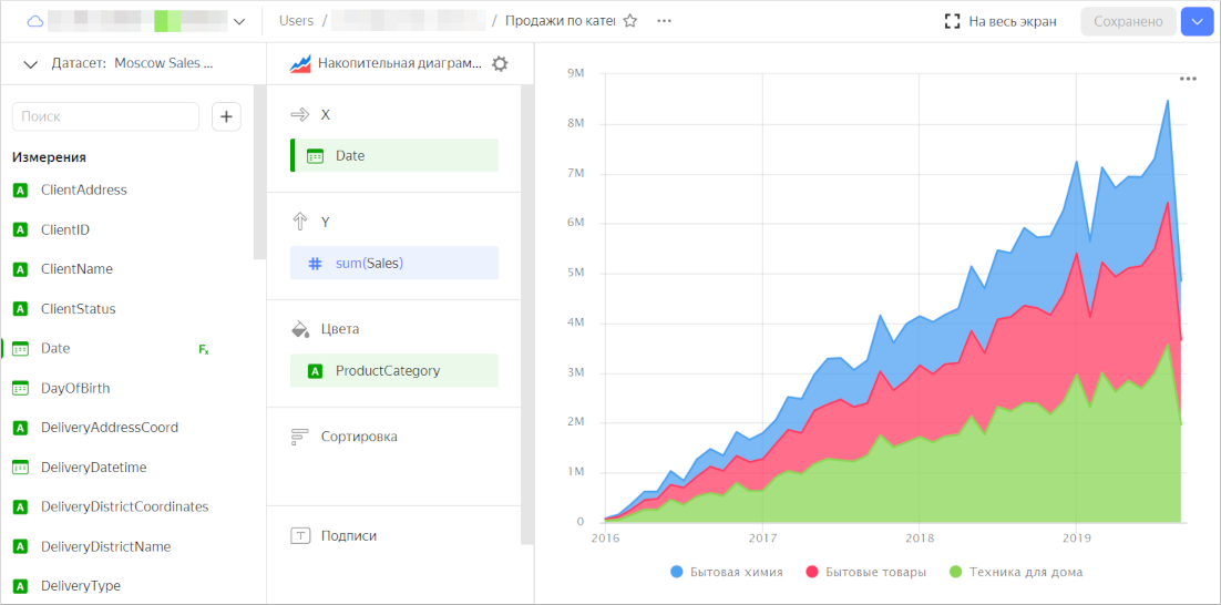
Select Area chart as the visualization type.
-
Add a calculated field to the chart:
-
On the left of the screen, click under the dataset and select Field.
-
In the Field settings window, enter the following:
-
In the Name field,
Date. -
In the formula field,
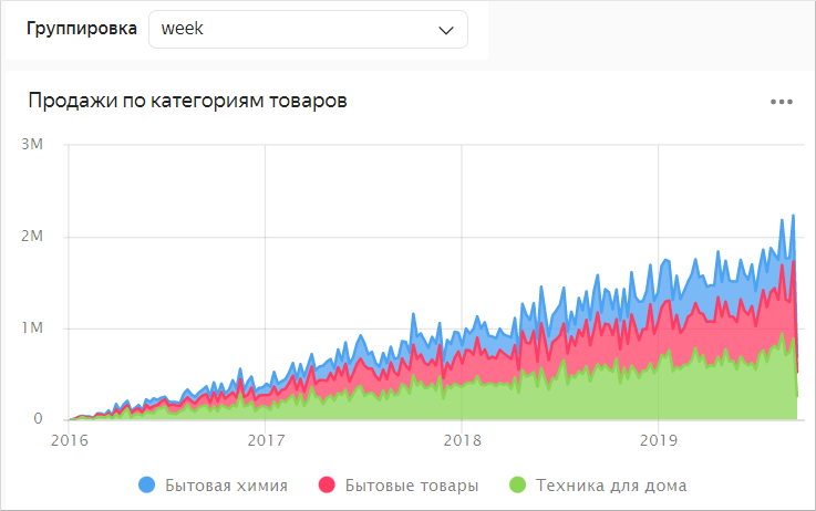
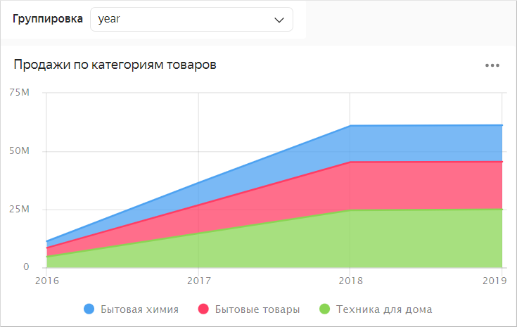
DATETRUNC([OrderDate], [scale]). The order date will be rounded depending on the value of thescaledataset parameter.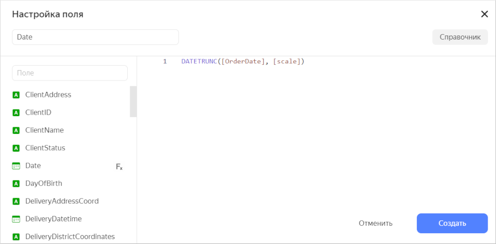
-
-
Click Create.
-
Drag the new Date field to the X section.
-
-
Drag the Sales measure to the Y section.
-
Add grouping by product category to the chart. To do this, drag the ProductCategory field from Dimensions to the Colors section. The chart areas mapping to each product category will get different color fills.
-
Save the chart.
-
In the top-right corner, click Save.
-
Enter Sales by product category for the chart name, then click Save.
-
Create a chart with a configurable visualization dimension
-
In the top-right corner of the dataset, click Create chart.
-
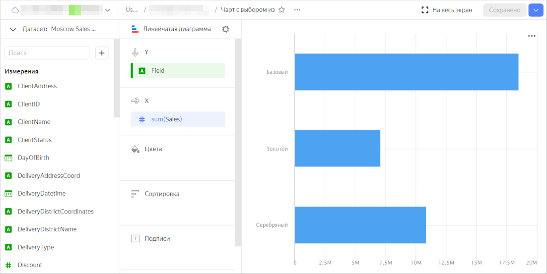
For the visualization type, select Line chart.
-
Add a calculated field for selecting a dimension to the chart:
-
On the left of the screen, click under the dataset and select Field.
-
In the Field settings window, enter the following:
-
In the Name field,
Field. -
In the formula field:
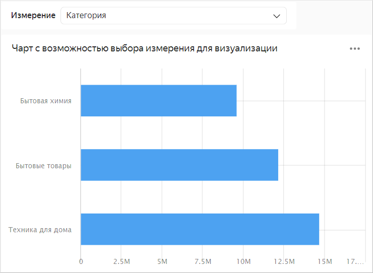
if(
     [dimension] = 'Status', [ClientStatus],
     [dimension] = 'Category', [ProductCategory],
     [dimension] = 'Payment type', [PaymentType],
     null
   )
The visualized dimensions will change depending on the value of the
dimensiondataset parameter.
-
-
Click Create.
-
Drag the new Field field to the Y section.
-
-
Drag the Sales measure to the X section.
-
Save the chart.
-
In the top-right corner, click Save.
-
Enter Chart with a configurable visualization dimension for the chart name, then click Save.
-
Create a dashboard
Create a dashboard for the charts.
- In the left-hand panel, click Dashboards.
- Click Create dashboard.
Add charts to the dashboard
-
The first time you open the dashboard after saving, it opens in edit mode. If you open it later, click Edit in the top-right corner.
-
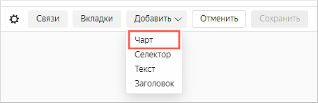
Click Add and select Chart.
-
In the Chart field, click Select.
-
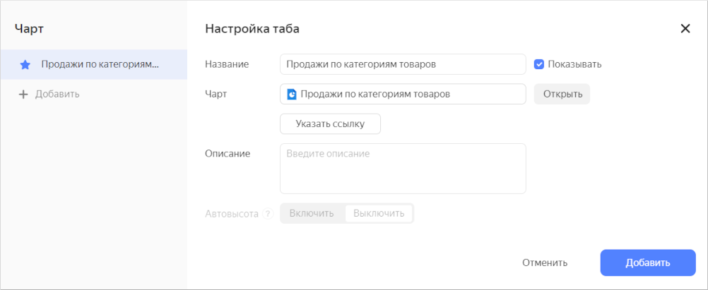
Select the Sales by product category chart. The Name field will be populated automatically.
-
Click Add.
-
Similarly, add Chart with a configurable visualization dimension.
-
Position the charts on the dashboard however you prefer.
-
Save the dashboard:
- In the top-right corner, click Save.
- Enter Visualizing data using parameters for the dashboard name and click Create.
Add selectors to the dashboard
Add selectors with manual input to edit values in the charts.
Warning
After adding a selector, unlink it from other selectors in this dashboard tab.
-
To switch to dashboard editing mode, click Edit in the top-right corner.
-
Add a selector for the Sales by product category chart:
-
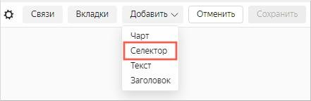
At the top of the page, click Add.
-
Choose Selector.
-
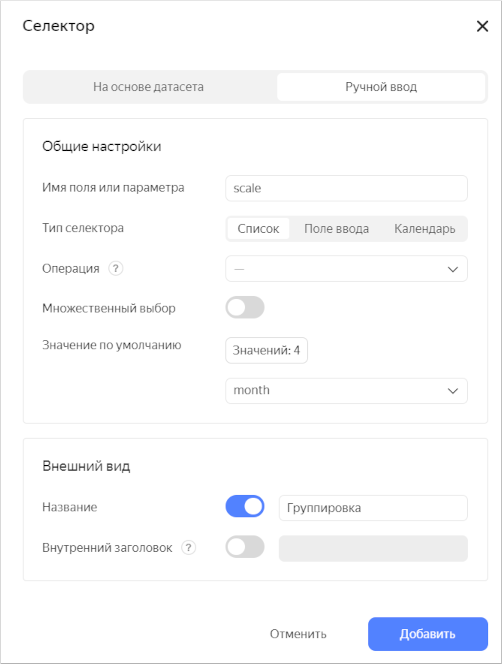
Select Manual input as the source type.
-
In Field or parameter name, enter
scale. The selected selector value will be provided to this dataset parameter. -
Select List as your selector type.
-
Click the input field next to the Default value parameter and add these values:
dayweekmonthyear
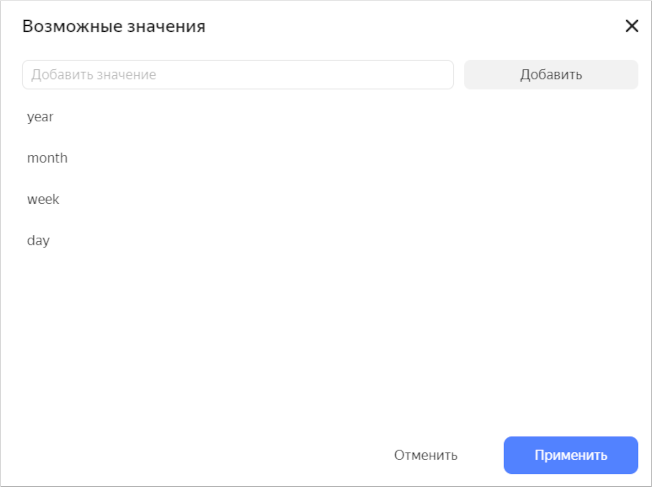
Click Apply.
-
In the Default value list, specify month.
-
Enable the Name option and enter
Grouping. -
Check the specified selector parameters.
-
Click Add.
-
Place the selector on the dashboard above the Sales by product category chart. Now you can manage grouping by date in this chart.
-
-
Add a selector for Chart with a configurable visualization dimension:
-
At the top of the page, click Add.
-
Choose Selector.
-
Select Manual input as the source type.
-
In Field or parameter name, enter
dimension. The selected selector value will be provided to this dataset parameter. -
Select List as your selector type.
-
Click the input field next to the Default value parameter and add these values:
StatusCategoryPayment type
Click Apply.
-
In the Default value list, specify Status.
-
Enable the Name option and enter
Dimension. -
Click Add.
-
Place the selector on the dashboard above Chart with a configurable visualization dimension.
-
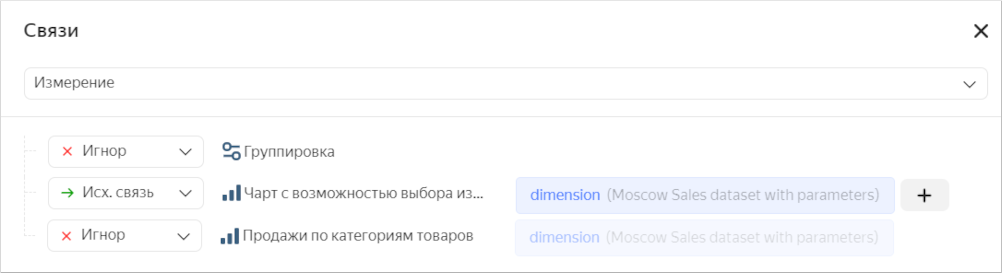
Unlink this selector from the Grouping selector:
-
Click at the top of the screen. The settings window will open on the right.
-
In the settings window, click Links .
-
In the Links window, select Dimensions.
-
Make sure you selected the Outgoing link link type for Chart with a configurable visualization selection. For the Grouping selector, set the Ignore link type.
-
Click Save. Now, you can use this selector to select a dimension for visualization.
-
-
Useful links
- Parameters in Yandex DataLens
- Adding parameters to a dashboard in Yandex DataLens
- Adding a parameter to a chart in Yandex DataLens
- Adding parameters
ClickHouse® is a registered trademark of ClickHouse, Inc.