Examples of creating QL charts
Note
In this tutorial, all objects will be created and stored in a workbook. If using legacy folder navigation, create an individual folder to work in.
Create a folder
- Go to the DataLens home page.
- In the left-hand panel, select All objects or Personal folder.
- In the top-right corner, click Create → Folder.
- Enter a name for the folder.
- Click Create.
In this tutorial, you will create charts using SQL queries. SQL queries provide more options for configuring data for visualization than the standard dataset method. For example, you can add parameters from dashboards to an SQL query.
We recommend using a QL chart if creating a regular chart using a dataset does not suit your needs or if you want to experiment with the data.
A direct connection to a demo database will be used as your data source.
To visualize and explore data, set up DataLens and follow the steps below:
- Create a workbook.
- Create a connection.
- Create a QL chart.
- Create a dashboard.
- Add the QL chart to the dashboard.
- Add selectors to the dashboard.
Warning
SQL queries only work with databases. File, GoogleSheets, Yandex Metrica, and other service connections do not support SQL queries.
Getting started
To get started with DataLens:
- Log in to your Yandex account. If you do not have an account, create one.
- Open the DataLens home page.
- Click Start in cloud.
- Confirm that you have read the Terms of use and click Log in.
-
Log in to your Yandex account.
-
Open the DataLens home page.
-
Click Start in cloud.
-
Select one of these options:
-
If you already have an organization, select it from the drop-down menu in the Organizations tab and click DataLens.
Note
To activate a DataLens instance, the user must have the
adminorownerrole. For more information about roles, see Access management in Yandex Identity Hub. -
If you have a cloud but no organization, click Add new DataLens. In the window that opens, enter a name and description for your organization and click Create organization and DataLens. For more information about working with organizations, see Getting started with organizations.
-
If you encounter a technical issue with the service, contact Yandex Cloud support. To ask for advice, discuss a solution to your issue, or explore current best practices, join the DataLens chat in Telegram.
Create a workbook
- Go to the DataLens home page.
- In the left-hand panel, select Collections and workbooks.
- In the top-right corner, click Create → Create workbook.
- Enter
Tutorialsfor the workbook name. - Click Create.
Create a connection
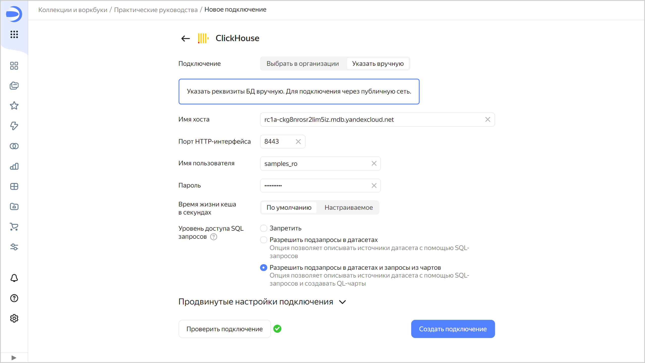
A connection named Sample ClickHouse will be created for database access.
-
In the top-right corner of the workbook, click Create → Connection.
-
Under Databases, select the ClickHouse® connection.
-
In the window that opens, select
Specify manuallyfor the connection type and provide the following connection parameters:- Host name:
rc1a-ckg8nrosr2lim5iz.mdb.yandexcloud.net - HTTP interface port:
8443(default). - Username:
samples_ro. - Password:
MsgfcjEhJk.
- Host name:
-
Enable Allow subqueries in datasets, source parameterization, and QL charts.
-
Click Check connection and make sure you get a green check mark.
-
Click Create connection.
-
Enter the connection name:
Sample ClickHouse. -
Click Create.
-
Wait for the connection to be saved.
Create a QL chart
Create a QL chart based on the Sample ClickHouse connection:
-
In the top-right corner of the connection page, click Create dataset.
Note
Make sure Raw SQL level → Allow subqueries in datasets and queries from charts is enabled.
-
In the top-right corner, click Create QL chart.
-
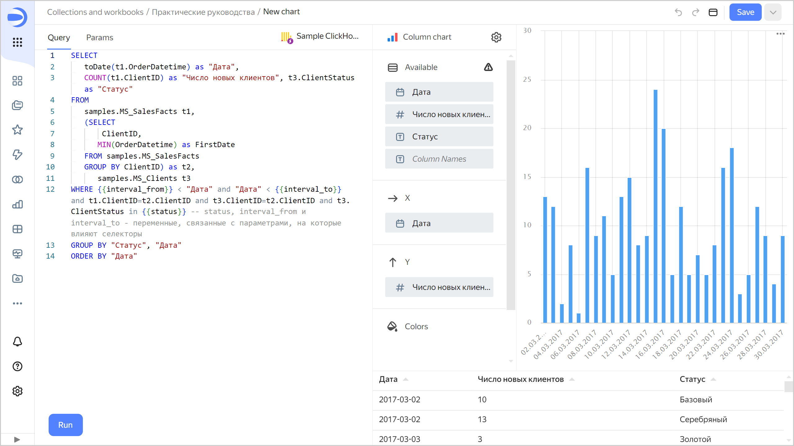
On the Query tab, enter the query code:
SELECT toDate(t1.OrderDatetime) as "Date", COUNT(t1.ClientID) as "Number of new clients", t3.ClientStatus as "Status" FROM samples.MS_SalesFacts t1, (SELECT ClientID, MIN(OrderDatetime) as FirstDate FROM samples.MS_SalesFacts GROUP BY ClientID) as t2, samples.MS_Clients t3 WHERE {{interval_from}} < "Date" and "Date" < {{interval_to}} and t1.ClientID=t2.ClientID and t3.ClientID=t2.ClientID and t3.ClientStatus in {{status}} -- status, interval_from and interval_to are variables linked to the parameters affected by the following selectors: GROUP BY "Status", "Date" ORDER BY "Date" -
On the Parameters tab, click Add parameter and complete the input fields:
-
From the drop-down list, select
string(default). -
In the Name field, enter
status. -
In the Default value field, enter
Gold. -
Click Add value below and enter
Silver. -
Click Add value below and enter
Basic.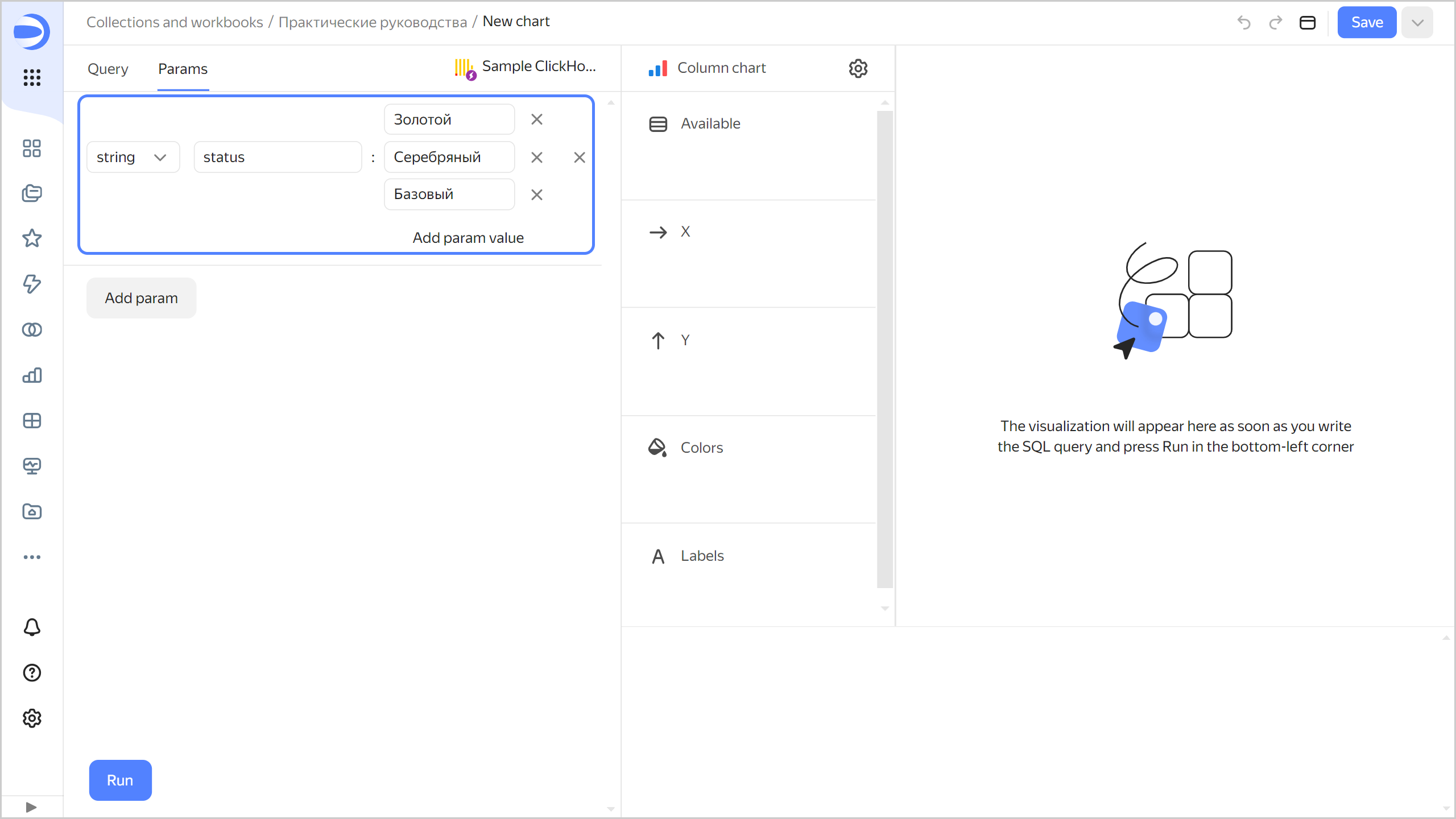
The added parameter will be linked to the
{{status}}variable in the query. -
-
Click Add parameter and complete the input fields:
-
From the drop-down list, select
date-interval. -
In the Name field, enter
interval. -
Click the field with the interval value and in the window that opens, specify:
-
From:
01.03.2017 -
To:
31.03.2017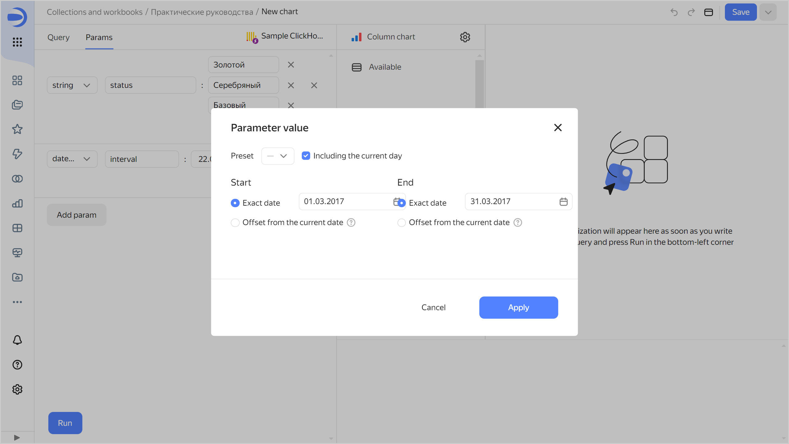
-
Click Apply.
The From: and To: values of the added parameter will be linked to the
{{interval_from}}and{{interval_to}}variables in the SQL query, respectively.Note
You can control the parameter values using dashboard selectors.
-
-
-
Go back to the Query tab. In the bottom-left corner, click Start. Running the query will produce a visualization in the right-hand window.
-
Configure the visualization:
-
Make sure the X section contains the
Datefield; otherwise, drag it from the Available section. -
Make sure the Y section contains the
Number of new clientsfield; otherwise, drag it from the Available section. -
Add color division of clients by status to the chart. To do this, drag the
Statusfield from the Available section to the Colors section.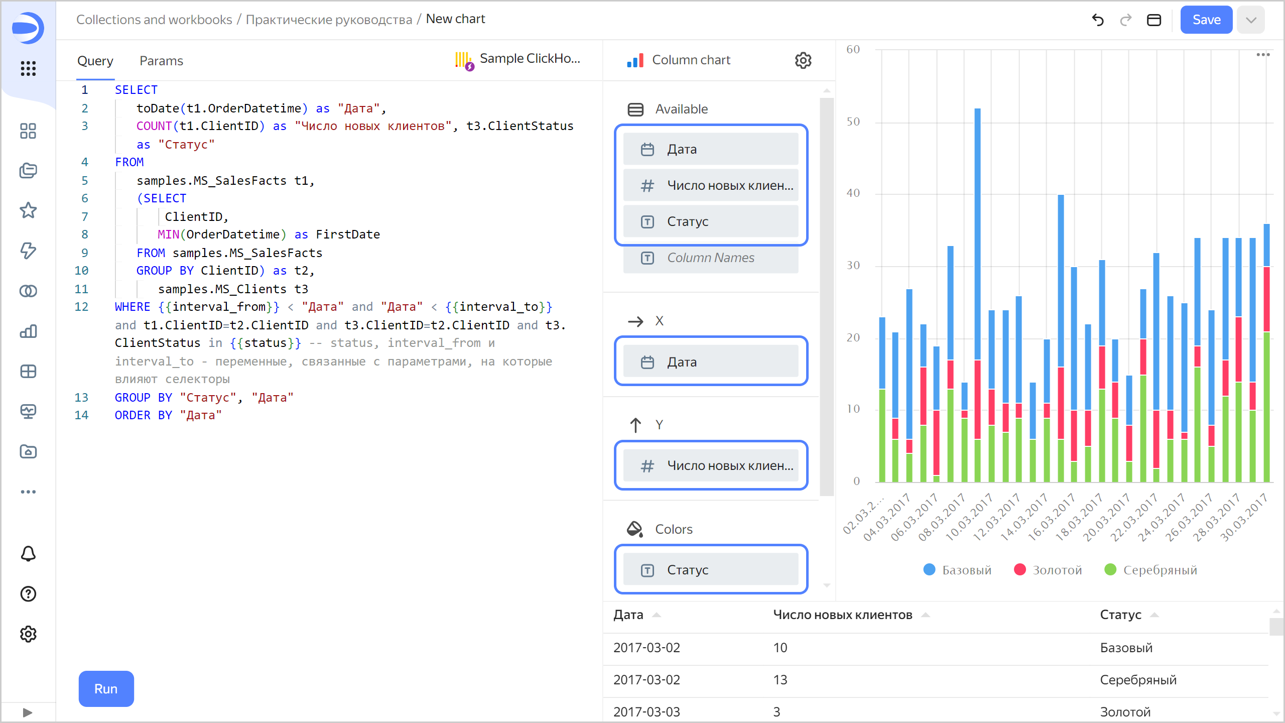
-
-
Save the chart:
- In the top-right corner, click Save.
- In the window that opens, enter
New clientsfor the chart name and click Save.
You can add the chart to the dashboard. You can also add selectors to the dashboard to manage the values of the status and interval QL chart parameters.
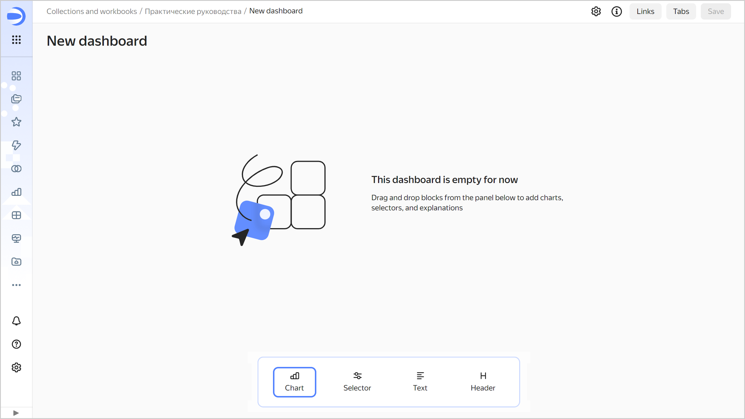
Create a dashboard
Create a dashboard to add charts and other widgets to:
- In the left-hand panel, select Collections and workbooks and go to the
Tutorialsworkbook. - In the top-right corner, click Create → Dashboard.
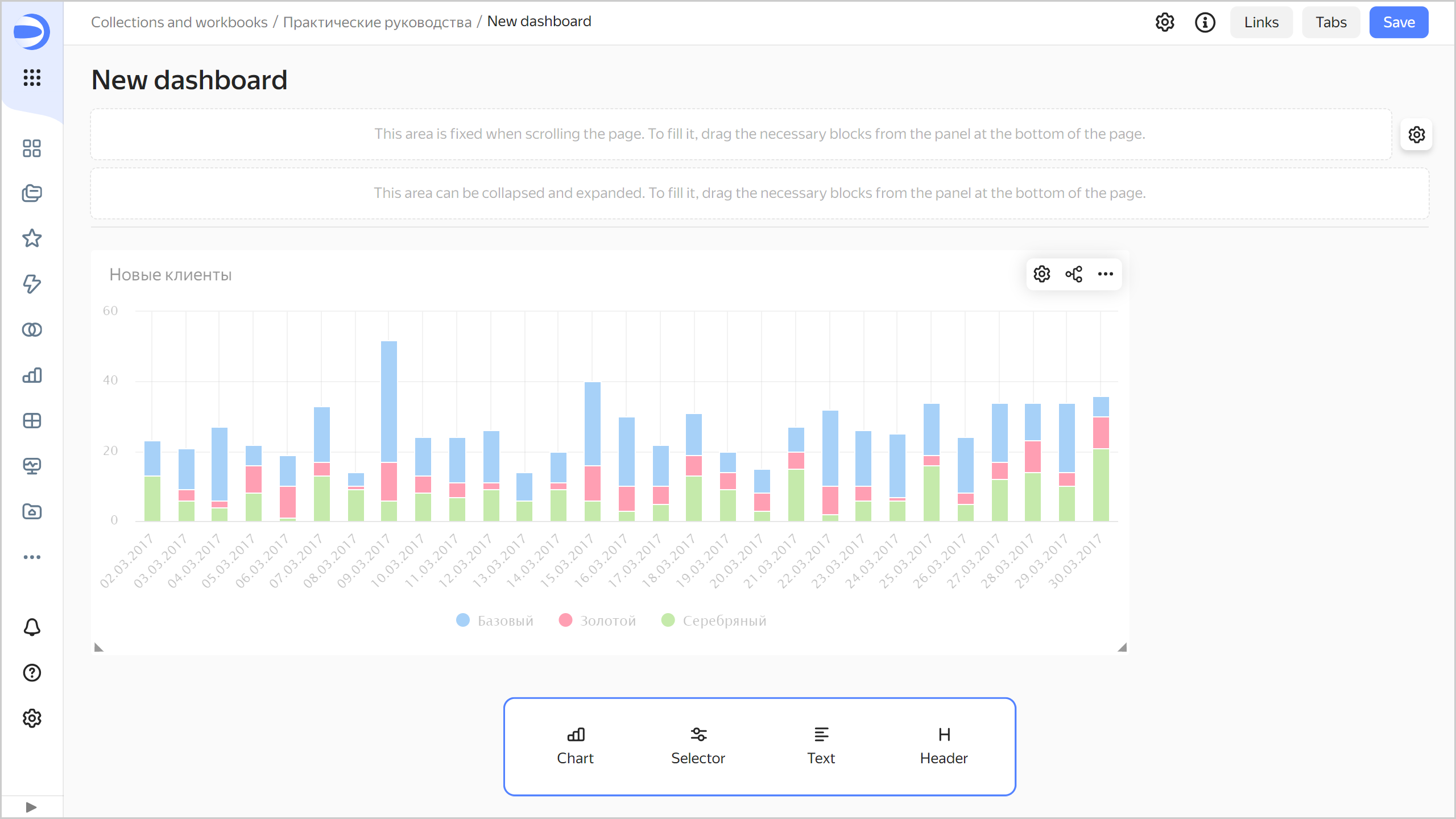
Add the QL chart to the dashboard
-
In the panel at the bottom of the page, click Chart and drag it where you want it to be.
-
In the window that opens, click Select.
-
Select the
New clientschart.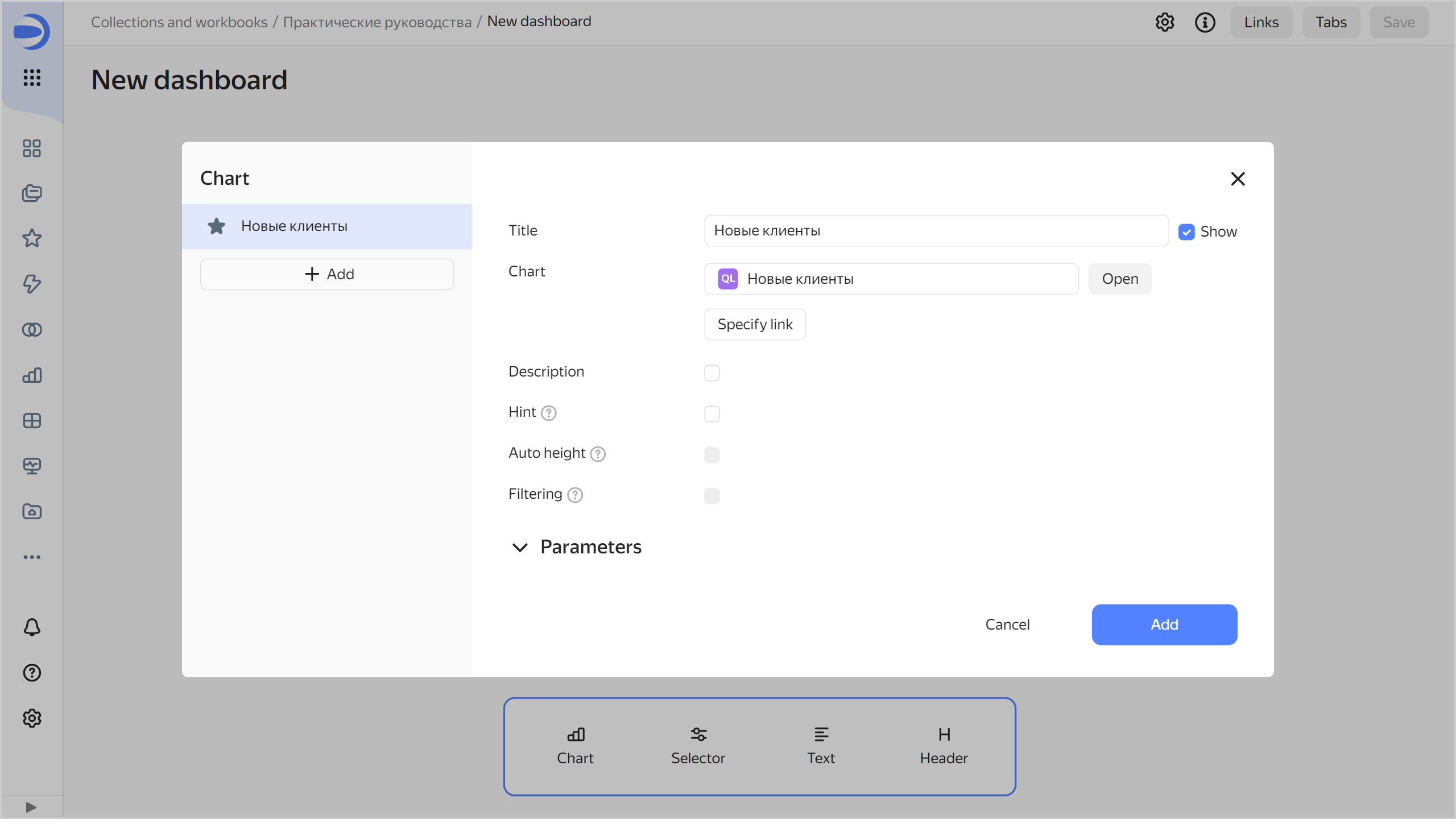
-
Click Add.
-
Adjust the size of the chart with your mouse and place it on the dashboard as you prefer.
Add selectors to the dashboard
Add selectors to filter charts by date and client statuses:
-
In the panel at the bottom of the page, click Selector and drag it where you want it to be.
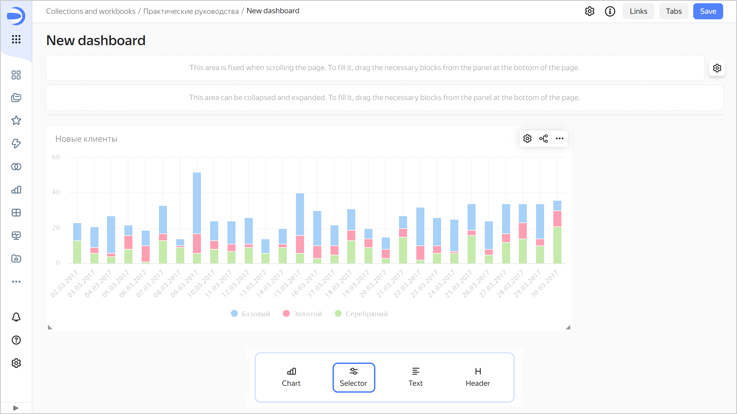
-
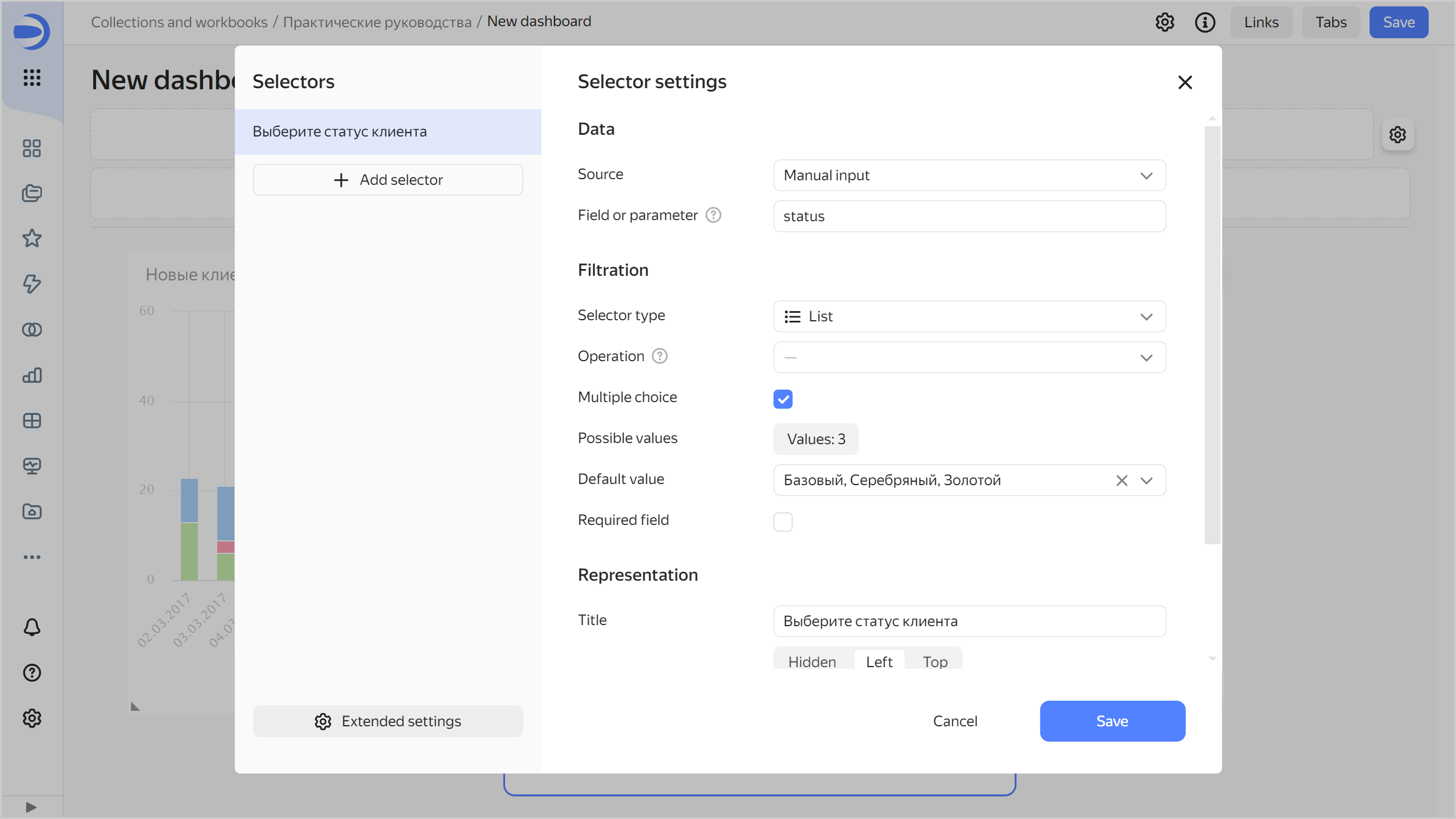
Add a selector for client status:
-
In the Source list, select
Manual input. -
In Field or parameter, enter
status. This SQL query variable will get the selected values from the selector. -
Select
Listas your selector type. -
Enable Multiple choice.
-
Next to the Possible values parameter, click Add. In the window that opens, add the following values:
- Gold
- Silver
- Basic
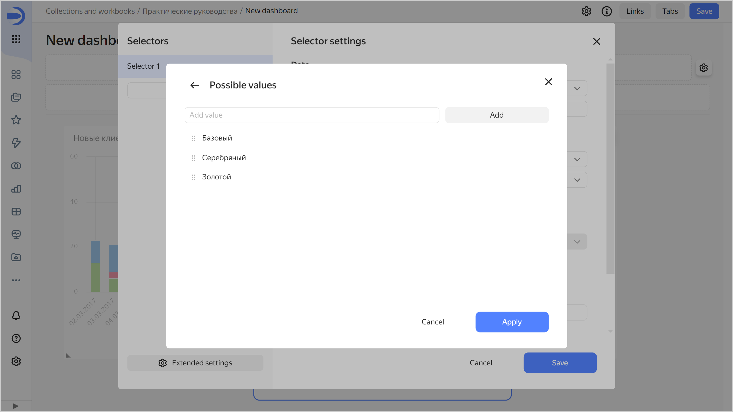
Click Apply.
-
In the Default value list, specify Select all.
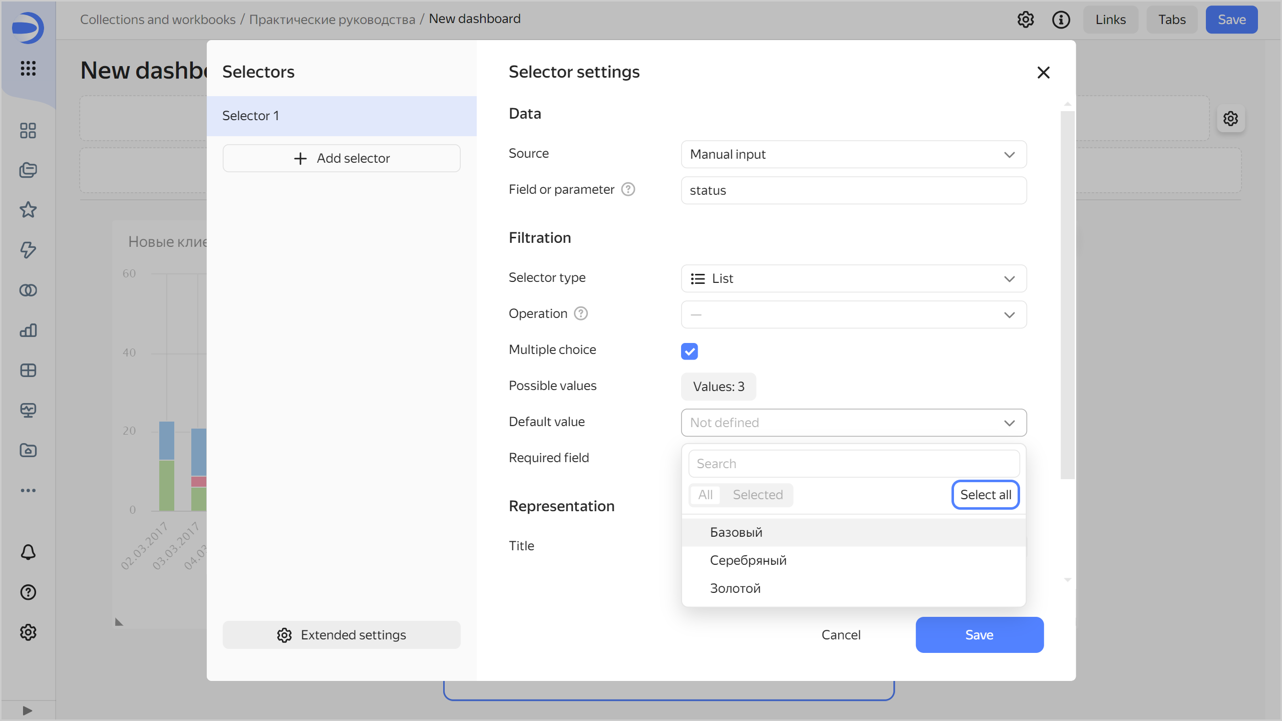
-
In the Header field, enter
Select client status. -
Click Save.
-
-
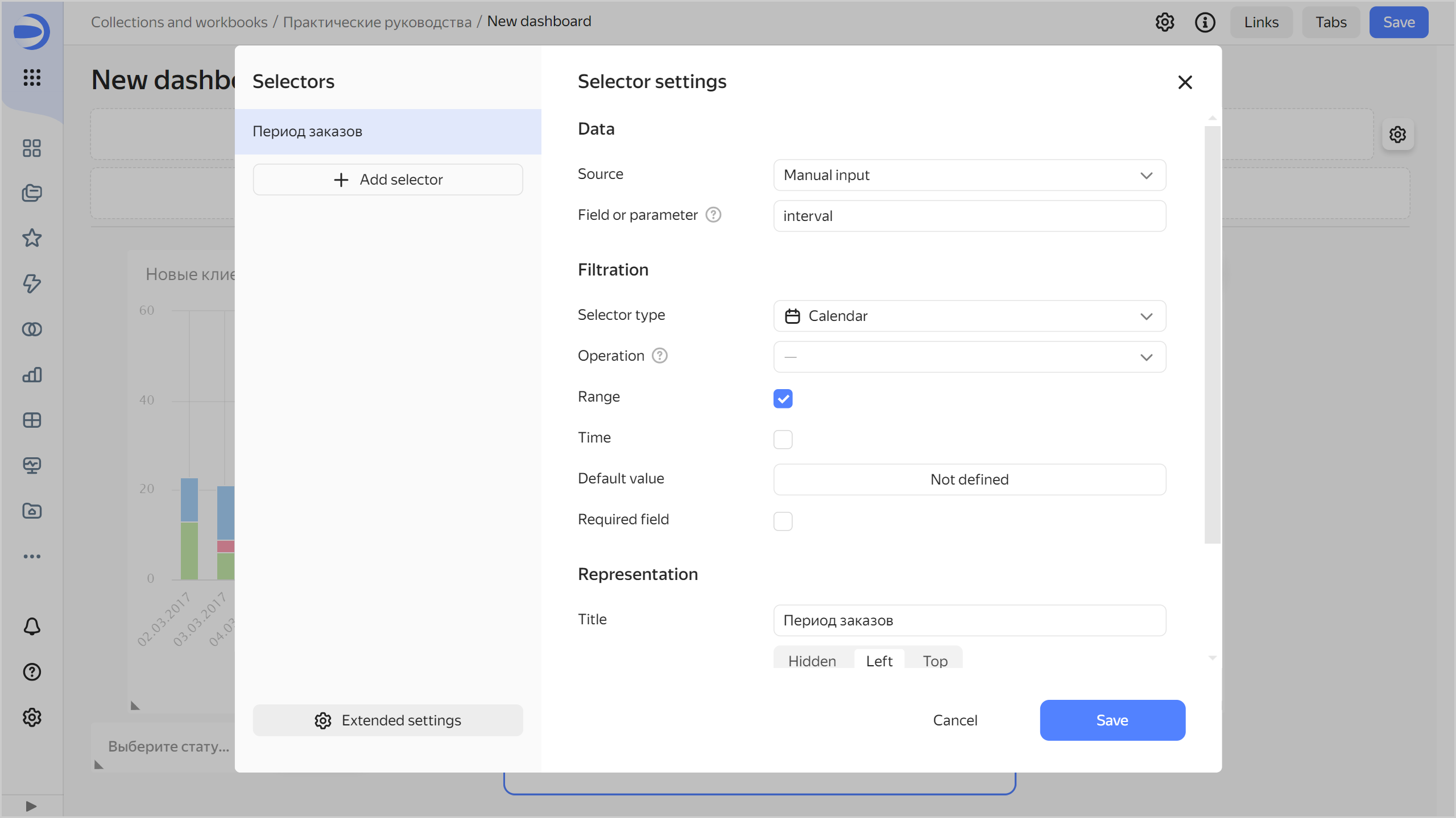
Add the calendar selector to filter by date interval:
-
In the Source list, select
Manual input. -
In Field or parameter, enter
interval. The start and end values of the interval from the selector will be provided to the{{interval_from}}and{{interval_to}}variables of the SQL query. -
Select
Calendaras the selector type. -
Enable Range.
-
In the Header field, enter
Order interval. -
Click Save.
-
-
Position the selectors on the dashboard however you prefer.
-
Save the dashboard:
- In the top-right corner of the dashboard, click Save.
- Enter
Change in number of clients by yearas the dashboard name and click Create.
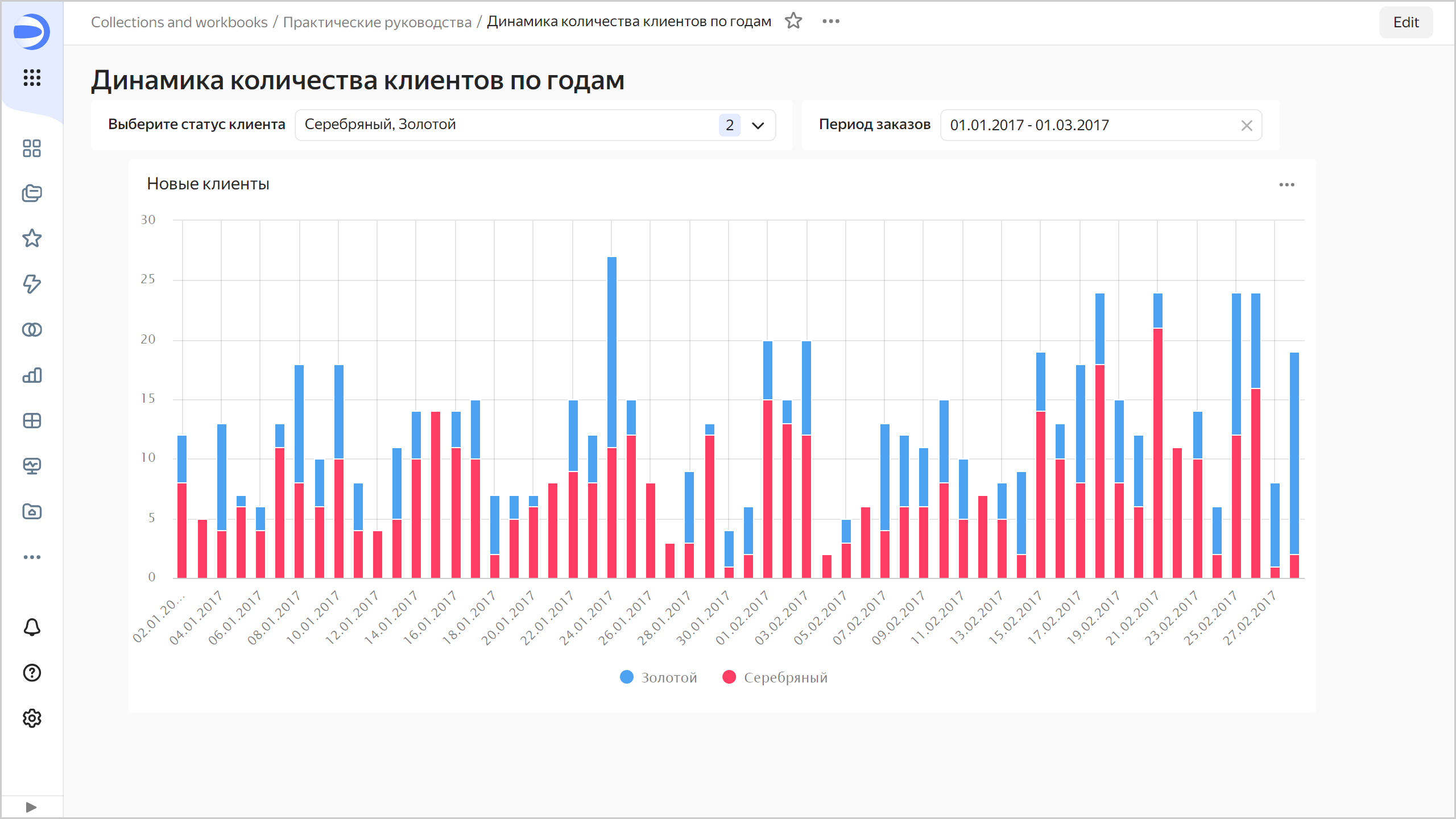
Your dashboard is ready for use.
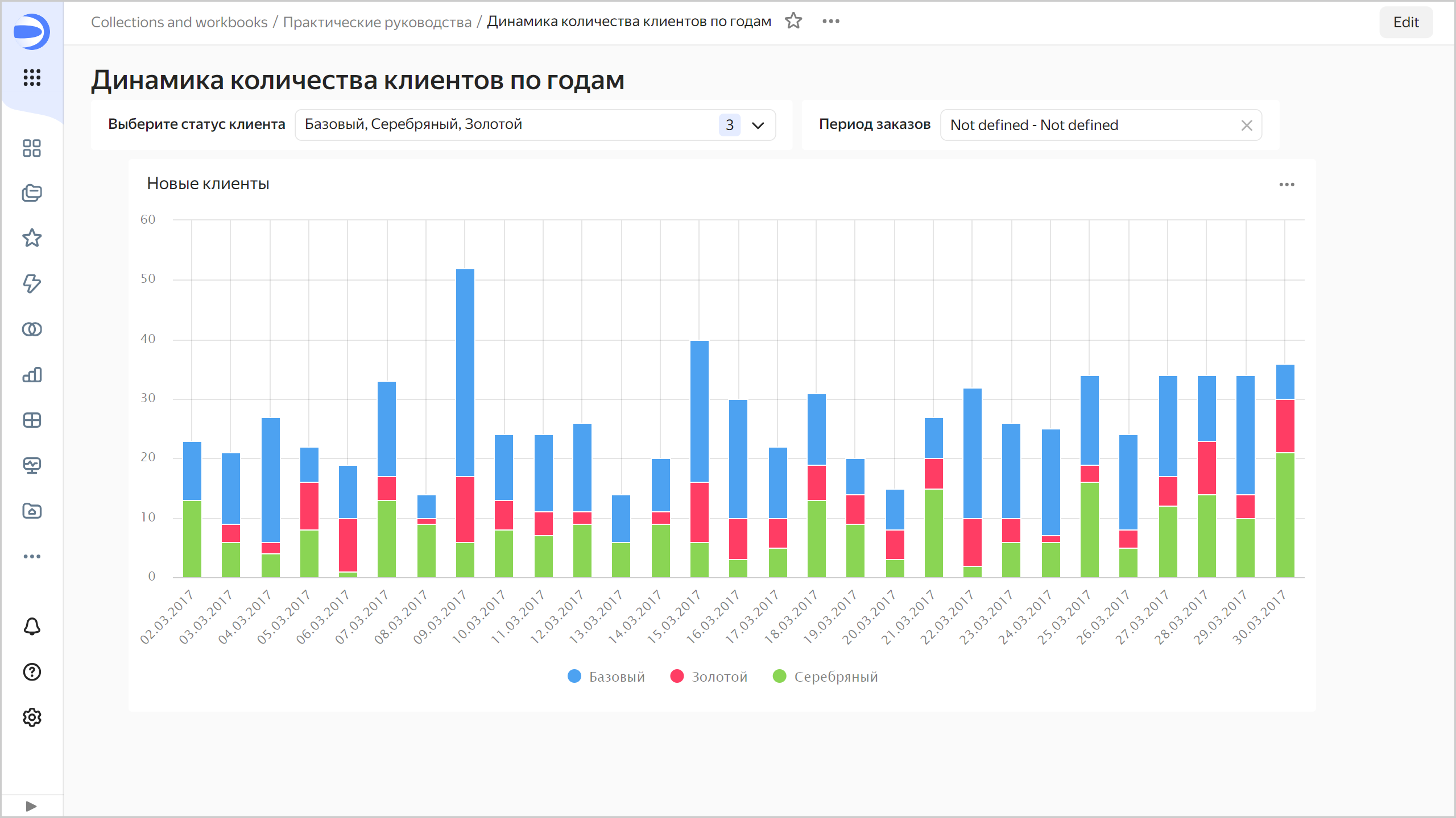
-
Your dashboard is ready for use. Now you can filter the chart by status using the selector.
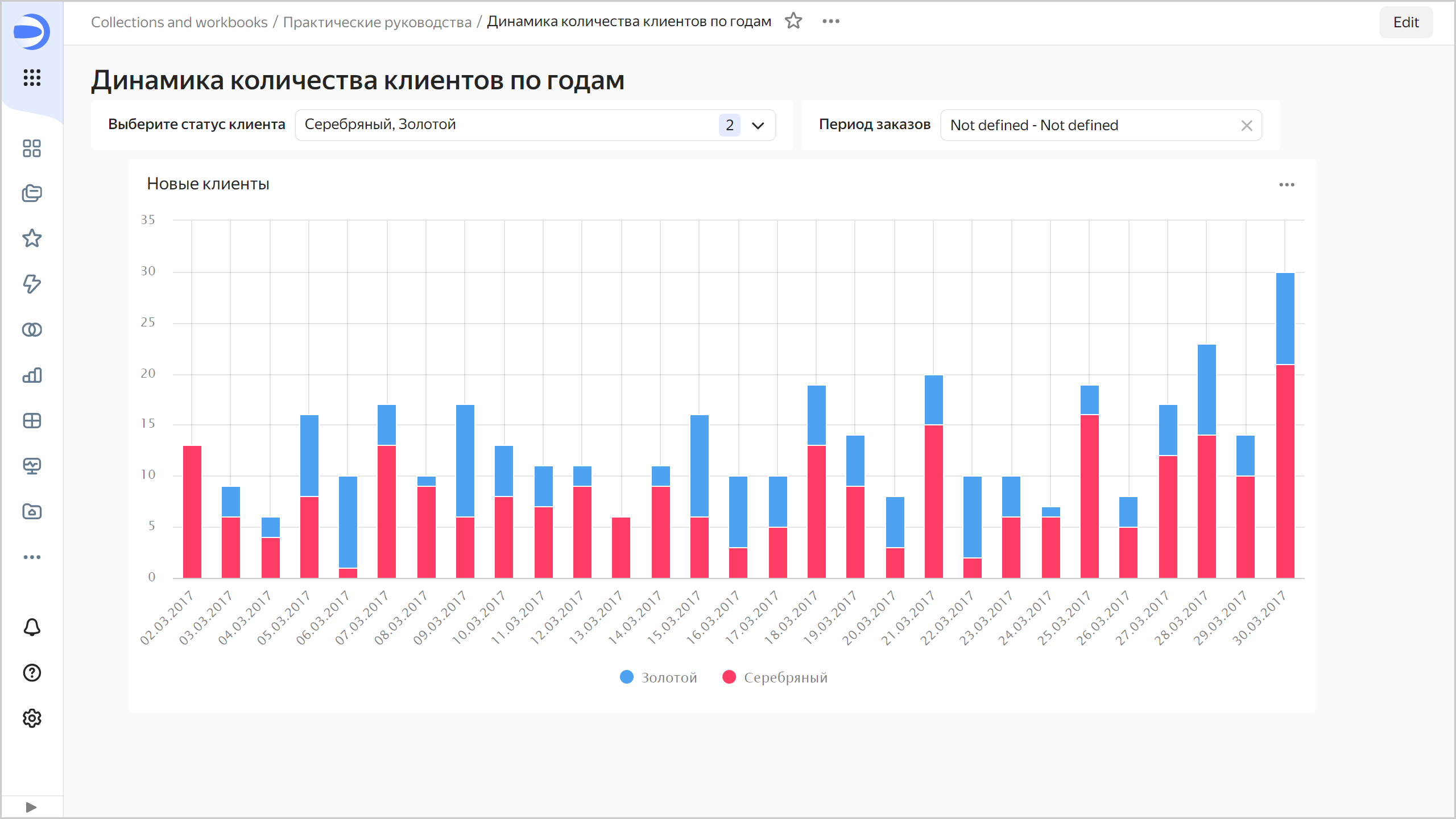
You can also filter the chart by date interval using the second selector.