Parameters in Yandex DataLens
A parameter is a variable that can substitute constant values in calculated fields. You can create parameters both at the dataset level and at the chart level.
Dataset parameters are available in all charts created based on this dataset, while chart parameters are only available in the chart they are created in. The default value for a dataset parameter can be overridden at the chart level.
Using parameters
With dataset or chart parameters, you can manage formulas and change visualization in a chart.
The saved dataset parameters are propagated to all charts based on this dataset when they are uploaded.
You can edit parameter values on dashboards using selectors with manual input. However, you cannot do the following:
- Use the Multiple choice option.
- Choose an operation in a selector (leave a dash in the selection field of the Operation drop-down list).
- When using a selector based on a dataset parameter, you must unlink the selector from the other selectors on the dashboard tab (set Not linked for link type).
You can also specify parameter values in chart links. To do this, add ? at the end of a URL, write the parameter name without spaces after the URL, put =, and specify the parameter value without spaces. You can list multiple parameters in a URL using & as a separator.
To use a chart with a parameter:
-
Place your chart on a dashboard.
-
Add a selector to the dashboard to manage the chart parameter:
- Select Manual input.
- In the Field or parameter field, enter the name of the parameter from the chart.
- Leave a dash in the selection field of the Operation drop-down list.
- In the Default value field, specify the value to propagate in the chart parameter.
- Enter the selector Header to display on the dashboard.
By changing selector values, you can customize visualization in the chart through the parameter.
Examples
Let's look at some examples of how to use parameters to manage visualization in a chart. We will build a dataset from a connection to the demo DB (the samples.MS_SalesFullTable table) and use it as our data source.
Example 1
Set up visualization of a sales chart on a dashboard by changing the detail level with a selector:
-
Add to the dataset a parameter named
scalewithStringfor type andyearfor default value. The parameter will be available in all charts created based on this dataset. -
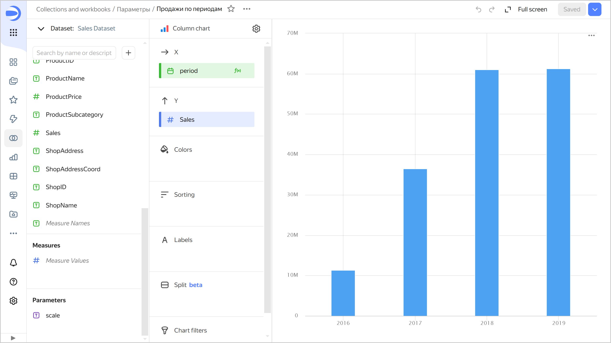
Create a Column chart based on the created dataset:
- Add to the chart a field named
periodwith theDATETRUNC([OrderDatetime], [scale])formula and drag it to the X section. - Drag the
Salesdimension to the Y section. TheSalesdimension will be automatically converted to theSUM[Sales]measure.
Sales by period
- Add to the chart a field named
-
Place your chart on a dashboard.
-
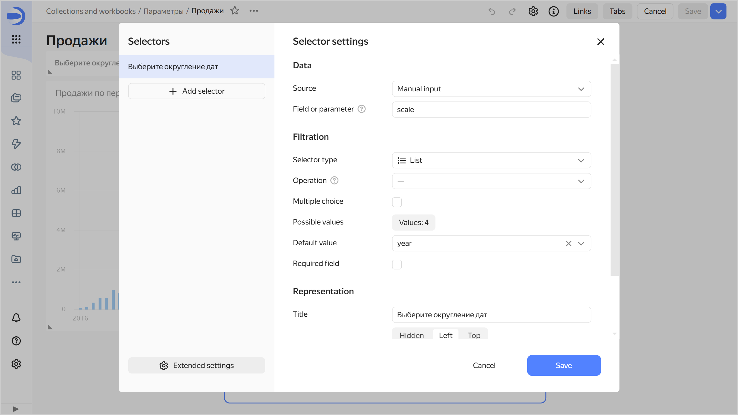
Add a selector to manage the chart parameter:
- Select Manual input.
- Specify
scalein the Field or parameter field. - Leave
Listin the selection field of the Selector type drop-down list. - Leave a dash in the selection field of the Operation drop-down list.
- In the Possible values window, add:
year,month,week. - In the Default value field, specify
yearto round dates to a year in the chart by default. - In the Header field, enter the selector name to display on the dashboard.
Period selector
-
Make sure a link between the selector and the chart on the dashboard is set up properly:
-
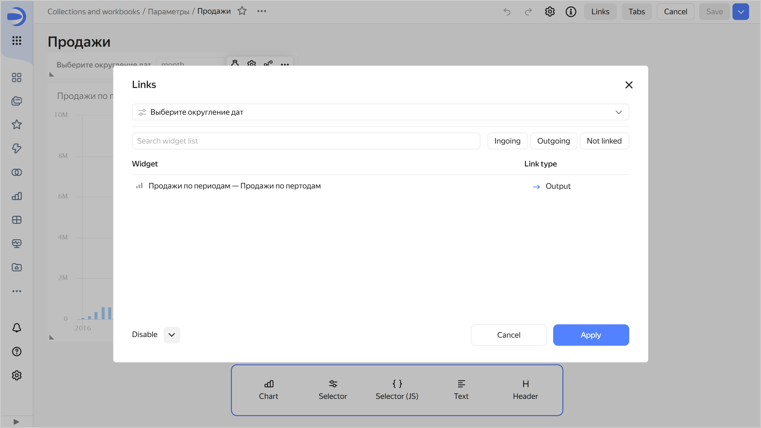
In dashboard editing mode, click the icon at the top of the screen. The settings window will open on the right.
-
In the settings window, click Links .
-
Select the added selector from the list. Check that it has an outgoing link to the appropriate chart by the
scalefield. -
Add a link between widgets if needed.
Links between widgets
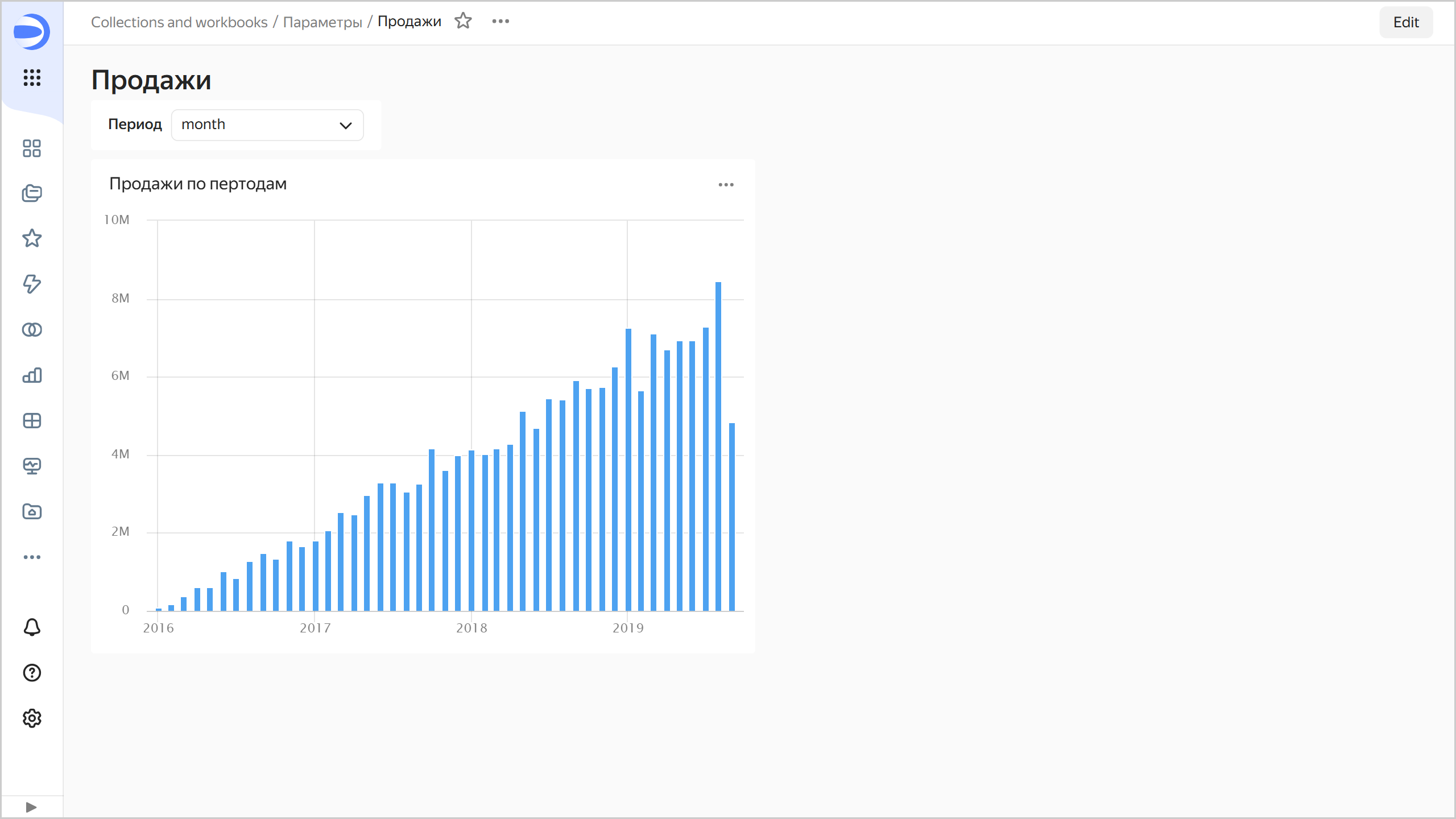
Now, by choosing selector values, you can change the way dates are rounded in the chart, e.g., by year or by month.
Sales by month
-
Example 2
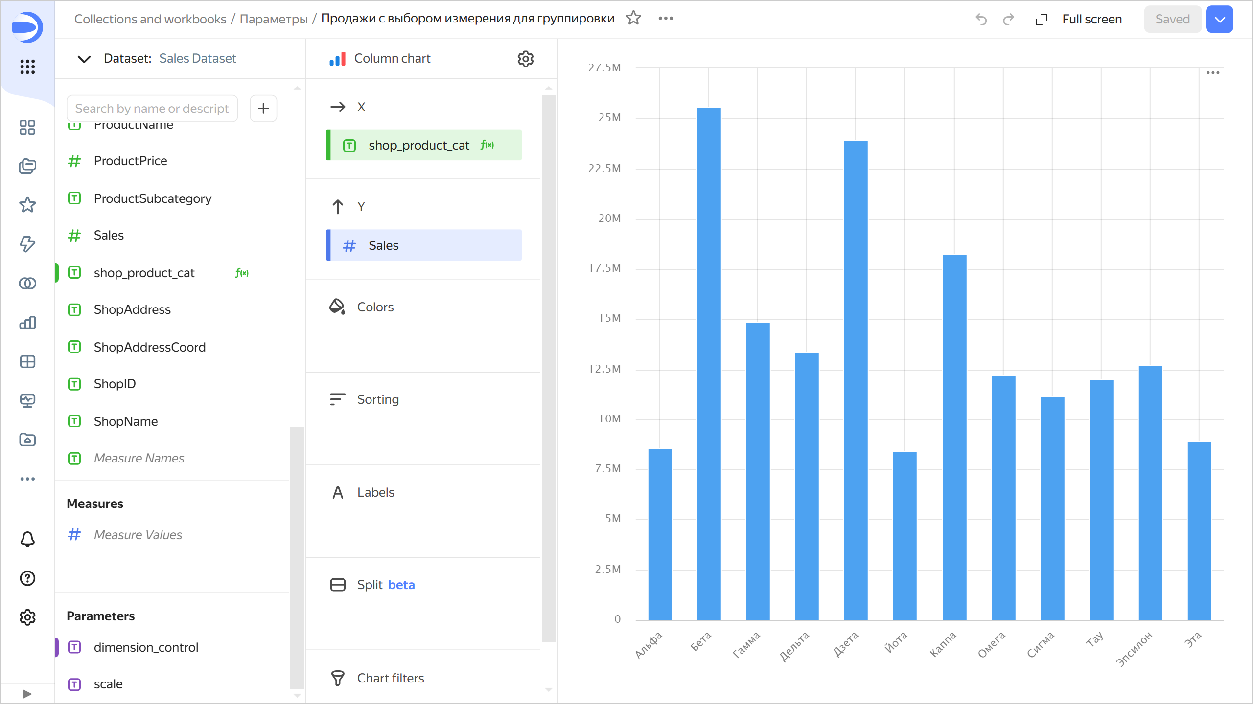
Enable selecting a dimension with a selector to display it in your chart on a dashboard:
-
Create a Column chart:
- Add to the chart a parameter named
dimension_controlwithStringfor type andby shopfor default value. The parameter will only be available in this chart. - Add to the chart a field named
shop_product_catwith theCASE([dimension_control], "by shop", [ShopName], "by product category",[ProductCategory], "by product subcategory", [ProductSubcategory], '')formula and drag it to the X section. - Drag the
Salesdimension to the Y section. TheSalesdimension will be automatically converted to theSUM[Sales]measure.
Sales with choice of dimension four grouping
- Add to the chart a parameter named
-
Place your chart on a dashboard.
-
Add a selector to manage the chart parameter:
- Select Manual input.
- Specify
dimension_controlin the Field or parameter field. - Leave
Listin the selection field of the Selector type drop-down list. - Leave a dash in the selection field of the Operation drop-down list.
- In the Possible values window, add:
by shop,by product category, andby product subcategory. - In the Default value field, specify
by shopto display sales amounts by shop by default. - In the Header field, enter the selector name to display on the dashboard.
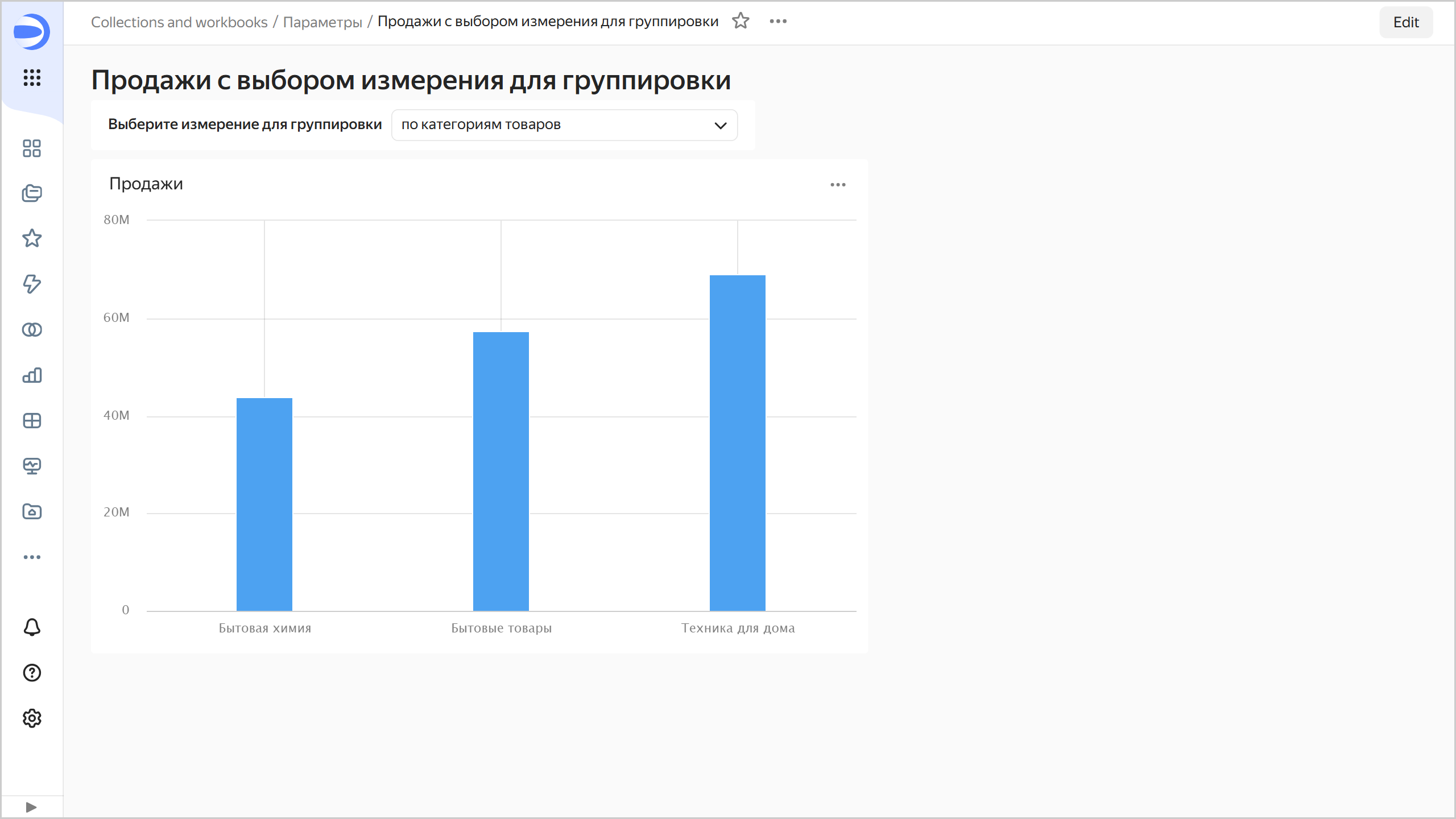
Now, by choosing selector values, you can change the dimension displayed on the chart.
Sales by category
Example 3
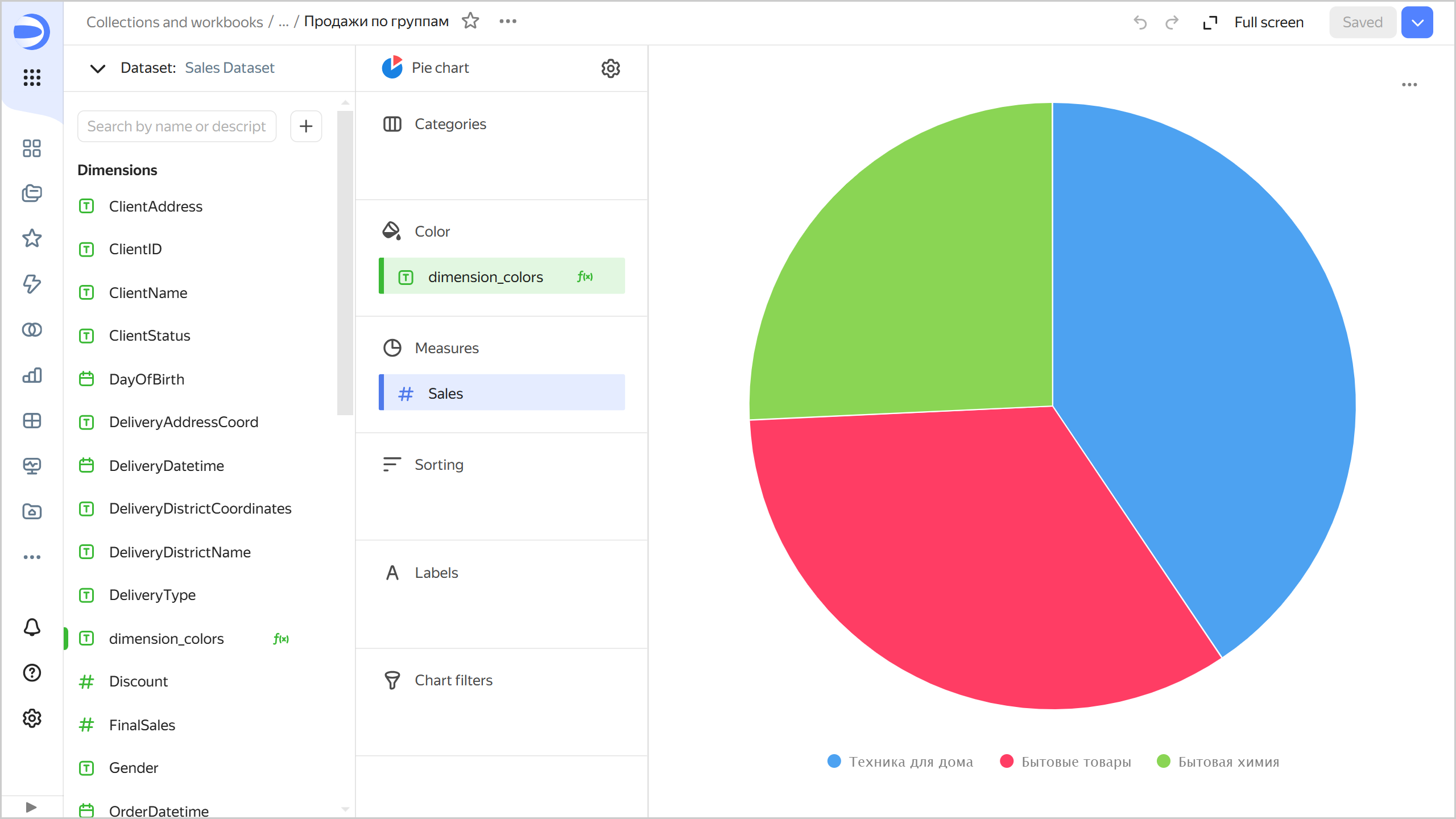
Use a selector to enable selecting a dimension to color in your chart:
-
Create a Pie chart:
- Add to the chart a parameter named
colorswithStringfor type andcategoriesfor default value. The parameter will only be available in this chart. - Add to the chart a field named
dimension_colorswith theIF([colors]="categories", [ProductCategory], [ProductSubcategory])formula and drag it to the Color section. - Drag the
Salesdimension to the Measures section. TheSalesdimension will be automatically converted to theSUM[Sales]measure.
Sales by group
- Add to the chart a parameter named
-
Place your chart on a dashboard.
-
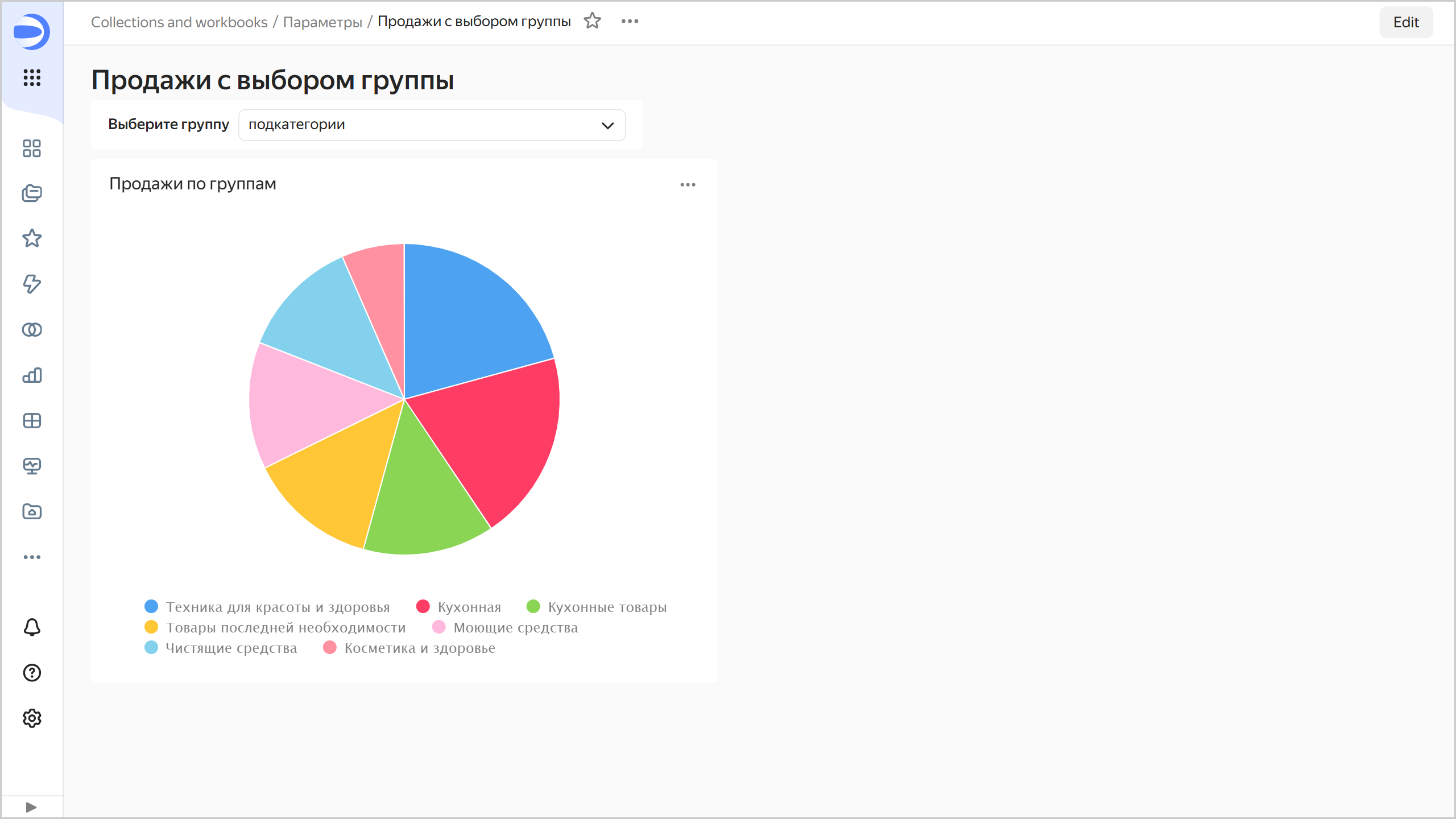
Add a selector to manage the chart parameter:
- Select Manual input.
- Specify
colorsin the Field or parameter field. - Leave
Listin the selection field of the Selector type drop-down list. - Leave a dash in the selection field of the Operation drop-down list.
- In the Possible values window, add
categoriesandsubcategories. - In the Default value field, specify
categoriesto color sales amounts by product category by default. - In the Header field, enter the selector name to display on the dashboard.
Now, by choosing selector values, you can change the dimension to color in your chart.
Sales with choice of group
Limitations
When using parameters, keep in mind the following parameter naming restrictions:
- Valid characters include Latin letters (both uppercase and lowercase), digits, hyphen (
-), and underscore (_). - The name must not be longer than 36 characters.
- It must not start with an underscore, e.g.,
_name. - You cannot use these reserved parameter names:
tab,state,mode,focus,grid,tz,from,to. - Parameter names are case-sensitive, which means
Testandtestare two different parameters. - Parameter names cannot be the same as dataset field names.
- After adding a parameter to a dataset, make sure to save charts in the wizard again.
- If a dataset and a chart have parameters with the same name, the parameter from the chart is ignored.