Trends and smoothings in Yandex DataLens charts
In DataLens, you can apply a smoothing or add a trend line to a chart on a dashboard:
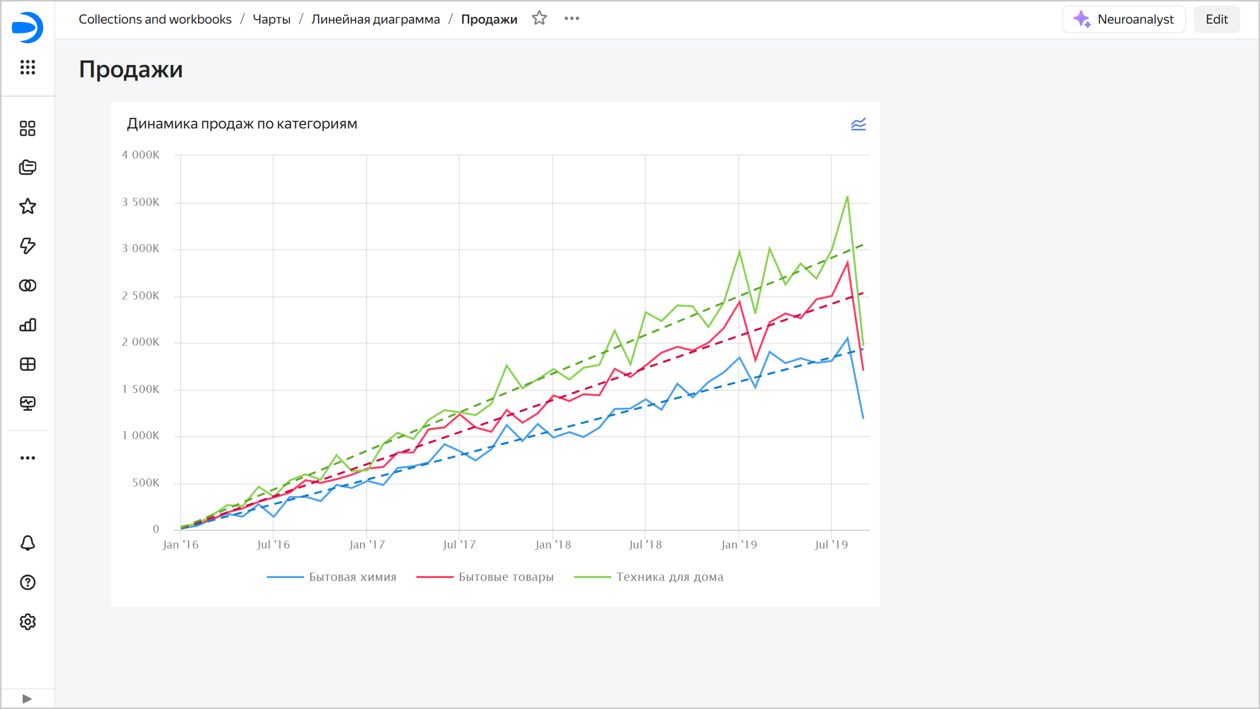
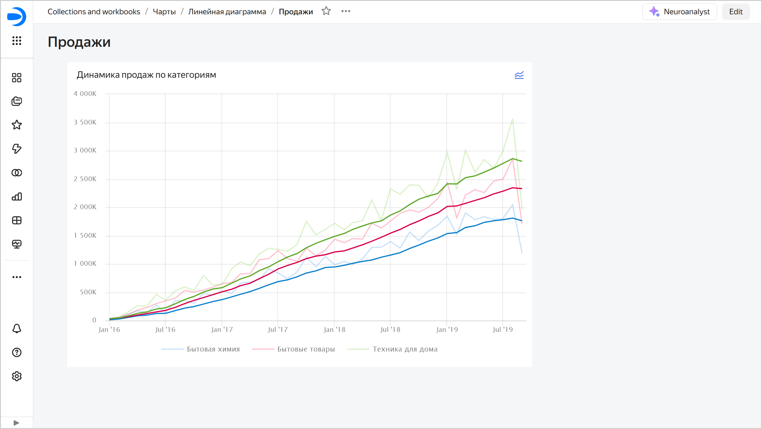
- Smoothing: Adds a line with a simple moving average for better visualization of fluctuant data.
- Trend line: Adds a trend line to highlight the overall data change trend.
Allows you to temporarily change the visualization without saving the changes in the original chart.
For every chart on the dashboard, you can:
The feature is at the Preview stage. Before using it, learn about its limitations.
Warning
Trend and smoothing settings are applied to the current dashboard view only and not saved after the page is refreshed.
When a smoothing or trend line is on, will appear in the top right corner of the dashboard chart. Clicking it opens the settings window.
Add or remove a trend
To add a trend line, click → Modeling → Add trend in the top right corner of the dashboard chart or enable Trend in the settings window. Every chart line will now be accompanied by a trend line representing the overall data change trend.
To remove a trend line, click → Modeling → Remove trend in the top right corner of the dashboard chart or disable Trend in the settings window.
Add or remove a smoothing
To add a trend line, click → Modeling → Add smoothing in the top right corner of the dashboard chart or enable Smoothing in the settings window. Every chart line will now be accompanied by a smoothing line.
To remove a trend line, click → Modeling → Remove smoothing in the top right corner of the dashboard chart or disable Smoothing in the settings window.
Configure trend lines and smoothings
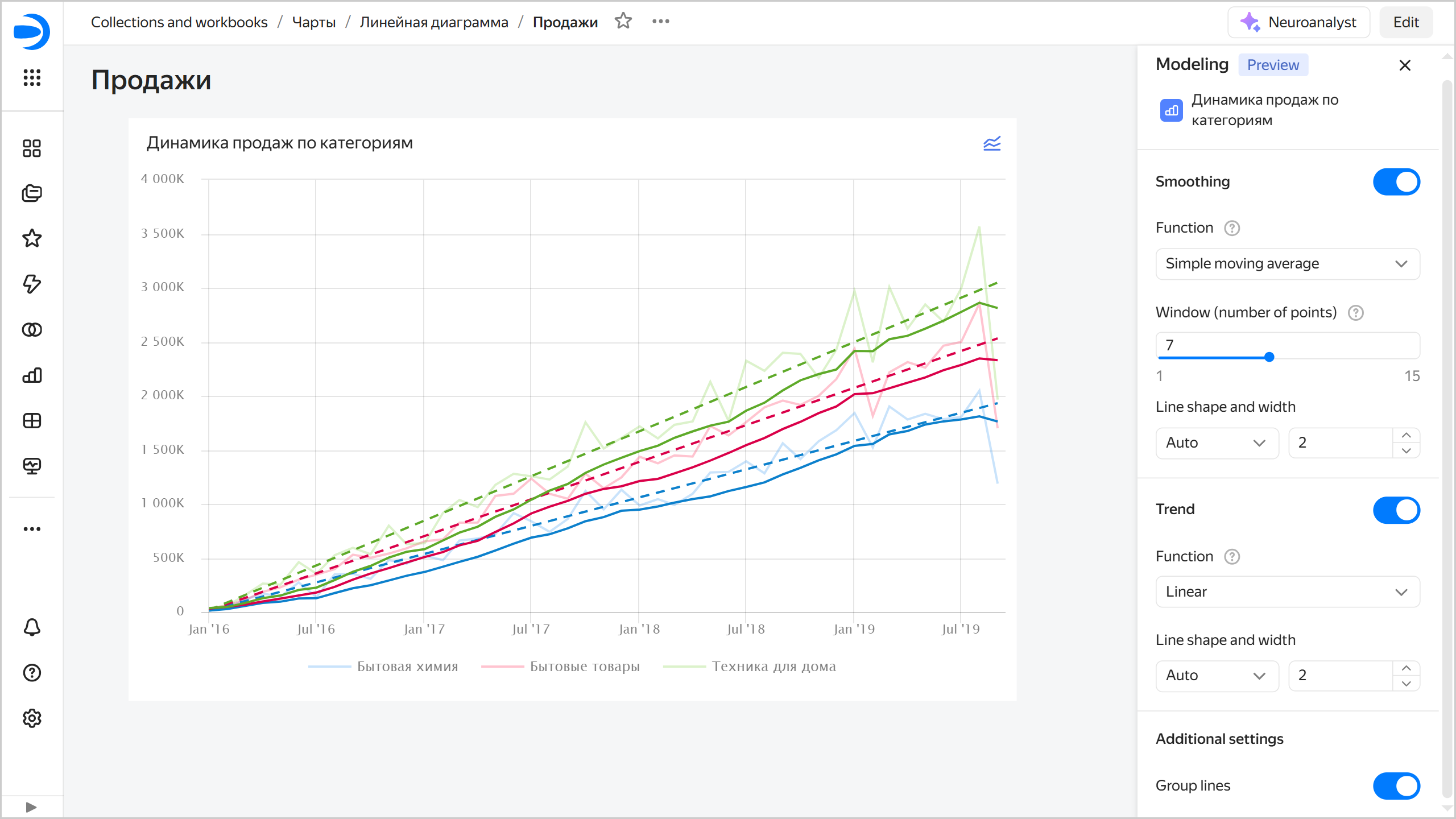
To configure trend lines and smoothings, click → Modeling → Configure in the top right corner of the dashboard chart. On the right, in the Modeling window:
-
Enable Smoothing and select:
- Function: You can use the
Simple moving averagevalue, which represents an arithmetic mean in pointtover the time interval set in the Window field. The window includes points precedingtand thetpoint itself. - Window (number of points): Interval or number of points for arithmetic mean calculation, including the
tpoint itself. The possible values range from1to15. - Line form and density: Smoothing line properties.
- Function: You can use the
-
Enable Trend and select:
-
Function: Chart line smoothing function:
- Linear: Linear regression, which is a straight line that gives you a general idea of increase or decline over the selected interval. The regression model is , where and are selected so that you get a straight line most accurately reflecting the relationship between the source line data.
- Quadratic: Use if there is an obvious non-linear dependency in the source data. The regression model is , where , , and are selected so that you get a parabola line most accurately reflecting the relationship between the source line data.
- Cubic: Use if there is clearly more than one bend in the source data. The regression model is , where , , $c, and are selected so that you get a cubic parabola line most accurately reflecting the relationship between the source line data.
Use the quadratic and cubic functions with caution.
-
Line form and density: Trend line properties.
-
-
Additional settings:
- Enable Group lines to hide smoothing and trend lines from the chart legend.
The changes made to the trend line and smoothing settings will appear directly on the chart.
Limitations
- Available only for linear charts (Wizard, QL charts, or Editor charts).
- Available only from dashboards.
- Not available for linear charts with the
Xaxis in discrete mode. - The settings are not retained.
- Not available on public and embedded dashboards for now.