Map in Yandex DataLens

Maps are used for geoanalytics: displaying and analyzing business indicators on a map.
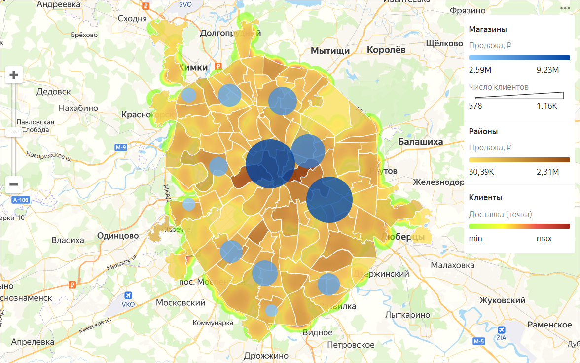
What you can see on maps
- Population size and density.
- Number of commercial facilities and their revenue.
- Other measures potentially affecting business performance.
Map layer types
-
Areas
A layer of this type represents entire areas or regions. The measure value is expressed through colors or hues.
By adding tooltips with region names and measures you can make the chart info easier to read. -
Points
Points can represent individual objects, such as cities, stores, pickup points, or customer addresses.
There are two ways to show the value: through point color and size. -
Lines
Lines are used to show connections between objects on the map, such as airline flights or cargo transportation routes.
-
Heatmap
Shows the density of points on the map. This map type is useful for displaying large numbers of points and areas of their clustering.
What you need to know about maps
-
To create a map, add either coordinates with the Geopoint type or areas with the Geopolygon type to the data source.
-
Use the Center and Scale settings to show a portion of the map.
-
A single map supports up to five layers of any visualization type.
Geolayers
Map chart layers are called geolayers. Geolayers are used to present measures as points or polygons.
What you can do with geolayers
- Rename a layer.
- Set transparency using the slider.
- Reorder layers within the visualization type.
However, you cannot change the order of visualization types (top-to-bottom: point map, polyline map, chloropleth map, and heatmap).
To get geolayers, you can find and use a creation from Gallery.
Note
You cannot create maps in QL charts.