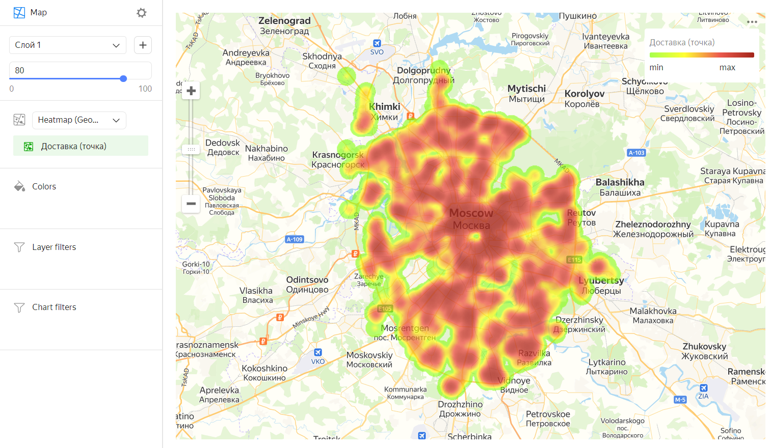
Heat map in Yandex DataLens
A heat map shows the density of point distribution. Map areas are colored with a gradient ranging from green to red: the more points are grouped in an area, the closer its color is to red.
What you need to know about heat maps
-
Heat maps are used to display clusters of large numbers of points.
Note
If there are few points, using this type of map may distort the detected dependencies.
-
A heat map is at its most effective when representing a dataset of many points within a small geographical area.
If there are few points, their values can be expressed through the intensity of their color: the higher the value, the closer the color is to red.
-
A heat map helps you find dependencies that might otherwise be hidden due to overlapped points on the map (in case of a point map).
For example, you can use a heat map to determine the districts where customers order for delivery most often.
Wizard sections
| Wizard section |
Description |
|---|---|
| Heat map (Geopoints) | Measure of the Geopoint type |
| Colors | Dimension or measure. Affects the intensity of point fill. |
| Layer filters | Dimension or measure. Used as a filter for the current layer. |
| Filters | Dimension or measure. Used as a filter for the entire chart. |
Creating a heat map
Warning
If you use the new DataLens object model with workbooks and collections:
-
Go to the DataLens home page. In the left-hand panel, select Collections and workbooks.
-
Open the workbook, click Create in the top-right corner, and select the object you need.
Follow the guide from step 4.
-
Go to the DataLens home page.
-
In the left-hand panel, select Charts.
-
Click Create chart → Chart.
-
At the top left, click Select dataset and specify the dataset to visualize. If you do not have a dataset, create one.
-
Select Map for the chart type.
- Select the Heat map (Geopoints) layer type.
- Drag a dimension of the Geopoint type from the dataset to the layer type selection section.
- Change the weight of the points on the heat map. To do this, drag the measure to the Colors section.
- Optionally, update the color settings for the measure.
Note
You can show a particular area on the map using the Center and Scale settings.
You can also:
- Add, rename, and delete a layer.
- Apply a filter to the entire chart or one layer.
Color setting
To change the color settings:
-
Click in the Colors section (the icon appears when you hover over the section).
-
In the color settings, specify:
- Gradient type: Select two or three colors.
* Gradient color: Select a color palette for the gradient from the list.
* Gradient direction: Change the gradient direction using the icon. - Set threshold values: Set numeric thresholds for each color.
- Gradient type: Select two or three colors.
-
Click Apply.
Recommendations
- Use a heat map if your dataset has many enough points. If there are few points, using this type of map may distort the detected dependencies.
- The intensity of point and area fill on a heat map varies depending on the map's scale. Please keep this in mind.