Pie chart in Yandex DataLens
This chart shows relative proportions of different categories to the whole as circle slices (sectors). The circle represents the total of all categories and equals 100%. The size of each segment indicates the proportion of each category to the total amount.
Pie charts are a good choice for demonstrating proportions of a small number of segments.
Example
| Product categories | Sales |
|---|---|
| Home appliances | 69M |
| Household goods | 57M |
| Household cleaners | 44M |
Use one color for multiple small sectors belonging to a larger category
Wizard sections
| Wizard section |
Description |
|---|---|
| Categories | Dimension. You can specify only one field here. Your data will be grouped by this field. |
| Color | Dimension. You can specify only one field here. Your charts segments will be colored according to it. |
| Measures | Measure. You can specify only one field here. |
| Sorting | Measure or dimension from the Color section. Affects area sorting. The sorting direction is marked with an icon next to the field: for ascending or for descending. To change the sorting direction, click the icon. |
| Labels | Measure. Displays measure values on the chart. To add callouts with category names to the chart, drag the Measure Names dimension to this section. Markup functions are supported. For String type fields, you can configure using basic Markdown in Yandex DataLens syntax: click the icon before the field name and enable Markdown. |
| Filters | Dimension or measure. Used as a filter. |
Creating a pie chart
To create a pie chart:
Warning
If you use the new DataLens object model with workbooks and collections:
-
Go to the DataLens home page. In the left-hand panel, select Collections and workbooks.
-
Open the workbook, click Create in the top-right corner, and select the object you need.
Follow the guide from step 4.
-
Go to the DataLens home page.
-
In the left-hand panel, select Charts.
-
Click Create chart → Chart.
-
At the top left, click Select dataset and specify the dataset to visualize. If you do not have a dataset, create one.
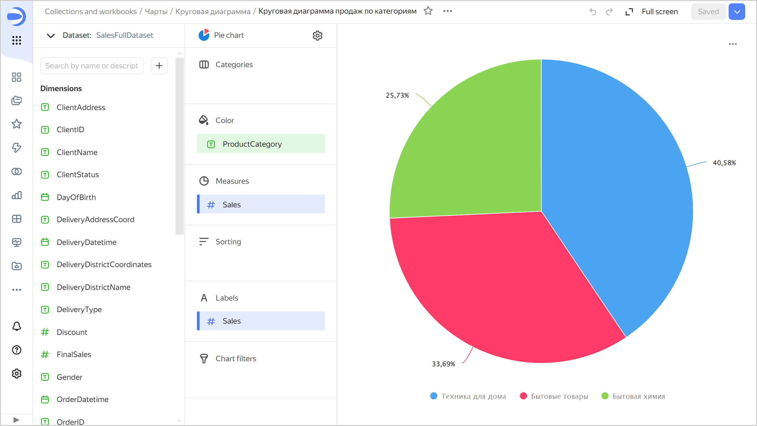
- Select Pie chart as the chart type.
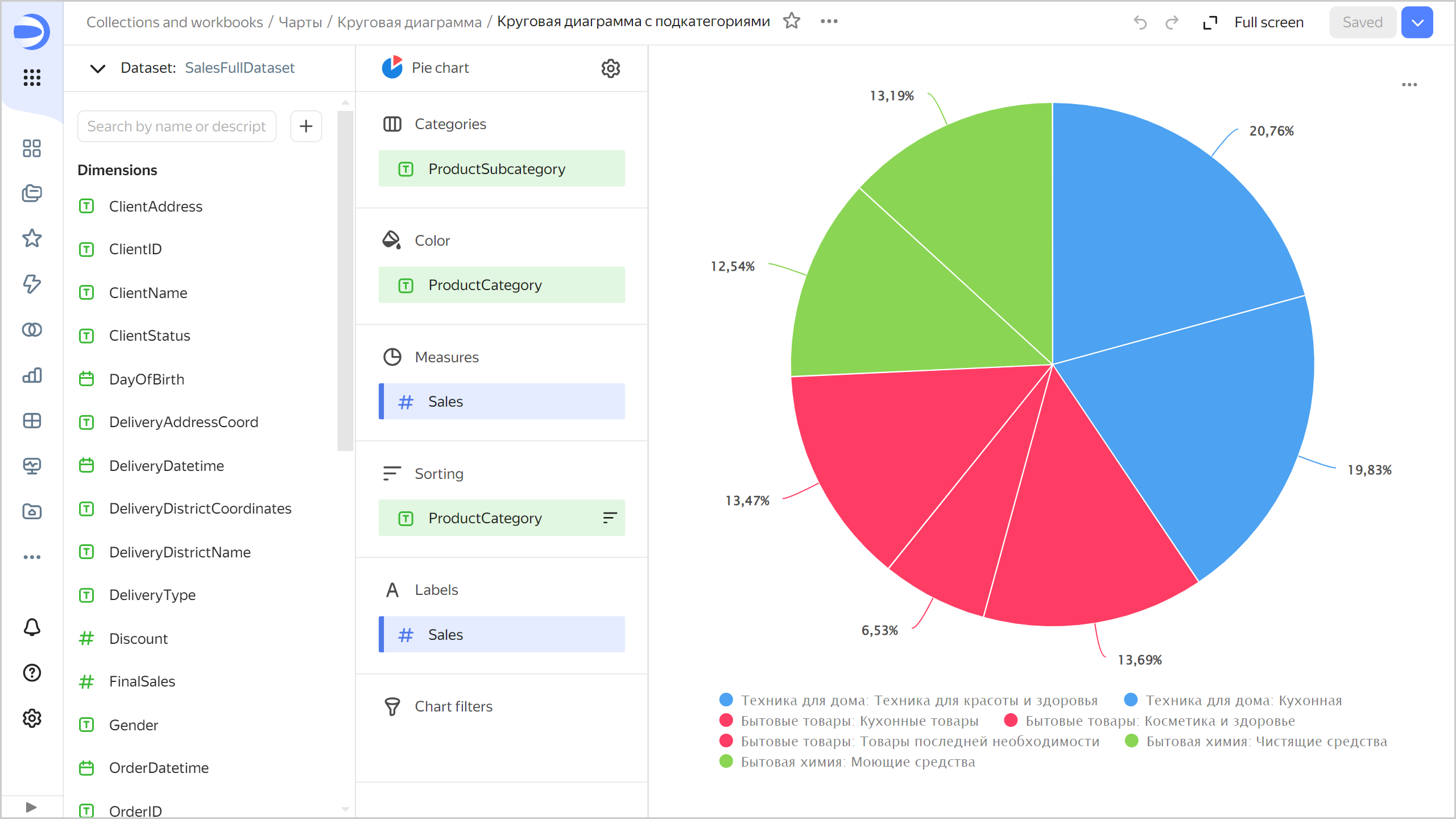
- Drag a dimension from the dataset to the Categories section.
- Drag a dimension from the dataset to the Color section.
- Drag a measure from the dataset to the Measures section. The values will be displayed as pie chart areas.
Note
You cannot display negative and null values on this type of chart.
Recommendations
-
Segments. With too many segments, your chart will look cluttered, making it difficult to interpret the data. If there are more than 4-6 segments in one chart, consider combining the smallest of them into one segment, e.g.,
Other. You can do this by processing the data, e.g., by creating a calculated field in your dataset or chart.Example of combining segments in a chart
Source table
ProductSubcategory Sales Beauty and health products 11M Kitchenware 34M Kitchen products 23M Detergents 22.5M Health and beauty equipment 35M Non-essential goods 23M Cleaners 21.5M To combine multiple segments by the
ProductSubcategoryfield into a joined group:-
Add a new field to the chart with the following formula:
CASE [ProductSubcategory] WHEN "Beauty and health equipment" THEN "Beauty and health equipment" WHEN "Kitchen" THEN "Kitchen" WHEN "Kitchenware" THEN "Kitchenware" ELSE "Other" END -
Drag the new field to the Color section.
-
Drag the
Salesfield to the Measures and Signatures sections.
The sales amount will be calculated separately for the
Beauty and health equipment,Kitchen, andKitchenwaresubcategories; for other subcategories, in theOthergroup.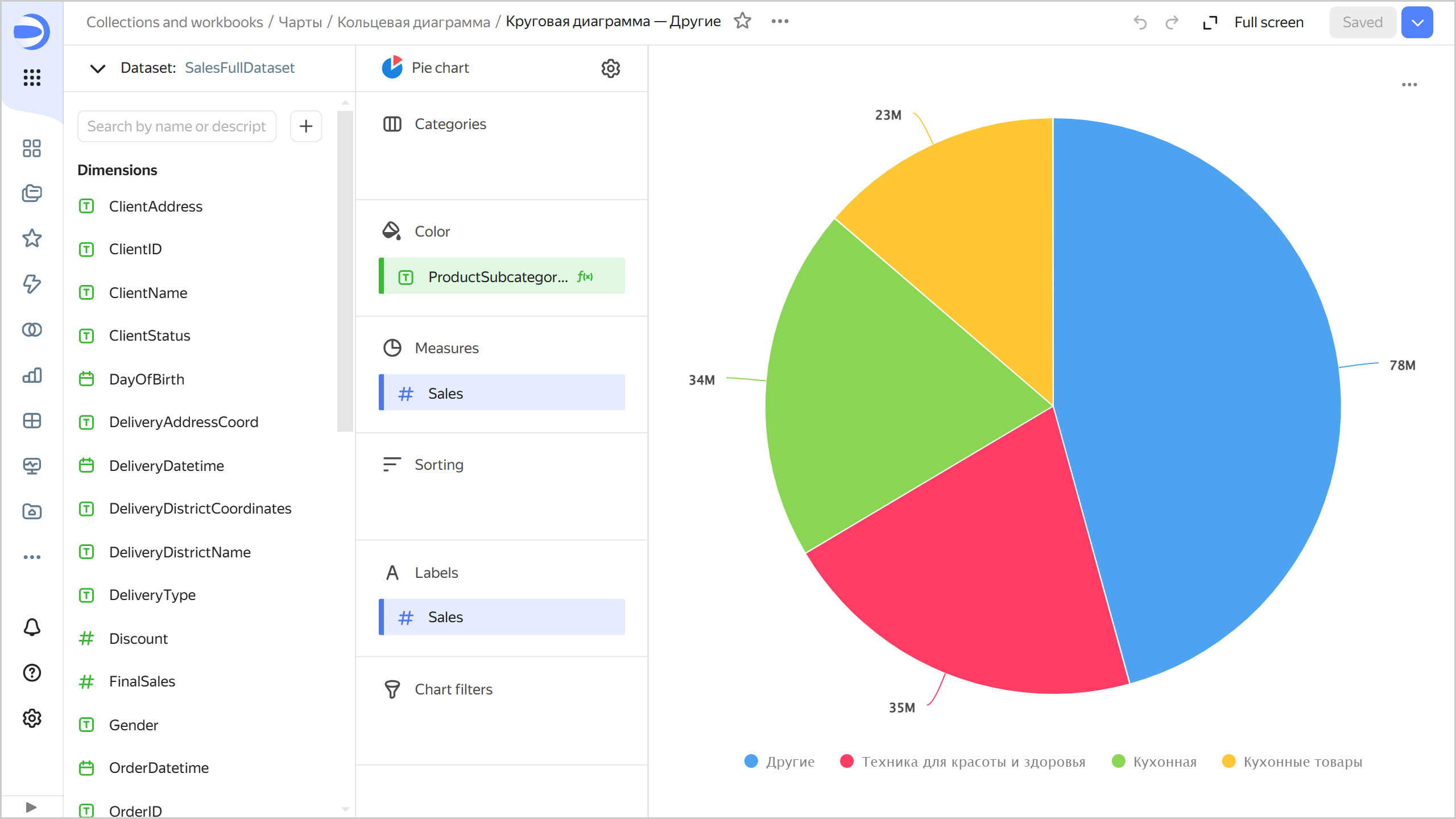
-
-
Segments. Combine small segments into larger groups:
- Use the Categories section to highlight segments.
- Use the Color section to highlight groups.
-
Do not use pie charts to show changes to proportions over time or for precisely comparing data by category.