Indicator in Yandex DataLens
An indicator reflects the value of a single key measure. To build a more complex and meaningful indicator, use several measures.
-
You may want to use indicators when a dashboard contains values you need to monitor on a regular basis to understand the general picture. This could be, for example, the number of incidents for the previous day, plan performance percentage, or year-on-year sales growth.
-
Indicators are most commonly placed at the top or on the right side of a dashboard. Add no more than six indicators per screen so they remain in focus without confusing the user. Adjust widget sizes to reflect the importance of different metrics.
-
You can set up the size and color of an indicator.
VisualizationSource table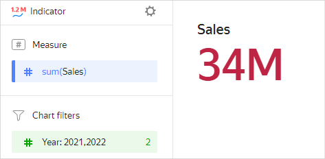
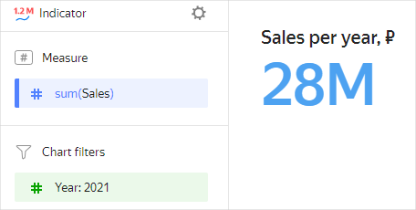
Year Sales 2022 6M 2021 28M 2020 18M 2019 9M 2018 1M
Wizard sections
| Wizard section |
Description |
|---|---|
| Measure | Measure. One measure that determines the indicator value. |
| Colors | The field from the Measure section is used. The setting in this section allows changing the color of the indicator. |
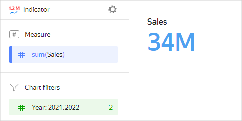
| Filters | Dimension or measure. Used as a filter. |
Creating an indicator
To create an indicator:
Warning
If you use the new DataLens object model with workbooks and collections:
-
Go to the DataLens home page. In the left-hand panel, select Collections and workbooks.
-
Open the workbook, click Create in the top-right corner, and select the object you need.
Follow the guide from step 4.
-
Go to the DataLens home page.
-
In the left-hand panel, select Charts.
-
Click Create chart → Chart.
-
At the top left, click Select dataset and specify the dataset to visualize. If you do not have a dataset, create one.
- Select the Indicator chart type.
- Drag a dimension or measure from the dataset to the Measure section. The value is displayed as a number.
Additional settings
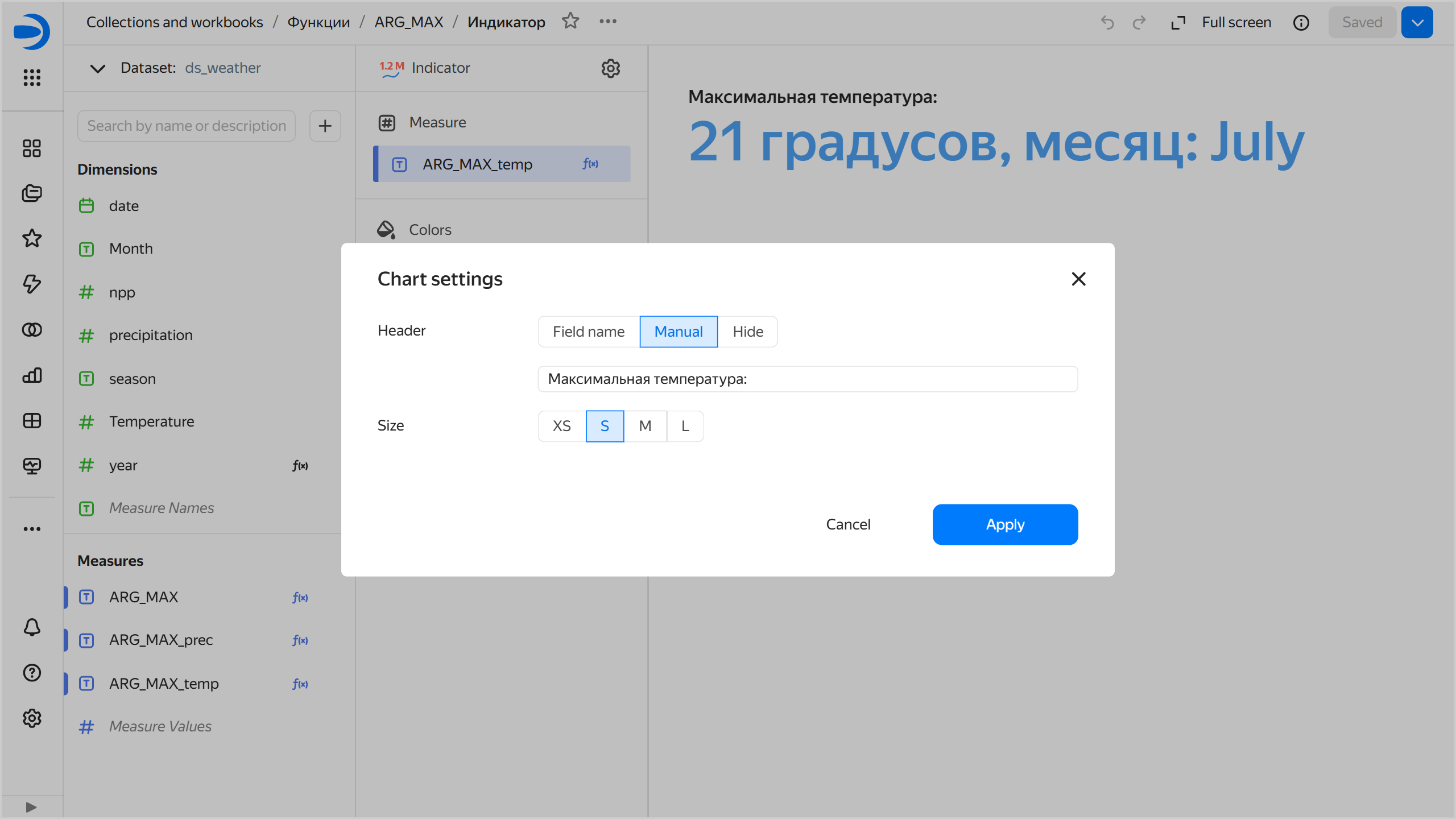
Customizing header display
To customize header display:
-
At the top of the screen, click next to the chart type.
-
Select header display options:
Field name: Show field name in header.Manually: Rename header.Hide: Hide header.
-
Click Apply.
Chart settings window
Changing indicator size
This setting is not available for a field of the Markup type. In this case, use markup functions for formatting as when creating a complex indicator.
To change the indicator size:
- At the top of the screen, click next to the chart type.
- Select one of the size presets and click Apply.
Changing indicator color
This setting is not available for a field of the Markup type. In this case, use markup functions for formatting as when creating a complex indicator.
To change the indicator color:
- Under Colors, click .
- Select a color pallete and color, then click Apply.
Creating a complex indicator
To create a complex indicator representing a number of measures, use the markup functions. Proceed as follows:
- Create a calculated field using the markup functions.
- Drag a field from Measures to the indicator's Measure section.
Text formatting
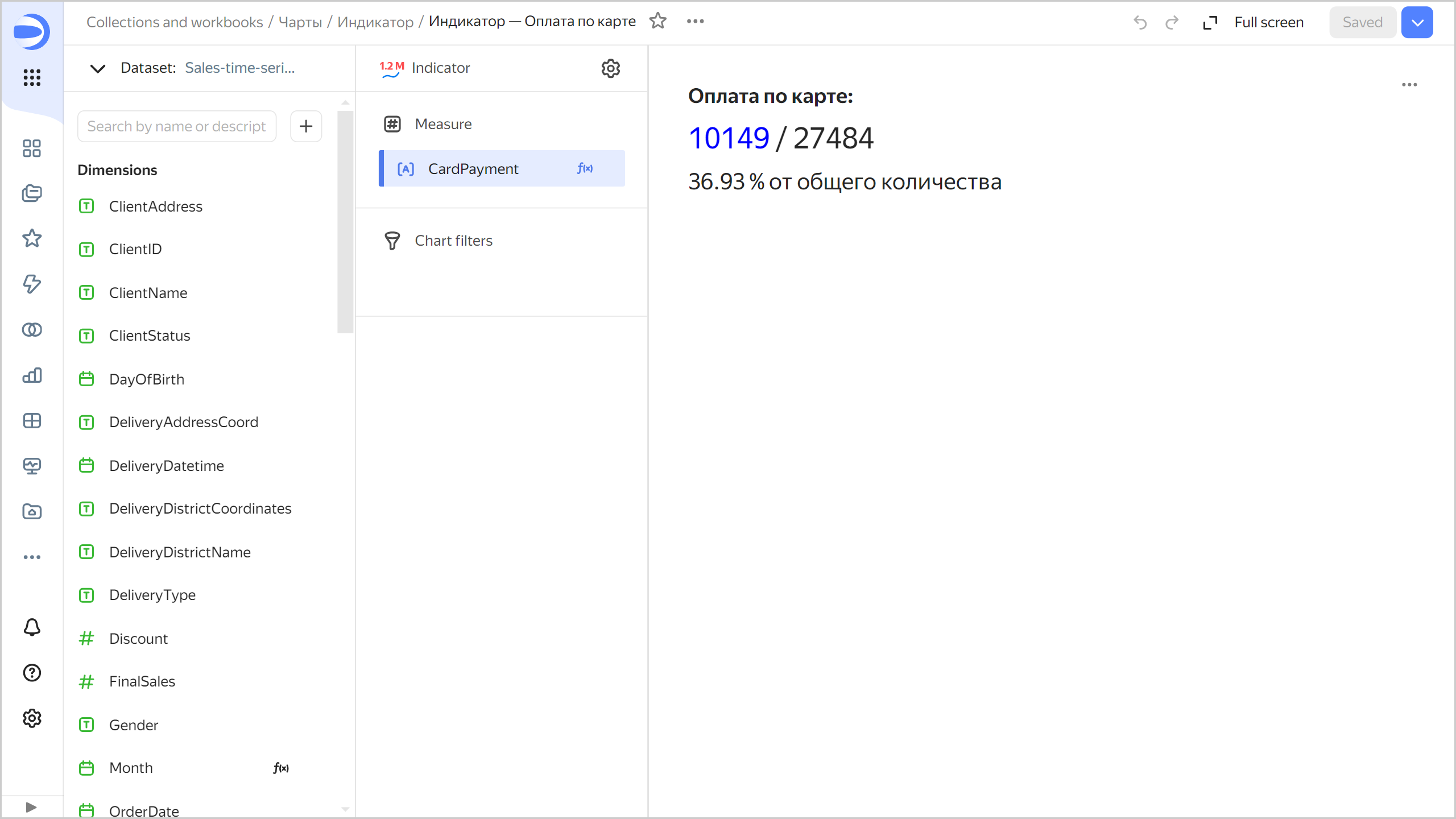
BOLD(SIZE('Payment by card: ', '18px')) +
BR() + BR() +
SIZE(COLOR(STR(COUNTD_IF([OrderID], [PaymentType]='Bank card')),'blue') + ' / ' + STR(COUNTD([OrderID])), '26px') +
BR() + BR() +
SIZE(STR(ROUND(COUNTD_IF([OrderID], [PaymentType]='Bank card')/COUNTD([OrderID])*100, 2)) +
' %  in total', '20px')
Indicator with multiple measures
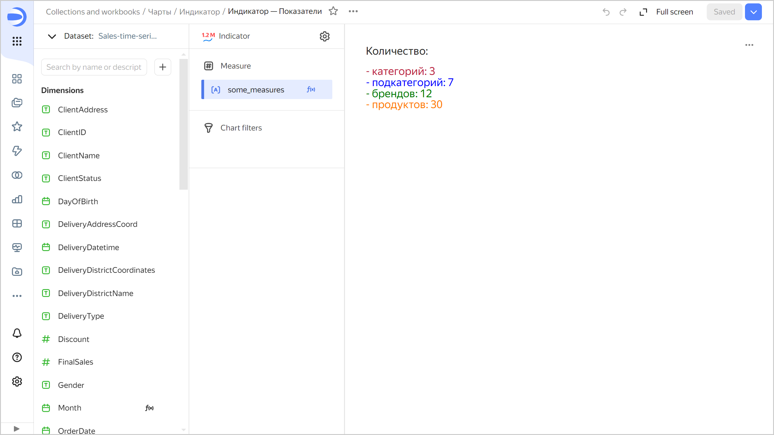
SIZE('Amount: ', '18px') +
BR() + BR() +
COLOR(SIZE('- categories: ' + STR(COUNTD([ProductCategory])), '18px'), '#BE2443') +
BR() +
COLOR(SIZE('- subcategories: ' + STR(COUNTD([ProductSubcategory])), '18px'), 'blue') +
BR() +
COLOR(SIZE('- brands: ' + STR(COUNTD([ProductBrend])), '18px'), 'green') +
BR() +
COLOR(SIZE('- products: ' + STR(COUNTD([ProductName])), '18px'), '#FF7E00')
Indicator with a measure by category
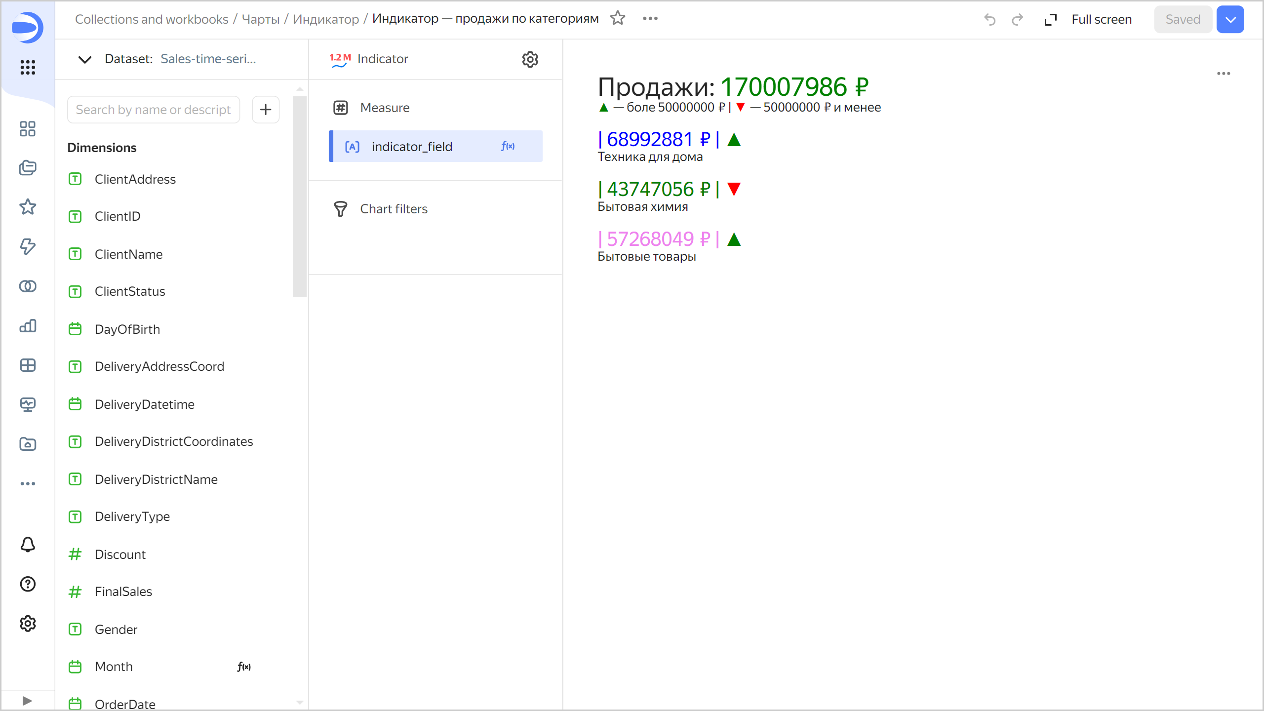
SIZE('Sales: ' + COLOR(STR([Sales])+ ' ₽', 'green'), '26px') +
BR() +
COLOR(" ▲ ", "green")+": More than ₽50,000,000  | " + COLOR(" ▼ ", "red") + ": ₽50,000,000 or less" +
BR() + BR() +
SIZE(
    COLOR('| ' + STR(SUM_IF([Sales],[ProductCategory]='Home appliances'))+ ' ₽ | ', 'blue') +
    COLOR(if(SUM_IF([Sales],[ProductCategory]='Home appliances')>50,000,000, " ▲ "," ▼ "), if(SUM_IF([Sales],[ProductCategory]='Home appliances')>50,000,000,"green", "red")),
    '20px') +
BR() + 'Home appliances' +
BR() + BR() +
SIZE(
    COLOR('| ' + STR(SUM_IF([Sales],[ProductCategory]='Household chemicals'))+ ' ₽ | ', 'green') +
    COLOR(if(SUM_IF([Sales],[ProductCategory]='Household chemicals')>50,000,000, " ▲ "," ▼ "), if(SUM_IF([Sales],[ProductCategory]='Household chemicals')>50,000,000,"green", "red")),
    '20px') +
BR() + 'Household chemicals' +
BR() + BR() +
SIZE(
    COLOR('| ' + STR(SUM_IF([Sales],[ProductCategory]='Household products'))+ ' ₽ | ', 'violet') +
    COLOR(if(SUM_IF([Sales],[ProductCategory]='Household products')>50,000,000, " ▲ "," ▼ "), if(SUM_IF([Sales],[ProductCategory]='Household products')>50,000,000,"green", "red")),
    '20px') +
BR() + 'Household products'
Indicator with an image
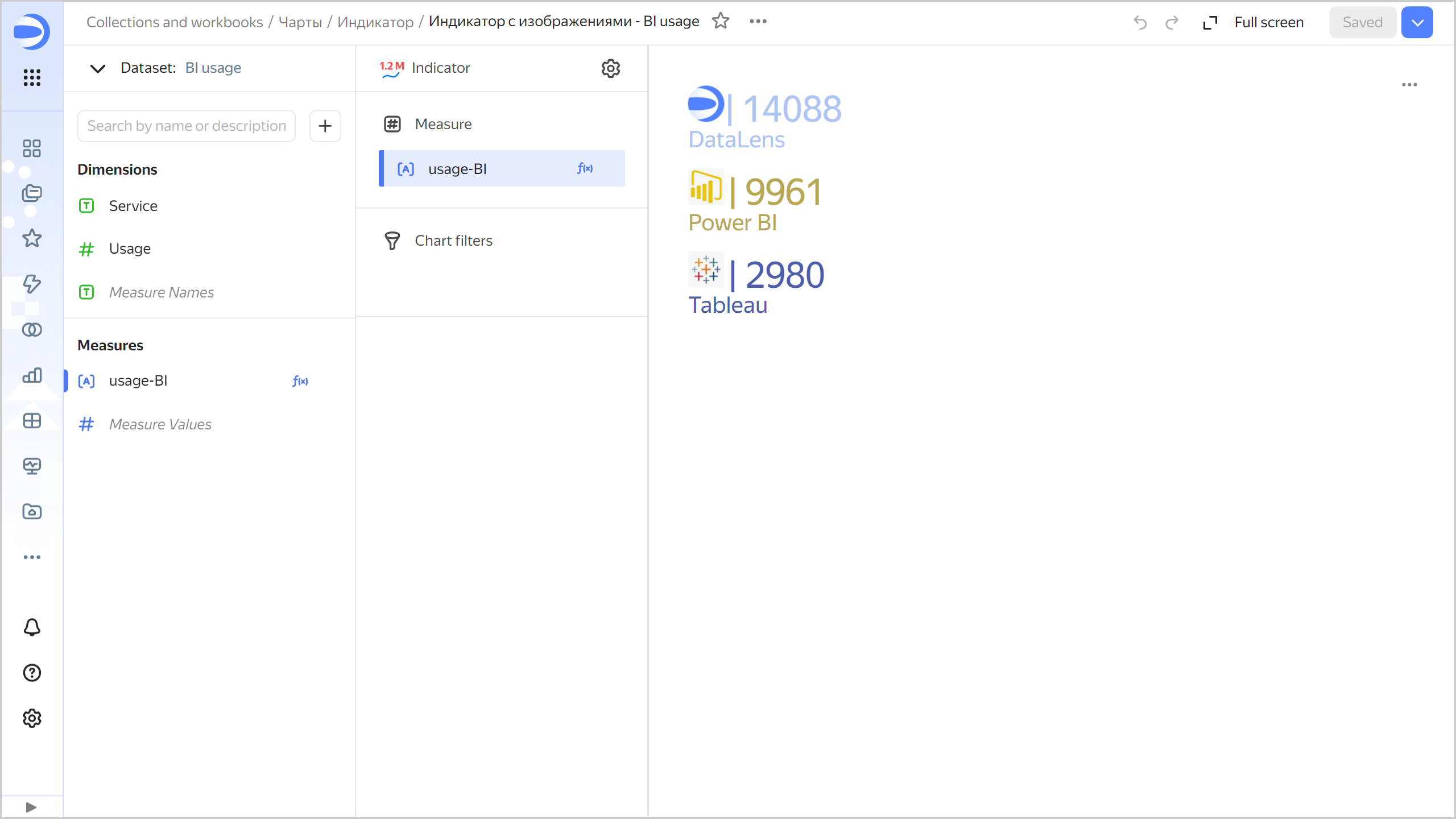
IMAGE('https://storage.yandexcloud.net/dl--********//datalens.jpg', 32, 32, 'alt-text-1') +
COLOR(SIZE('| ' + STR(SUM_IF([Usage],[Service]='DataLens')), '32px'), '#AEC5F3') +
BR()+
COLOR(SIZE('DataLens', '20px'), '#AEC5F3')+
BR()+
BR()+
IMAGE('https://storage.yandexcloud.net/dl--********//powerbi.jpg', 32, 32, 'alt-text-1') +
" " + COLOR(SIZE('| ' + STR(SUM_IF([Usage],[Service]='Power BI')), '32px'), '#B8A754')+
BR()+
COLOR(SIZE('Power BI', '20px'), '#B8A754')+
BR()+
BR()+
IMAGE('https://storage.yandexcloud.net/dl-********/tableu.jpg', 32, 32, 'alt-text-1') +
" " + COLOR(SIZE('| ' + STR(SUM_IF([Usage],[Service]='Tableau')), '32px'), '#4D5DAB')+
BR()+
COLOR(SIZE('Tableau', '20px'), '#4D5DAB')
Recommendations
-
Use emojis when calculating indicator values to make them more informative.
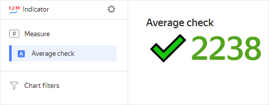
This indicator chart uses a calculated field with the following formula:
IF([Average spend]>2200, CONCAT("✔️",STR(ROUND([Average spend]))),CONCAT("🔻",STR(round([Average spend])))). -
Describe the context to make it clear what indicators mean.