Adding a selector to a dashboard in Yandex DataLens
Before adding a selector, make sure you have the Write or Admin permission for the dashboard. For more information, see Object access permissions.
To add a selector to a dashboard:
Warning
If you use the new DataLens object model with workbooks and collections:
- In the left-hand panel, select Collections and workbooks.
- Open the workbook you need and select an object.
Proceed with this guide from Step 2.
-
In the left-hand panel, click Dashboards and select the dashboard you need.
-
At the top of the page, click Edit.
-
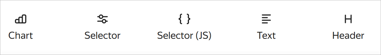
In the panel at the bottom of the page, click Selector and drag it to a desired location.
-
Under Selectors, set the source and specify the selector parameters:
Based on a datasetManual input-
Dataset: Dataset with data for the selector. You can choose a dataset from the list of objects or provide a link. This is a required field.
-
Field: Dataset field with selector values. It can be either a dimension or a measure. For more information, see Data fields. This is a required field.
-
Show in tabs: Select how to display the selector on the dashboard:
Current tab <tab_name>: Display the selector on the selected tab. This is the default option for a single selector.Selected tabs: Select one or more tabs to display the selector on. By default, the current tab is selected.All tabs: Display on all tabs. This option is available for a single selector.Based on <group_value>settings: Display the selector based on the advanced settings of the widget with a group of selectors. This option is only available for a selector in a group of selectors.
-
button: Displayed to the right of the Show in tabs setting if the Field is specified. It allows you to find and group selectors with the same field or parameter in other tabs. To group the current selector with the one you find, click Group next to the relevant selector in the list. After grouping, the current selector’s Show in tabs setting may get updated automatically, for example:
Current tab: Switches toSelected tabs, i.e., the tabs containing the grouped selectors.Selected tabs: No changes, but the list of tabs will include the tab with the new selector, if not specified previously.All tabs: No changes.
The links from the new selector’s tab will apply to the current selector within the relevant tab.
-
Selector type: Drop-down list, input field, calendar, or checkbox.
Note
- Calendar is only available for fields of the
DateorDate and timetype. - Checkbox is only available for fields of the
Booleantype. - Measure selectors can only have the Input field type.
- Calendar is only available for fields of the
-
Operation: Comparison operation for the selector to filter the chart values (e.g., Equal to, Greater than, or Less than). If the field is left blank, the selector will filter by the Equal to operation by default. The list of available operations depends on the field type.
Note
Do not specify an operation in the following cases:
- Selector will filter a QL chart.
- Selector is linked to parameters of a chart or dataset.
-
Multiple choice: Allows choosing several values in the selector. It is only available for the List selector type.
-
Range: Allows setting a time interval in the selector. It is only available for the Calendar selector type.
-
Required field: Sets the selector value as a required parameter. When enabled,
*is appended to the selector name. It is not available for the Checkbox selector type. -
Default value: Displayed when you first open the dashboard. This is a required field if the Required field option is enabled.
-
Header: To choose the selector for linking with other widgets. By default, when you add a selector, the header text is substituted from the field title in the dataset. This is a required field.
Select the header location below:
Left(default),Top, orHiddento hide it from the dashboard. It is not available for the Checkbox selector type. -
Inner title: Allows specifying text inside a selector. For example, you can use it to display an operation inside a selector. It is not available for the Checkbox selector type.
-
Coloring: Allows you to highlight important selectors. It is not available for the Checkbox selector type.
-
Tooltip: This option allows adding a text comment to a selector. By default, with this option enabled, the tooltip text is taken from the field description in the dataset. You can edit the tooltip text using the visual editor or Markdown. Changing the field description in the dataset will not automatically update the text.
When the option is enabled, the icon appears on the dashboard next to the selector. Hover over the icon to bring up the tooltip.
-
Field or parameter: Field name you can use to link the selector with other widgets in the alias configuration window. This is a required field.
-
Show in tabs: Select how to display the selector on the dashboard:
Current tab <tab_name>: Display the selector on the selected tab. This is the default option for a single selector.Selected tabs: Select one or more tabs to display the selector on. By default, the current tab is selected.All tabs: Display on all tabs. This option is available for a single selector.Based on <group_value>settings: Display the selector based on the advanced settings of the widget with a group of selectors. This option is only available for a selector in a group of selectors.
-
button: Displayed to the right of the Show in tabs setting if the Field or parameter is specified. It allows you to find and group selectors with the same field or parameter in other tabs. To group the current selector with the one you find, click Group next to the relevant selector in the list. After grouping, the current selector’s Show in tabs setting may get updated automatically, for example:
Current tab: Switches toSelected tabs, i.e., the tabs containing the grouped selectors.Selected tabs: No changes, but the list of tabs will include the tab with the new selector, if not specified previously.All tabs: No changes.
The links from the new selector’s tab will apply to the current selector within the relevant tab.
-
Selector type: Drop-down list, input field, calendar, or checkbox.
Note
- Calendar is only available for fields of the
DateorDate and timetype. - Checkbox is only available for fields of the
Booleantype. - Measure selectors can only have the Input field type.
- Calendar is only available for fields of the
-
Operation: Comparison operation for the selector to filter the chart values (e.g., Equal to, Greater than, or Less than). If the field is left blank, the selector will filter by the Equal to operation by default. The list of available operations depends on the field type.
Note
Do not specify an operation in the following cases:
- Selector will filter a QL chart.
- Selector is linked to parameters of a chart or dataset.
-
Required field: Sets the selector value as a required parameter. When enabled,
*is appended to the selector name. It is not available for the Checkbox selector type. -
Multiple choice: Allows choosing several values in the selector. It is only available for the List selector type.
-
Possible values: List of values to select. It is only available for the List selector type. To add multiple values at once, copy the list of values to the clipboard, paste it into the input field, and click Add. You can also remove a value by clicking , or swap the values around by dragging them.
-
Range: Allows setting a time interval in the selector. It is only available for the Calendar selector type.
-
Time: Allows specifying time. It is only available for the Calendar selector type.
-
Default value: Displayed when you first open the dashboard. This field must be set for the List type; otherwise, no value will be available in the selector. This is a required field if the Required field option is enabled.
-
Header: To choose the selector for linking with other widgets. This is a required field.
Select the header location below:
Left(default),Top, orHiddento hide it from the dashboard. It is not available for the Checkbox selector type. -
Inner title: Allows specifying text inside a selector. For example, you can use it to display an operation inside a selector. It is not available for the Checkbox selector type.
-
Coloring: Allows you to highlight important selectors. It is not available for the Checkbox selector type.
-
Tooltip: This option allows adding a text comment to a selector. By default, with this option enabled, the tooltip text is taken from the field description in the dataset. You can edit the tooltip text. Changing the field description in the dataset will not automatically update the text.
When the option is enabled, the icon appears on the dashboard next to the selector. Hover over the icon to bring up the tooltip.
In QL charts, you can manage selector parameters from the Parameters tab in the chart editing area and use the Query tab to specify a variable in the query in
{{variable}}format. -
-
Optionally, add another selector to the widget. To do this, click Add on the left side of the Selectors tab and repeat the previous step. You can also duplicate the new selector or copy it to the clipboard. To do this, on the Selectors tab, click next to the selector and select:
- Duplicate: This will add a new selector with the same parameters to the widget.
- Copy to clipboard: You can paste the selector you copied into a different widget using the Paste button on the Selectors tab or to a dashboard using the Paste button on the bottom panel of the dashboard page.
-
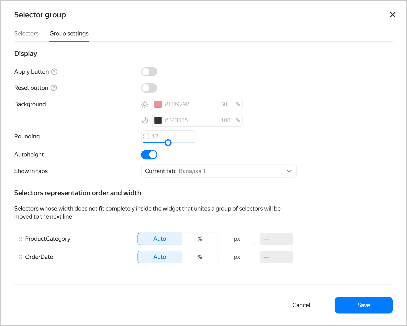
Optionally, go to the Group settings tab and specify the widget settings:
-
Apply button: Adds a widget button which applies the values of all selectors in the widget. The selector values are not applied until you click the button.
-
Reset button: Adds a widget button which resets the values of all the widget selectors to their defaults.
-
Background: Sets the widget background color and opacity for the light and dark theme individually.
-
Rounding: Widget corner rounding.
-
Auto height: Automatic widget height on the dashboard. It is available for widgets with multiple selectors.
-
Optionally, for a widget with multiple selectors, use the Show in tabs field to configure how to display the selector on the dashboard:
Current tab <tab_name>: Display on the selected tab. This is the default option.Selected tabs: Select one or more tabs to display the selector on. By default, the current tab is selected.All tabs: Display on all tabs.
This setting becomes available when you add a second selector to your widget:
- The setting value used in the first selector automatically applies to the entire group. You can change it at any time.
- For each new selector in the group, the default value is
From group settings <group_value>.
When using this setting, consider the following:
-
You cannot save a selector if it has the setting value where the current tab displays no selectors. For example, if you specify
Selected tabsfor a single selector, you can deselect the current tab, but you cannot save the selector. -
You cannot save a selector with the
Selected tabsvalue if no tabs are selected. -
Group settings restrict how you set up each selector in a group. For example, if you select
Current tabfor a group, you must also specifyCurrent tabfor each selector in this group.Configuring a group Configuring a selector All tabsCurrent tab,Selected tabs,All tabsSelected tabsCurrent tab,Selected tabsCurrent tabCurrent tab -
When you delete a selector on the current tab, it is automatically deleted from all tabs.
-
When you copy and paste a selector, its settings are preserved.
-
You cannot paste a copied selector if its settings prevent it from being displayed on the current tab.
-
Optionally, for a widget with multiple selectors, customize the selector arrangement. To do this, arrange the selectors as needed by dragging them and adjust the width of each one:
Auto: Automatic selector width.%: Selector width as a percentage of the widget's total width.px: Selector width in pixels.
Click Save.
-
-
Click Save. The widget will appear on the dashboard.
Warning
When adding a selector by a certain field to your dashboard, filters added at the chart level will no longer apply to the dashboard chart.
Limitations
- For measure selectors, only one type is available: Input field.
- We recommend that you always make your measure selectors independent from other selectors. To do this, set their link type to Not linked with other selectors in the Links section when editing your dashboard.
Copying and pasting selectors
You can copy and paste an existing selector onto your dashboard.
When you copy a selector from one tab and paste it into another tab of the current dashboard, you can link it to the original selector or create a new independent selector.
Generally, copying and pasting a widget or a JS selector works the same way as copying and pasting a single selector.
To copy a selector from a dashboard:
- In the left-hand panel, click Dashboards and select the dashboard you need.
- At the top of the page, click Edit.
- On the dashboard, next to the widget, click → Copy.
To paste a copied selector onto your dashboard:
-
In the left-hand panel, click Dashboards and select the dashboard you need.
-
At the top of the page, click Edit.
-
Select the dashboard tab you want to paste the widget onto.
-
In the panel at the bottom of the page, hold down Paste and drag the widget to a desired location. To paste the widget at the bottom of your dashboard, simply click Paste.
If you are trying to paste a selector into another tab of the current dashboard, select:
-
Update settings: After pasting, the original selector's Show in tabs setting will automatically update:
Current tab: Switches toSelected tabs, i.e., the tabs containing the original and added selectors.Selected tabs: No changes, but the list of tabs will include the tab with the new selector, if not specified previously.
-
Copy (or close the window): Creates an independent selector on the current tab.
If you copied the selector from the current tab, an independent selector will be created.
If the current tab is already selected in the Show in tabs setting, an independent selector will be created. -
-
Resize the widget and drag it where you need on the page.
-
In the top-right corner of the dashboard, click Save.