Creating a QL chart in Yandex DataLens
You can create a QL chart using one of the following methods:
Warning
Access permissions for QL charts based on Monitoring and Prometheus data are managed both on the DataLens side and in Monitoring and Prometheus.
To view a chart in DataLens, the user needs chart access and connection permissions, as well as permissions to read data from a specific Prometheus API or project in Monitoring.
QL charts have the same general settings and section settings as the dataset-based charts. Only certain measure settings are supported for chart fields.
At each step, you can undo/redo any change within the current version.
Creating a QL chart from the home page
Warning
If you use the new DataLens object model with workbooks and collections:
- Go to the DataLens home page. In the left-hand panel, select Collections and workbooks.
- Open the workbook, click Create in the top-right corner, and select the object you need.
Proceed with this guide from Step 3.
-
Go to the DataLens home page.
-
In the left-hand panel, select Charts.
-
Click Create chart → QL chart.
-
In the window that opens, select the Chart type:
SQLPrometheusMonitoring- Click Select connection.
- In the list, select a database connection you have access to. Make sure the Raw SQL level → SQL to read setting is active in the connection.
- Click Create.
- In the Query tab, enter your query using the SQL dialect of the database you are querying.
- In the bottom-left corner, click Run.
After the query runs, your data will be visualized.
Example of a ClickHouse® database query
SELECT Category, Month, ROUND(SUM(Sales)) FROM samples.SampleLite WHERE Category in {{category}} -- Variable used in the selector GROUP BY Category, Month -- Grouping by category and month ORDER BY Category, Month -- Sorting by category and month- Click Select connection.
- In the list, select a Prometheus connection you have access to.
- Click Create.
- Click Add query and specify a query in the Prometheus language.
- In the bottom-left corner, click Run.
After the query runs, your data will be visualized.
Example of a query for Prometheus
sum by (name) (rate(container_cpu_user_seconds_total{container_label_org_label_schema_group="monitoring"}[1m]) * 100 / scalar(count(node_cpu_seconds_total{mode="user"})))QL charts built on the Prometheus data can be parameterized similarly to SQL charts. This type of charts also has required global parameters created automatically when building a QL chart. You can edit default values of these parameters.
Parameter Data type Description from datetime Lower time limit to datetime Upper time limit step number Step on the time scale in seconds Note
On the dashboard, you can use a single selector for the date with the special
intervalname instead of the two selectors,fromandto.- Click Select connection.
- In the list, select a Monitoring connection you have access to.
- Click Create.
- Click Add query and specify a query in the Monitoring language.
- In the bottom-left corner, click Run.
After the query runs, your data will be visualized.
Example of a query for Monitoring
{project="monitoring", sensor="nodejs.heap_space.size.bytes"}QL charts built on the Monitoring data can be parameterized similarly to SQL charts. This type of charts also has required global parameters created automatically when building a QL chart. You can edit default values of these parameters.
Parameter Data type Description from datetime Lower time limit to datetime Upper time limit Note
On the dashboard, you can use a single selector for the date with the special
intervalname instead of the two selectors,fromandto.
Creating a QL chart from a connection
- Go to an existing database connection.
- Make sure the Raw SQL level → SQL to read setting is active in the connection.
- In the top-right corner, click Create QL chart.
- In the Query tab, enter your query using the SQL dialect of the database you are querying.
- In the bottom-left corner, click Run.
After the query runs, your data will be visualized.
Adding selector parameters
In QL charts, you can control selector parameters from the Parameters tab in the chart editing area and use the Query tab to specify a variable in the query itself in {{variable}} format.
To add a parameter:
-
Go to the Parameters tab when creating a chart.
-
Click Add parameter.
-
Set the value type for the parameter, e.g.,
date-interval. -
Name the parameter, e.g.,
interval. -
Set the default values, e.g.,
2017-01-01 — 2019-12-31.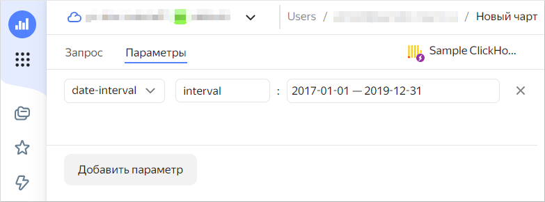
There are several ways to configure the parameters of the
date,datetime,date-interval, anddatetime-intervaltypes:- Exact date to specify an exact value.
- Offset from the current date to specify a relative value that will be updated automatically.
Use presets to quickly fill in the values.
To manage parameter values on the dashboard, create a selector with manual input and specify a parameter name in the Field or parameter name field.
Intervals
The date-interval and the datetime-interval type parameters can be used in query code only with the _from and _to postfixes. For example, for the interval parameter set to 2017-01-01 — 2019-12-31, specify:
interval_fromto get the start of the interval (2017-01-01).interval_toto get the end of the interval (2019-12-31).
Query example
SELECT toDate(Date) as datedate, count ('Oreder ID')
FROM samples.SampleLite
WHERE {{interval_from}} < datedate AND datedate < {{interval_to}}
GROUP BY datedate
ORDER BY datedate
Substituting parameter values in a QL chart query
A QL chart gets parameter values from a selector as:
- Single value if one element is selected.
- Tuple if multiple values are selected.
If a query for ClickHouse® or PostgreSQL connections has the in operator before a parameter, the substituted value is always converted into a tuple. In the case of other connections, there is no automatic conversion. A query with the in operator will run correctly if you select one or more values.
Example of a query with in
SELECT sum (Sales) as Sales, Category
FROM samples.SampleLite
WHERE Category in {{category}}
GROUP BY Category
ORDER BY Category
If the query has = before a parameter, the query will only run correctly if a single value is selected.
Example of a query with =
SELECT sum (Sales) as Sales, Category
FROM samples.SampleLite
WHERE Category = {{category}}
GROUP BY Category
ORDER BY Category
Null choice in a selector and parameters
If a selector has no value selected and no default value is set for a parameter, a null value is provided to a query. In this case, all values will be selected in dataset-based charts, and the filter for the relevant column will disappear when generating a query.
To enable a similar behavior in QL charts, you can use a statement like this in your query:
AND
CASE
    WHEN LENGTH({{param}}::VARCHAR)=0 THEN TRUE
    ELSE column IN {{param}}
END
Undoing and redoing changes in charts
When editing a QL chart, you can now undo/redo any change introduced within the current version.
Useful links
ClickHouse® is a registered trademark of ClickHouse, Inc.