Combined chart in Yandex DataLens

Combined chart is a separate type of visualization consisting of layers. Each layer is a separate type of diagram. You can combine line charts, column charts, and area charts.
Features
- The X, Sort, and Filters sections are the same for all layers.
- You can add, delete, reorder and rename layers.
- Each layer is executed with a separate query in the database.
- The maximum number of layers is 5.
Note
- There is no color fill by measure in column charts.
- In a combined chart, sorting only applies to the layers it is supported for.
What is important to know
-
A combined chart is often used for plan/actual comparison. You can show the plan as a dashed line on the line chart layer, while presenting the actual values broken down into categories on the column chart layer.
Example
VisualizationSource table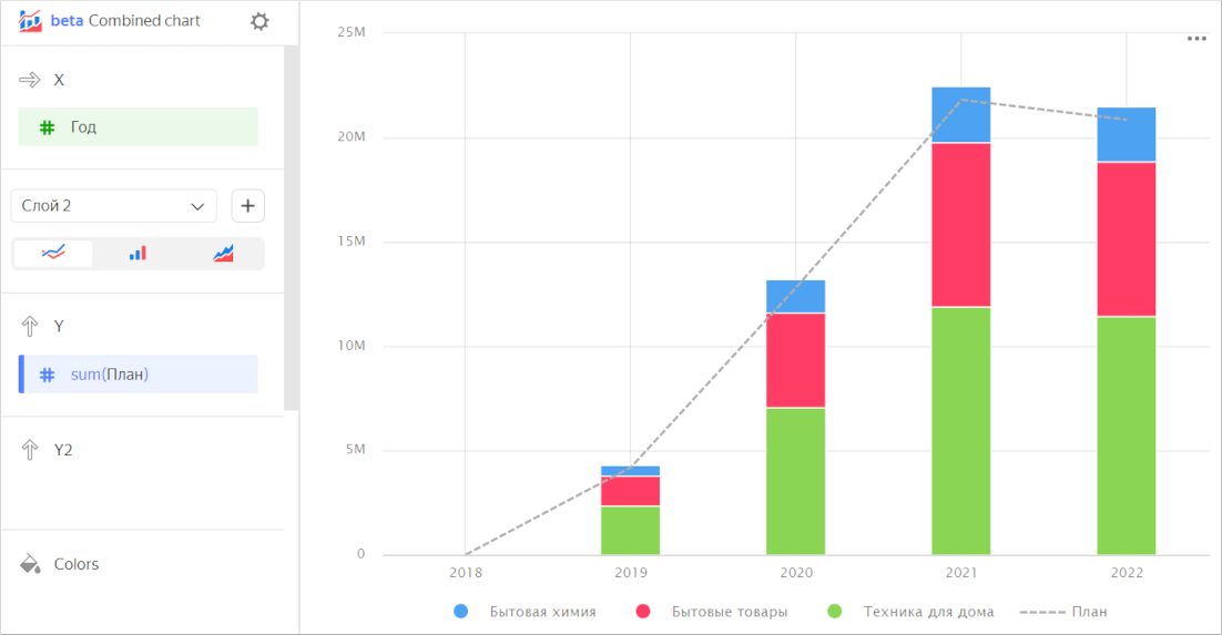
Year Category Plan Sales 2018 Household cleaners 435.53 449 2018 Household goods null null 2018 Home appliances null null 2019 Household cleaners 503,255 512,282 2019 Household goods 1,457,502 1,483,733 2019 Home appliances 2,237,228.4 2,331,805 2020 Household cleaners 1,623,124 1,644,668 2020 Household goods 4,495,448 4,535,567 2020 Home appliances 6,711,462.8 7,046,605 2021 Household cleaners 2,686,134 2,737,436 2021 Household goods 7,794,310 7,836,228 2021 Home appliances 11,329,663.6 11,910,983 2022 Household cleaners 2,512,031 2,652,918 2022 Household goods 7,013,145 7,382,385 2022 Home appliances 11,327,092 11,461,881 -
It is sometimes convenient to use a combined chart for same-type layers. For example, when one layer represents sales by category and another one shows the plan constant.
Example
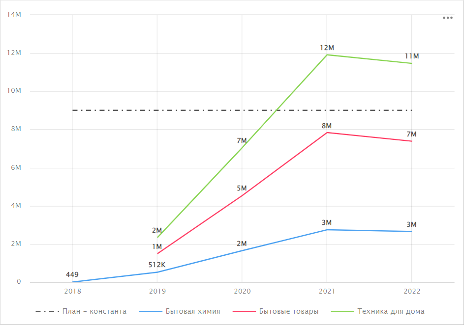
-
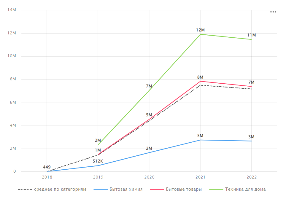
You can display additional lines calculated using window functions or LOD functions. For example, to calculate an average by category, use this formula:
avg(SUM([Sales] INCLUDE [Category])).Example
Wizard sections
| Wizard section |
Description |
|---|---|
| X | Dimension. You can specify only one field here. This dimension is usually a date. If this is the case, make sure to specify the Date data type for this field in the dataset. This is required for correct sorting and signature display. For better visualization, you can group dates into weeks, months, and years. For more information, see Field settings. The X section is common for all layers. |
| Layer section | Allows you to add, delete, reorder, and rename layers. You can select a chart type for a layer: line chart, column chart, or area chart. The list of other sections depends on the layer chart type you select. You can manage data display in the chart layers using the legend. To do this, click individual legend elements or select multiple elements by pressing and holding Ctrl/Cmd. You can enable or disable the legend in the chart settings. For more information, see General settings. |
Creating a combined chart
To create a combined chart:
Warning
If you use the new DataLens object model with workbooks and collections:
-
Go to the DataLens home page. In the left-hand panel, select Collections and workbooks.
-
Open the workbook, click Create in the top-right corner, and select the object you need.
Follow the guide from step 4.
-
Go to the DataLens home page.
-
In the left-hand panel, select Charts.
-
Click Create chart → Chart.
-
At the top left, click Select dataset and specify the dataset to visualize. If you do not have a dataset, create one.
-
Select Combined chart as your chart type.
-
Drag a dimension from the dataset to the X section. The values will be displayed in the lower part of the chart on the X axis.
-
Select a layer chart type: line chart , column chart , or area chart . Rename the layer, if required.
-
Create a chart of the appropriate type:
-
Add a new layer. To do this, click to the right of the layer name.