Bar chart in Yandex DataLens
A horizontal bar chart plots the values of one or more measures for each category.
The length of a bar reflects the measure value: the longer the bar, the larger the value.
Example
Product sales by subcategory
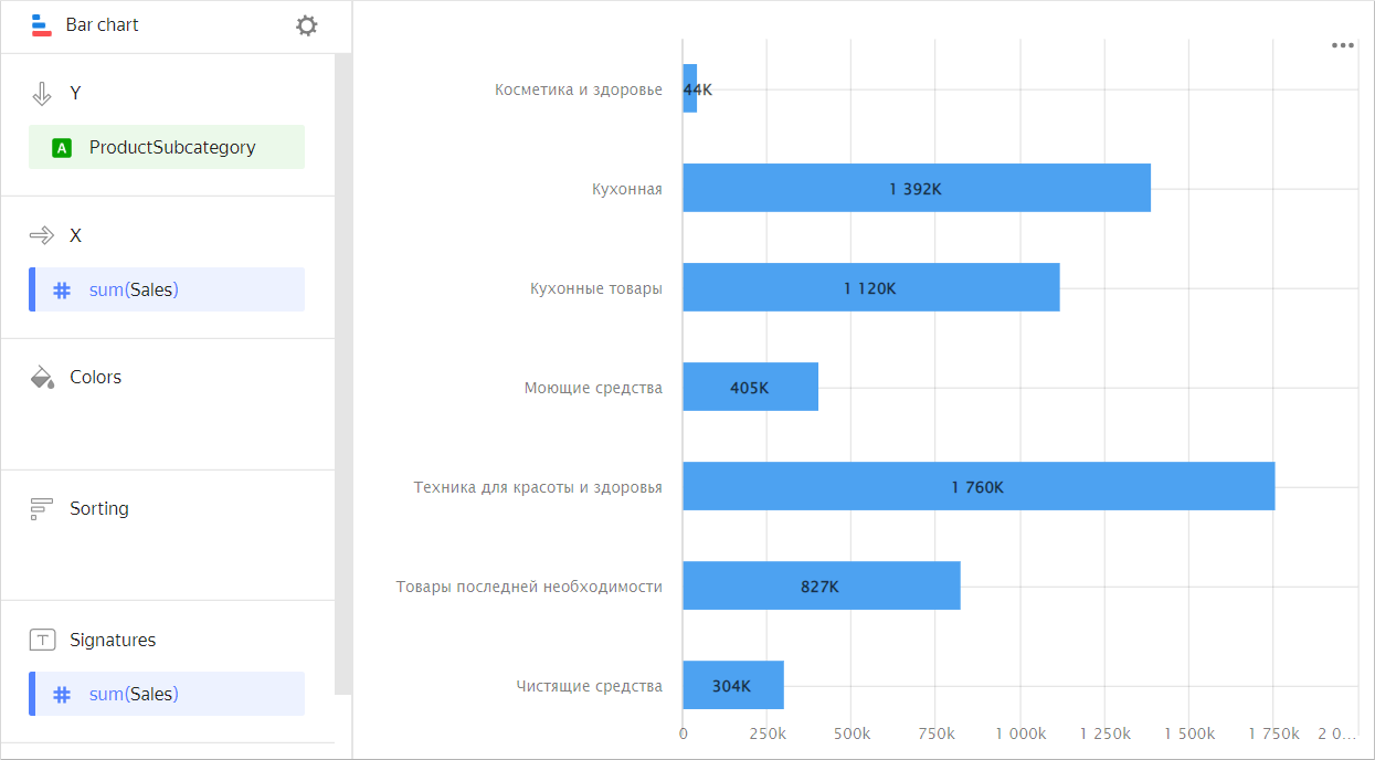
| Subcategory | Sales |
|---|---|
| Beauty and health products | 44K |
| Kitchenware | 1,392K |
| Kitchen products | 1,120K |
| Detergents | 405K |
| Health and beauty equipment | 1,760K |
| Non-essential goods | 827K |
| Cleaners | 304K |
Types of bar charts
Grouped
You can use a chart grouped by dimension to compare the values of a single measure for two or more categories.
-
For example, grouping by delivery type allows you to compare the cost of products delivered by courier and picked up. Categories are highlighted in different colors and the length of the bar indicates the measure value.
Example
VisualizationSource table
Subcategory Delivery Pickup Beauty and health products 12K 32K Kitchenware 394K 998K Kitchen products 371K 749K Detergents 127K 278K Health and beauty equipment 497K 1,263K Non-essential goods 268K 560K -
Use a grouped chart to compare two or more measures, e.g., the number of orders and the number of products. The bar length corresponds to the measure value.
Example
VisualizationSource table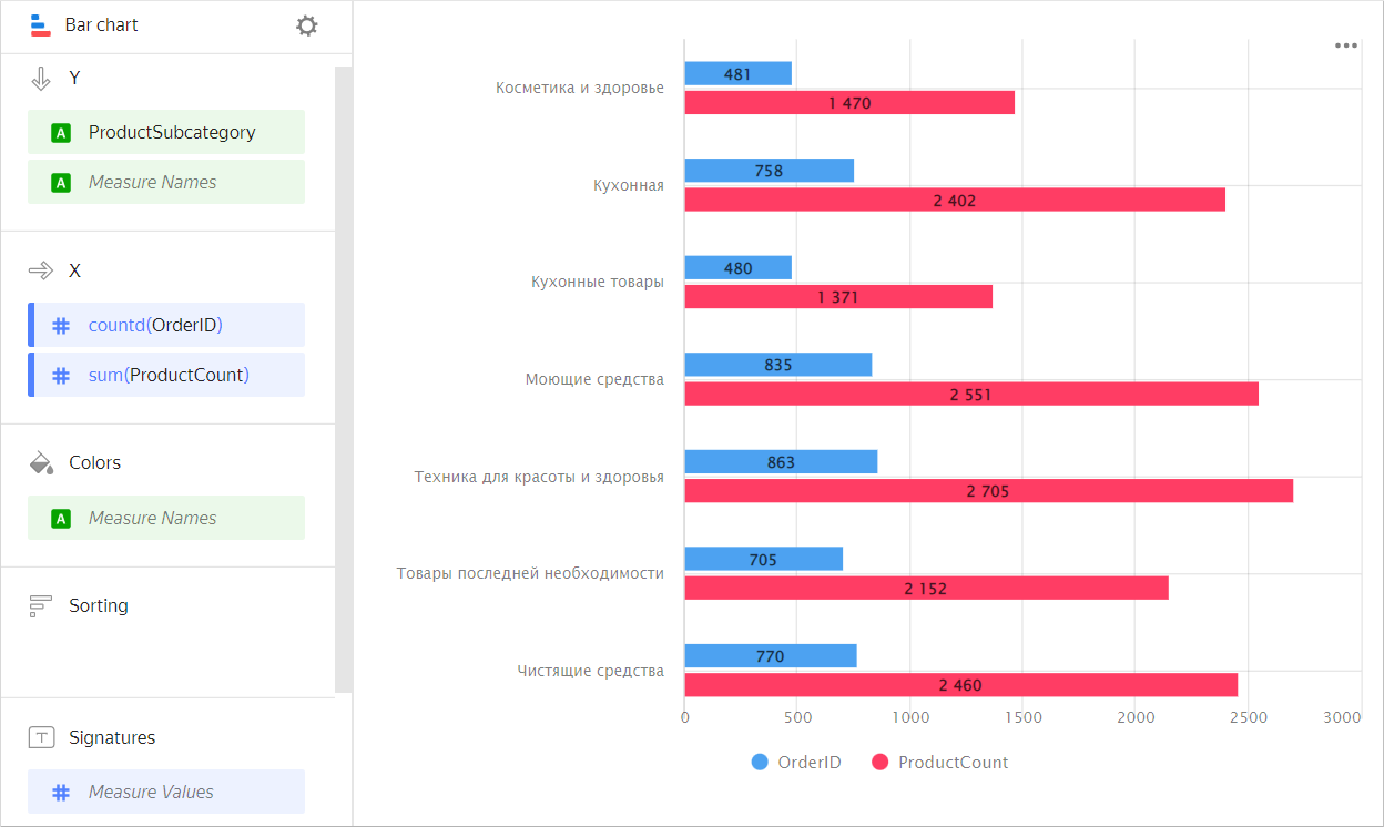
Subcategory Orders Number of products Beauty and health products 481 1,470 Kitchenware 758 2,402 Kitchen products 480 1,371 Detergents 835 2,551 Health and beauty equipment 863 2,705 Non-essential goods 705 2,152 Cleaners 770 2,460
Stacked
A stacked chart shows a ratio of internal segments to the total value.
-
Segments are placed one after another, where the beginning of each next segment is the outer boundary of the previous one.
-
Use this chart type to see how each measure contributes to the total by period or category, e.g., to view the percentage of each expense category in the total budget.
Example
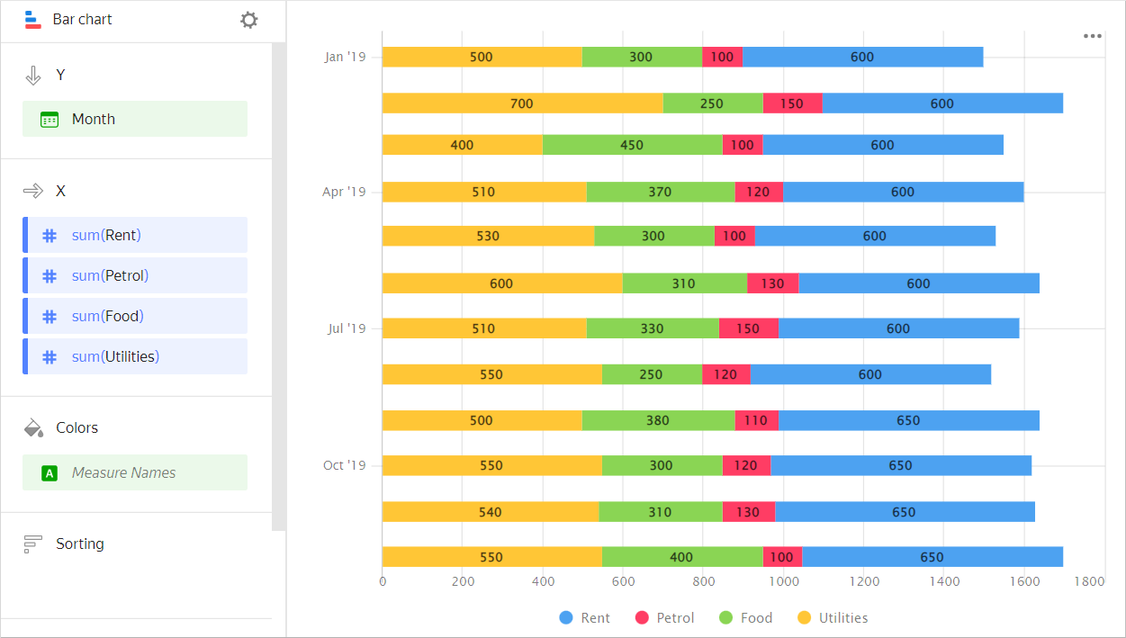
| Month | Gasoline | Rent | Food | Utility bills |
|---|---|---|---|---|
| January 2019 | 100 | 600 | 300 | 500 |
| February 2019 | 150 | 600 | 250 | 700 |
| March 2019 | 100 | 600 | 450 | 400 |
| April 2019 | 120 | 600 | 370 | 510 |
| May 2019 | 100 | 600 | 300 | 530 |
| June 2019 | 130 | 600 | 310 | 600 |
| July 2019 | 150 | 600 | 330 | 510 |
| August 2019 | 120 | 600 | 250 | 550 |
| September 2019 | 110 | 650 | 380 | 500 |
| October 2019 | 120 | 650 | 300 | 550 |
| November 2019 | 130 | 650 | 310 | 540 |
| December 2019 | 100 | 650 | 400 | 550 |
Wizard sections
| Wizard section |
Description |
|---|---|
| Y | Dimensions. You can specify one or two dimensions. |
| X | Measure. You can specify multiple measures. If you add more than one measure to a section, the Colors section will contain a dimension named Measure Names. You can move Measure Names to the Y axis. |
| Colors | Measure Names dimension or field. Affects the column color. To delete Measure Names, click the cross icon or remove measures from the X axis. |
| Sorting | Dimension or measure. Affects the column sorting. The sorting direction is marked with an icon next to the field: for ascending or for descending. To change the sorting direction, click the icon. |
| Labels | Measure. Displays measure values on the chart. If multiple measures are added to the Y section, drag Measure Values to this section. Markup functions are supported. For String type fields, you can configure using basic Markdown in Yandex DataLens syntax: click the icon before the field name and enable Markdown. |
| Filters | Dimension or measure. Used as a filter. |
Creating a bar chart
To create a bar chart:
Warning
If you use the new DataLens object model with workbooks and collections:
-
Go to the DataLens home page. In the left-hand panel, select Collections and workbooks.
-
Open the workbook, click Create in the top-right corner, and select the object you need.
Follow the guide from step 4.
-
Go to the DataLens home page.
-
In the left-hand panel, select Charts.
-
Click Create chart → Chart.
-
At the top left, click Select dataset and specify the dataset to visualize. If you do not have a dataset, create one.
- Select Line chart as the chart type.
- Drag one or more dimensions from the dataset to the Y section. The values will be displayed on the Y axis.
- Drag one or more measures from the dataset to the X section.
- Drag a dimension from the dataset or the Measure Names field to the Color section.
A stacked column chart is displayed by default.
Creating a grouped bar chart
To display an Y-axis grouped bar chart:
-
Go to the bar chart that you created.
-
Depending on the number of measures in the X section, follow these steps:
Single measureTwo or more measures- Check if there is a dimension in the Colors section.
- Duplicate this dimension in the Y section. The sequence of dimensions affects the grouping order.
- Drag the Measure Names dimension to the Colors section.
- Drag the Measure Names dimension to the Y section. The sequence of dimensions affects the grouping order.
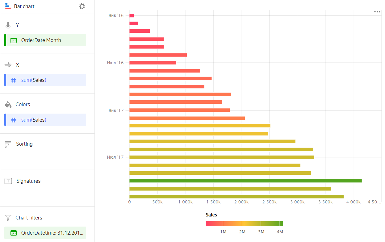
Adding a column color based on a measure
To color columns in a chart based on the value of a measure:
-
Go to the column chart that you created.
-
Depending on the number of measures in the X section, follow the steps below:
Single measureTwo or more measuresCopy the measure from the X section to the Colors section.
The colors of the columns in the chart will apply based on the measure values.
Example
Drag the Measure Values measure to the Colors section.
The chart columns will be colored based on the values of all measures listed in section X.
Example
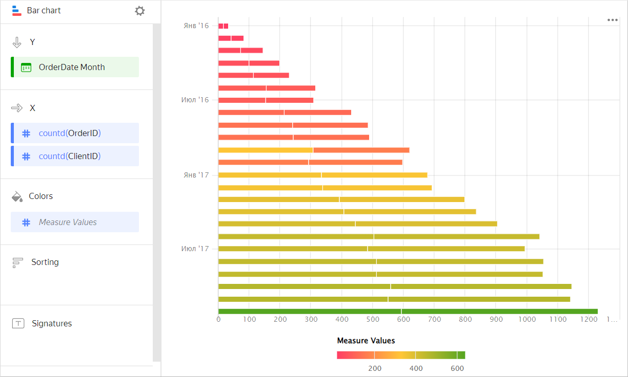
-
Configure a color gradient for the measure as well. To do so, in the top-right corner of the Colors section, click (the icon is displayed when you hover over the section).
-
In the color settings, specify:
- Gradient type: Select two or three colors.
- Gradient color: Select a color palette for the gradient from the list.
- Gradient direction: Change the gradient direction using the icon.
- Set threshold values: Set numeric thresholds for each color. Works if the X section contains a single value.
Configuring display of null values
-
If the source data has a row with
nullfor a measure value, this point will not be plotted on a chart with default settings.For example, if the source has a row with the date,
20.07.2022, but the sales total for it is not specified.To set up null value display on a chart:
- Click in the top-right corner of the section with the measure you want to configure (the icon appears when you hover over the section).
- In Empty values (null), select
Display as 0. - Click Apply. Now the chart will use
0instead ofnull.
-
If a row is missing from the source data altogether, the chart section settings will not change the chart.
For example, if the source does not have a row with the particular date,
20.07.2022, nothing will be shown for this date on the chart.
For more information, see Configuring the display of null values in a Yandex DataLens chart.
Recommendations
-
Labels. If the category values are too verbose, make them shorter so that the chart labels look neater.
You can use string functions in calculated fields or the CASE conditional statements.
- Place segments inside bars so that the largest or most important categories are located to the left, closer to the chart's Y-axis. This makes it easier to compare the values.
-
Dimension or measure. It affects the intensity of point fill.