Column chart in Yandex DataLens
This chart plots the values of one or more measures by period or category. The column height represents the measure value: the higher the column, the larger the value.
Unlike a line chart, this type of chart allows you to compare individual periods and focus on individual values rather than the general trend.
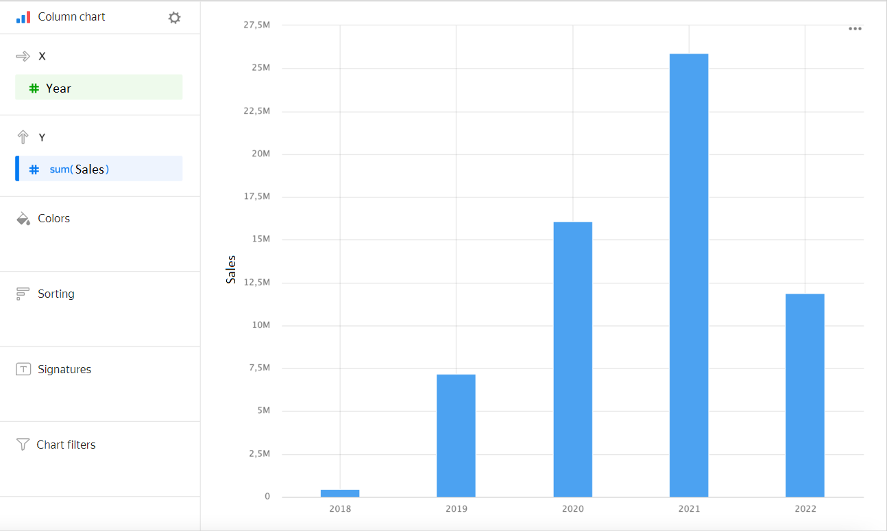
| Year | Sales |
|---|---|
| 2022 | 6M |
| 2021 | 28M |
| 2020 | 18M |
| 2019 | 9M |
| 2018 | 1M |
Types of column charts
Grouped
A chart with grouping lets you compare two or more measures: for example, the number of products delivered and the number picked up. The column height corresponds to the measure value.
Example
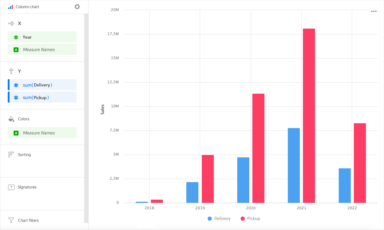
| Year | Delivery | Pickup |
|---|---|---|
| 2022 | 2M | 4M |
| 2021 | 8M | 19M |
| 2020 | 5M | 13M |
| 2019 | 3M | 6M |
| 2018 | 331K | 918K |
Stacked
This chart depicts the ratio of internal segments by period or category. The segments are stacked one on top of the other, i.e., the base of the above segment is the top side of the one below.
Since the sum of all segments is equal to the overall column length, the stacked chart is used when you need to visualize the total column values.
Example
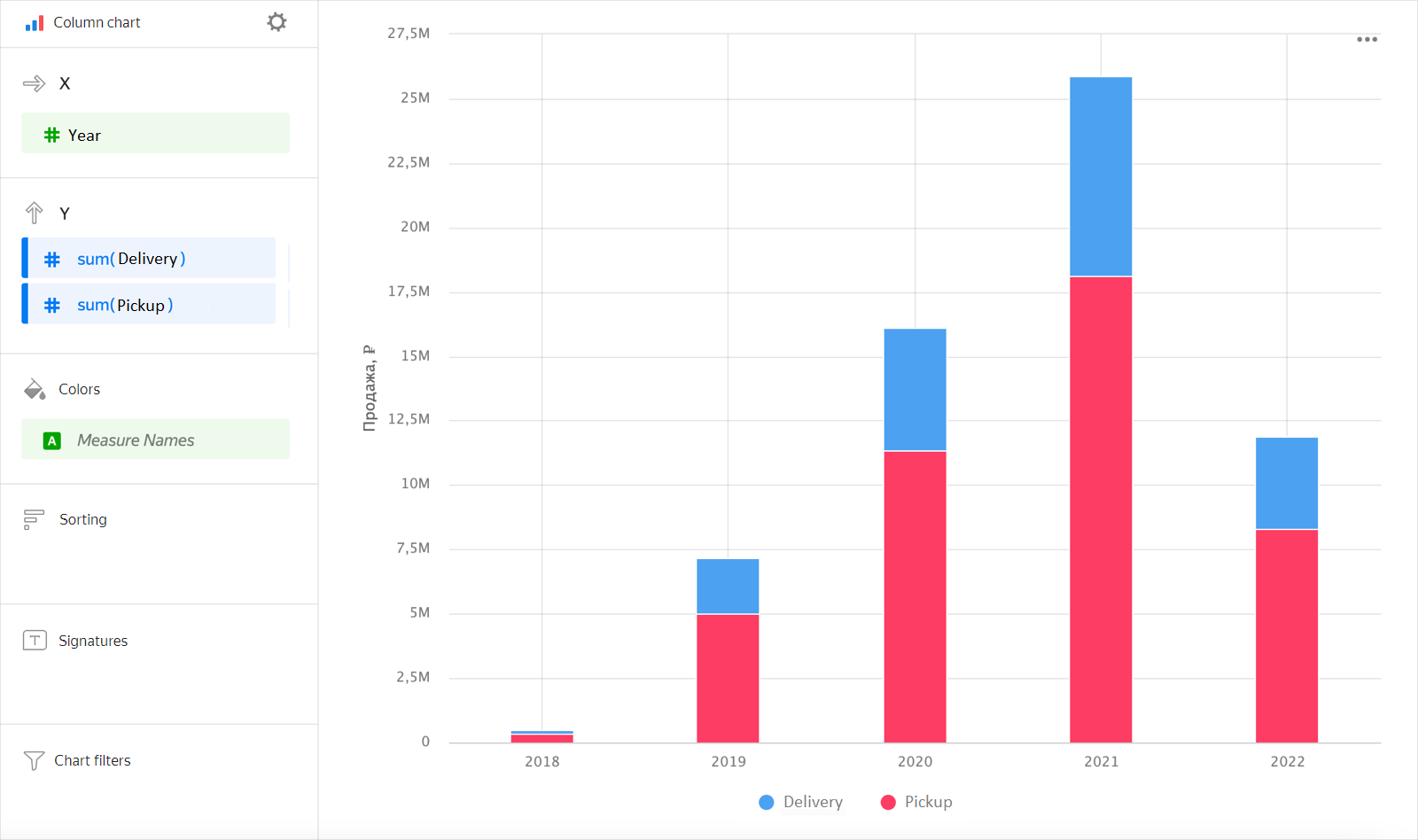
| Year | Delivery | Pickup |
|---|---|---|
| 2022 | 2M | 4M |
| 2021 | 8M | 19M |
| 2020 | 5M | 13M |
| 2019 | 3M | 6M |
| 2018 | 331K | 918K |
Wizard sections
| Wizard section |
Description |
|---|---|
| X | Dimensions You can specify one or two dimensions. Affects X-axis value grouping. The order of specified dimensions affects the order of value grouping on the X-axis. For the Date and Date and time types, you can set grouping by time: minutes, hours, weeks, and so on. |
| Y | Measure. You can specify multiple measures. If you add more than one measure to a section, the Colors section will contain a dimension named Measure Names. |
| Colors | Dimension, measure, Measure Names or Measure Values field. Affects the column color. To delete Measure Names and Measure Values, click the icon or remove measures from the Y axis. |
| Sorting | Dimension or measure. Affects the column sorting. Sorting only applies to dimensions used when building a chart. The sorting direction is marked with an icon next to the field: for ascending or for descending. To change the sorting direction, click the icon. |
| Labels | Measure. Displays measure values on the chart. When using multiple measures for a signature, add Measure Values. Markup functions are supported. For String type fields, you can configure using basic Markdown in Yandex DataLens syntax: click the icon before the field name and enable Markdown. |
| Split | Dimension. Splits a chart horizontally by the selected dimension's values. The maximum number of splits per chart is 25. |
| Filters | Dimension or measure. Used as a filter. A filter can be overridden by a dashboard selector if the selector is based on the same field. |
Creating a column chart
To create a column chart:
Warning
If you use the new DataLens object model with workbooks and collections:
-
Go to the DataLens home page. In the left-hand panel, select Collections and workbooks.
-
Open the workbook, click Create in the top-right corner, and select the object you need.
Follow the guide from step 4.
-
Go to the DataLens home page.
-
In the left-hand panel, select Charts.
- Click Create chart → Chart in Wizard.
-
At the top left, click Select dataset and specify the dataset to visualize. If you do not have a dataset, create one.
- Select Column chart as the chart type.
- Drag a dimension from the dataset to the X section. The values will be displayed in the lower part of the chart on the X axis.
- Drag one or more measures from the dataset to the Y section. The values will be displayed as columns on the Y-axis.
Note
- By default, a stacked chart is displayed if you have more than one measure.
- To make a grouped chart, use the Colors section for grouping.
Creating a grouped column chart
To display an X-axis grouped column chart:
-
Open a column chart or create a new one.
-
Depending on the number of measures in the Y section, follow these steps:
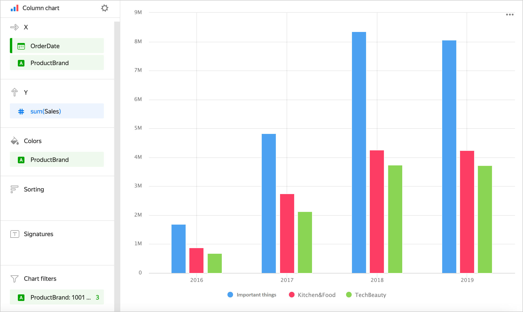
Single measureTwo or more measures- Drag a dimension that you want to group the chart columns by to the Color section.
- Duplicate this dimension in the X section. The sequence of dimensions affects the grouping order.
Example
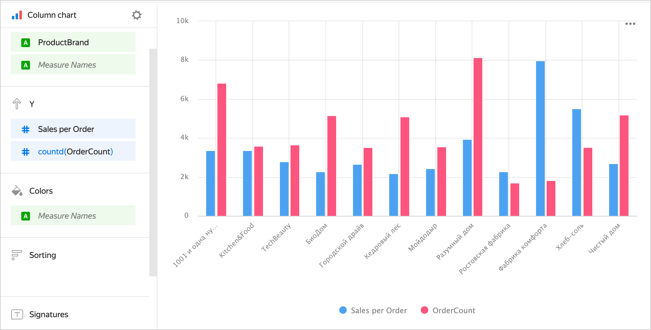
- Drag the
Measure Namesdimension to the Color section. - Drag the
Measure Namesdimension to the X section. The sequence of dimensions affects the grouping order.
Example
Adding a column color based on a measure
To color columns in a chart based on the value of a measure:
-
Open a column chart or create a new one.
-
Depending on the number of measures in the Y section, follow the steps below:
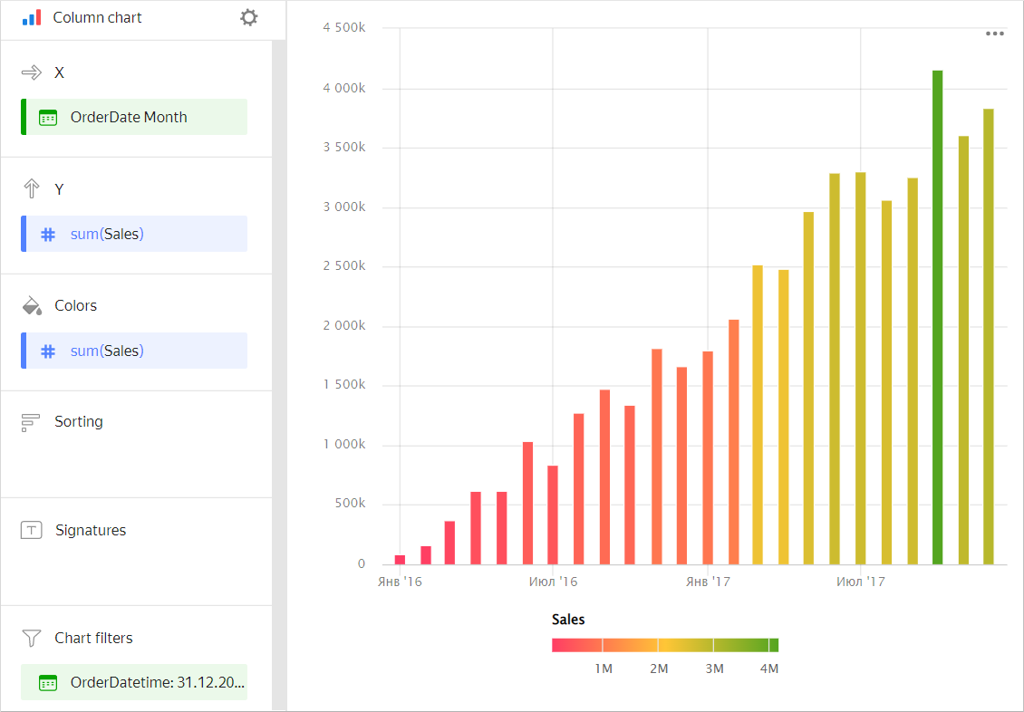
Single measureTwo or more measuresCopy the measure from the Y section to the Colors section.
The colors of the columns in the chart will apply based on the measure values.
Example
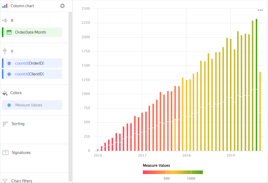
Drag the
Measure Valuesmeasure to the Color section.The colors of the columns in the chart will apply based on the values of all the measures listed in the Y section.
Example
-
Configure a color gradient for the measure as well. To do so, in the top-right corner of the Colors section, click (the icon is displayed when you hover over the section).
-
In the color settings, specify:
- Gradient type: Select two or three colors.
- Gradient color: Select a color palette for the gradient from the list.
- Gradient direction: Change the gradient direction using the icon.
- Set threshold values: Set numeric thresholds for each color. Works if the Y section contains a single value.
Adding column sorting by aggregated value
In the Sorting section, you cannot use a value with aggregation.
To sort columns by an aggregated value (e.g., sum, count, or average), first create a calculated field in the dataset or chart using the aggregation formula. Then use it to build a chart and do the sorting.
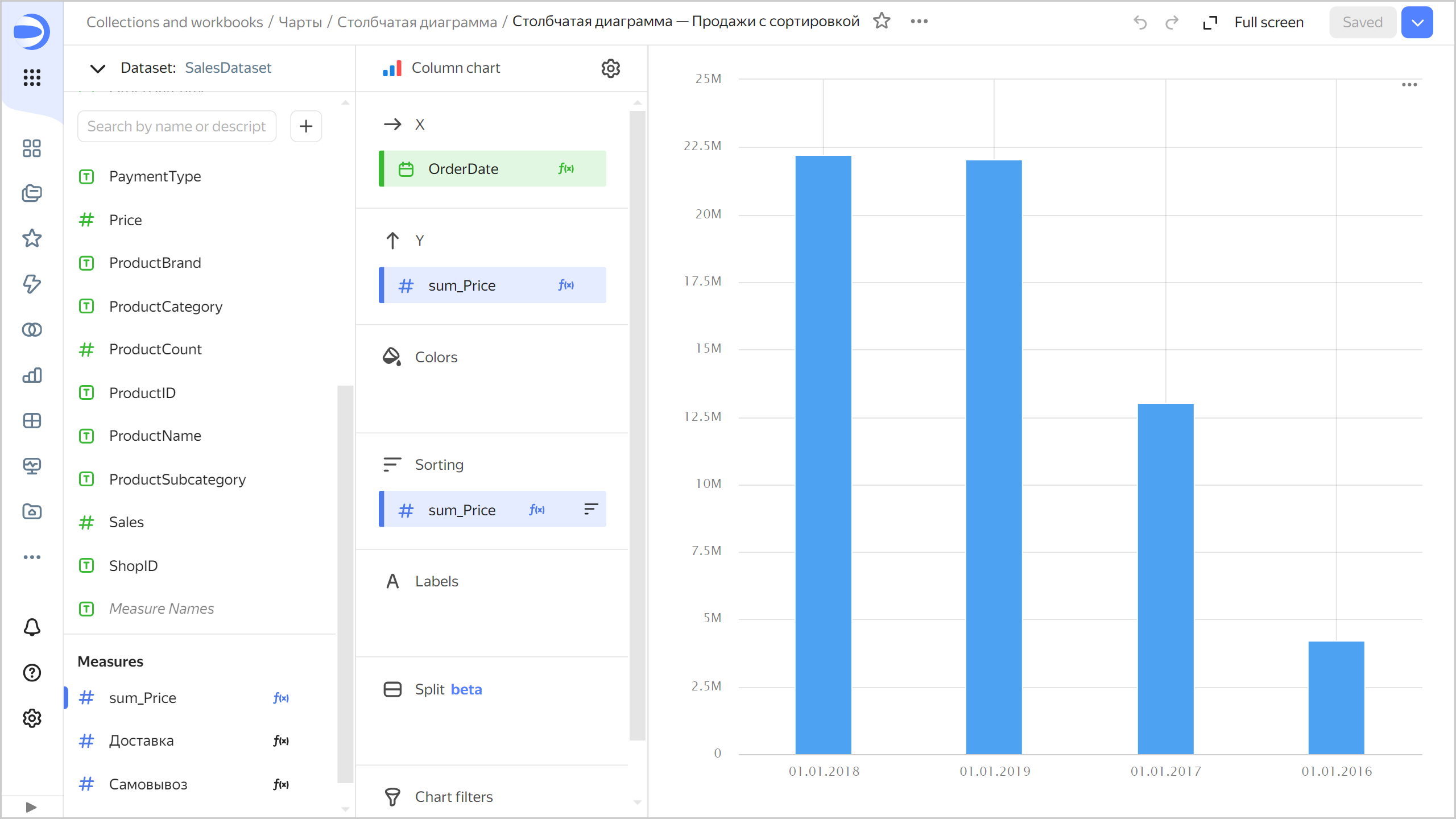
For example, to sort your sales by total amount:
-
Open a column chart or create a new one.
-
On the left side of the screen above the list of dimensions and measures, click and select Field.
-
In the Field settings window, enter:
- Field name:
sum_Price - Formula:
SUM([Price])
- Field name:
-
Click Create.
-
Drag the new field to the Y and Sorting sections. The columns will be sorted by sales total. To change the sorting direction, in the Sorting section, click or to the right of the field name.
Example
Configuring display of nullvalues
-
If the source data has a row with
nullfor a measure value, this point will not be plotted on a chart with default settings.For example, if the source has a row with the date,
20.07.2022, but the sales total for it is not specified.To set up null value display on a chart:
- Click in the top-right corner of the section with the measure you want to configure (the icon appears when you hover over the section).
- In Empty values (null), select
Display as 0. - Click Apply. Now the chart will use
0instead ofnull.
-
If a row is missing from the source data altogether, the chart section settings will not change the chart.
For example, if the source does not have a row with the particular date,
20.07.2022, nothing will be shown for this date on the chart.
For more information, see Configuring the display of null values in a Yandex DataLens chart.
Recommendations
-
Labels. If the values of the categories contain lots of text, try to shorten it to make the labels look neater. You can use string functions in calculated fields or the
CASEconditional statements. -
Sorting. If each column is a category, not time, consider sorting the columns in ascending or descending order of the measure. This will make your chart look better and more informative. Sorting may also be helpful inside each column's subcategories.
-
We recommend using a column chart to display changes to a measure or measures over time. In this case, be careful when sorting values on the X-axis, because the user usually expects to see changes over time on the X-axis.
-
Dimension or measure. It affects the intensity of point fill.
-
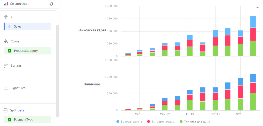
Splitting. You can split a chart by dimension into several small, easy-to-compare charts. To do this, drag a dimension from the dataset to the Split section.
Chart example