Line chart in Yandex DataLens

The chart shows how one or more measures change over a period of time. The chart line connects points with coordinates (X, Y).
What you can observe
The chart depicts trends, seasonal patterns, dynamics, and relationships between multiple measures at a the same point in time.
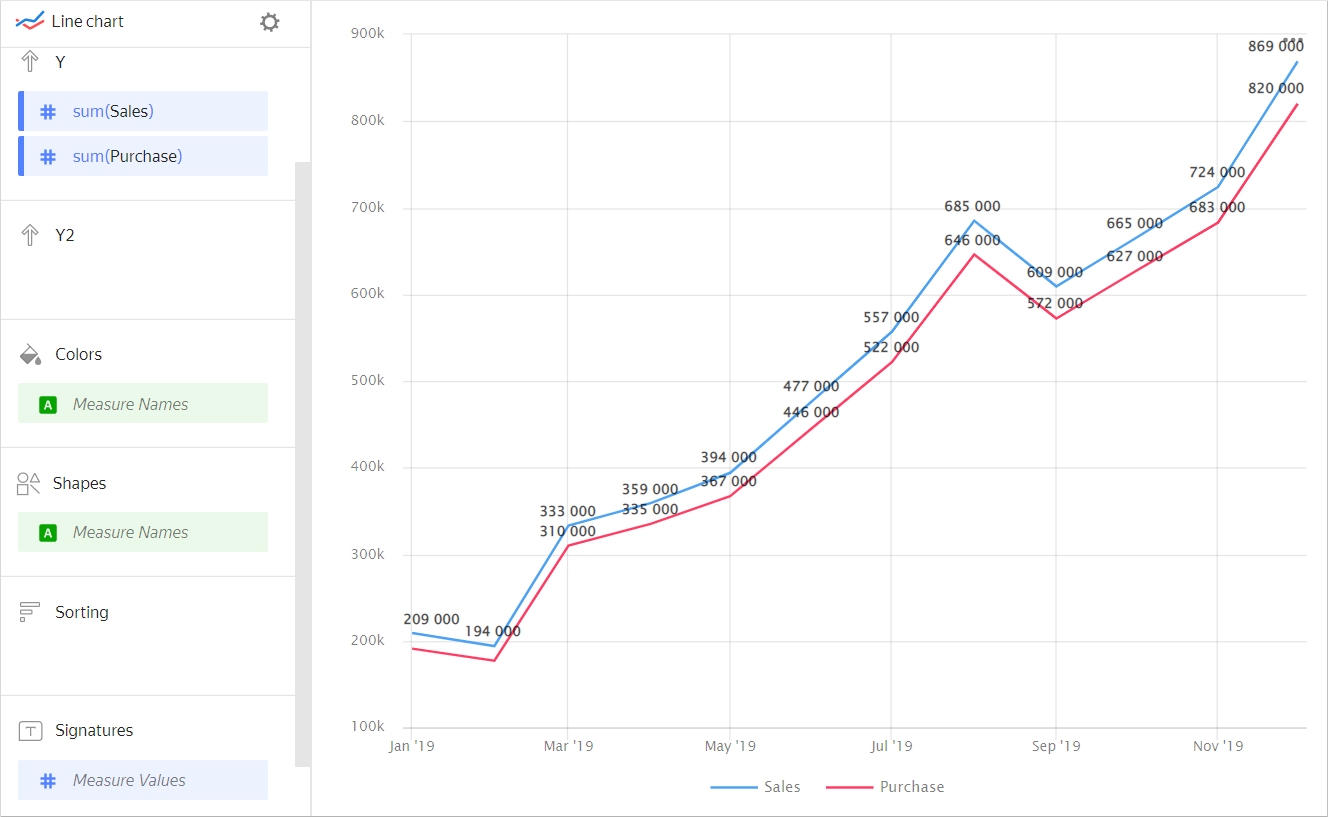
Multiple measures can be drawn using different lines on the same chart. For example, the basic sales targets, optimistic sales targets, and actual sales can be represented as a dotted, dashed, and solid line, respectively.
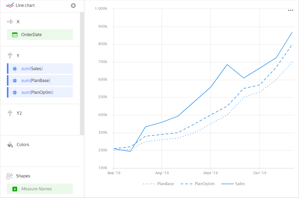
| Year | Sales | Basic targets | Optimistic targets |
|---|---|---|---|
| January 2019 | 209K | 200K | 210K |
| February 2019 | 194K | 205K | 220K |
| March 2019 | 333K | 250K | 280K |
| April 2019 | 359K | 260K | 290K |
| May 2019 | 394K | 270K | 300K |
| June 2019 | 477K | 300K | 350K |
| July 2019 | 557K | 350K | 400K |
| August 2019 | 685K | 400K | 450K |
| September 2019 | 609K | 500K | 550K |
| October 2019 | 665K | 530K | 570K |
| November 2019 | 724K | 600K | 670K |
| December 2019 | 869K | 700K | 800K |
In the settings of the line chart added to the dashboard, you can apply modeling, i.e., add smoothing or a trend line. These lines are shown only temporarily and not added to the original chart.
Extra options
-
Additional axes
When measure values vary greatly, you can use separate Y-axes for each measure.
Example
Sales and customer count chartSource table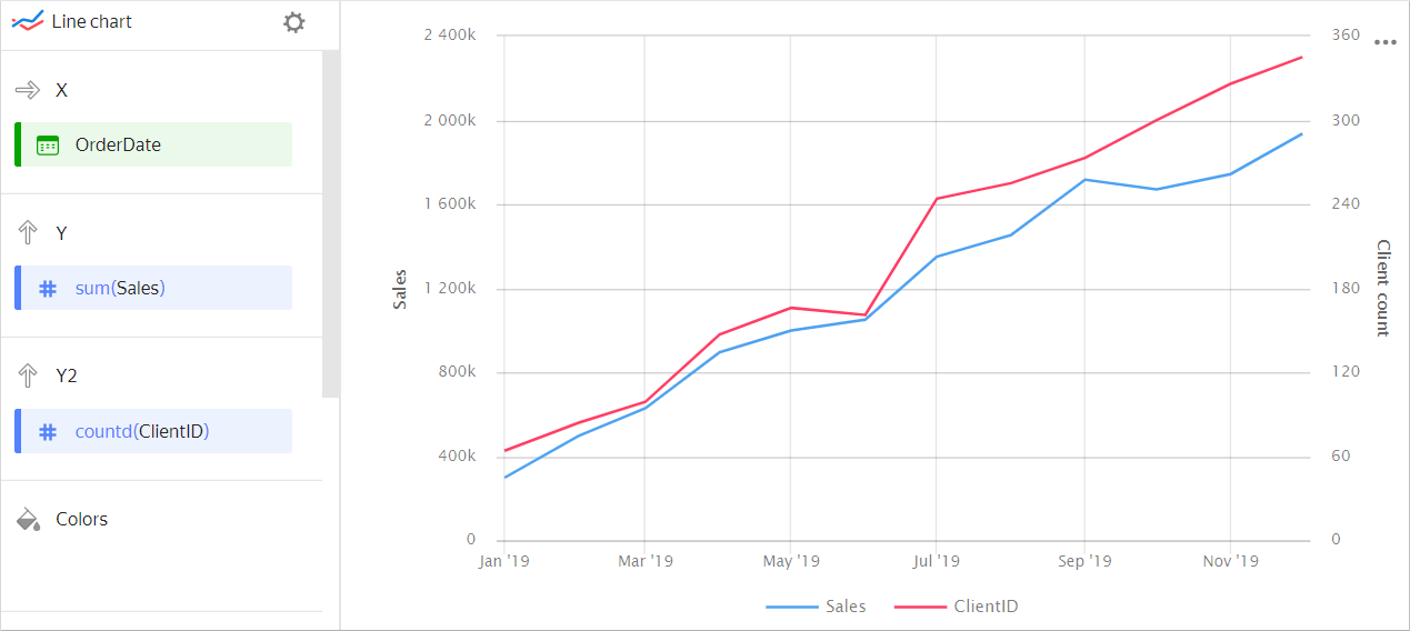
Year Sales Number of customers January 2019 298,450 64 February 2019 498,052 84 March 2019 629,201 99 April 2019 895,075 147 May 2019 998,557 166 June 2019 1,050,330 161 July 2019 1,350,246 244 August 2019 1,452,550 255 September 2019 1,716,182 273 October 2019 1,670,980 300 November 2019 1,743,450 326 December 2019 1,935,377 345 -
Additional categories
The chart allows you to compare several categories based on the same measure. Each category has a line of a different color or shape.
Example
Total sales for different product categoriesSource table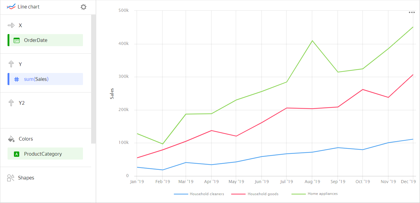
Year Home appliances Household goods Household cleaners January 2019 128K 55K 26K February 2019 97K 79K 18K March 2019 187K 105K 41K April 2019 188K 137K 34K May 2019 230K 121K 43K June 2019 256K 162K 59K July 2019 284K 206K 67K August 2019 409K 204K 72K September 2019 314K 209K 86K October 2019 324K 262K 79K November 2019 385K 238K 101K December 2019 451K 307K 111K -
Points instead of lines
If using single values on the X-axis, you will see nothing but points on the chart. This may happen due to filtering.
Example
Individual pointsSource table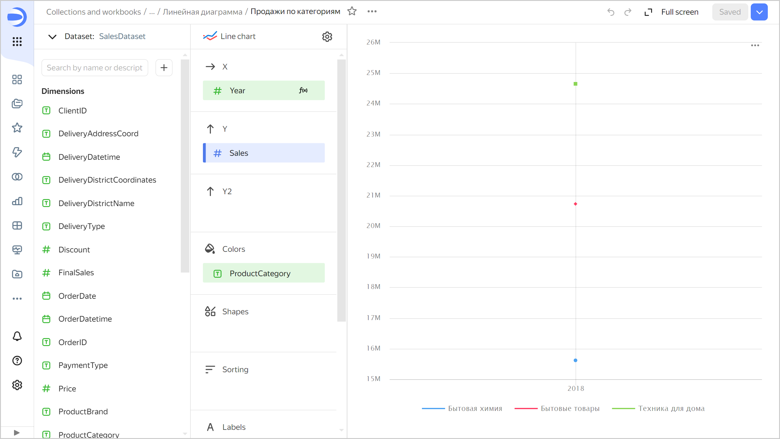
Year Home appliances Household goods Household cleaners 2?018 25K 21K 16K
Wizard sections
| Wizard section |
Description |
|---|---|
| X | Dimension. You can specify only one field here. This dimension is usually a date. If this is the case, make sure to specify the Date data type for this field in the dataset. This is required for correct sorting and signature display. For better visualization, you can group dates into weeks, months, and years. For more information, see Field settings. |
| Y | Measure. You can specify multiple measures. If you add more than one measure to a section, the Colors section will contain a dimension named Measure Names. |
| Y2 | Measure. Use it to add a second Y axis to a chart. You can specify multiple measures. If you add more than one measure to a section, the Colors section will contain a dimension named Measure Names. |
| Colors | Measure Names dimension or field. Affects the color of lines. To delete Measure Names, click the cross icon or remove measures from the Y axis. |
| Forms | Measure Names dimension or field. Affects the shape and size of lines. You can select the line shape from presets. You can select the line size from the list, or enter manually: from 1 to 12 pixels. |
| Sorting | Dimension or measure. Affects the sorting of the X axis. Sorting only applies to dimensions used when building a chart. The sorting direction is marked with an icon next to the field: for ascending or for descending. To change the sorting direction, click the icon. |
| Labels | Measure. Displays measure values on the chart. If multiple measures are added to the Y or Y2 section, drag Measure Values to this section. Markup functions are supported. For String type fields, you can configure using basic Markdown in Yandex DataLens syntax: click the icon before the field name and enable Markdown. |
| Split | Dimension. Splits a chart horizontally by the selected dimension's values. The maximum number of splits per chart is 25. |
| Filters | Dimension or measure. Used as a filter. |
Creating a line chart
To create a line chart:
Warning
If you use the new DataLens object model with workbooks and collections:
-
Go to the DataLens home page. In the left-hand panel, select Collections and workbooks.
-
Open the workbook, click Create in the top-right corner, and select the object you need.
Follow the guide from step 4.
-
Go to the DataLens home page.
-
In the left-hand panel, select Charts.
-
Click Create chart → Chart.
-
At the top left, click Select dataset and specify the dataset to visualize. If you do not have a dataset, create one.
- Select Line chart as your chart type.
- Drag a dimension from the dataset to the X section. The values will appear in the lower part of the chart on the X axis.
- Drag one or more measures from the dataset to the Y section. The values will be displayed as a chart on the Y axis.
- Drag one or more measures from the dataset to the Y2 section. The values will be displayed as a chart on the second Y axis.
- Drag a dimension to the Color section. The measure value will be divided by color depending on the dimension you select.
- Drag the Measure Names dimension or field to the Forms section. The measure value will be divided by line shape and width depending on the dimension you select. Set up line sizes and shapes.
- Drag a dimension or measure from the dataset to the Filters section. The field can be empty. In this case, no filters are applied.
Configuring display of nullvalues
-
If the source data has a row with
nullfor a measure value, this point will not be plotted on a chart with default settings.For example, if the source has a row with the date,
20.07.2022, but the sales total for it is not specified.To set up null value display on a chart:
- Click in the top-right corner of the section with the measure you want to configure (the icon appears when you hover over the section).
- In Empty values (null), select
Display as 0. - Click Apply. Now the chart will use
0instead ofnull.
-
If a row is missing from the source data altogether, the chart section settings will not change the chart.
For example, if the source does not have a row with the particular date,
20.07.2022, nothing will be shown for this date on the chart.
For more information, see Configuring the display of null values in a Yandex DataLens chart.
Recommendations
-
Scale. The line chart data perception depends on its proportions.
The lines may look steeper (rising or falling sharply) if the chart is compressed over a small segment. If the chart covers a longer segment, the lines appear smoother because the chart is stretched out.
Example
SteepSmoother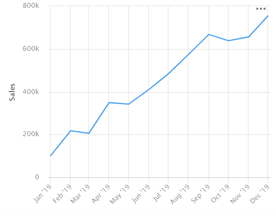
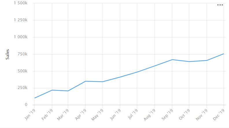
For a closer look at the chart, make the axis longer.
-
Labels. Use labels to display measure values on the chart. To display values on the chart, drag a measure from the dataset to the Labels section.
Chart example
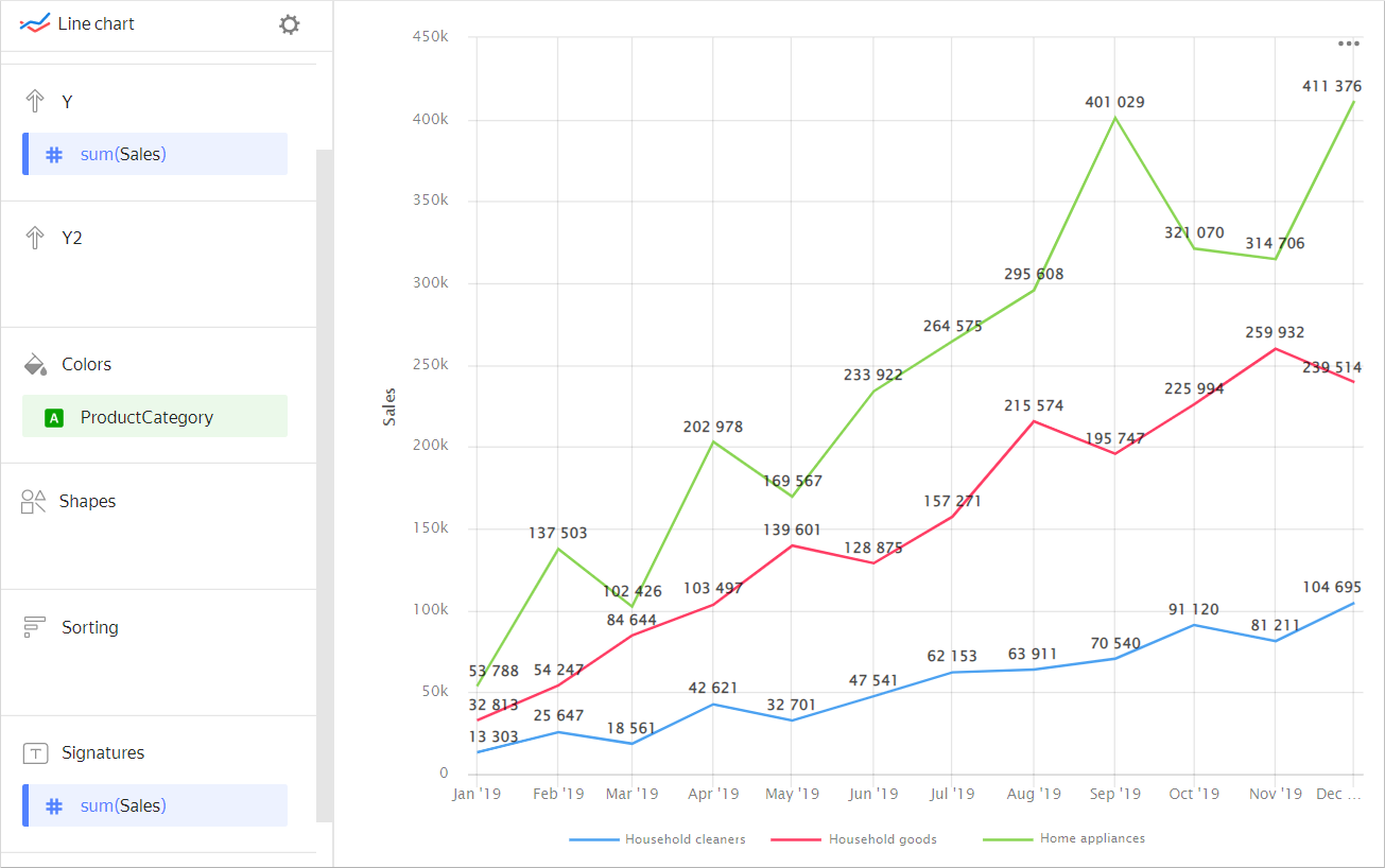
If multiple measures are added to the Y or Y2 section, drag Measure Values to this section.
Chart example
You can also sign only the last value on the chart by adding a calculated field with the
MAXfunction. For more information, see Demo dashboard. -
Labels. If the category values are too verbose, make them shorter so that the chart labels look neater.
You can use string functions in calculated fields or the CASE conditional statements.
-
Colors. For multiple measures, choose distinguishable and contrasting colors. Using more than 3-5 colors can make the chart harder to read.
To highlight one measure, select the brightest color for it. -
Disable the Sum in tooltips option in the chart settings if the chart lines represent different entities. For example, the sales amount and the number of customers.
-
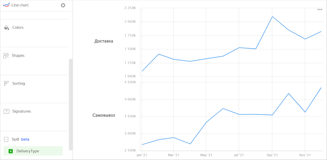
Splitting. You can split a chart by dimension into several small, easy-to-compare charts. To do this, drag a dimension from the dataset to the Split section.
Chart example
-
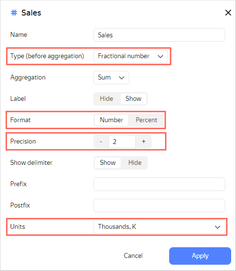
For better visualization, use formatting in the dimension and measure setup window.
Check the data type for correct sorting and comparison of values. Specify additional parameters.For example, the format and units for numeric data and the number of decimal places for fractions.
Example of measure settings