Yandex DataLens chart settings
Charts are configurable. For example, you can choose to display a legend, customize a color scheme, or set your own title.
Available settings depend on the type of chart being configured.
General settings
General settings affect the overall display of charts.
To open general settings, click on the left side of the screen above the chart.
Warning
The settings specified below may not be available for some chart types.
|
Name |
Description |
|
Header |
Sets the header for the chart.
|
|
Legend |
Displays the legend below the chart. The legend contains chart colors with text descriptions referring to the field values in the Colors section.
|
|
Tooltip |
Displays tooltips when hovering over a chart item.
|
|
Sum in tooltips |
Displays a sum in a tooltip when you hover over the chart.
|
|
Navigator |
Displays an additional element below the chart, the navigator. It allows to reduce the data selection displayed on the chart.
For more information, see this guide. |
|
Pagination |
Breaks a table into pages. It is not available if only one page is displayed or there is no data.
|
|
Limit |
Sets the number of rows to export. This is also the number of rows displayed per page. Available if Pagination is enabled. |
|
Grouping |
Displays unique field values.
|
|
Summary |
Displays a row with total values for table columns. The row values are calculated using the same formulas as aggregation in the measure.
|
|
Preserving spaces and line breaks |
Displays spaces and line breaks in the table as in the source data.
|
|
Stacking |
Stacked or isolated data display for each category in the area chart.
|
|
Center |
Sets the default center coordinates in Maps.
|
|
Scale |
Sets the default scale in Maps.
|
Field settings
You can configure:
- Both dimensions and measures for charts based on a dataset.
- Only measures for QL charts.
To open settings of a dimension or a measure, click the icon to the left of its name.
Note
If you apply an aggregation to the dimension, it will become a measure and the relevant settings will become available for it.
Dimensions
|
Name |
Description |
||||||||||
|
Name |
Sets a dimension name. |
||||||||||
|
Type |
Sets the type of dimension data. |
||||||||||
|
Grouping |
Sets the type of grouping or rounding. The setting is only available for the |
||||||||||
|
Format |
Sets the format of how the values are displayed. |
||||||||||
|
Date mode |
Sets the date display mode. The setting is only available for the
|
||||||||||
|
Aggregation |
Sets the aggregation type. Aggregation functions are available according to the Aggregating data table. |
||||||||||
|
Markup |
The field value will be formatted according to the option you select:
This setting is not available in the following visualizations: Indicator, Table, and Pivot table. |
||||||||||
|
Sub-totals |
Shows columns and/or rows with subtotals. This setting is only available for Pivot table charts. |
Measures
|
Name |
Description |
|
Name |
Sets the measure name. |
|
Type |
Sets the type of measure data. Not available for QL charts. |
|
Aggregation |
Sets the aggregation type. Aggregation functions are available according to the Aggregating data table. Not available for QL charts. |
|
Format |
Sets value display format. |
|
Decimal places |
Sets the number of decimal places. Not available for QL charts. |
|
Display groups of thousands |
Enables displaying groups of thousands for numeric values.
|
|
Prefix |
Sets a text displayed before a value. |
|
Postfix |
Sets a text displayed after a value. |
|
Dimension |
Sets a rounding scale of values. |
Section settings
To open section settings, click in the row with the section name.
Axes
Axis settings are only available for charts that have at least one X or Y axis:
- Line chart.
- Area chart (stacked and normalized).
- Column chart (including normalized).
- Bar chart (including normalized).
- Scatter chart.
You can configure settings for both the X and Y axes.
Warning
Some of these settings may not be available for some axes.
|
Name |
Description |
|
Axis name |
Sets an axis label.
|
|
Axis type |
Defines the axis type. This setting is available if the fields in the axis section are of the
|
|
Graph axis |
This setting allows you to hide all axis elements: lines, labels, and grid.
|
|
Display mode |
Enables configuring continuous chart display.
|
|
Axis formatting |
Sets the formatting of axis labels with numeric values, date values, or date and time values.
|
|
Grid |
Enables or disables grid display on the chart.
|
|
Grid increments, px |
Sets grid increment in pixels. Available if the Grid setting is on.
|
|
Labels |
Shows or hides axis labels based on field values.
|
|
Label appearance |
Sets the way the labels are displayed. Available if the Labels setting is on.
|
|
Null values |
Allows you to select the handling method for null values.
|
|
Scaling |
Sets the chart axis scale.
|
Colors
Generally, you can set a specific color for any graph value.
You can create color palettes and use them in your charts.
If the Legend option is enabled in common settings, placing this field into the Colors section will make the legend visible below the chart. The legend contains chart colors with text descriptions corresponding to the field values in the Colors section.
For tree chart, table (including a pivot table), and map, the following settings are available:
|
Name |
Description |
|
Gradient type |
Sets the number of gradient colors.
|
|
Colors |
Sets a color for a value. Available colors depend on the gradient type. |
|
Set threshold values |
Allows you to set threshold values that will refer to each color. |
|
Borders |
Sets borders for geopolygons.
|
General color settings
To set up colors:
-
In the top-right corner of the Colors section, click (the icon is displayed when you hover over the section).
-
Specify the configuration:
Note
You can use the Palette type for dimensions and the Gradient type for measures.
For a dimensionFor a measure-
Set a color in one of the following ways:
-
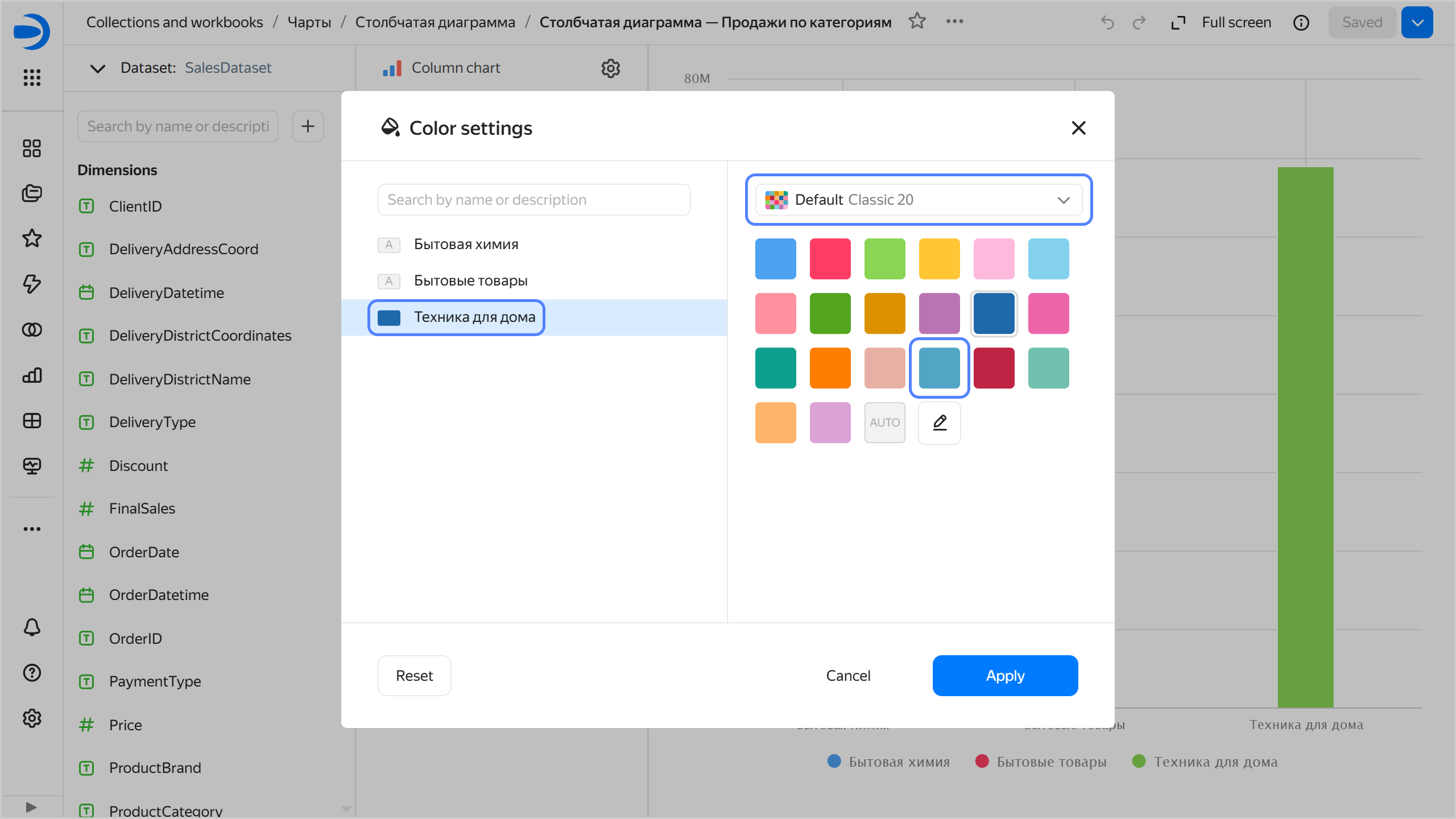
Select a color palette from the preset options or one created by the user. You can set a color for each dimension from the preset options of the current color palette. To revert to the default colors for the current palette, click AUTO.
Selecting a color from the color palette
-
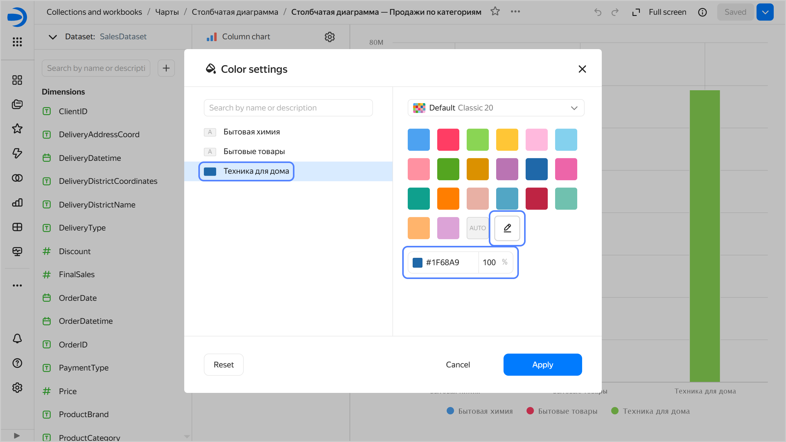
Click and set the color in hex format. You can also specify background transparency as a percentage.
Setting a color in hex format
-
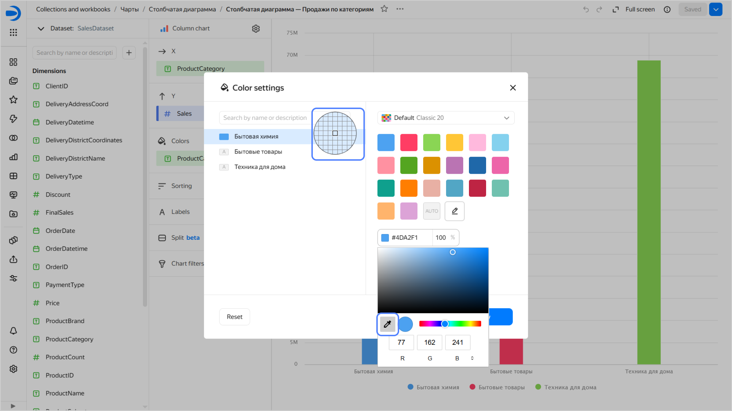
Click and then click the color icon preceding its hex value. In the window that opens, select a color from the color palette or specify a color in RGB, HSL, or hex format. To switch between formats, click .
Switching between color formats

You can also use the eyedropper tool to select a color on the report page.
Picking a color on the screen
-
-
Click Apply.
-
Click the gradient selection field and set the following properties:
-
Gradient type: Select two or three colors.
- Gradient color: Select a color palette for the gradient from the list.
- Gradient direction: Change the gradient direction using the icon.
-
Set threshold values: Set numeric thresholds for each color.
-
-
Click Apply.
-
You can create color palettes and use them in your charts.
Forms
This setting is only available for line (including as part of a combined chart) and scatter charts in the wizard and in QL charts.
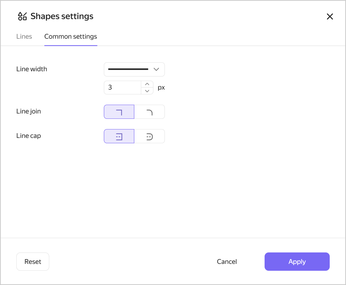
In a line chart, the setting allows you to set line shape and size, as well as line cap and junction style for a dimension or the Measure Names field. To configure line shapes and sizes:
-
In the top-right corner of the Forms section, click (the icon appears when you hover over the section).
-
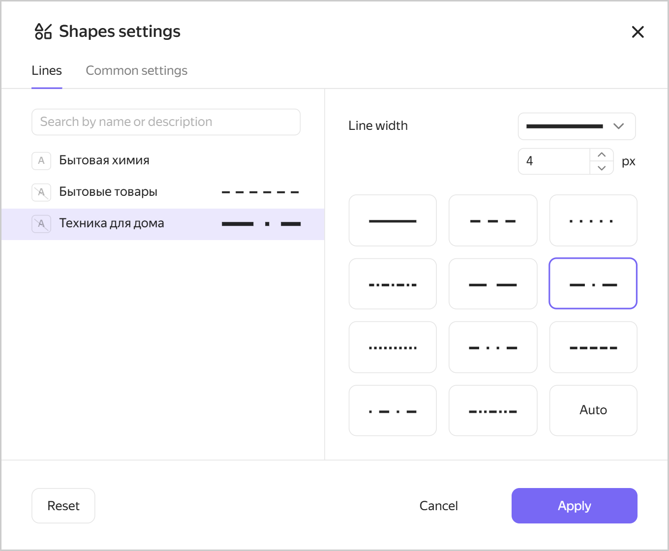
On the Lines tab, specify the following for each value:
- Select line thickness from the list or enter manually, from
1to12pixels. If you selectAuto, the size from the General settings tab or the default size will be used. - Select line shape from the preset values. If you select
Auto, the shape from the General settings tab or the default shape will be used.
Line settings
- Select line thickness from the list or enter manually, from
-
In the General settings tab, set thickness, junction shape, and line caps for all values from the Lines tab.
General line settings
In the scatter chart, the setting allows you to set the shape of the dimension points by selecting it from the preset shapes.
Labels
Labels display measure values on the chart. Markup functions are supported. For String type fields, you can configure using basic Markdown in Yandex DataLens syntax: click the icon before the field name and enable Markdown.
Labels are available for the following charts types:
- Line chart.
- Area chart (stacked and normalized).
- Column chart (including normalized).
- Bar chart (including normalized).
- Pie chart.
- Map.
Sorting
Allows you to sort chart values by measure or dimension.
Sorting is available for the following chart types:
- Line chart.
- Area chart (stacked and normalized).
- Column chart (including normalized).
- Bar chart (including normalized).
- Pie chart.
- Table (including a Pivot table).
Filters
Filters allow you to make a selection of values by dimension or measure.
Filters are available for all chart types.
Map section settings
You can configure layers, point size and color, tooltips, and filters.
To open section settings, click in the row with the section name.
Warning
Depending on the visualization type, different settings are available.
|
Name |
Description |
|
Size |
Sets point size depending on the measure value. |
|
Colors |
These set a color for geopoints and geopolygons depending on the measure value. |
|
Tooltips |
These create a tooltip displayed when you hover over a point. The tooltip contains dimension and measure values. For |
|
Layer filters |
Create a selection by dimension or measure for the current layer. |
|
General filters |
Create a selection by dimension or measure for the whole chart. |
Layers
You can add up to five layers with any visualization types to a single map:
- Scatter chart:
Geopointsdimension type. - Choropleth map:
Geopolygonsdimension type. - Heat map:
Geopoints (heat map)dimension type.
You can delete and rename layers.
You can change the transparency of the current layer using the slider. You can also set transparency of a text field above the slider.
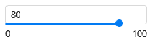
Transparency can have a value from 0 to 100.
Colors
You can set a color for geopoints and geopolygons, which will depend on the measure value.
|
Name |
Description |
|
Gradient type |
Sets the number of gradient colors.
|
|
Borders |
Sets borders for geopolygons.
|
|
Color |
Sets a color for geopoints and geopolygons. Available colors depend on the gradient type. |
|
Set threshold values |
It allows you to set threshold values that will refer to each color. |
You can create color palettes and use them in your charts.
Undoing and redoing changes in charts
When editing a chart in the wizard or a QL chart, you can now undo/redo any change introduced within the current version:
- To undo changes, click in the top-right corner of the screen or press Ctrl (Cmd) + Z.
- To redo changes, click or press Ctrl (Cmd) + Shift + Z.
You undo and redo changes that result in creating a new version.
Unsaved changes in the current version are reset:
- When refreshing the page.
- When saving a chart.
- When switching to another version.