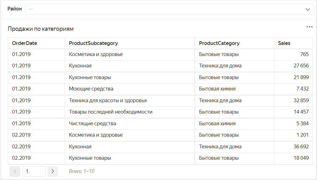
Pivot table in Yandex DataLens
A table is a standard form of presenting data with maximum level of detail.
Tip
It is best to place tables at the end of a dashboard.
Graphics are easier to "read", whereas delving into tabular data requires more time and attention.
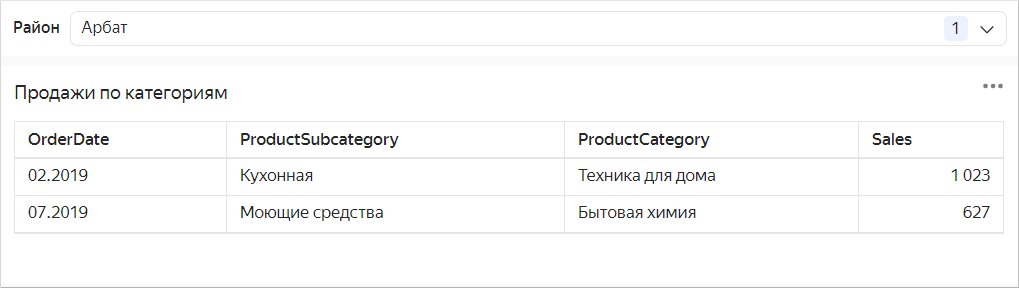
Tables are good for detailed analytics (a deep dive into figures) and problem detection.
Features
Here is how a pivot table is different from a flat table:
- Categories can reside both in columns and rows.
- Columns and rows may contain several categories, the cells at their intersections containing the measure values.
- Suitable for large volumes of data and for analysis of links between measures.
Example
Product sales based on delivery type with a breakdown by brand and product category for a given year:
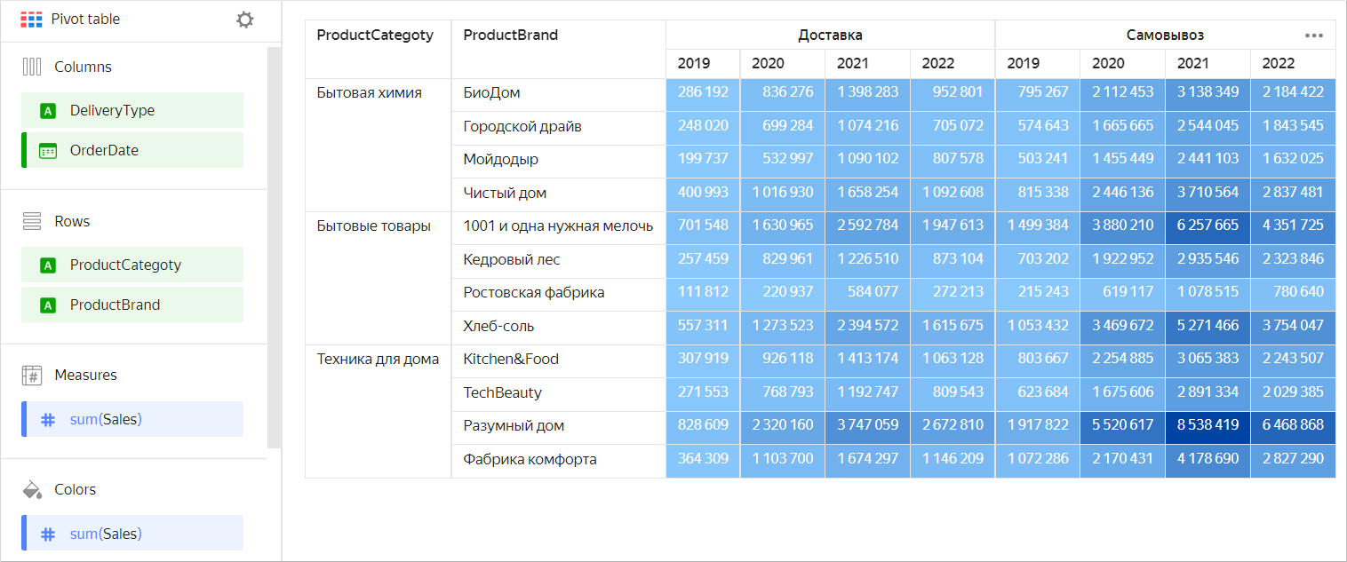
| Categories | Product brand | Delivery type | 2019 | 2020 | 2021 | 2022 |
|---|---|---|---|---|---|---|
| Household cleaners | BioDom | Delivery | 286,192 | 836,276 | 1,398,283 | 952,801 |
| Household cleaners | City Driver | Delivery | 248,020 | 699,284 | 1,074,216 | 705,072 |
| Household cleaners | Moydodyr | Delivery | 199,737 | 532,997 | 1,090,102 | 807,578 |
| Household cleaners | Chisty Dom | Delivery | 400,993 | 1,016,930 | 1,658,254 | 1,092,608 |
| Household cleaners | BioDom | Pickup | 795,267 | 2,112,453 | 3,138,349 | 2,184,422 |
| Household cleaners | City Driver | Pickup | 574,643 | 1,665,665 | 2,544,045 | 1,843,545 |
| Household cleaners | Moydodyr | Pickup | 503,241 | 1,455,449 | 2,441,103 | 1,632,025 |
| Household cleaners | Chisty Dom | Pickup | 815,338 | 2,446,136 | 3,710,564 | 2,837,481 |
| Household goods | 1001 necessary little things | Delivery | 701,548 | 1,630,965 | 2,592,784 | 1,947,613 |
| Household goods | Cedar wood | Delivery | 257,459 | 829,961 | 1,226,510 | 873,104 |
| Household goods | Rostov factory | Delivery | 111,812 | 220,937 | 584,077 | 272,213 |
| Household goods | Khleb-Sol | Delivery | 557,311 | 1,273,523 | 2,394,572 | 1,615,675 |
| Household goods | 1001 necessary little things | Pickup | 1,499,384 | 3,880,210 | 6,257,665 | 4,351,725 |
| Household goods | Cedar wood | Pickup | 703,202 | 1,922,952 | 2,935,546 | 2,323,846 |
| Household goods | Rostov factory | Pickup | 215,243 | 619,117 | 1,078,515 | 780,640 |
| Household goods | Khleb-Sol | Pickup | 1,053,432 | 3,469,672 | 5,271,466 | 3,754,047 |
| Home appliances | Kitchen&Food | Delivery | 307,919 | 926,118 | 1,413,174 | 1,063,128 |
| Home appliances | TechBeauty | Delivery | 271,553 | 768,793 | 1,192,747 | 809,543 |
| Home appliances | Razumny Dom | Delivery | 828,609 | 2,320,160 | 3,747,059 | 2,672,810 |
| Home appliances | Fabrika Komforta | Delivery | 364,309 | 1,103,700 | 1,674,297 | 1,146,209 |
| Home appliances | Kitchen&Food | Pickup | 803,667 | 2,254,885 | 3,065,383 | 2,243,507 |
| Home appliances | TechBeauty | Pickup | 623,684 | 1,675,606 | 2,891,334 | 2,029,385 |
| Home appliances | Razumny Dom | Pickup | 1,917,822 | 5,520,617 | 8,538,419 | 6,468,868 |
| Home appliances | Fabrika Komforta | Pickup | 1,072,286 | 2,170,431 | 4,178,690 | 2,827,290 |
Wizard sections
| Wizard section |
Description |
|---|---|
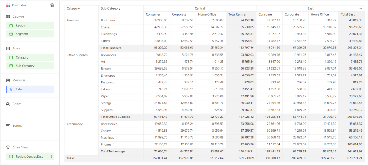
| Columns | Dimensions |
| Rows | Dimensions |
| Measures | Measures. If you add more than one measure to a section, the Columns section will contain the Measure Names dimension that defines the location of the measure headers. You can move Measure Names to Rows. |
| Colors | Measure. Affects the fill of all cells containing measures. It may only contain one measure. |
| Sorting | Dimensions and measures under Columns and Rows. Multiple dimensions and measures can be used. The sorting direction is marked with an icon next to the field: for ascending or for descending. To change the sorting direction, click the icon. DataLens first groups columns or rows in the order they are listed in their respective sections, and only then sorts the groups according to the Sorting section. The order of fields in the section affects the sorting order of the table fields. Sorting by measure affects only the query to the source, not the pivot table. |
| Filters | Dimension or measure. Used as a filter. |
Creating a pivot table
Note
Not supported in QL charts.
To create a pivot table:
Warning
If you use the new DataLens object model with workbooks and collections:
-
Go to the DataLens home page. In the left-hand panel, select Collections and workbooks.
-
Open the workbook, click Create in the top-right corner, and select the object you need.
Follow the guide from step 4.
-
Go to the DataLens home page.
-
In the left-hand panel, select Charts.
-
Click Create chart → Chart.
-
At the top left, click Select dataset and specify the dataset to visualize. If you do not have a dataset, create one.
-
Select the Pivot table chart type.
-
Drag a dimension from the dataset to the Columns section.
-
Drag a dimension from the dataset to the Rows section.
Note
In the Columns and Rows sections, you can change the order of dimensions by dragging them.
-
Drag a measure from the dataset to the Measures section. The values are displayed in the table cells.
-
Drag a measure from the dataset to the Color section. Cells with the measure are filled in with a color from the color gradient, depending on the measure value.
Additional settings
Appearance
Renaming columns and rows
- Under Columns or Rows, click the icon to the left of the dimension name.
- In the window that opens, change the Name field value and click Apply.
Adding tooltips to table headers
- Under Rows, click the icon to the left of the dimension or measure name.
- In the window that opens, enable the Tooltip option, enter the text in the field below, and click Apply. By default, with this option enabled, the tooltip text is taken from the field description in the dataset.
When the option is enabled, the icon appears next to the table column header. Hover over the icon to bring up the tooltip.
Setting field fill color
-
Under Columns, Rows, or Measures, click the icon to the left of the field name.
-
In the window that opens, enable Column fill color.
-
In the By field list, select the field whose values the fill will be based on.
-
Set the Fill type:
Note
- You can use the Palette type for dimensions and the Gradient type for measures.
- Fill is not supported for the Total columns and rows.
For a dimensionFor a measure- Click the color scheme selection field and set a color for each dimension value.
- Click Apply.
-
Click the gradient selection field and set the following properties:
- Gradient type: Select two or three colors.
* Gradient color: Select a color palette for the gradient from the list.
* Gradient direction: Change the gradient direction using the icon. - Set threshold values: Set numeric thresholds for each color.
- Gradient type: Select two or three colors.
-
Click Apply.
-
For the Gradient fill type, specify the coloring option for
nullvalues:Do not colororColor as 0. -
Click Apply.
Columns and rows
Setting the width of table columns and rows
-
In the top-right corner of the Columns or Rows section, click (this icon appears when you hover over the section).
-
Under Width, select the values for columns and rows:
Auto: Automatic column/row width.%: Column/row width as a percentage of the table's total width.px: Column/row width in pixels.
You can use
%andpxto make table cell breaks (by word). Thus the number of rows in a cell may grow.Note
The total width of a table always takes up 100% of available space regardless of the specified width of individual columns and rows.
-
Click Apply.
To set the width of any column to Auto, click Reset.
Freezing table columns
Note
You can only freeze columns generated from dimensions in the Rows section.
- In the top-right corner of the Columns or Rows section, click (this icon appears when you hover over the section).
- In the Freeze window that opens, enter the number of columns to freeze. These columns will stay in place as you scroll horizontally.
- Click Apply.
Changing the number of rows
Use the Pagination and Limit settings to manage the number of rows displayed on the screen and exported from the chart. To change the number of rows:
- At the top of the screen, click next to the chart type.
- Enable pagination and set the number of rows per page or disable pagination.
- Click Apply.
By default, tables come with pagination on and a limit of 100 rows per page. With pagination off, the whole table will be displayed within the display limits. Pagination is not available if only one page is displayed or there is no data.
With pagination on, only table data from the current page will be exported. To save the whole table within the chart export size limit, disable pagination.
Enabling pagination
Enable pagination if your table has many rows:
- At the top of the screen, click next to the chart type.
- Enable Pagination and click Apply.
This option is not available if only one page is displayed or there is no data.
Adding rows with subtotals
- Under Columns or Rows, click the icon in front of the field name.
- In the field settings window, enable Sub-totals.
- Click Apply.
The table will show columns and/or rows with Total <field_name>.
To output the common Total row, enable Sub-totals in the settings for the first fields under Columns and Rows.
Pivot table with subtotals
Note
- The Total row does not support filtering by measure. You can hide the Total row by dragging a measure to the Filters or Dashboard filters section.
- Calculations using LOD expressions, window functions, and time series functions may not work correctly in the row with totals.
Adding a linear indicator to a column with a measure
-
Under Measures, click the icon to the left of the measure name.
-
In the window that opens, enable Linear indicator.
-
Specify the indicator settings:
- Fill type: Type of fill color for the indicator.
- Positive values: Indicator color for positive values.
- Negative values: Indicator color for negative values.
- Show labels: This option enables displaying measure values in a cell.
- Show in totals: This option enables displaying the indicator in cells with totals.
- Align: Left or right alignment of the indicator position in a column. Only applies if all numbers in a column are either positive or negative.
- Scale: Sets the indicator scale. If you set a scale manually, specify the min and max values. Make sure the min value is less than or equal to
0and the max value is larger than or equal to0.
Example of linear indicator settings
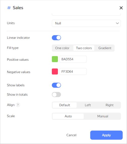
-
Click Apply.
Recommendations
Tip
Use tables for their intended purpose only, e.g., to represent aggregate data in table format.
Tables are not a replacement for other data visualization types.
Appearance
- Place dimensions on the left and measures on the right. This makes your data more readable.
- Use short, simple, and clear column headers.
- You can color table cells depending on the values of a measure. This will help you to highlight the values.
Sizes
-
Limit the size of your table or use filters and sorting. Tables with too many rows or columns are hard to read.
-
When posting a table on a dashboard, enable auto height in the widget settings. This will help you save dashboard space.
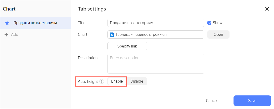
If you use a filter, the table height will automatically adapt to the number of rows.
If no value is set in the filter, a table displays all rows depending on the limit to the number of rows per page.
If the number of displayed rows decreases when using the filter, the table height is reduced automatically.