Normalized bar chart in Yandex DataLens

A normalized bar chart shows the contribution, as a percentage, of multiple measures in the total amount by period or category.
-
Unlike a stacked bar chart, the proportion of segment ratios and not the total bar length is important for this type of chart.
-
Segments are highlighted in different colors and located one after the other. The length of a segment indicates its ratio to the total amount represented as 100%.
Percentage of expenses in the annual budget
VisualizationSource table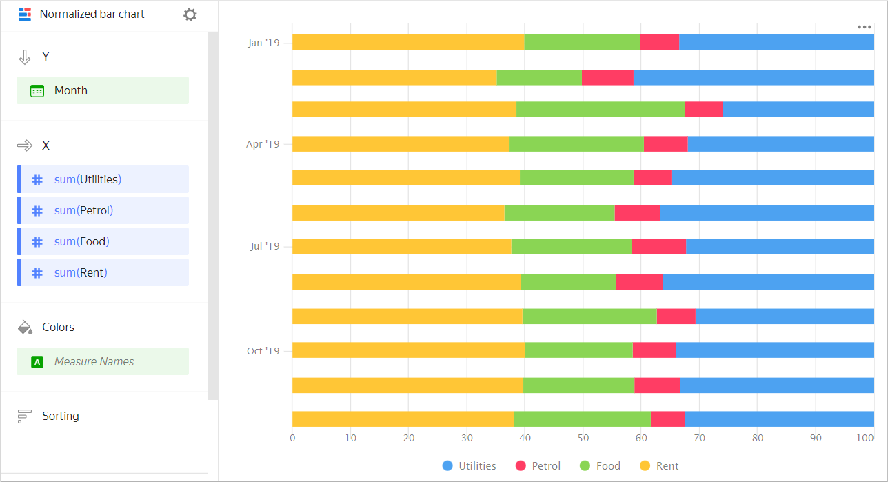
Month Gasoline Rent Food Utility bills January 2019 100 600 300 500 February 2019 150 600 250 700 March 2019 100 600 450 400 April 2019 120 600 370 510 May 2019 100 600 300 530 June 2019 130 600 310 600 July 2019 150 600 330 510 August 2019 120 600 250 550 September 2019 110 650 380 500 October 2019 120 650 300 550 November 2019 130 650 310 540 December 2019 100 650 400 550 Percentage of payment types across product subcategories.
VisualizationSource table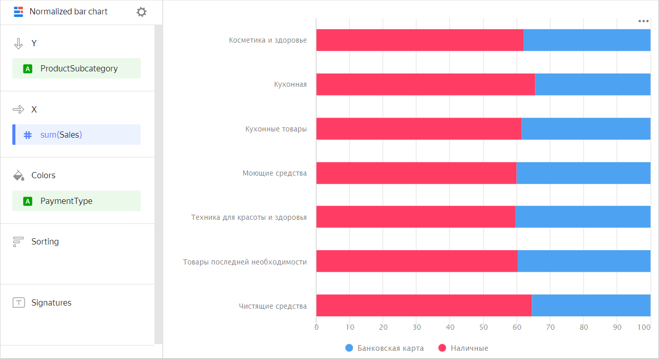
Subcategory Delivery Pickup Beauty and health products 615K 373K Kitchenware 1,929K 1,005K Kitchen products 1,217K 759K Detergents 1,210K 803K Health and beauty equipment 2,046K 1,380K Non-essential goods 1,368K 894K Cleaners 1,237K 673K -
A normalized bar chart shows the contribution, as a percentage, of each category in the total measure value over a time interval.
Sales percentage for different product categories
VisualizationSource table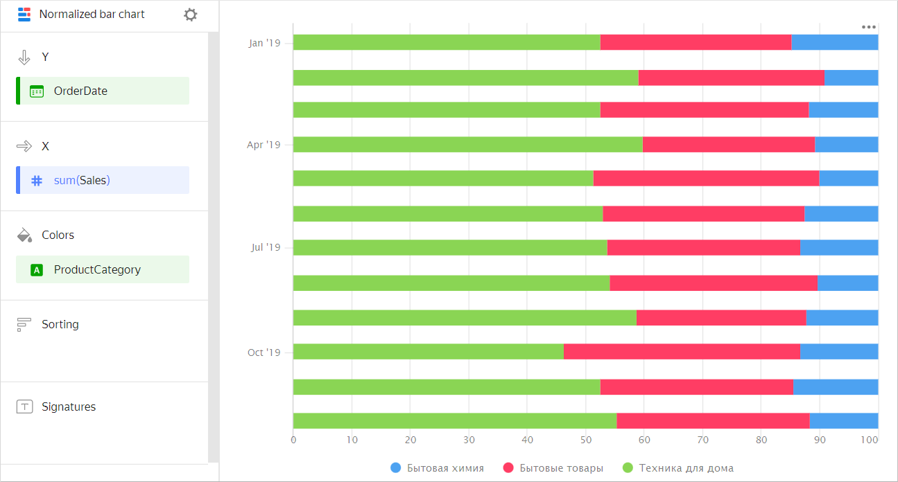
Month Home appliances Household goods Household cleaners January 2019 128K 55K 26K February 2019 97K 79K 18K March 2019 187K 105K 41K April 2019 188K 137K 34K May 2019 230K 121K 43K June 2019 256K 162K 59K July 2019 284K 206K 67K August 2019 409K 204K 72K September 2019 314K 209K 86K October 2019 324K 262K 79K November 2019 385K 238K 101K December 2019 451K 307K 111K
Wizard sections
| Wizard section |
Description |
|---|---|
| Y | Dimensions. You can specify one or two dimensions. For the Date and Date and time types, you can set grouping by time: minutes, hours, weeks, and so on. |
| X | Measure. You can specify multiple measures. If you add more than one measure to a section, the Colors section will contain a dimension named Measure Names. You can move Measure Names to the Y axis. |
| Colors | Measure Names dimension or field. Affects the color of lines. To remove Measure Names, delete measures from the Y axis. |
| Sorting | Dimension or measure. Affects the column sorting. The sorting direction is marked with an icon next to the field: for ascending or for descending. To change the sorting direction, click the icon. |
| Labels | Measure. Displays measure values on the chart. If multiple measures are added to the Y section, drag Measure Values to this section. Markup functions are supported. For String type fields, you can configure using basic Markdown in Yandex DataLens syntax: click the icon before the field name and enable Markdown. |
| Filters | Dimension or measure. Used as a filter. |
Creating a normalized bar chart
To create a normalized bar chart:
Warning
If you use the new DataLens object model with workbooks and collections:
-
Go to the DataLens home page. In the left-hand panel, select Collections and workbooks.
-
Open the workbook, click Create in the top-right corner, and select the object you need.
Follow the guide from step 4.
-
Go to the DataLens home page.
-
In the left-hand panel, select Charts.
-
Click Create chart → Chart.
-
At the top left, click Select dataset and specify the dataset to visualize. If you do not have a dataset, create one.
- Select Normalized bar chart as the chart type.
- Drag one or more dimensions from the dataset to the Y section. The values will be displayed on the Y axis.
- Drag one or more measures from the dataset to the X section.
- Drag a dimension from the dataset or the Measure Names field to the Color section.
Recommendations
-
Labels. If the category values are too verbose, make them shorter so that the chart labels look neater.
You can use string functions in calculated fields or the CASE conditional statements.
- Segments. Do not display more than three to five segments on the chart.
-
Dimension or measure. It affects the intensity of point fill.