Measure Names and Measure Values in Yandex DataLens
When you add a measure to a chart section, two auxiliary fields are added to the list of dataset fields: Measure Names and Measure Values. They are missing in the original dataset field list, as DataLens creates them automatically. The Measure Names and Measure Values fields are used to create charts with multiple measures.
Measure Names is a dimension (a green field) that includes names of all measures in the chart. It is used to group chart values or show measure names as legends. For example, you can use Measure Names to build a column chart grouped by multiple measures or to label sectors in a pie chart.
Measure Values is a measure (blue field) that includes values of all measures in the chart. It is used to label values of each measure. For example, you can use Measure Values to label each line in a chart or each column in a column chart.
Using Measure Names and Measure Values in charts
Let's see some examples of how to use Measure Names and Measure Values in charts. As a data source, we will use a direct connection to a demo database; the dataset is based on the SampleSuperstore table.
Example 1
Create a pivot table with total sales across each product category by region.
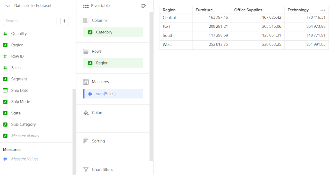
Now, let's also use the table to show profit for each category and region. To do this, drag the Profit field to Measures. The Measure Names field will be added automatically to the Columns section. This way, you can group your chart by measure names.
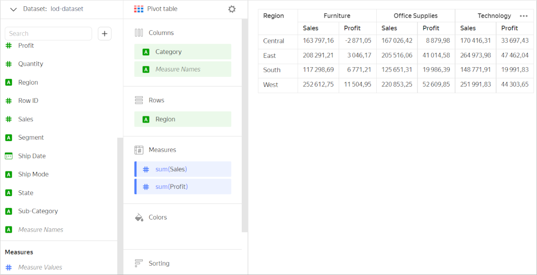
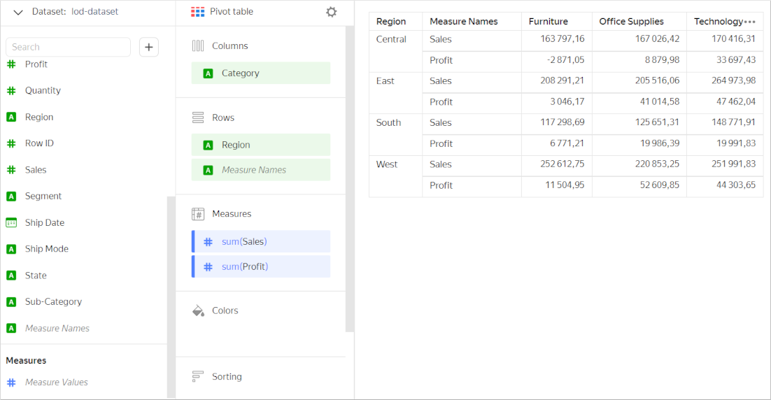
You can edit grouping by table measure names. To do this, drag the Measure Names field to the Rows section.
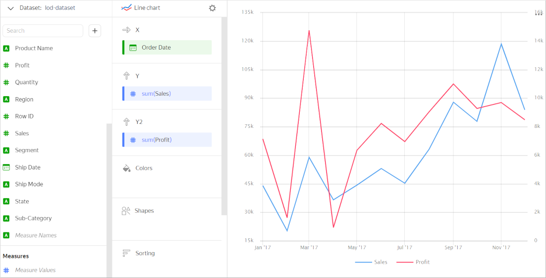
Example 2
Let's use the chart to show monthly sales during a year.
To display the year’s data, add a filter by sales date. To do this, drag the Order Date dimension to Filters and set filtering conditions:
- Operation:
Falls within the range - Start:
Exact date,01.01.2017 - End:
Exact date,31.12.2017
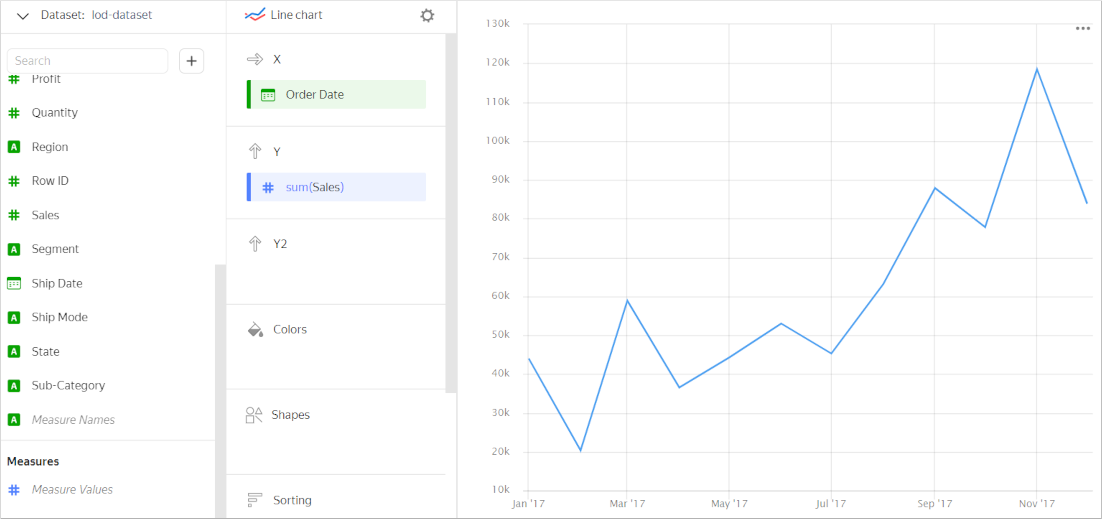
Now let's add a second Y axis to show the profit.
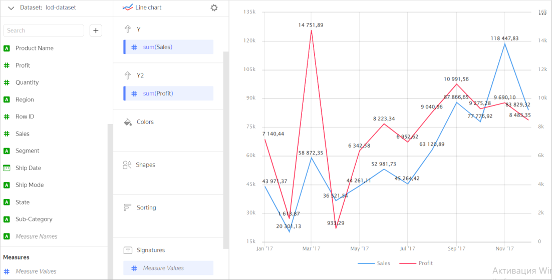
Add labels with measure values to each line. The chart uses two measures, but you can only add one of them to the Labels section. To label each line in this case, add Measure Values to Labels. Every line will be labeled by values of its measure.
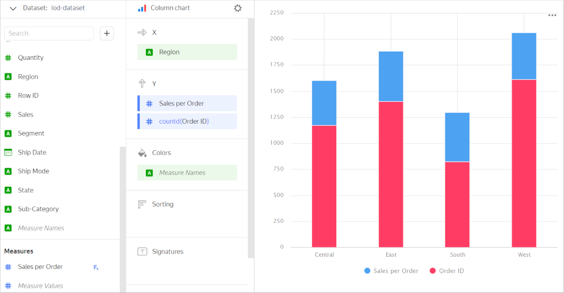
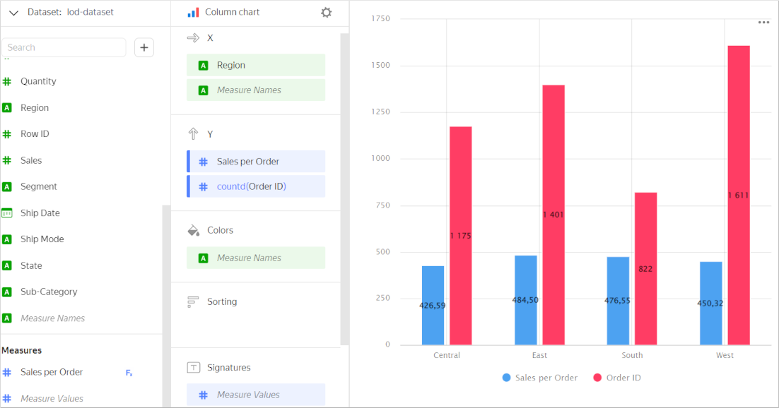
Example 3
Compare the number of orders and average spend by region:
- Add the
Sales per Orderfield with thesum([Sales])/COUNTD([Product ID])formula to display the average spend. - Drag the
Order IDdimension from the field list to the Y section to display the number of orders; theNumber of uniqueaggregation will automatically apply to this dimension.
Add the measures to the Y section to build a stacked column chart. The Measure Names field will be added automatically to the Colors section for grouping by measure name.
This is not the best way to compare measures, though. Showing an X axis grouped column chart would be a better idea. To do this, drag the Measure Names dimension to the X section.
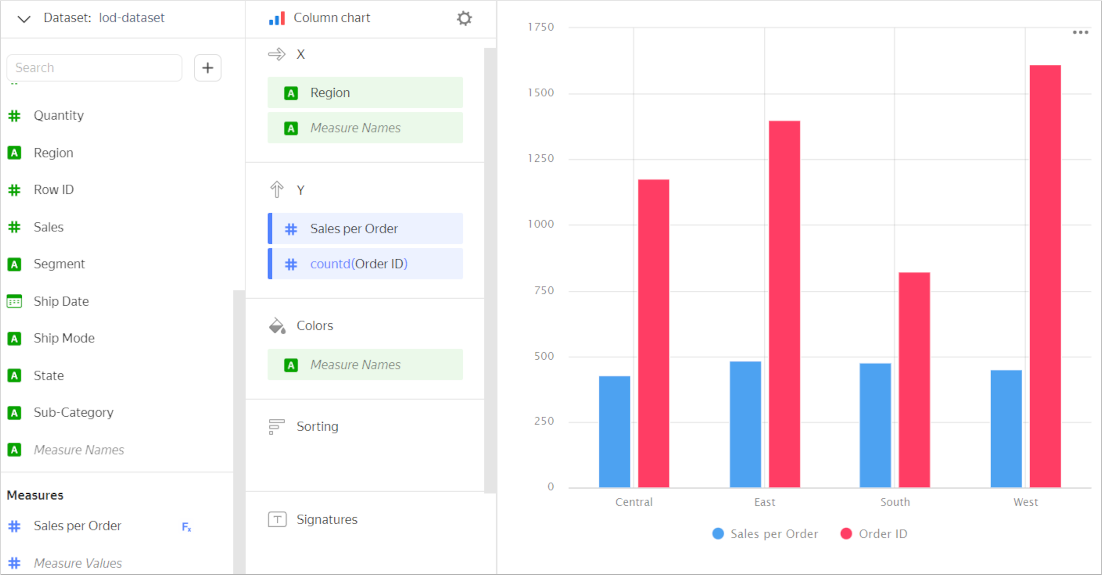
To label each column with its respective measure value, add Measure Values to the Labels section.
Limitations
The following restrictions apply to the Measure Names and Measure Values fields:
- You cannot use
Measure NamesandMeasure Valuesto filter your chart. - You can use
Measure Valuesto sort data only in the Area chart in Yandex DataLens and Normalized stacked area chart in Yandex DataLens charts after addingMeasure Namesto the Colors section.