Getting started with Yandex DataLens
This section outlines how you can connect to a data source, create your first dataset, build several data visualization charts, and put them on a dashboard.
Getting started
To get started with DataLens:
- Log in to your Yandex account. If you do not have an account, create one.
- Open the DataLens home page.
- Click Start in cloud.
- Confirm that you have read the Terms of use and click Log in.
-
Log in to your Yandex account.
-
Open the DataLens home page.
-
Click Start in cloud.
-
Select one of these options:
-
If you already have an organization, select it from the drop-down menu in the Organizations tab and click DataLens.
Note
To activate a DataLens instance, the user must have the
adminorownerrole. For more information about roles, see Access management in Yandex Identity Hub. -
If you have a cloud but no organization, click Add new DataLens. In the window that opens, enter a name and description for your organization and click Create organization and DataLens. For more information about working with organizations, see Getting started with organizations.
-
If you encounter a technical issue with the service, contact Yandex Cloud support. To ask for advice, discuss a solution to your issue, or explore current best practices, join the DataLens chat in Telegram.
Create a connection
Connections contain information about data source access parameters, such as the DB host IP address and port. You can create datasets based on connections.
To create a connection:
-
Go to the DataLens home page.
-
In the left-hand panel, click Connections.
-
Click Create connection.
-
Under Databases, select the ClickHouse® connection.
-
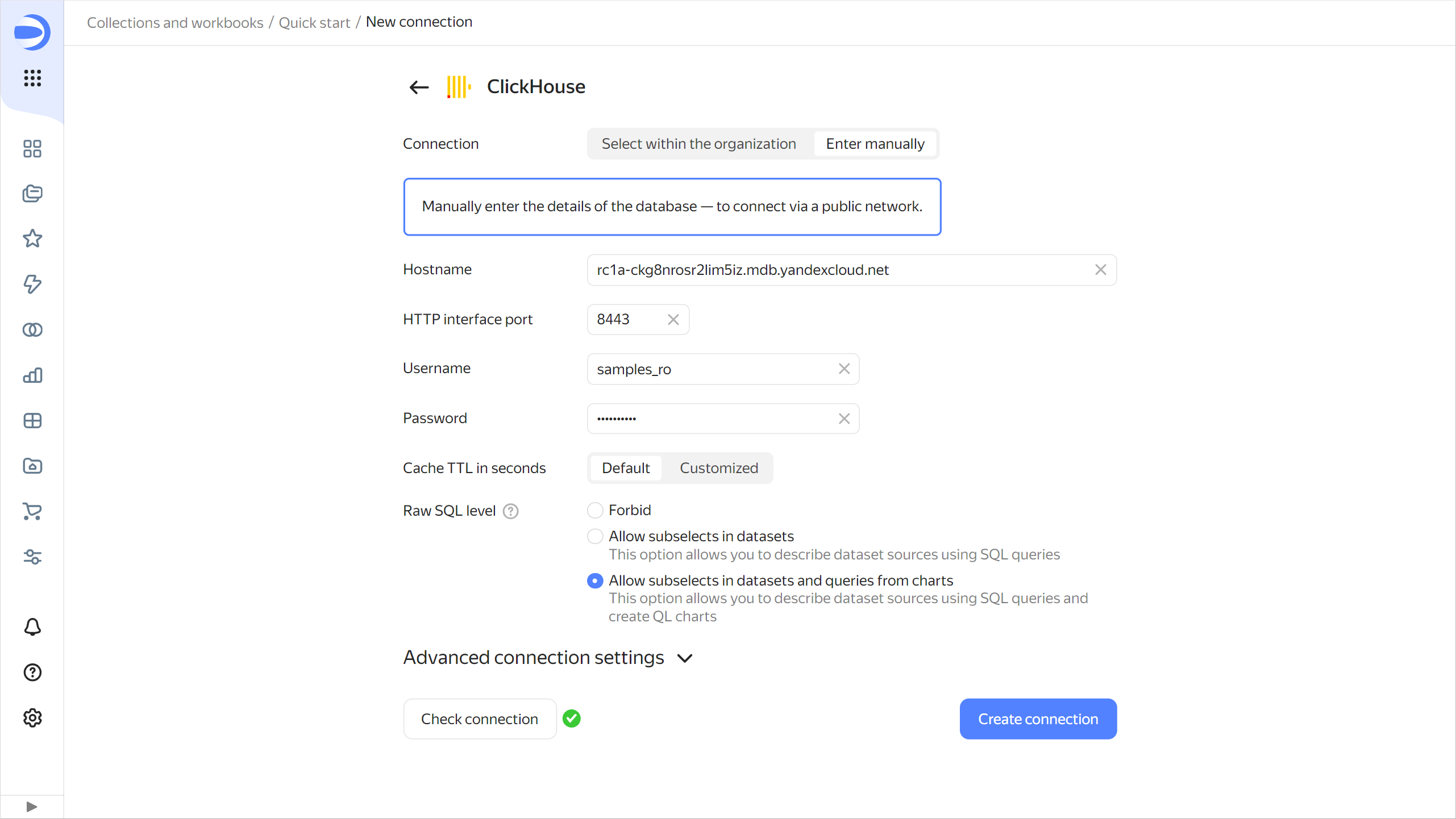
In the window that opens, select
Specify manuallyfor the connection type and provide the following connection parameters:- Host name:
rc1a-ckg8nrosr2lim5iz.mdb.yandexcloud.net - HTTP interface port:
8443(default). - Username:
samples_ro. - Password:
MsgfcjEhJk.
- Host name:
-
Enable Allow subqueries in datasets and queries from charts.
-
Click Check connection and make sure you get a green check mark.
-
Click Create connection.
-
In the window that opens, click Create workbook.
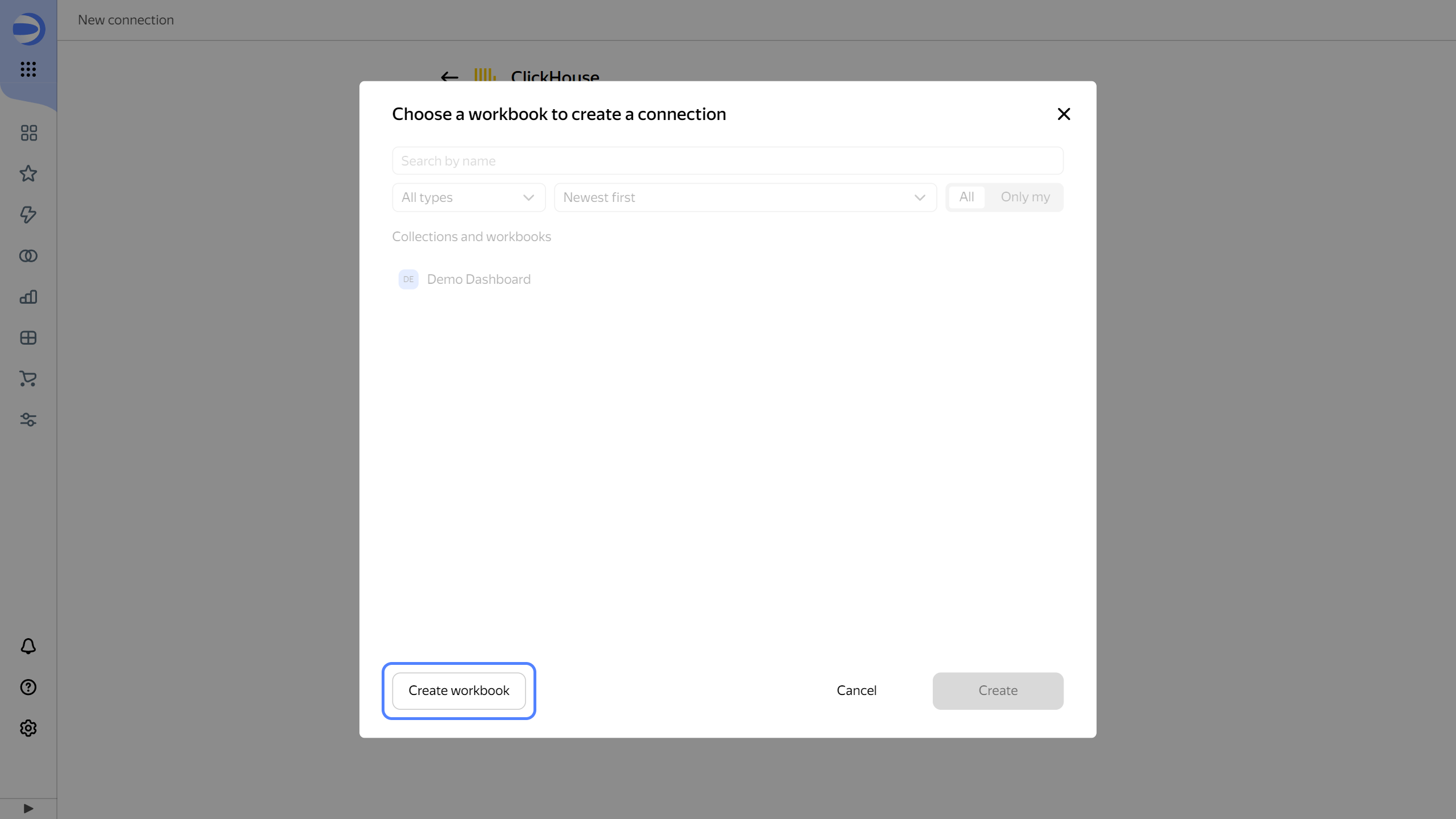
-
Enter
Quick startfor the workbook name and click Create. -
Select the workbook you created and click Create.
-
Enter
Sample ClickHousefor the connection name and click Create.
-
Wait for the connection to be saved.
Create a dataset
A dataset describes a set of data and its structure. It is created by connecting to a data source. A dataset is used when creating the following widgets:
To create a dataset based on the Sample ClickHouse connection:
-
In the top-right corner of the connection page, click Create dataset.
-
Drag the
MS_SalesMiniTabletable to the workspace.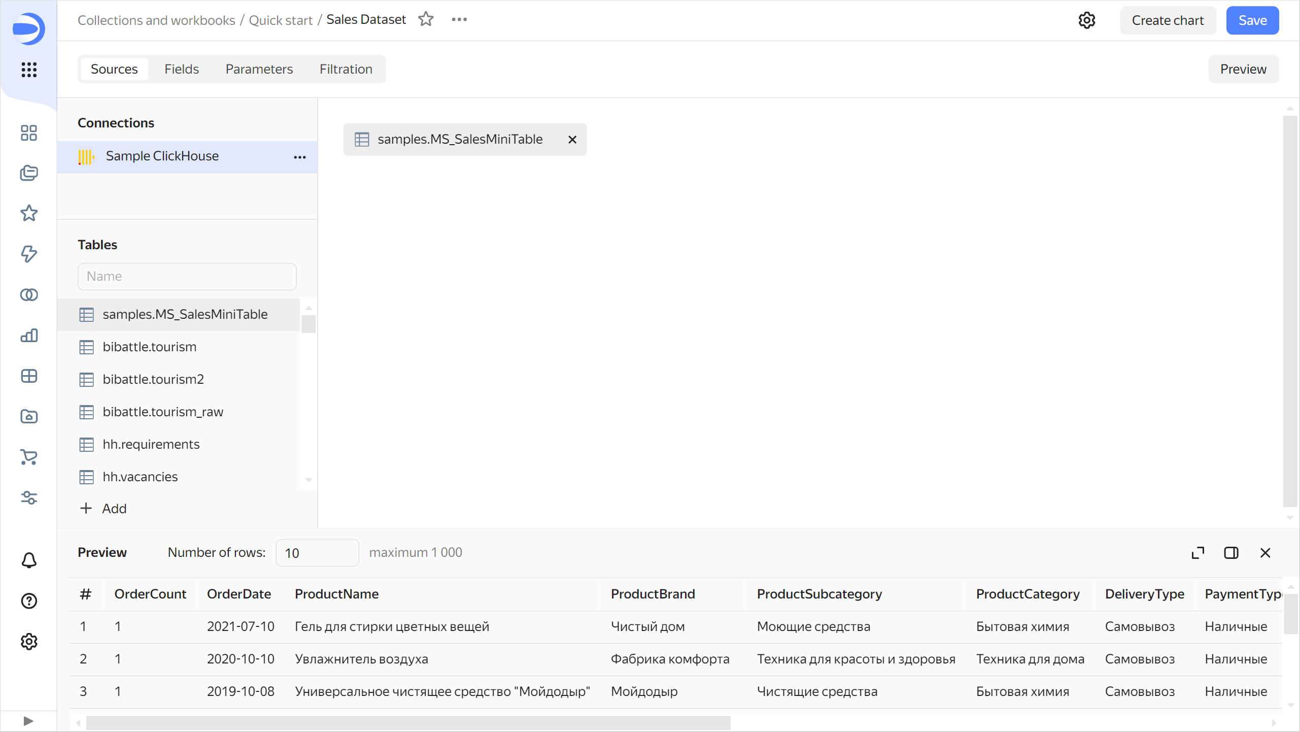
-
Navigate to the Fields tab.
-
Create a measure for the order amount. To do this, select Sum for the
Salesfield in the Aggregation column.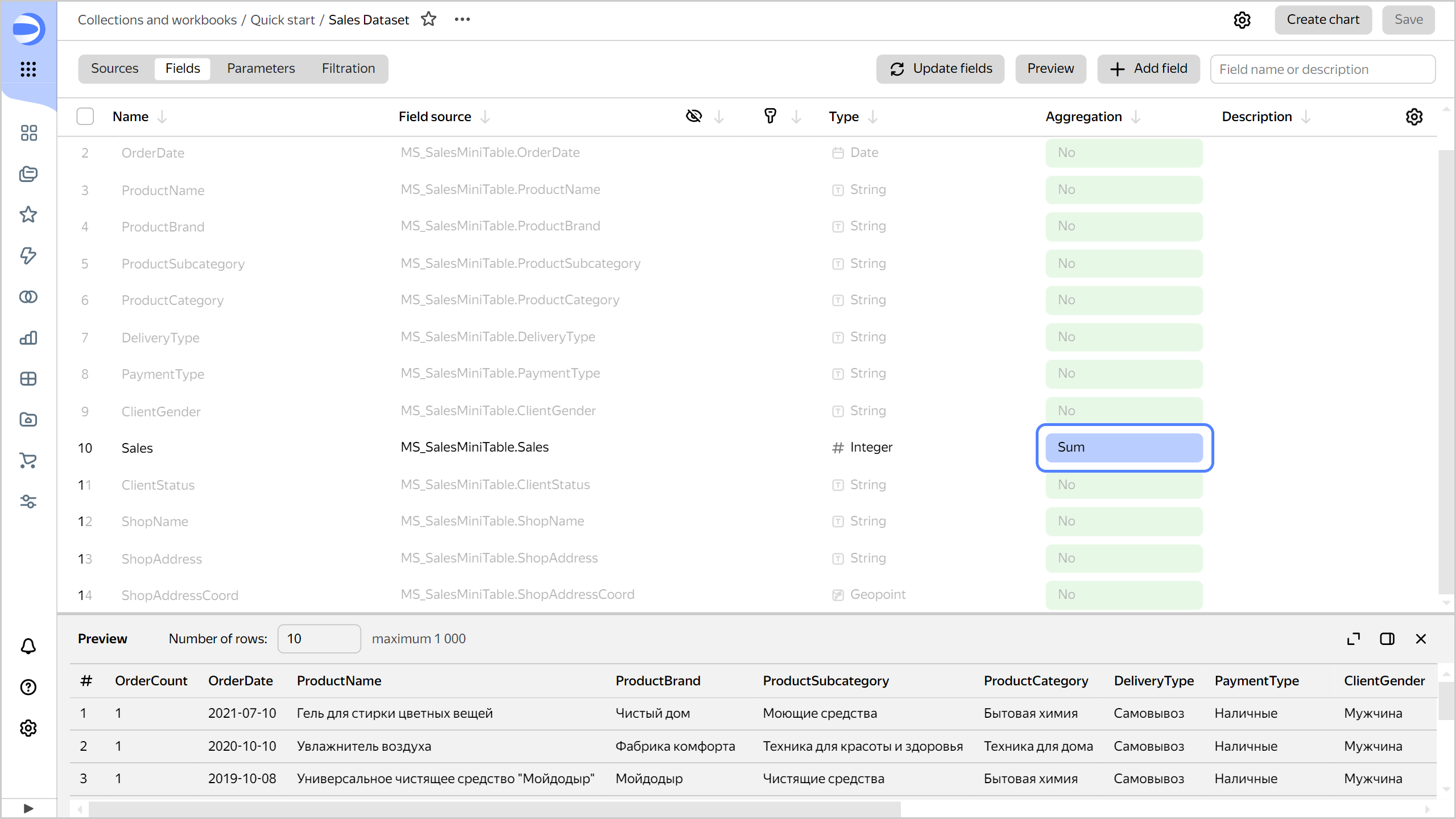
-
Create a measure for the number of orders:
- Rename the
OrderIDfield asOrderCount: click the field name, delete the current name, and enter the new one. - Select Number of unique for the
OrderCountfield in the Aggregation column.
- Rename the
-
Change the data type for the
ShopAddressCoordfield: select Geopoint in the Type column.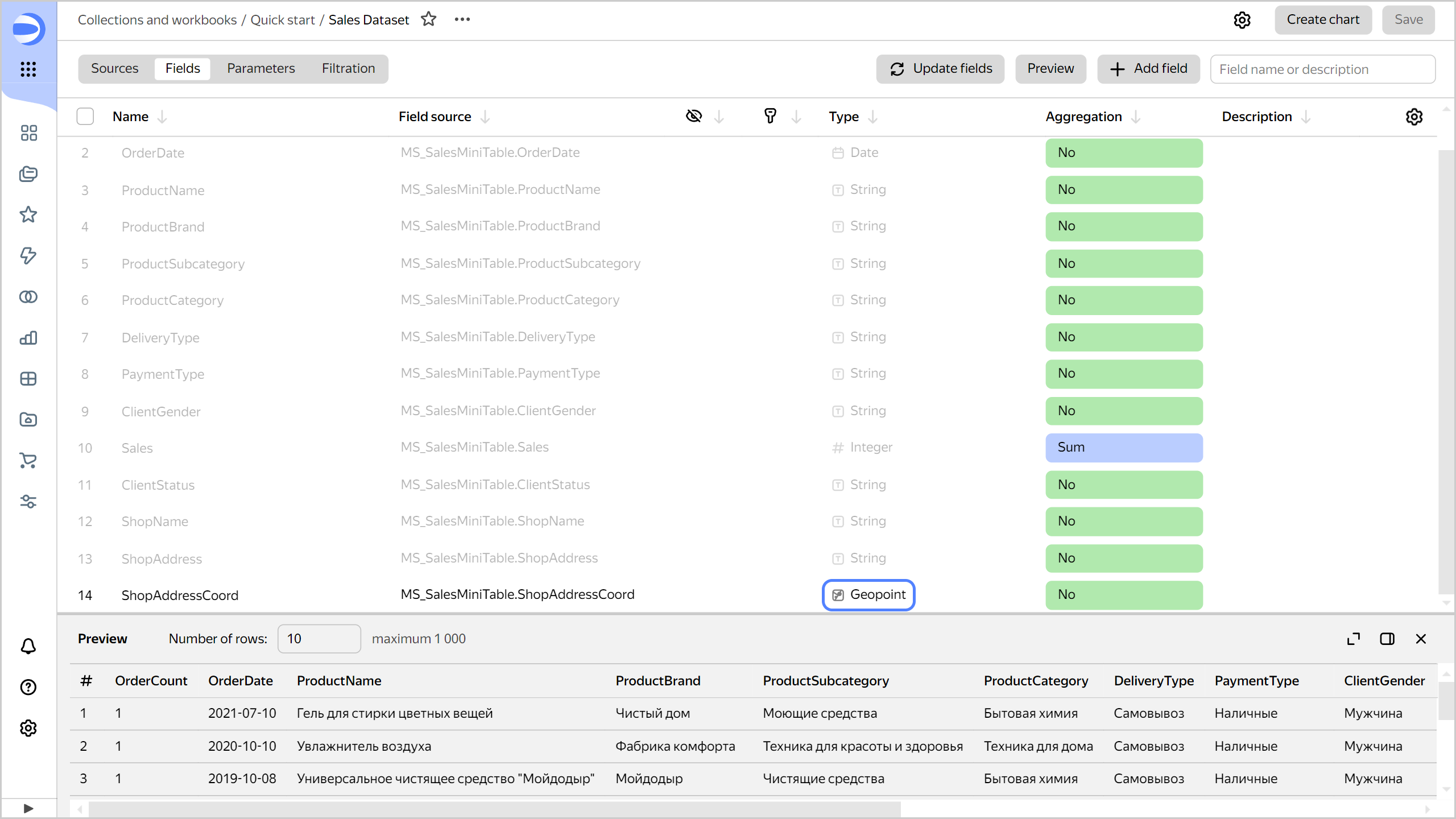
-
Save the dataset:
-
In the top-right corner, click Save.
-
Enter
Sales Datasetfor the dataset name and click Create.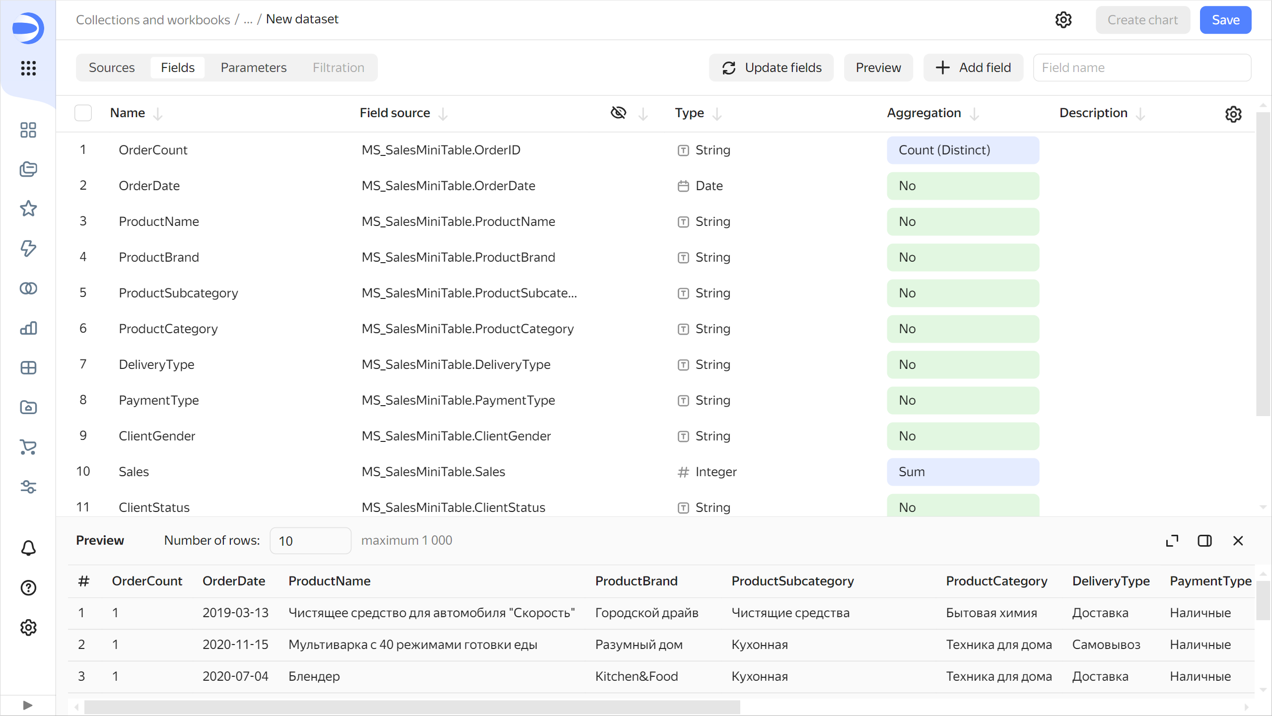
-
Create a column chart
A chart is a dataset visualization in the form of a table, diagram, or map.
To create a chart based on Sales Dataset:
-
Click Create chart in the top-right corner of the dataset page.
-
Add the product subcategory to the chart. To do this, drag the
ProductSubcategoryfield from Dimensions to the X section. -
Add a sales measure to the chart. To do this, drag the
Salesfield from Measures to the Y section. -
Sort the chart by sales in descending order by dragging the
Salesfield from Measures to the Sorting section. -
Save the chart:
-
In the top-right corner, click Save.
-
In the window that opens, enter the
Sales by subcategoryname for the chart and click Save.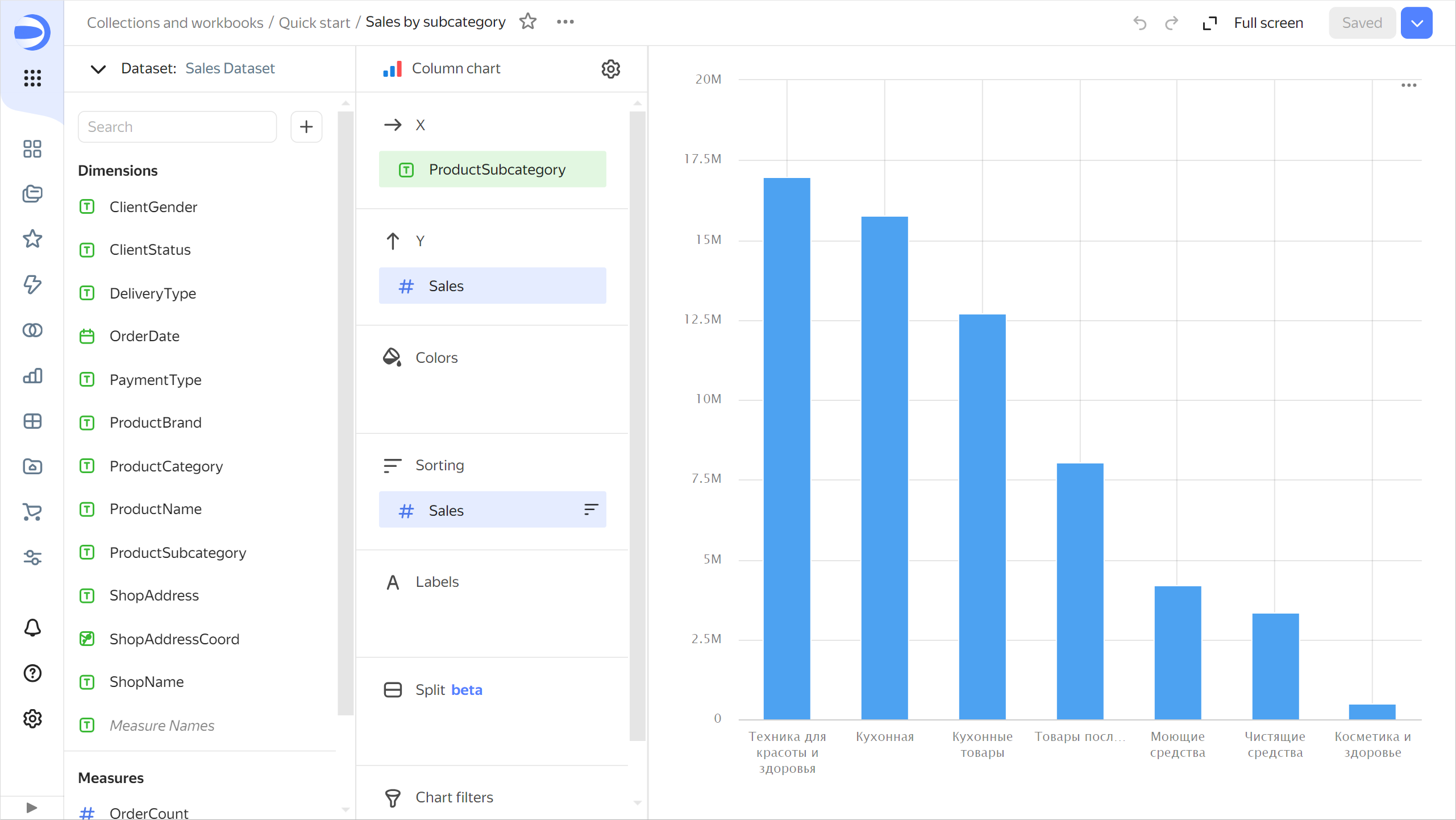
-
Create an area chart
-
Copy the chart you created in the previous step:
-
In the top-right corner, click → Save as copy.
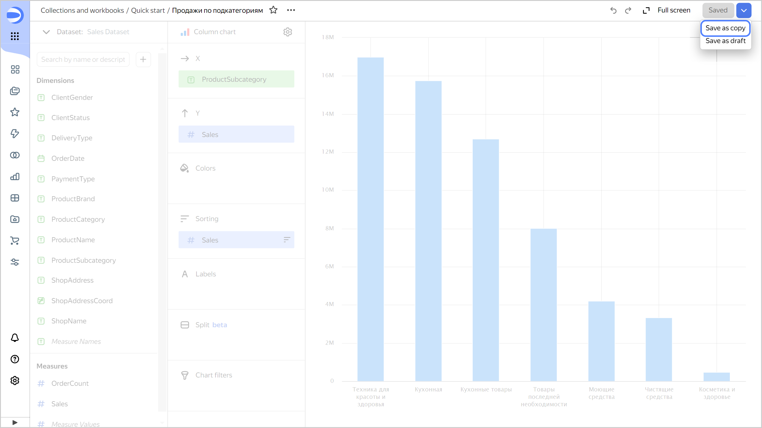
-
In the window that opens, enter the
Sales by weekname for the new chart and click Save.
-
-
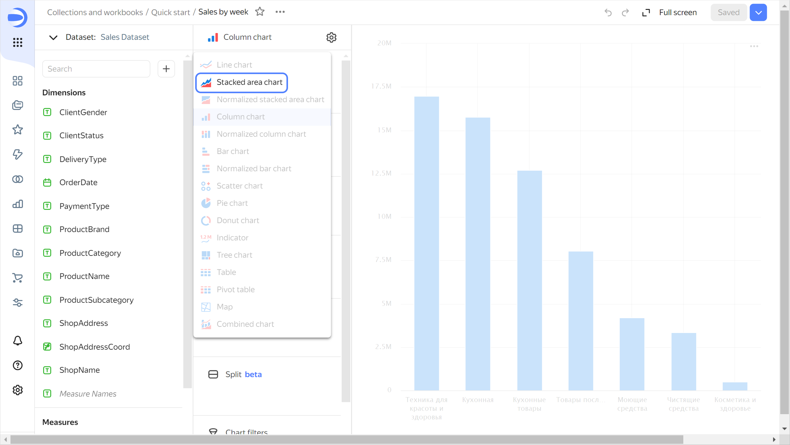
Select Area chart as the visualization type.
-
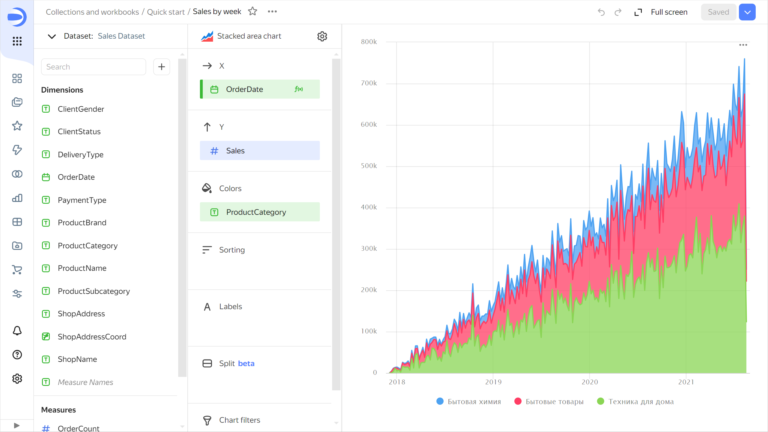
Replace the product subcategories with the order date on the X-axis. To do this, drag the
OrderDatefield from Dimensions to the X section and hold it over theProductSubcategoryfield until the latter turns red. -
Add the product category to the chart. To do this, drag the
ProductCategoryfield from Dimensions to the Colors section. -
Display a week by week chart:
-
Click the calendar icon next to the
OrderDatefield in the X section. -
In the Grouping field, select Rounding → Week.
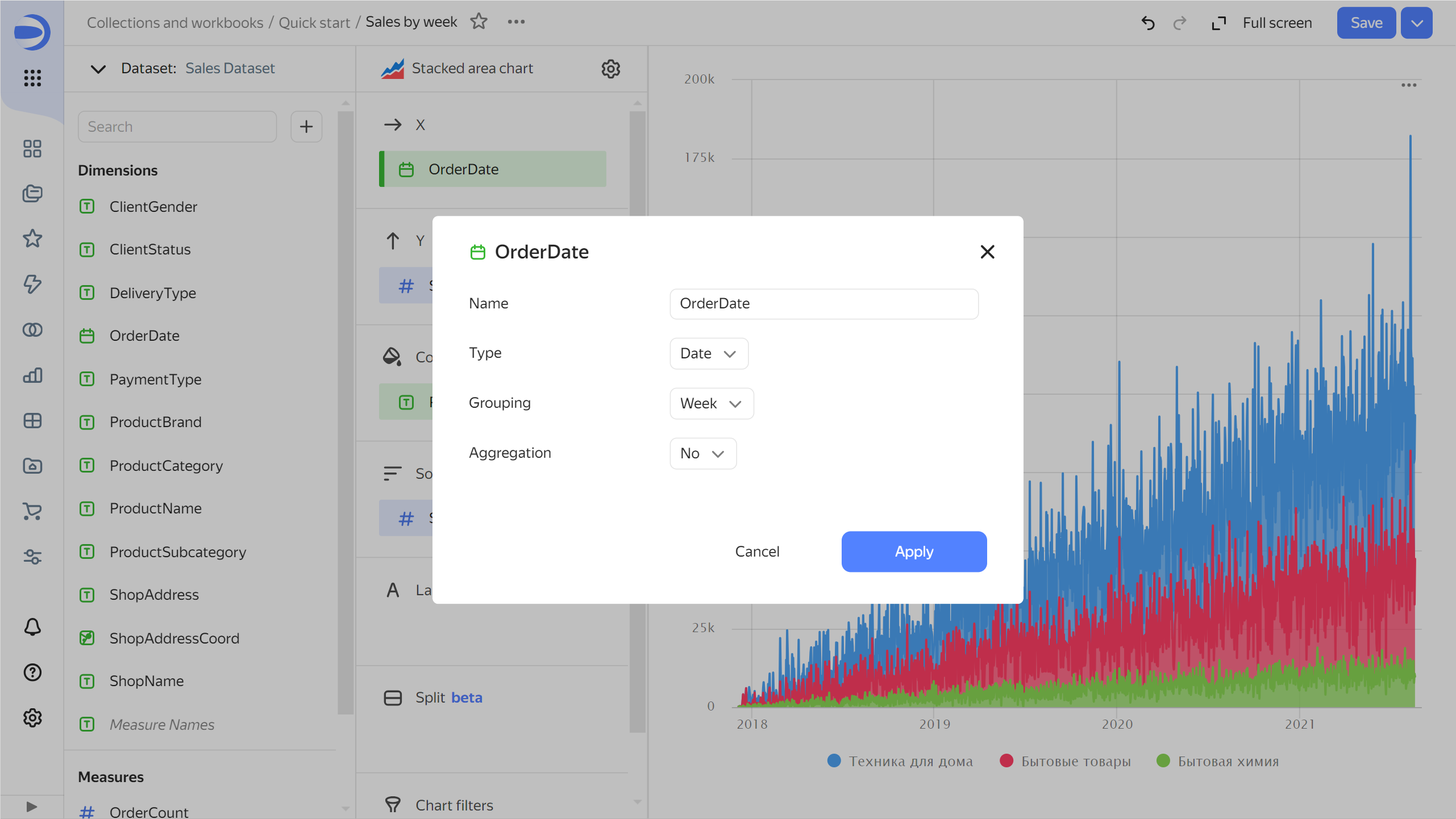
-
Click Apply.
-
-
Remove sorting by sales: click (the icon appears when you hover over the field) next to the
Salesfield in the Sorting section. -
In the top-right corner, click Save.
Create a map chart
-
Copy the chart you created in the previous step:
- In the top-right corner, click → Save as copy.
- In the window that opens, enter the
Sales mapname for the new chart and click Save.
-
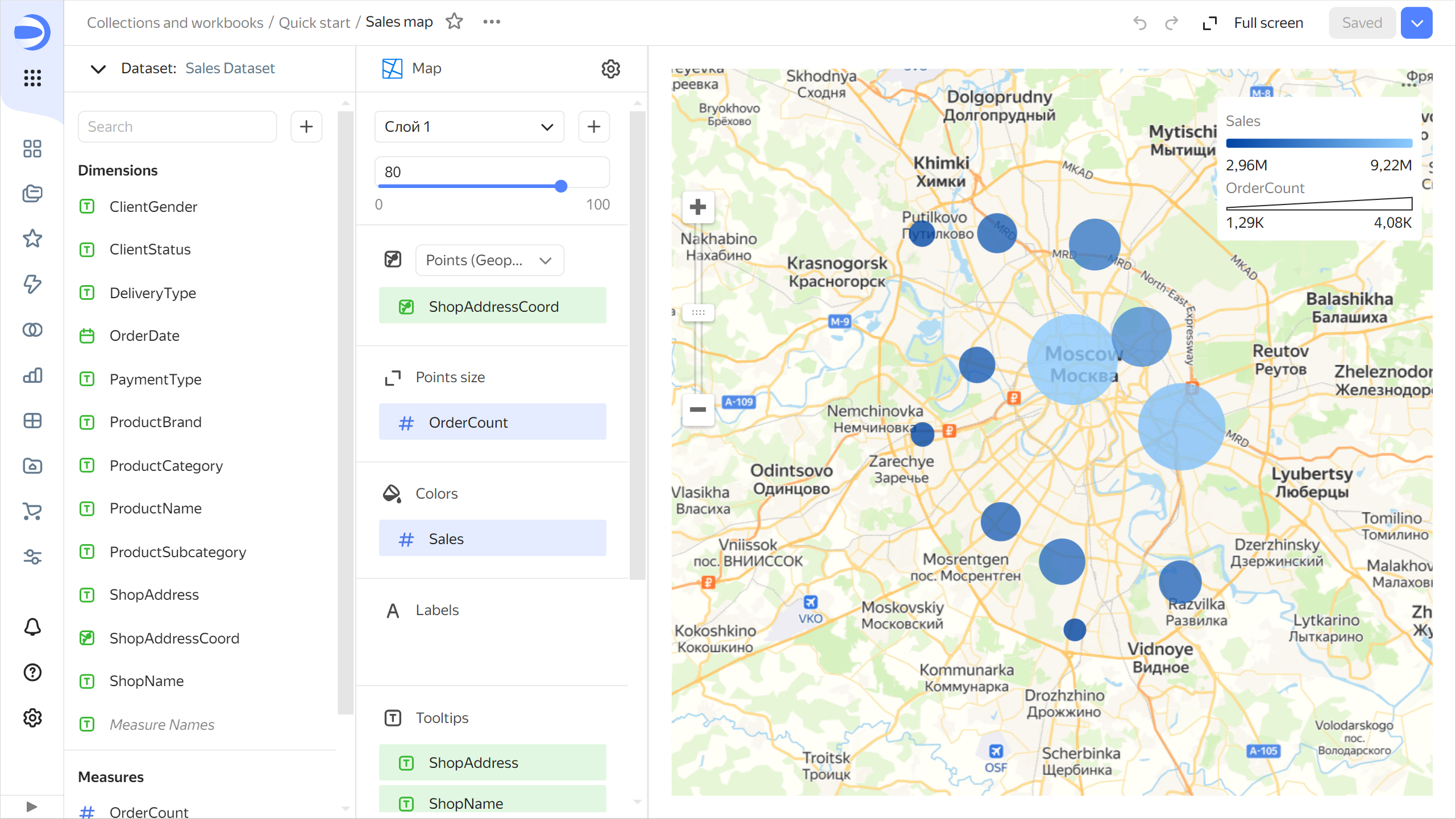
Select the Map visualization type.
-
Add the coordinates of the points of sale to the map. To do this, drag the
ShopAddressCoordfield from Dimensions to the Points (Geopoints) section. -
Change the point size based on the number of orders. To do this, drag the
OrderCountfield from Measures to the Point size section. -
Change the point color based on the sales measure. To do this, drag the
Salesfield from Measures to the Colors section. -
Add the following fields to the Tooltips section:
ShopAddressShopNameSalesOrderCount
-
In the top-right corner, click Save.
Create a dashboard and add charts to it
A dashboard is a page or multiple pages that contain widgets. It allows you to group your charts in the same place and add captions and titles to them.
To create a dashboard:
-
Go to the
Quick startworkbook by clicking its name in the chart path.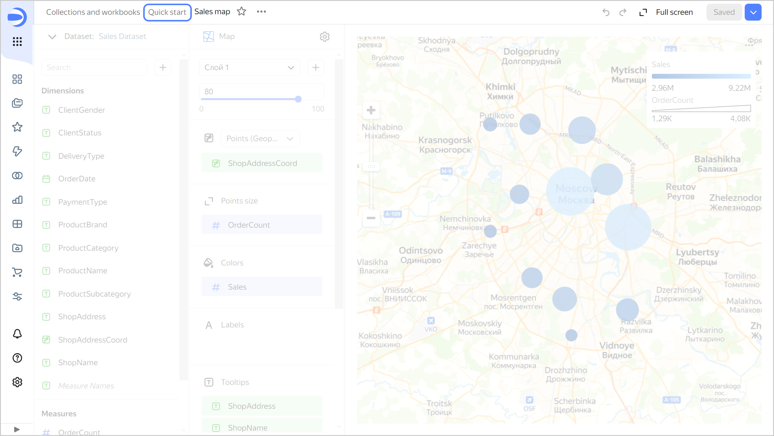
-
In the top-right corner, click Create → Dashboard.
-
In the panel at the bottom of the page, hold down Chart and drag it to desired position.
-
In the window that opens, click Select.
-
Select the
Sales mapchart.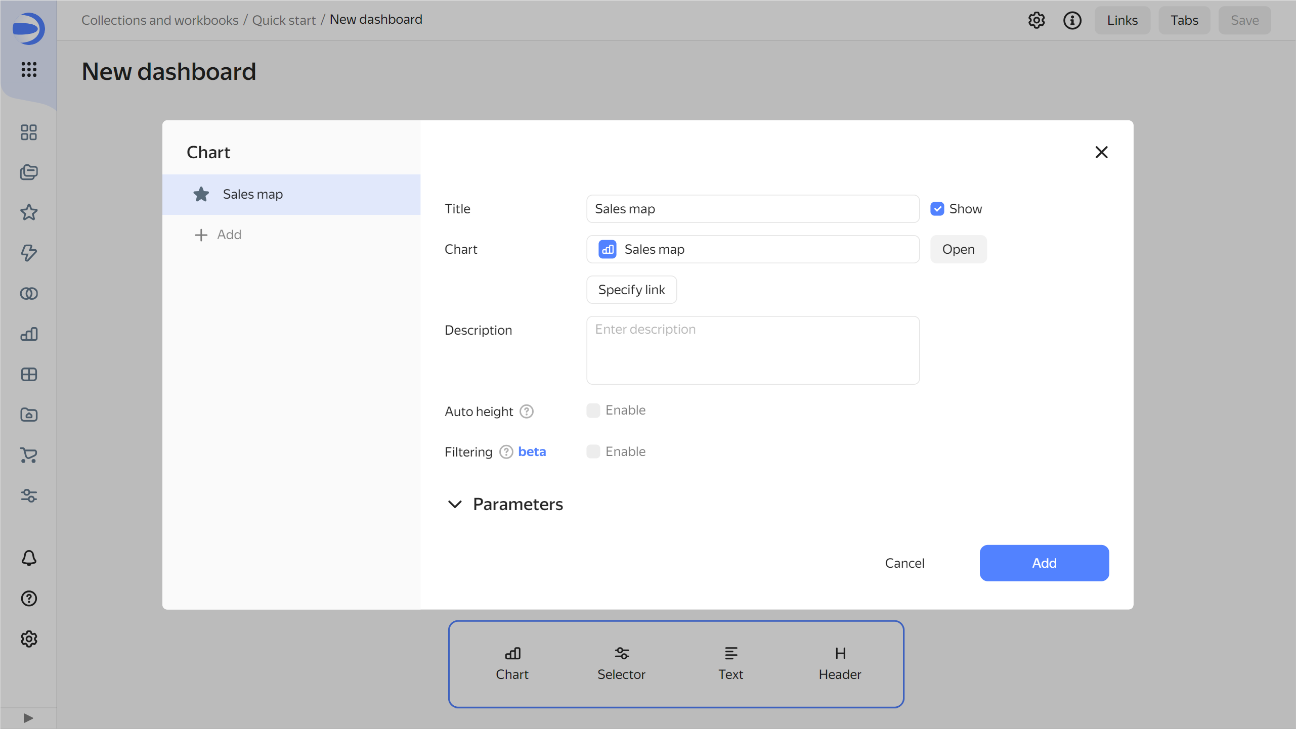
-
Click Add.
-
Repeat steps 3 through 6 to add the
Sales by subcategoryandSales by weekcharts. -
Adjust the size of the charts with your mouse and place them on the dashboard as you prefer.
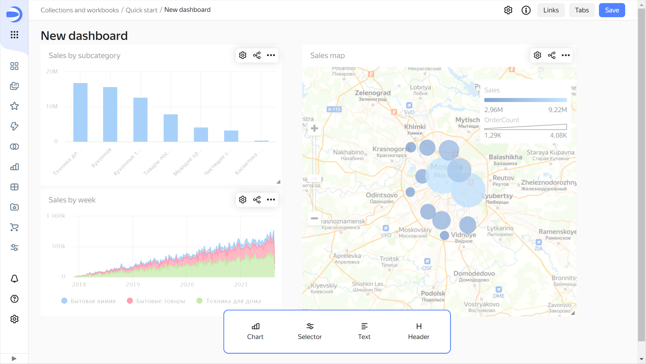
Set up chart filtering
Add filtering by the Sales map chart to the dashboard to filter other charts:
-
Hover over the
Sales mapchart and click in its top-right corner.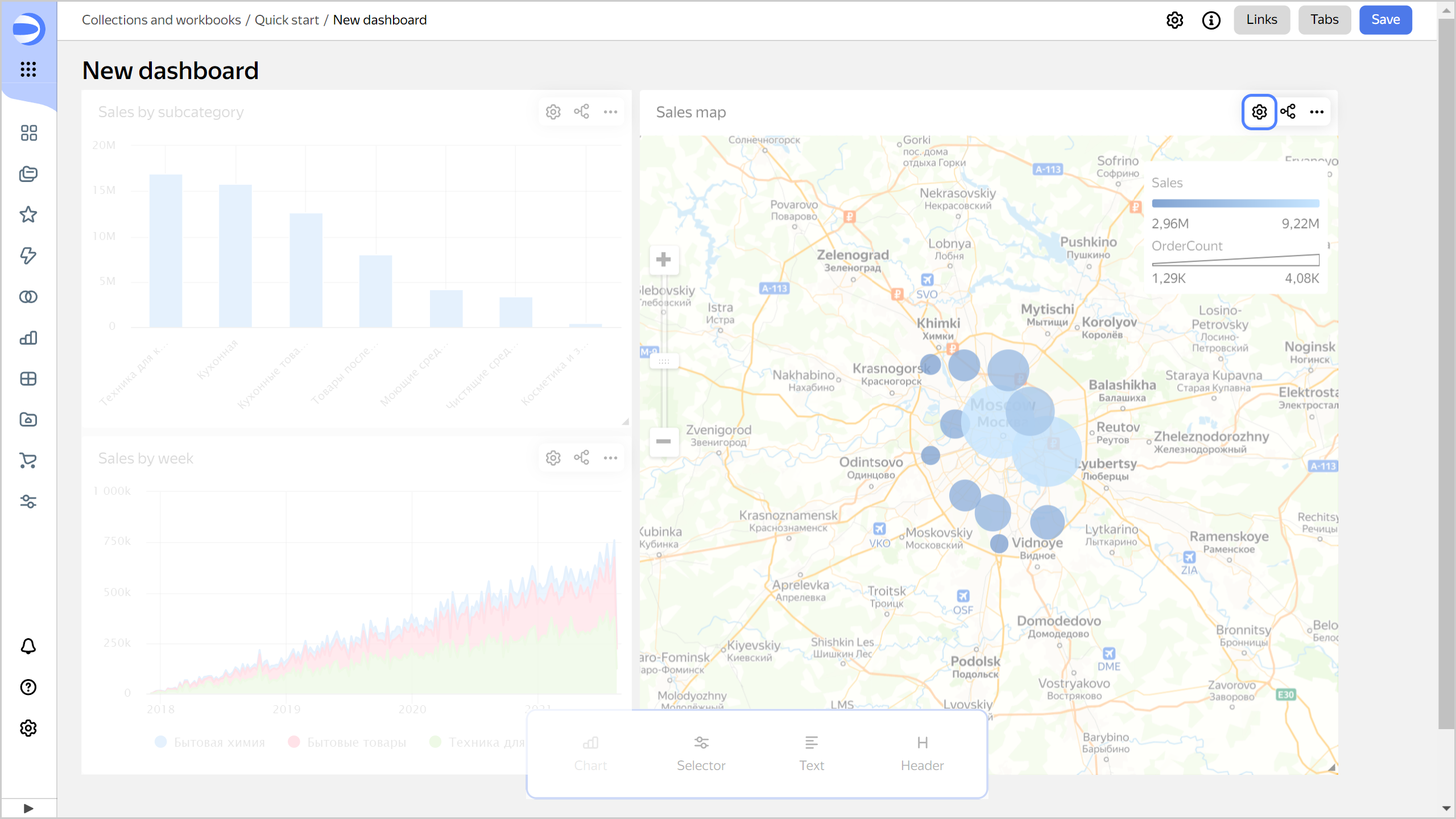
-
Enable Filtering.
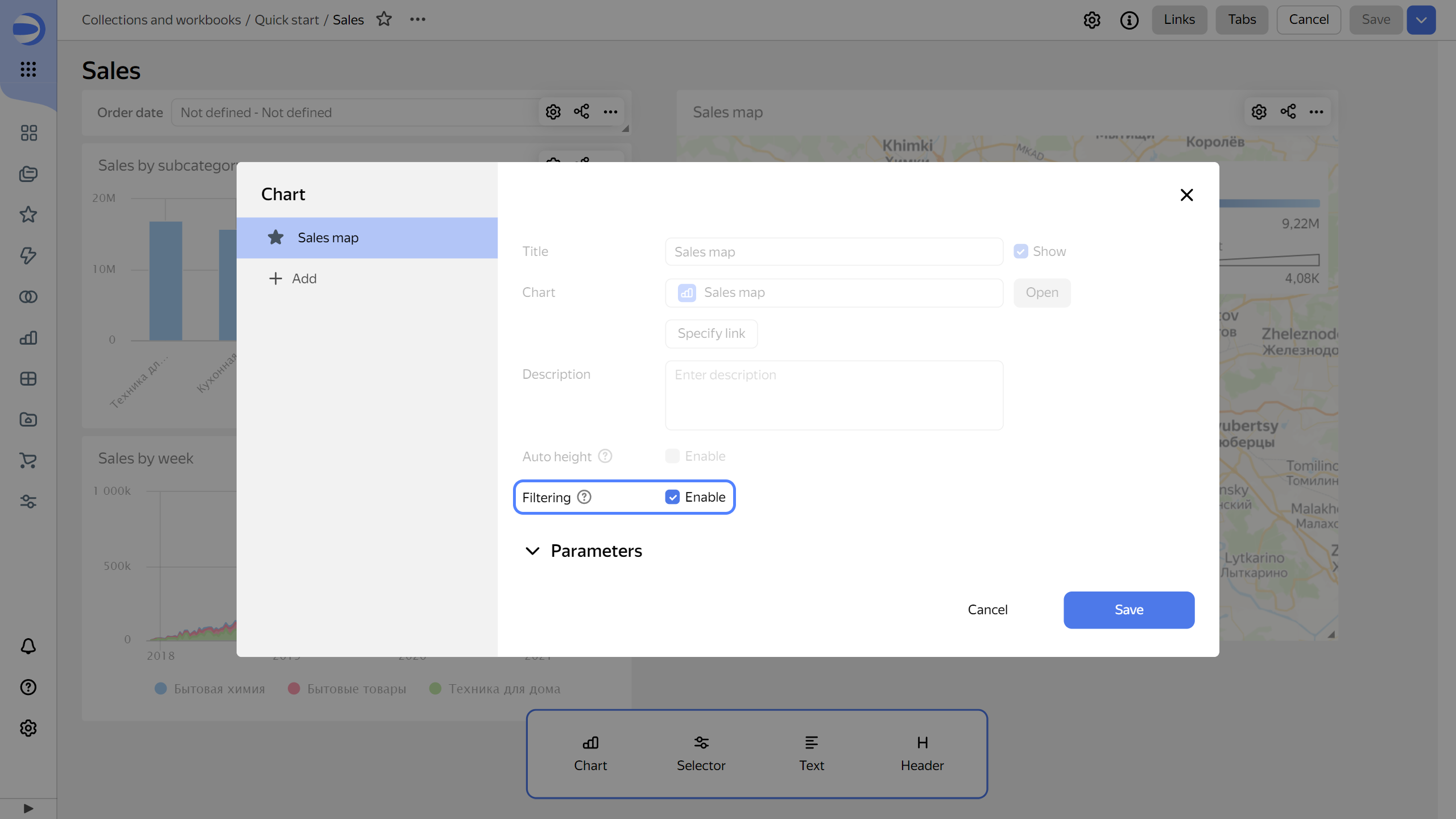
-
Click Save.
By default, the chart used for filtering filters data in all charts on the current dashboard tab that share the same dataset.
Add a selector to the dashboard
Selectors are filters that affect the results of queries in the linked widgets.
To add a selector to a dashboard:
-
In the panel at the bottom of the page, hold down Selector and drag it to desired position.
-
Add the calendar selector for the order date:
-
Select
Sales Dataset. -
Select the
OrderDatefield. -
In the Header field, enter
Order date. -
Enable Range.
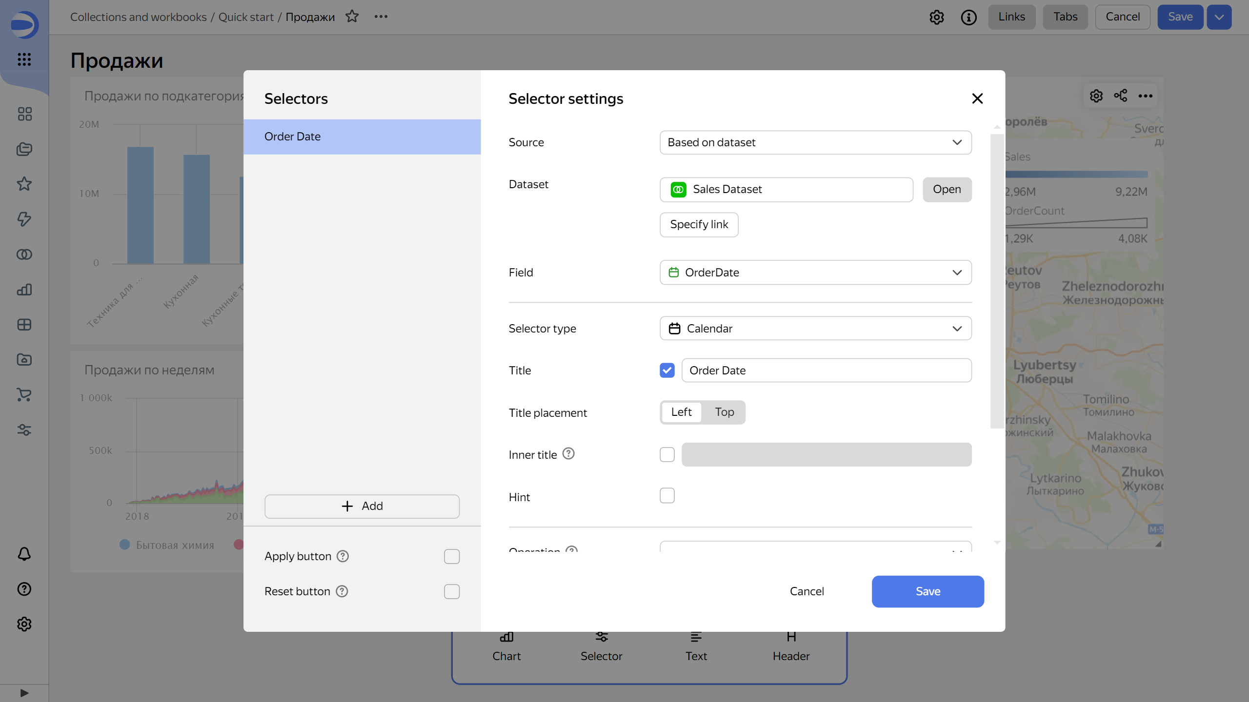
-
Click Save.
-
-
Position the selector on the dashboard wherever you like.
-
Save the dashboard:
-
In the top-right corner of the dashboard, click Save.
-
Enter
Salesfor the dashboard name and click Create.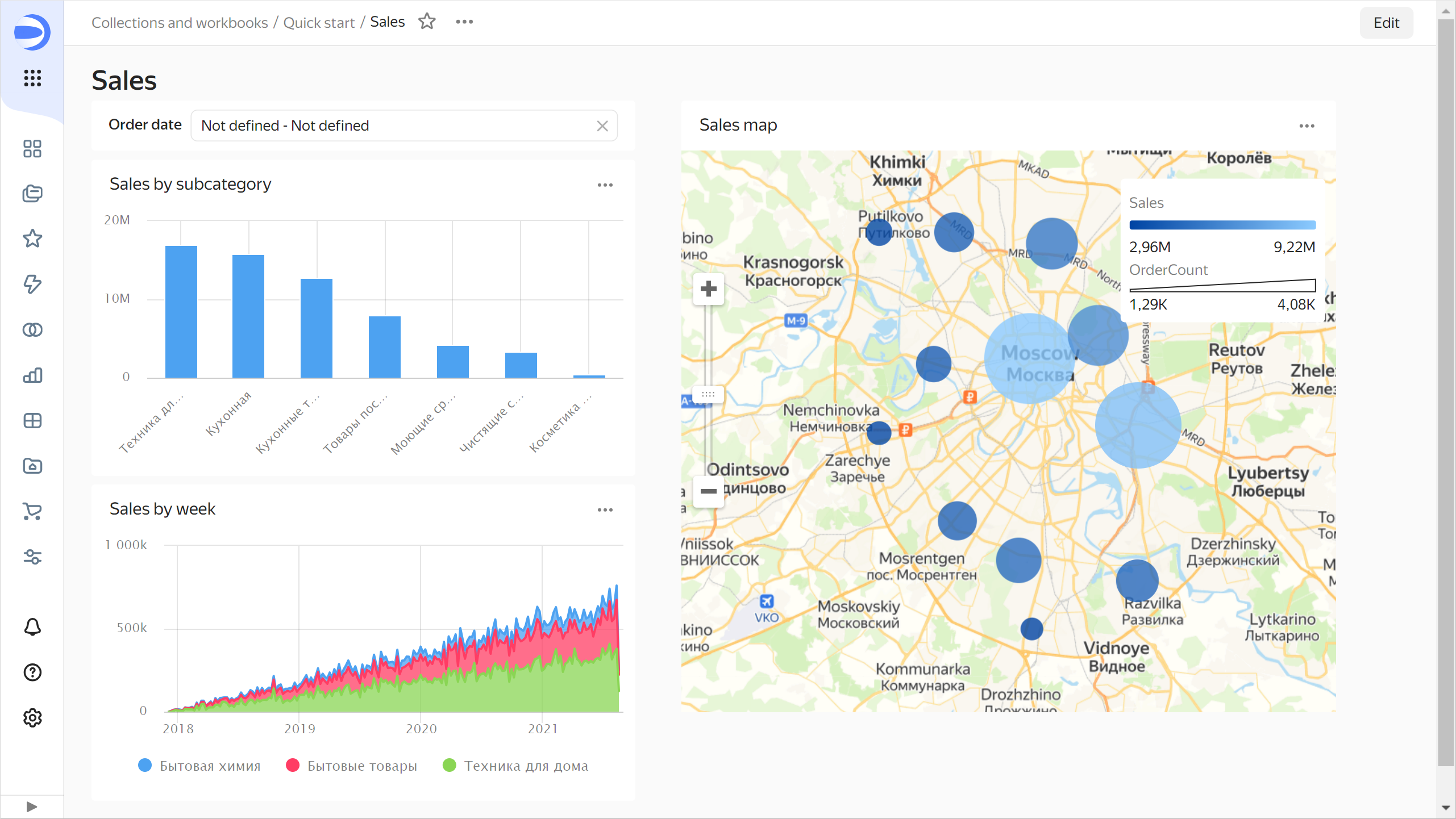
-
Learn how a dashboard works
-
Apply cross-chart filtering on the dashboard:
-
Click a point on the map in the
Sales mapchart. This will filter the linked charts by the selected dimension.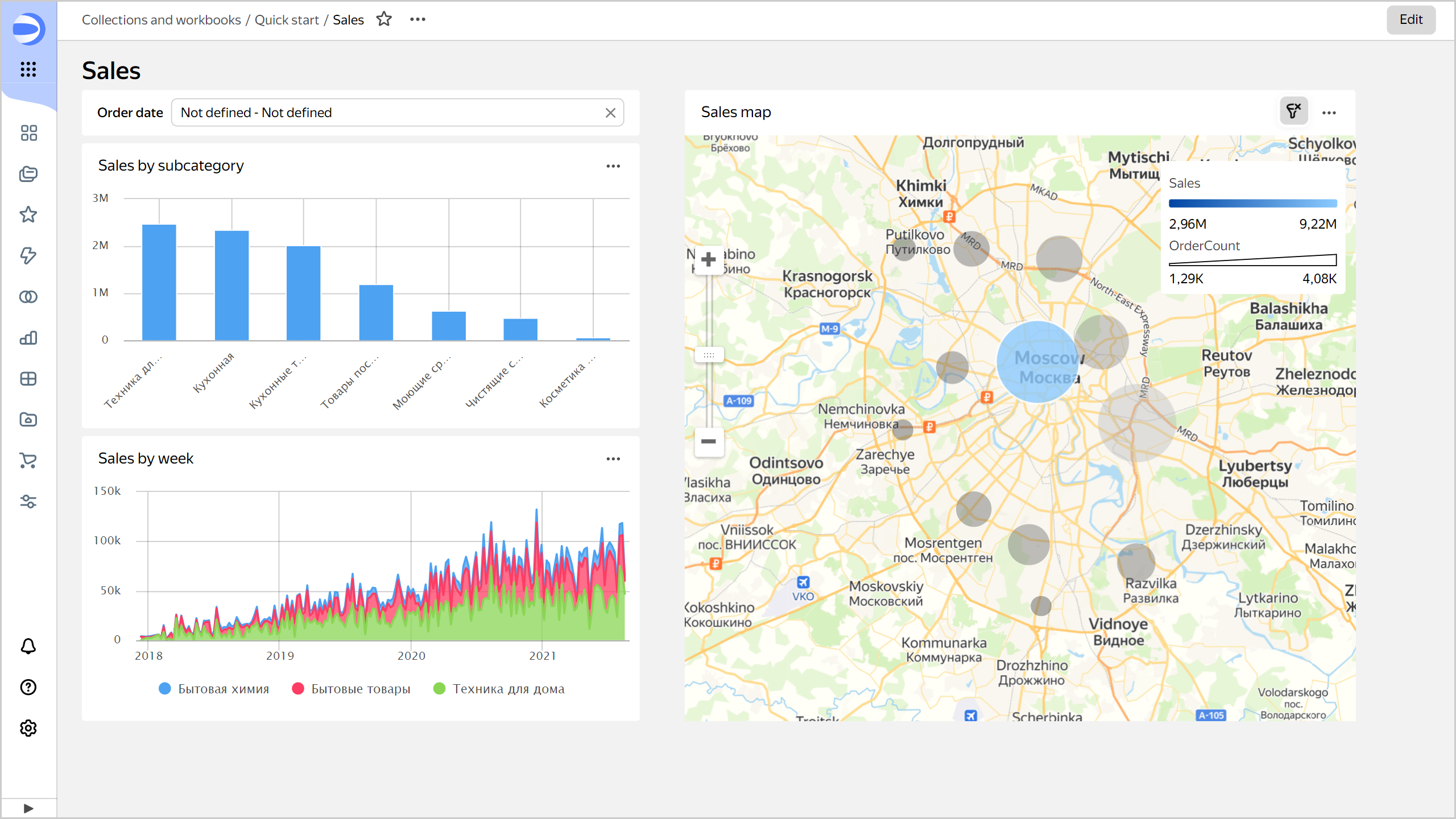
-
Clear chart filtering by clicking the selected point once more or in the top-right corner of the chart.
-
-
Use the
Order dateselector:-
In the
Order dateselector, enter the period start and end dates:01.01.2019 - 31.01.2019. -
This will filter data by the
OrderDatefield in all charts on the current tab that share the same dataset.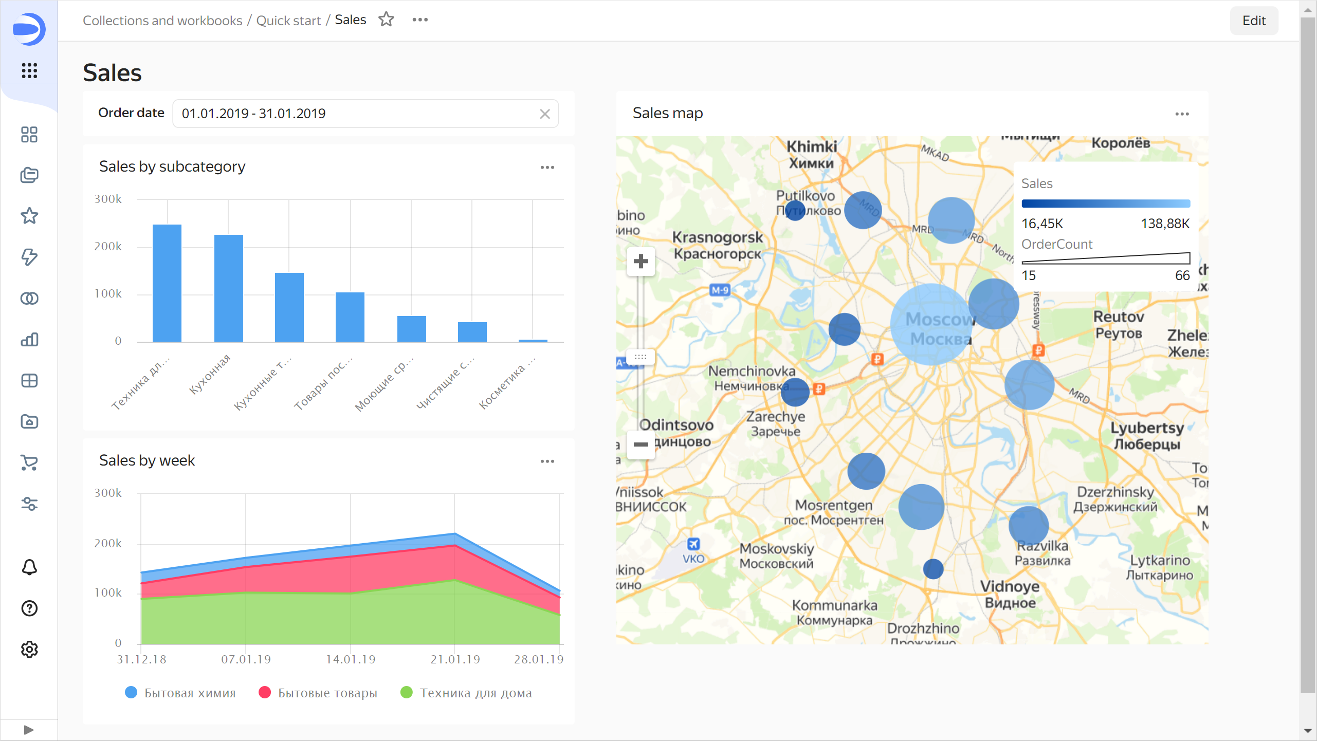
-
Clear selector filtering by clicking in the right corner of the selector.
-
Share the dashboard
You can grant access to your dashboard to other users:
-
Add users with a Yandex account to DataLens:
-
In the left-hand panel, select Service settings.
-
Select the Users tab.
-
Under Invite users, do the following.
-
Enter the email addresses of the users you want to invite, e.g.,
login@yandex.com.You can send invitations to any email address. Invited users will be able to select the appropriate Yandex account once they accept the invitation.
-
Click Send invitation.
Once the user accepts the invitation and selects the account for login, they can log in to your organization and start using DataLens. The user will get the
datalens.creatorrole in the organization with the current DataLens instance. To log in to DataLens, the user will need a seat.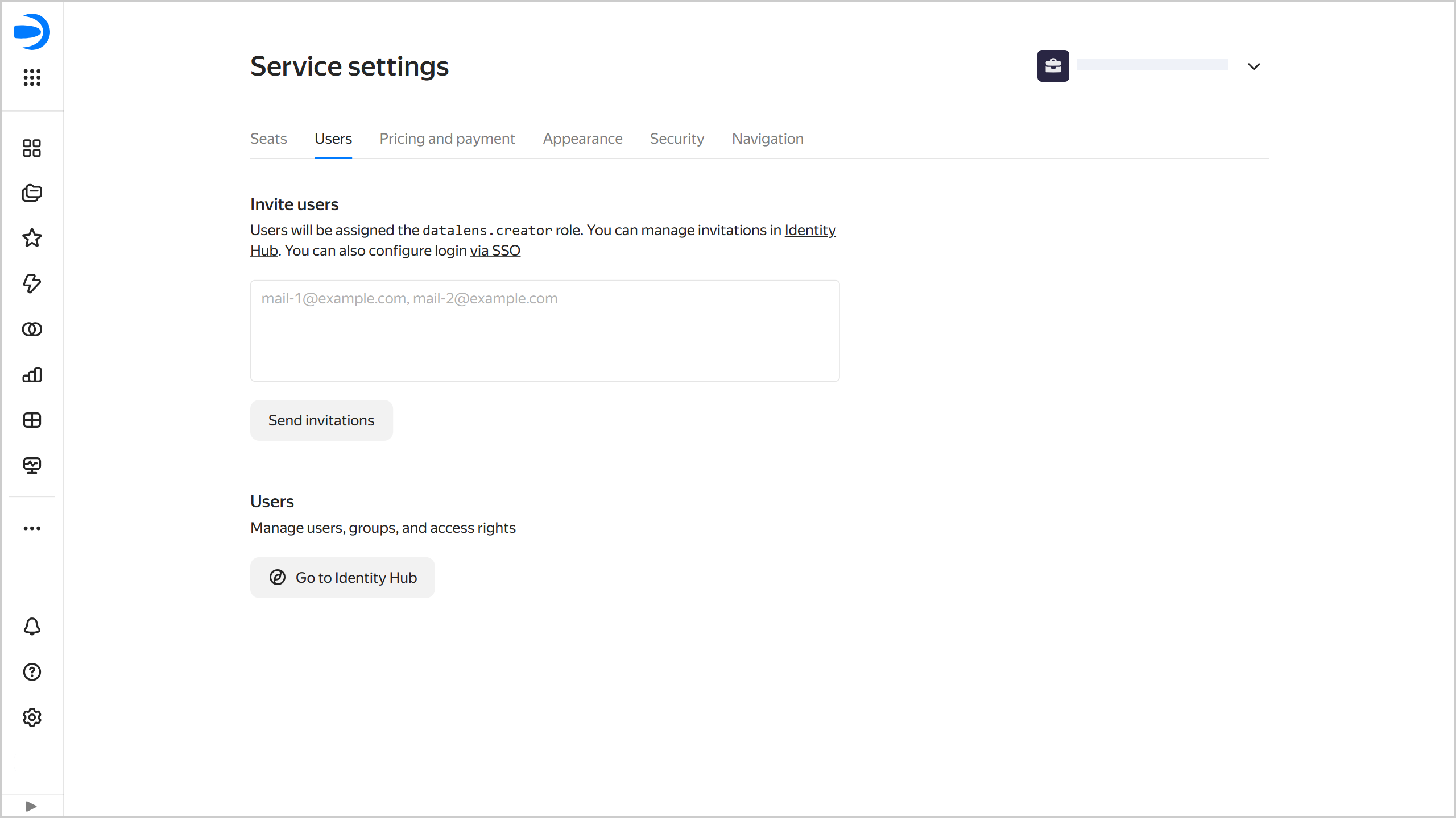
-
-
Configure access permissions for a workbook:
-
In the left-hand panel, select Collections and workbooks.
-
Click next to the
Quick startworkbook and select Access.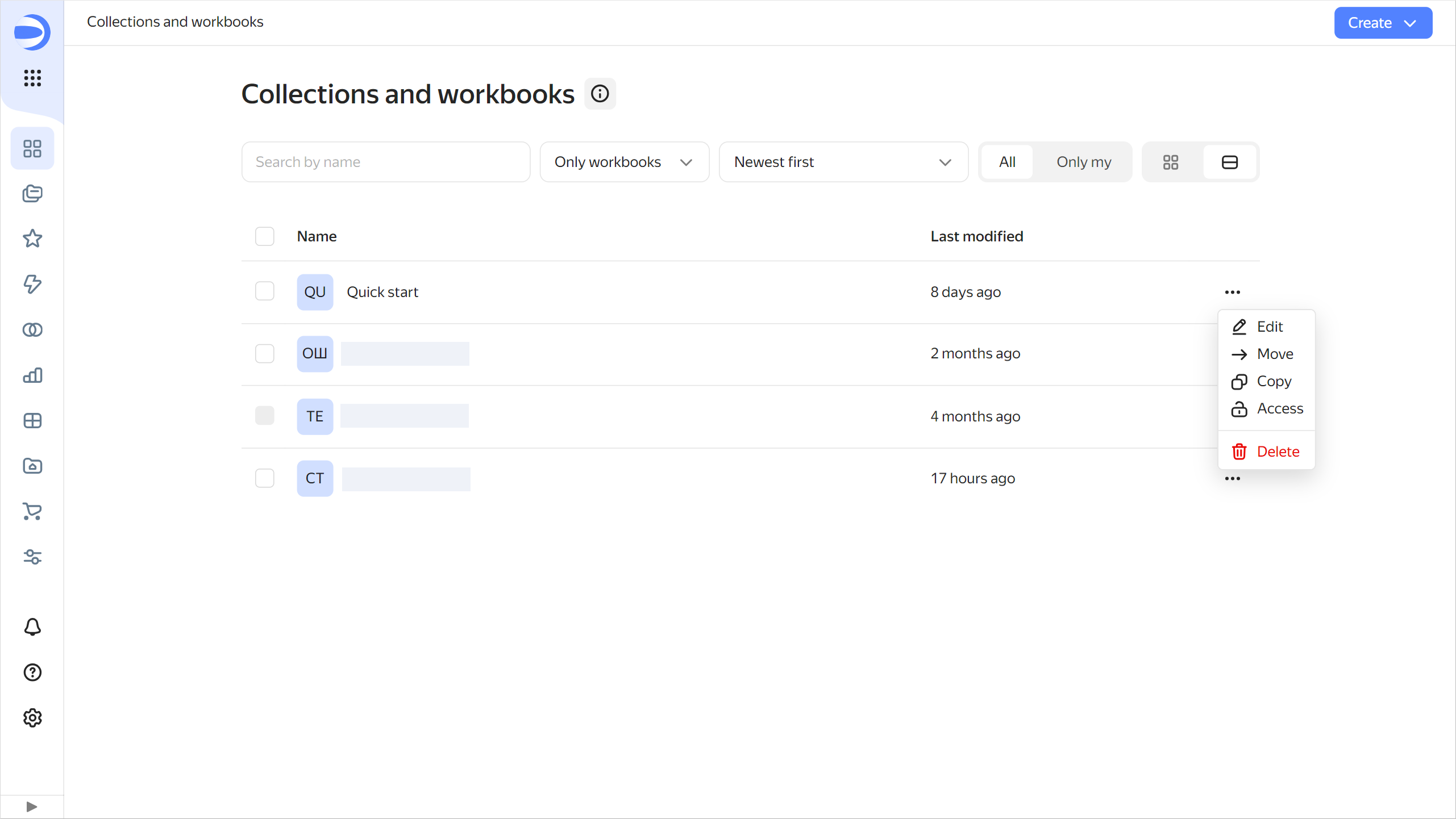
-
Click Add user.
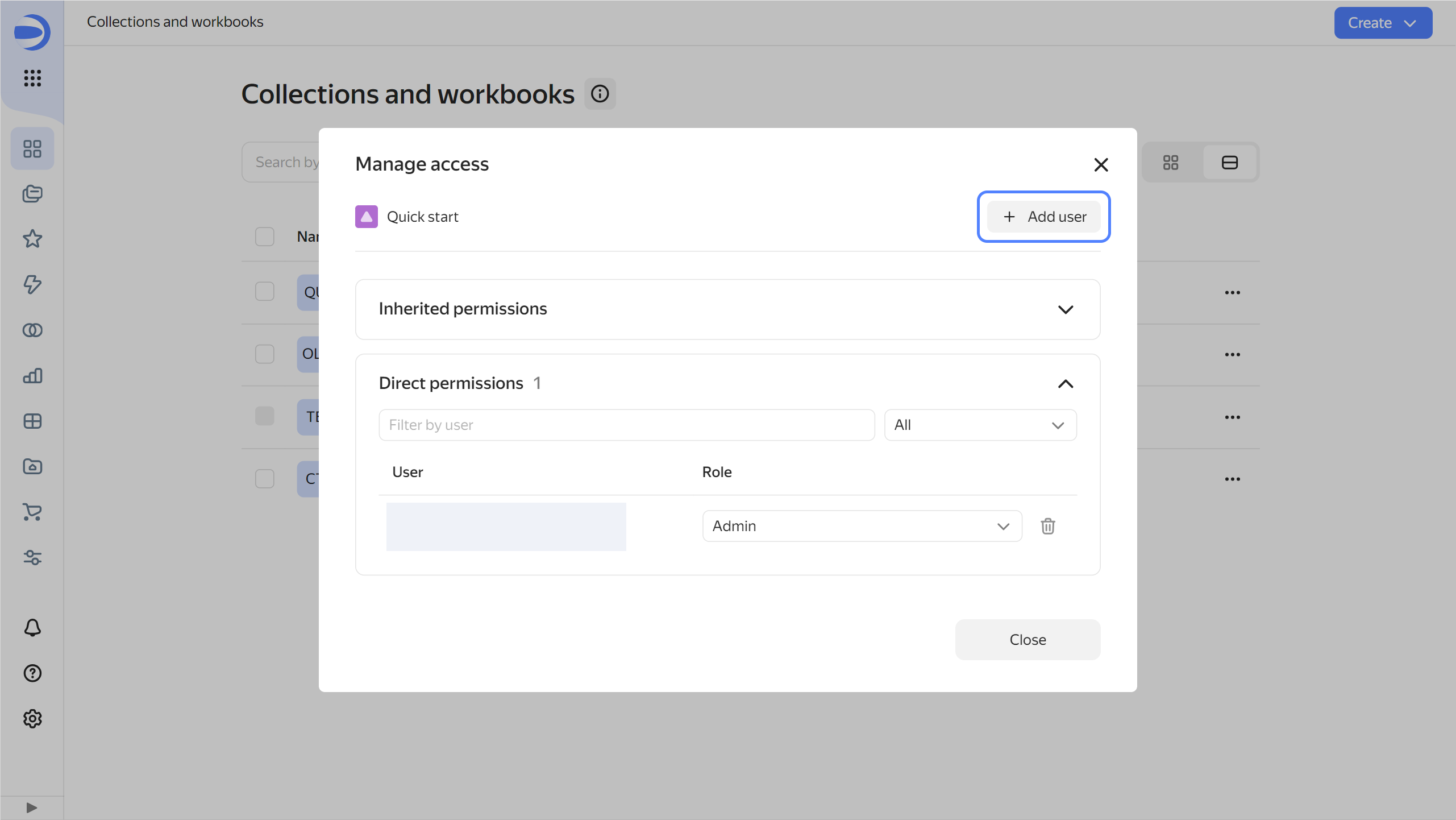
-
In the window that opens, select a user or user group, specify the appropriate permission, and click Save. The user or user group will be granted permissions to this object.
-
You can make the charts and dashboards you create publicly available, so any user can follow a link to view a published object without logging in. You can embed published dashboards and charts into your website or app using iframe.
What's next
- See the tutorials with DataLens usage examples.
- Read about service concepts.
- View an example of a ready-to-use dashboard.
ClickHouse® is a registered trademark of ClickHouse, Inc.