Normalized stacked area chart in Yandex DataLens

A normalized stacked area chart shows variations in the amount each category contributes into a measure over a time interval.
-
Areas are highlighted in different colors and located above each other. The chart shows the percentage of areas and not their absolute value.
-
The width of an area indicates its ratio to the total amount represented as 100%. For example, the percentage of different expenses in the total budget amount.
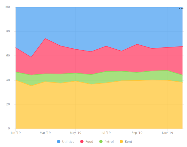
Example
VisualizationSource table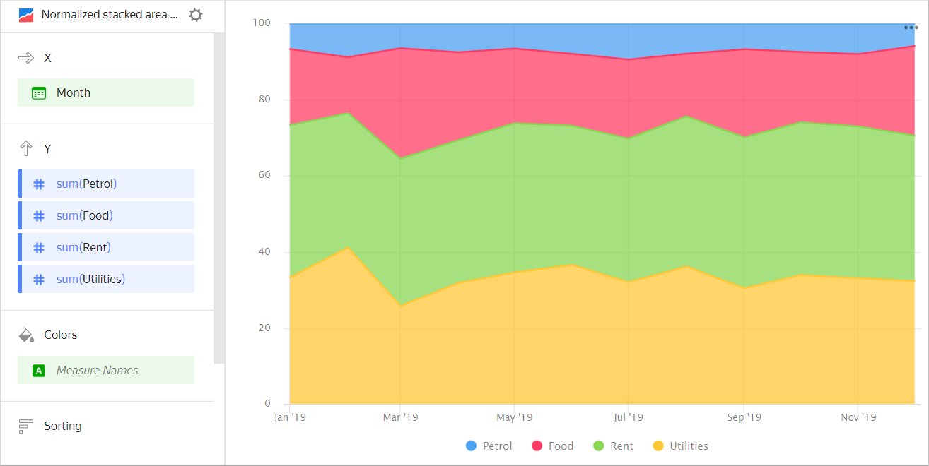
Month Gasoline Rent Food Utility bills January 2019 100 600 300 500 February 2019 150 600 250 700 March 2019 100 600 450 400 April 2019 120 600 370 510 May 2019 100 600 300 530 June 2019 130 600 310 600 July 2019 150 600 330 510 August 2019 120 600 250 550 September 2019 110 650 380 500 October 2019 120 650 300 550 November 2019 130 650 310 540 December 2019 100 650 400 550 -
This type of chart is used to show a change to the proportion of categories, while their totals are not critical. For example, to show how the percentage of product categories changes in the total sales amount.
Example
VisualizationSource table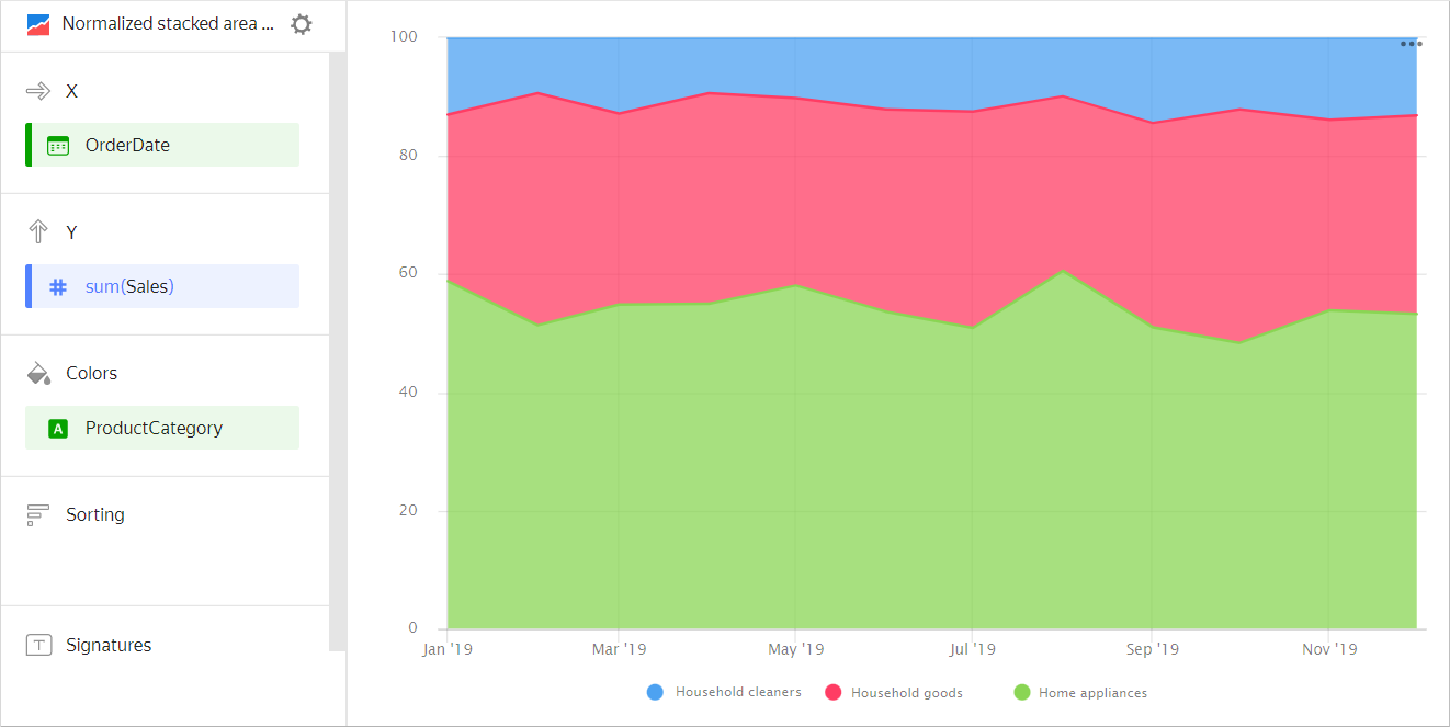
Month Home appliances Household goods Household cleaners January 2019 128K 55K 26K February 2019 97K 79K 18K March 2019 187K 105K 41K April 2019 188K 137K 34K May 2019 230K 121K 43K June 2019 256K 162K 59K July 2019 284K 206K 67K August 2019 409K 204K 72K September 2019 314K 209K 86K October 2019 324K 262K 79K November 2019 385K 238K 101K December 2019 451K 307K 111K
Wizard sections
| Wizard section |
Description |
|---|---|
| X | Dimension. You can specify only one field here. This dimension is usually a date. If this is the case, make sure to specify the Date data type for this field in the dataset. This is required for correct sorting and signature display. For better visualization, you can group dates into weeks, months, and years. For more information, see Field settings. |
| Y | Measure. You can specify multiple measures. If you add more than one measure to a section, the Colors section will contain a dimension named Measure Names. |
| Colors | Measure Names dimension or field. Affects the color of lines. To remove Measure Names, delete measures from the Y axis. |
| Sorting | Dimension or measure. You can use a dimension from the X and Color sections or a measure from the Y axis. This section affects the sorting of values on the X axis or areas along the Y axis. The sorting direction is marked with an icon next to the field: for ascending or for descending. To change the sorting direction, click the icon. |
| Labels | Measure. Displays measure values on the chart. If multiple measures are added to the Y section, drag Measure Values to this section. Markup functions are supported. For String type fields, you can configure using basic Markdown in Yandex DataLens syntax: click the icon before the field name and enable Markdown. |
| Split | Dimension. Splits a chart horizontally by the selected dimension's values. The maximum number of splits per chart is 25. |
| Filters | Dimension or measure. Used as a filter. |
Creating a normalized area chart
To create a normalized area chart:
Warning
If you use the new DataLens object model with workbooks and collections:
-
Go to the DataLens home page. In the left-hand panel, select Collections and workbooks.
-
Open the workbook, click Create in the top-right corner, and select the object you need.
Follow the guide from step 4.
-
Go to the DataLens home page.
-
In the left-hand panel, select Charts.
-
Click Create chart → Chart.
-
At the top left, click Select dataset and specify the dataset to visualize. If you do not have a dataset, create one.
- Select Normalized area chart as the chart type.
- Drag a dimension from the dataset to the X section. The values will be displayed in the lower part of the chart on the X axis.
- Drag one or more measures from the dataset to the Y section. The values will be displayed as areas along the Y axis.
- Drag a dimension from the dataset to the Color section. Colored areas will indicate the share of an individual category in the total measure value.
Recommendations
-
Labels. If the category values are too verbose, make them shorter so that the chart labels look neater.
You can use string functions in calculated fields or the CASE conditional statements.
-
Do not display more than three to five areas on the chart.
-
To make it easier to track the dynamics, place the largest or most important categories closer to the chart base. To do this, drag the measure to the Sorting section or set up their order in the Y section.
For example, when comparing budget expenses.
Chart example
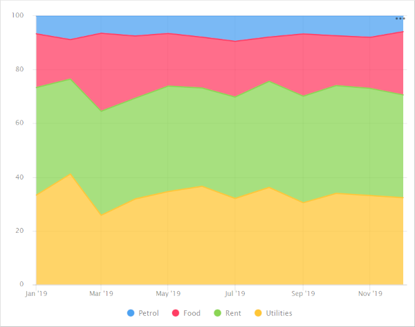
To monitor the budget spending dynamics by the
Gasolinecategory, place it close to the chart base.Chart example
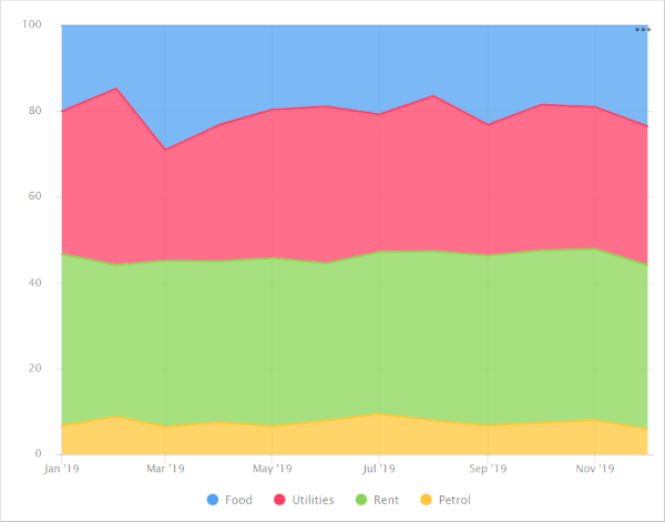
If there is another important category, place it by the upper boundary of the chart. This way the areas will have clear boundaries to help visually compare their values. For example, to compare
Utility billsandRent.Chart example
-
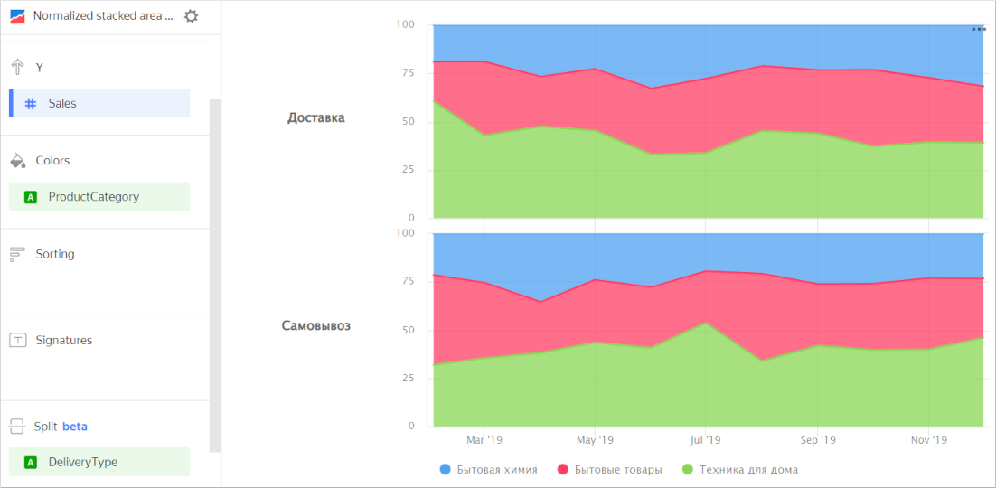
Splitting. You can split a chart by dimension into several small, easy-to-compare charts. To do this, drag a dimension from the dataset to the Split section.
Chart example
-
To display the absolute values of variables, use an area chart.