Choropleth map in Yandex DataLens

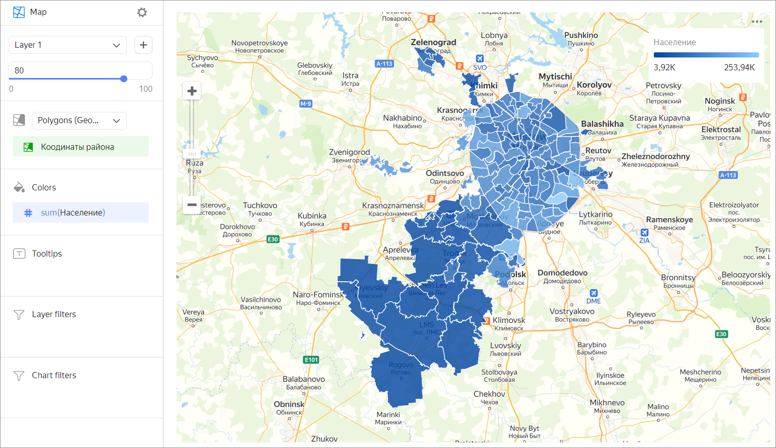
A choropleth map uses different colors and hues for entire areas and regions. Areas on a map are set using geopolygons.
A geopolygon is an element that consists of an area bounded by a closed line and the line itself. The measure value is expressed through color saturation or hue.
A choropleth map is used to analyze a measure within a territorial unit. For example, you can use a choropleth map to demonstrate the density of population of individual districts.
To show polygons on a map, add a Geopolygon type field to your dataset:
- Create a text field with data formatted as
[[[55.60807, 37.5698], [55.60847, 37.56992], [55.60851, 37.57095]]]for polygon point coordinates enclosed in square brackets.
You can first prepare data in a database and set the Geopolygon data type in the dataset description interface. - Use the
GEOPOLYGON(polygon_string)function to create a calculated field with the Geopolygon data type. - If your data contains a field with names of cities, regions, or countries, use the geopoint/geopolygon reference by Geointellect, a Yandex partner.
Follow the link to download a sample CSV file with Russian region polygons.
Wizard sections
| Wizard section |
Description |
|---|---|
| Polygons (Geopolygons) | Dimension of the Geopolygon type. |
| Colors | Dimension or measure. Affects the color and intensity of area fill. |
| Tooltips | Dimension or measure. A tooltip that appears when you hover over an area. For String type fields, you can configure using the basic Markdown in Yandex DataLens syntax by clicking the icon before the field name and enabling Markdown. |
| Layer filters | Dimension or measure. It is used as a filter for the current layer. |
| Filters | Dimension or measure. It is used as a filter for the entire chart. |
Creating a choropleth map
Warning
If you use the new DataLens object model with workbooks and collections:
-
Go to the DataLens home page. In the left-hand panel, select Collections and workbooks.
-
Open the workbook, click Create in the top-right corner, and select the object you need.
Follow the guide from step 4.
-
Go to the DataLens home page.
-
In the left-hand panel, select Charts.
-
Click Create chart → Chart.
-
At the top left, click Select dataset and specify the dataset to visualize. If you do not have a dataset, create one.
-
Select Map for the chart type.
- Select Polygons (Geopolygons) as the layer type.
- Drag a dimension of the Geopolygon type from the dataset to the layer type selection section.
- Color the polygons on the map. Move the measure or dimension to the Colors section.
- Add tooltips to show the dimension and measure values when hovering over a polygon.
Note
You can show a particular area on the map using the Center and Scale settings.
You can also:
- Add, rename, and delete a layer.
- Reorder the layers within a layer type.
- Apply a filter to the entire chart or one layer.
Recommendations
- Do not use a choropleth map for accurate comparison of values.
- For better comparison accuracy, add data labels or tooltips with information to the map.