Funnel in Yandex DataLens

A funnel chart visualizes the sequential decrease in measure values across stages. Each stage of the funnel is represented by a segment whose width is proportional to the measure value.
This visualization type is well-suited for analysis of processes where data goes through several successive stages. For example, it is widely used to represent the sales funnel from a product view to purchase or to track user conversion rates during a multi-step registration flow.
Example
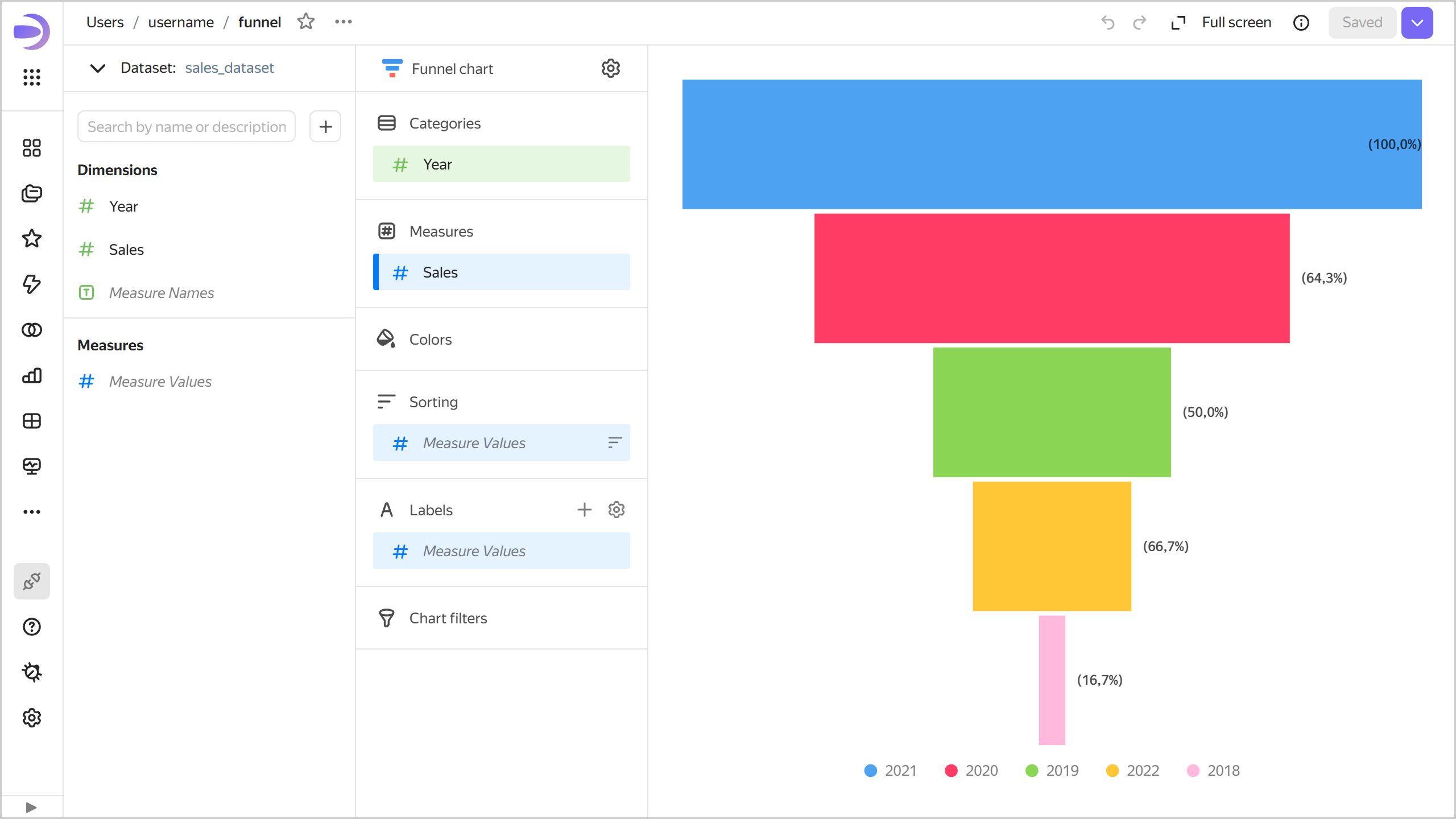
| Year | Sales |
|---|---|
| 2022 | 6M |
| 2021 | 28M |
| 2020 | 18M |
| 2019 | 9M |
| 2018 | 1M |
Wizard sections
| Wizard section |
Description |
|---|---|
| Categories | Dimension. You can specify only one field here. Your data will be grouped by this field. |
| Measures | Measure. You can specify one or multiple fields. If you add more than one measure to a section, the Categories section will contain the Measure Names dimension. |
| Color | Dimension or measure. You can specify a dimension from the Categories section or any measure. Affects the color of the funnel segments. |
| Sorting | Dimension or measure. Affects the order of funnel stages. The sorting direction is marked with an icon next to the field: for ascending or for descending. To change the sorting direction, click the icon. |
| Labels | Measure. You can specify one or multiple fields. Displays measure values on the funnel segments. To display both absolute values and percentages for each segment, add multiple Measure Values fields and set their format. Markup functions are supported. |
| Filters | Dimension or measure. It is used as a filter. |
Creating a funnel
To create a funnel:
Warning
If you use the new DataLens object model with workbooks and collections:
-
Go to the DataLens home page. In the left-hand panel, select Collections and workbooks.
-
Open the workbook, click Create in the top-right corner, and select the object you need.
Follow the guide from step 4.
-
Go to the DataLens home page.
-
In the left-hand panel, select Charts.
-
Click Create chart → Chart.
-
At the top left, click Select dataset and specify the dataset to visualize. If you do not have a dataset, create one.
- Select Funnel for the chart type.
- Drag a dimension from the dataset to the Categories section.
- Drag one or more measures from the dataset to the Measures section.
- Drag a dimension from the dataset or the Measure Names field to the Colors section.
- Drag a measure from the dataset to the Signatures section.
Chart settings
You can configure the following chart settings:
- Percentage calculation stage: Baseline stage for calculating percentages displayed in chart tooltips:
- Initial stage (default).
- Previous stage.
- Distance between segments: Gap size between funnel segments.
- Shape: Shape of the funnel segments:
- Rectangle (default).
- Trapezoid.
Recommendations
- Funnel stages: Arrange funnel stages in a logical sequence from initial to final. Use the Sorting section to configure this order.
- Number of stages: Avoid overloading your funnel with stages: 3 to 7 stages work best. A funnel with too many stages is hard to read.
- Colors: Use the Colors section to highlight important stages or group related stages together.
- Labels: Add labels with both absolute values and percentages to make your data easier to interpret. To do this, drag multiple Measure Values fields with different formats to the Labels section.