Adding a hierarchy to charts in Yandex DataLens
Note
- You cannot use hierarchies in Map, Indicator, and Pivot table charts.
- You can only add one hierarchy to a chart.
To add a hierarchy:
Warning
If you use the new DataLens object model with workbooks and collections:
- In the left-hand panel, select Collections and workbooks.
- Open the workbook you need and select an object.
Proceed with this guide from Step 2.
-
In the left-hand panel, click Charts and select the chart to add a hierarchy to.
-
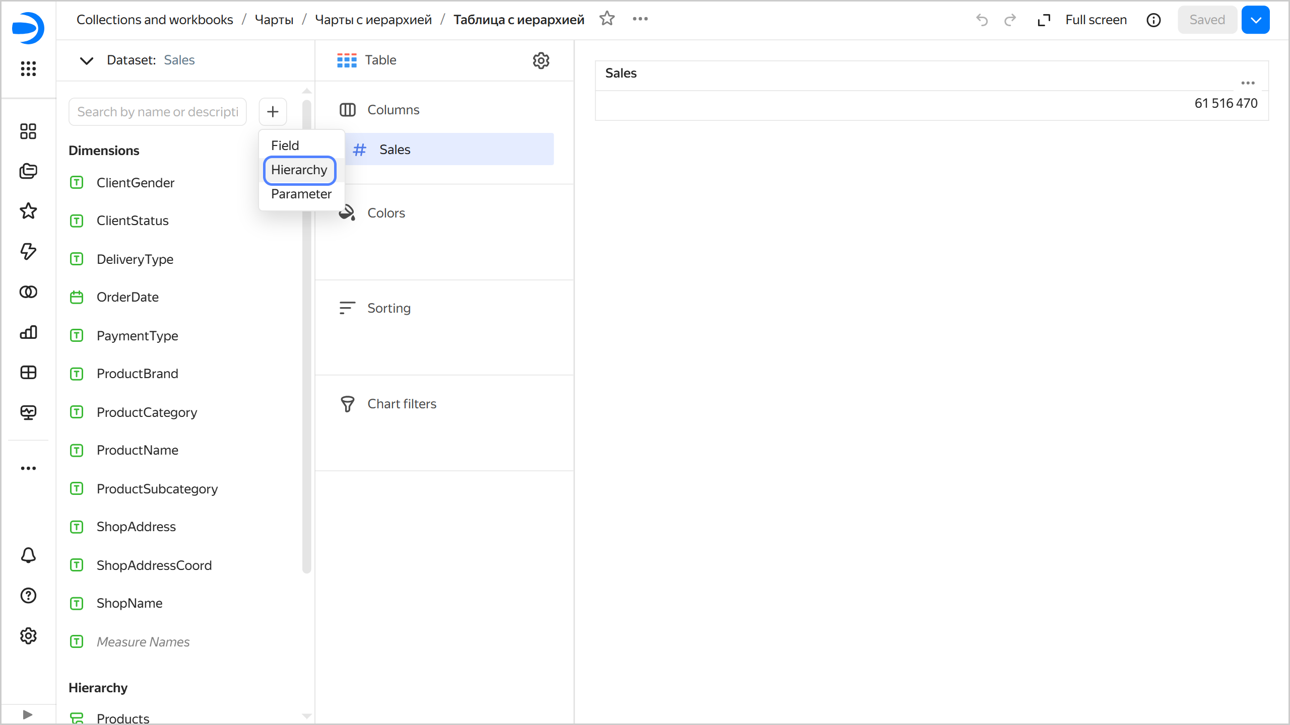
On the left side of the screen above the list of dimensions and measures, click and select Hierarchy.
-
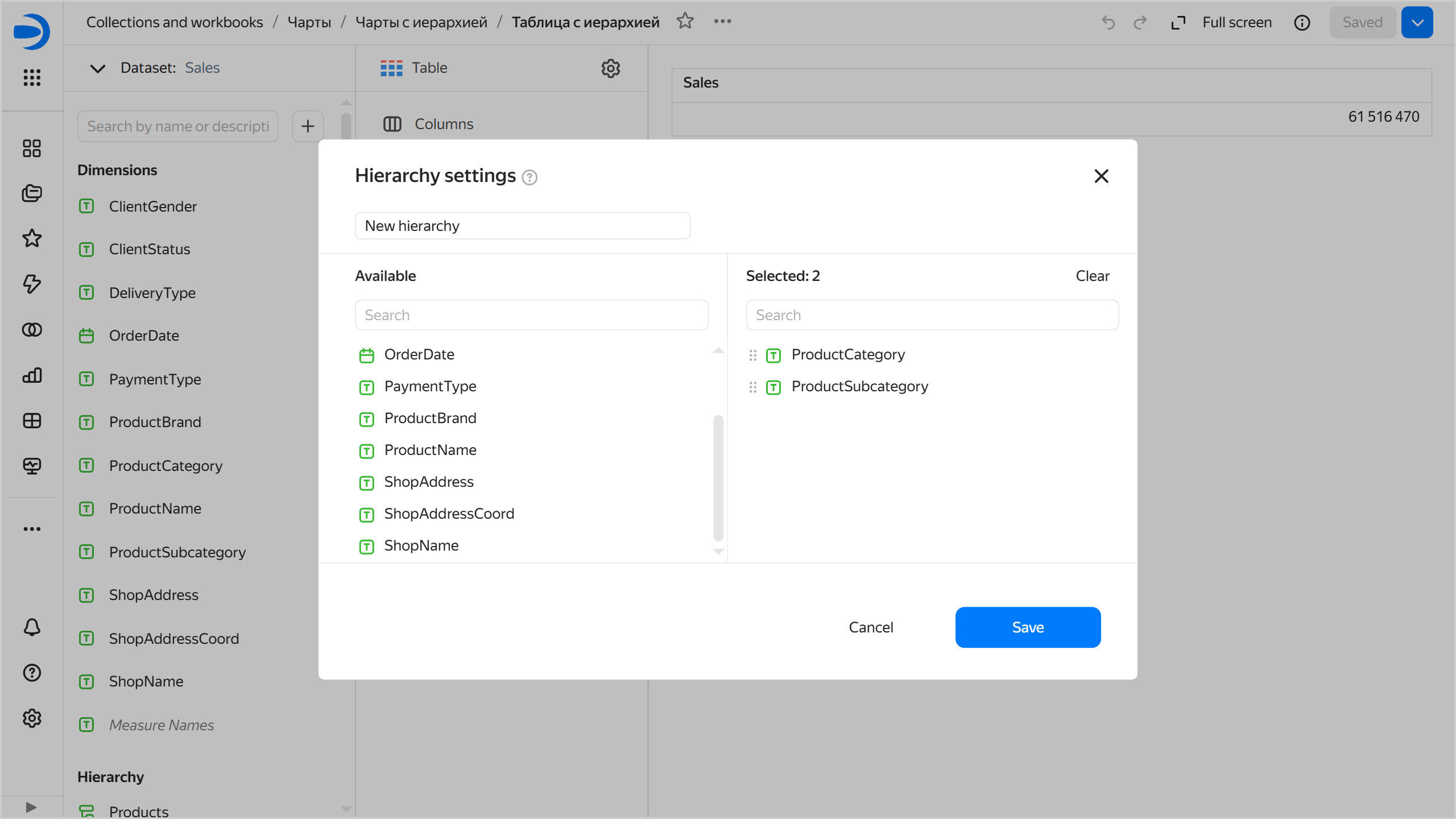
Enter the hierarchy name, select dimensions, and arrange them as needed.
-
In the bottom-right corner, click Save.
-
Drag your hierarchy to any available section. For example, for a Table chart, you can use the Columns section.
-
Drag other dimensions and measures to the appropriate sections.
-
In the top-right corner, click Save.
Example of adding a hierarchy
As our data source, we will use a ClickHouse® demo database with a Moscow retail chain's sales data. For an example of creating a connection and dataset, see this guide.
-
In the top-right corner of the dataset, click Create chart.
-
Select the Donut chart visualization type.
-
Add a sales measure to the chart. To do this, drag the
Salesfield from Measures to the Measures section. -
On the left side of the screen above the list of dataset fields, click and select Hierarchy.
-
Enter
Productsas the hierarchy name and select the dimensions in the following order:ProductCategory,ProductSubcategory,ProductBrand, andProductName. -
In the bottom-right corner, click Save.
-
Drag your hierarchy to the Color section.
-
Save the chart:
- In the top-right corner, click Save.
- In the window that opens, enter Donut chart with hierarchy as the chart name and click Save.
Adding the hierarchy to the chart will allow you to switch between levels of detail: ProductCategory → ProductSubcategory → ProductBrand → ProductName.
Check out some examples of charts with a hierarchy on our ready-made dashboard.
Useful links
ClickHouse® is a registered trademark of ClickHouse, Inc.