Creating a table based on an SQL query
Follow this guide to build a table based on an SQL query to the data source in Editor. For convenience, we will use the connection and dataset from the deployed demo workbook as the data source.
Getting started
To get started with DataLens:
- Log in to your Yandex account. If you do not have an account, create one.
- Open the DataLens home page.
- Click Start in cloud.
- Confirm that you have read the Terms of use and click Log in.
-
Log in to your Yandex account.
-
Open the DataLens home page.
-
Click Start in cloud.
-
Select one of these options:
-
If you already have an organization, select it from the drop-down menu in the Organizations tab and click DataLens.
Note
To activate a DataLens instance, the user must have the
adminorownerrole. For more information about roles, see Access management in Yandex Identity Hub. -
If you have a cloud but no organization, click Add new DataLens. In the window that opens, enter a name and description for your organization and click Create organization and DataLens. For more information about working with organizations, see Getting started with organizations.
-
If you encounter a technical issue with the service, contact Yandex Cloud support. To ask for advice, discuss a solution to your issue, or explore current best practices, join the DataLens chat in Telegram.
Deploy a demo workbook
-
In the Gallery, open the dashboard titled DataLens Demo Dashboard.
-
Click Use → Deploy.
-
Select where to save the workbook: workbook and collection root, existing collection, or new collection. Navigate to the saving destination and click Deploy. The workbook name must be unique, so edit the name if you need to.
-
Click Create.
-
Navigate to the new workbook and, on the Connections tab, find
00: Demo Dashboard. Connection. -
Copy the connection ID by clicking → Copy ID next to it. The ID will be copied to the clipboard.
Create a chart in Editor
-
In the workbook, click Create → Chart in Editor in the top-right corner. On the page that opens, select the Table visualization type.
-
Link the chart with the connection by navigating to the Meta tab and adding the connection ID to
links:{ "links": { "demoConnection": "<connection_ID>" } }Where:
<connection_ID>: Connection ID copied in the previous step.demoConnection: Any alias name you assign to the connection and use to request chart data from the source.
Note
You need the Meta tab to describe service information about the list of related entities. This information is used to figure out what connections and datasets the chart is related to, as well as for the related objects dialog, when copying a workbook and when publishing to Public.
-
Get data from the data source: to do this, open the Source tab and specify:
module.exports = { 'salesSourceData': { qlConnectionId: Editor.getId('demoConnection'), data: { sql_query: ` SELECT t1."PaymentType" AS PaymentType, toYear(toDate(t1."OrderDatetime")) AS OrderYear, toStartOfInterval(toDate(toDate(t1."OrderDatetime")), interval 1 month) AS OrderMonth, sum(toFloat64(t1."Price")) AS PriceSum FROM samples."MS_SalesFacts_up" AS t1 GROUP BY PaymentType, OrderYear, OrderMonth LIMIT 1000001`, }, }, };salesSourceData: An arbitrary alias name you assign to the object with requested chart data, used for access on the Prepare tab.The
sql_queryfield describes the query to the connection data source. -
Clear the contents of the Params and Config tabs: they contain a template that is not relevant to our example.
-
On the Prepare tab, create a table:
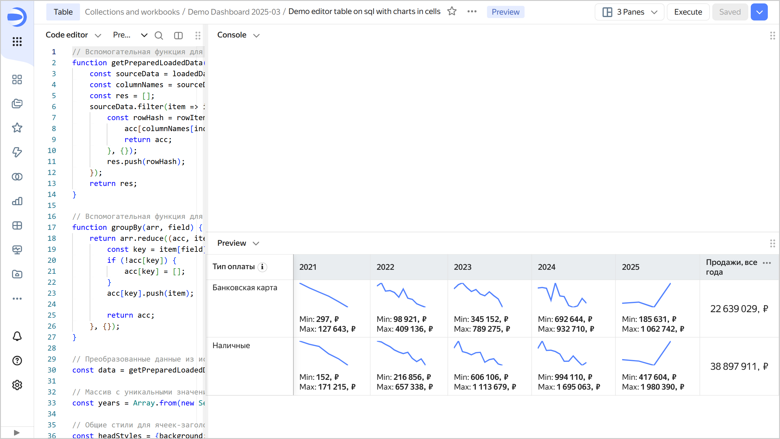
// Helper function to prepare source data in a more convenient format function getPreparedLoadedData(loadedData, sourceName) { const sourceData = loadedData[sourceName]; const columnNames = sourceData.filter(item => item.event === 'metadata').map(item => item.data.names)?.[0] || []; const res = []; sourceData.filter(item => item.event === 'row').map(item => item.data).forEach(rowItem => { const rowHash = rowItem.reduce((acc, field, index) => { acc[columnNames[index]] = field; return acc; }, {}); res.push(rowHash); }); return res; } // Helper function to group data by a specified field name function groupBy(arr, field) { return arr.reduce((acc, item) => { const key = item[field]; if (!acc[key]) { acc[key] = []; } acc[key].push(item); return acc; }, {}); } // Source data transformed into a convenient format const data = getPreparedLoadedData(Editor.getLoadedData(), 'salesSourceData'); // Array containing unique values of the "OrderYear" field, sorted in ascending numerical order const years = Array.from(new Set(data.map(d => String(d['OrderYear'])))).sort(); // Common styles for table header cells const headStyles = {background: 'var(--g-color-base-misc-light)', verticalAlign: 'middle'}; // Table header cell configuration const head = [ { name: 'Payment type', formattedName: Editor.generateHtml({ tag: 'span', content: [ {tag: 'span', content: 'Payment type'}, // tooltip for a cell header { tag: 'dl-tooltip', content: ' ℹ', style: { display: 'inline-block', margin: '0px 0px 0px 4px', 'line-height': '12px', 'text-align': 'center', width: '16px', height: '16px', border: '1px solid #ccc', 'border-radius': '50%', }, attributes : { 'data-tooltip-content': { tag: 'i', content: 'Tooltip content', }, }, } ], }), css: headStyles, pinned: true, }, // Creating columns based on the array of values from the "OrderYear" field obtained earlier ...years.map(year => ({ name: year, css: headStyles, })), { name: 'Sales, all years', css: headStyles, }, ]; // Helper function to render a chart line function createChart(chartData) { const chartWidth = 80; const chartHeight = 40; // Calculating the minimum and maximum coordinate values const minX = Math.min(...chartData.map(d => d.x)); const maxX = Math.max(...chartData.map(d => d.x)); const minY = Math.min(...chartData.map(d => d.y)); const maxY = Math.max(...chartData.map(d => d.y)); // Calculating coordinates based on the chart container dimensions (chartWidth, chartHeight) const coords = chartData.sort((d1, d2) => d1.x - d2.x).map(d => ([ (d.x - minX) / (maxX - minX) * chartWidth, (d.y - minY) / (maxY - minY) * chartHeight, ])); // Creating a path for the SVG line using the coordinates generated above let d = ""; coords.forEach((_, x) => { d += d === "" ? "M" : " L"; d += `${coords[x][0]} ${coords[x][1]}`; }); // Creating an SVG with var(--g-color-base-brand) for line color and thickness of 2px return ` <svg width="${chartWidth}" height="${chartHeight}"> <path d="${d}" style="fill: none; stroke: var(--g-color-base-brand); stroke-width: 2;" /> </svg>`; } const rows = []; // Helper function for number formatting const formatSalesValue = new Intl.NumberFormat('ru-RU').format; const postfix = ', ₽'; // Rows grouped by the "PaymentType" field const groupedData = groupBy(data, 'PaymentType'); // Generating and populating table rows for each grouped payment type (based on the PaymentType field value) Object.entries(groupedData).forEach(([key, items]) => { // Rows grouped by the "OrderYear" field const salesByYears = groupBy(items, 'OrderYear'); // Calculating the sum for the "PriceSum" field across all years (based on OrderYear) const totalSales = items.reduce((sum, d) => sum + d['PriceSum'], 0); rows.push({ cells: [ { value: key, }, // Creating columns based on previously prepared "OrderYear" values ...years.map(year => { const salesByYear = salesByYears[year] ?? []; const yearSales = salesByYear.map(d => ({ x: new Date(d['OrderMonth']).getTime(), y: d['PriceSum'], })); const maxSales = Math.max(...salesByYear.map(d => d['PriceSum'])); const minSales = Math.min(...salesByYear.map(d => d['PriceSum'])); return { value: maxSales, formattedValue: Editor.generateHtml(` <div> ${createChart(yearSales)} <div style="margin-top: 8px;">Min: <b>${formatSalesValue(minSales)}${postfix}<b></div> <div>Max: <b>${formatSalesValue(maxSales)}${postfix}</b></div> </div> `), }; }), { value: totalSales, formattedValue: formatSalesValue(totalSales) + postfix, css: { verticalAlign: 'middle', textAlign: 'center', fontSize: '16px', }, }, ], }); }); module.exports = {head, rows}; -
At the top of the chart, click Execute. The preview will show the connection as a table with rows grouped by the PaymentType field and columns grouped by the OrderYear field, along with a monthly sales chart:
-
To save a chart, click Save in the top-right corner and enter a name for the chart.