Appearance settings in Yandex DataLens
Appearance settings allow you to change how the interface looks for the entire organization:
- Customizing the UI.
- Add, edit, or delete chart color palettes.
These settings can be edited by the DataLens instance administrator (the datalens.admin role).
To access the appearance settings:
-
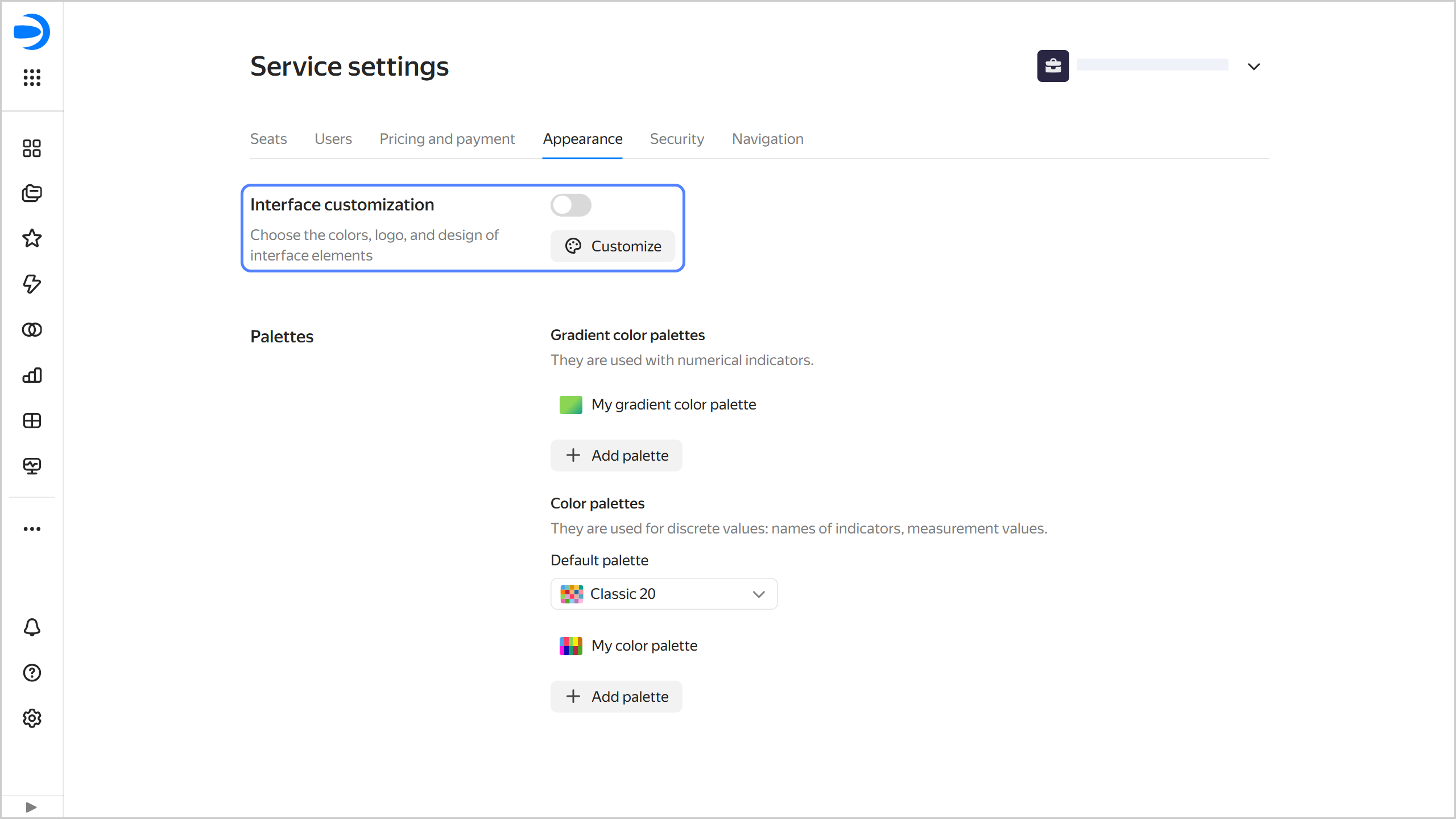
In the left-hand panel, select Service settings. If the panel does not feature , first select More, then Service settings.
-
Select the Appearance tab.
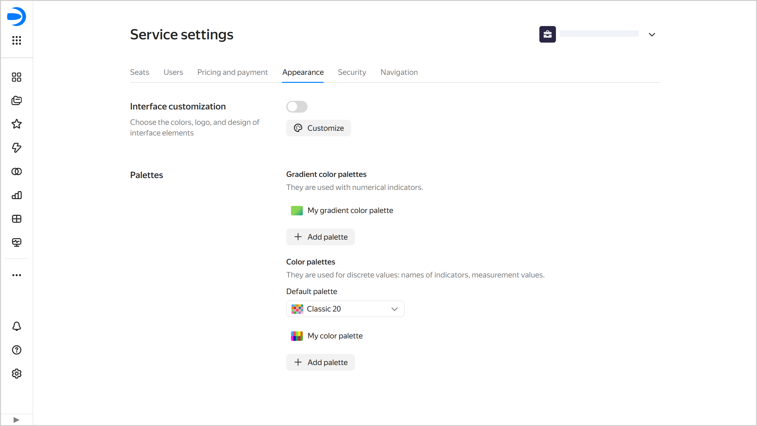
UI customization
With UI customization, you can achieve a custom DataLens look by editing colors, logo, and redesigning individual elements.
The customization settings can be edited by the DataLens instance administrator (the datalens.admin role).
For UI customization:
-
Go to the DataLens home page.
-
In the left-hand panel, select Service settings.
-
Select the Appearance tab.
-
In the UI customization section, click Configure.
Customizing the UI
-
Customize the design:
-
UI theme: Select the UI theme for which you want to set the color palette.
-
Contrast: Select the contrast for which you want to set the color palette.
-
Color palette: Select colors for the UI theme and contrast. You can customize a unique palette for each combination of theme and contrast.
You can set the colors manually or generate them:
ManuallyGenerate- Main color: Used as a background for buttons and controls: switches, checkboxes, and selectors. Additionally, the main color is used as a theme for tooltips.
- Main color on hovering the cursor: When manually customized, you can select any color. When generating a palette, a darker shade of the main color is set automatically.
- Page background: Page background color. For a light theme, white is the most commonly used color. Dark themes have more options, from neutral gray shades to warm or cool colors.
- Dashboard background: Default dashboard background color. Users can override it for specific dashboards.
- Widget background: Default widget background color and opacity. Users can override this setting for all widgets on a dashboard or configure each widget individually.
- Elevated element background: Background color of cards and other elevated elements. This setting does not affect the background color of widgets.
- Selected elements: Color for selected elements, e.g., clicked buttons, selected rows, or selected text.
- Selected items when hovering the cursor: Color for selected items (e.g., clicked buttons or selected rows) when hovering over them.
- Text on selected items: Text color on selected items. Set it to contrast with the color of the selected elements.
- Lines and outlines: Color of the active card or tab, as well as the color of the loading indicator.
- Link: Link text color.
- Link on hover: Link text color when the cursor hovers over it.
Click Generate palette and select the main color. Other colors will be automatically generated based on it. If required, edit the color settings manually.
-
Contrasting color: Select a color for the text on the button.
-
Logo and favicon: To replace the logo and favicon, upload a 1:1 aspect ratio SVG file to Yandex Object Storage. Then copy the link to the file in the storage and paste it into this field. Click Apply next to the field.
-
Rounding: Sets corner rounding for the following UI elements:
- Button: Select one of the preset options.
- Widgets: Select a preset option or enable Specify custom value and enter a value from
0to24in increments of2.
Note
The preview area displays how the UI elements will look like with the specified settings.
-
-
At the top right, click Save.
-
To apply the customized UI, enable the corresponding option under UI customization.
Managing a chart color palette
In Yandex DataLens, you can create, edit, or delete a color palette and configure the default palette.
Creating a color palette
Warning
To create a palette, you need the admin role for a DataLens instance.
To create a color palette:
-
Go to the DataLens home page.
-
In the left-hand panel, select Service settings.
-
Select the Appearance tab.
-
Under Palettes, add a new palette:
Gradient color paletteColor paletteA gradient color palette is used in charts for numerical measures.
-
Go to Gradient color palettes and click + Add palette.
-
In the window that opens, enter the following parameters:
-
Enter the Palette name at the top.
-
Enter the start value for the gradient color at the bottom left and its end value at the bottom right. For example, specify
0044A3on the left and8CCBFFon the right for a dark blue to light blue gradient.To add an intermediate gradient value, click below and specify the value. You can check the changes in the preview window.
-
-
Click Save.
A color palette is used in charts for discrete values: measure names, dimension values.
-
Go to Color palettes and click + Add palette.
-
In the window that opens, enter the following parameters:
-
Enter the Palette name at the top.
-
In the list on the right, click + Add color and enter values for palette colors, in hex format.
There are 20 default colors. You can edit, add, or delete palette colors. To change the order of colors, drag them using the mouse. You can check the changes in the preview window.
-
-
Click Save.
-
Changing a color palette
To change a color palette:
- Go to the DataLens home page.
- In the left-hand panel, select Service settings.
- Select the Appearance tab.
- Go to Palettes and click the line with the palette to change.
- Make changes in the Configure color palettes window.
- Click Save.
Deleting a color palette
Note
Deleting a color palette resets the color settings in all charts where it was used.
To delete a color palette:
- Go to the DataLens home page.
- In the left-hand panel, select Service settings.
- Select the Appearance tab.
- Go to Palettes and hover over the name of the palette to delete.
- Click next to it and select Delete.
- Click Delete.
Setting the default color palette
For DataLens instances created before September 16, 2025, the default palette is Classic 20. For instances created after September 16, 2025, the default palette is Default 20.
To set any of the preinstalled or previously added color palettes as default:
- Go to the DataLens home page.
- In the left-hand panel, select Service settings.
- Select the Appearance tab.
- Under Palettes, select the default palette from the list. The default palette will be applied to all charts that use it. In charts with custom palette settings, the palette will not change.
If you delete the default color palette, the Default 20 palette will apply instead. It will be applied to all charts that use the default palette.