Map

Maps are used for geoanalytics: displaying and analyzing business indicators on a map. These indicators may include population and population density, the number of commercial facilities and their profit, and other parameters that may affect the efficiency of a business.
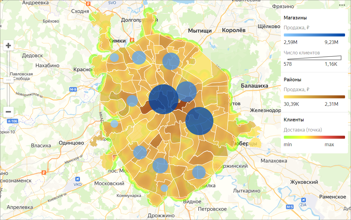
You can use a map to display layers of different types:
- Areas A layer indicates entire areas or regions. Measure values are represented using colors or color shades. It is a good practice to add pop-up hints with area names or measures to a map.
- Points Points can be used to display individual objects like cities, stores, order pickup points, or customer addresses. Measure values can be indicated in two ways: through a point color and its size.
- Lines Lines are used to show links between objects in the area. For example, airline flights or cargo transportation routes.
- Heat map shows the density of points on a map. It is helpful when you need to display a large number of points and their concentration areas.
To create maps, make sure the data source contains either Geopoint coordinates or Geopolygon areas.
One map can contain a maximum of 5 layers with any type of visualization. Layers in the Map chart are called geolayers.
Geolayers visualize indicators using points or polygons on the map.
You can do the following operations with geolayers:
- Change name.
- Set the transparency level using the slider.
- Reorder the layers inside a visualization type. However, you cannot change the order of visualization types (top-to-bottom: point map, polyline map, chloropleth map, and heat map).
You can purchase pre-calculated geolayers from partners in Cloud Marketplace.
Note
You cannot create maps in QL charts.