Area chart

This chart shows how a measure changed over time. The area between the axis and the line is filled with colors, which shows the volume. Multiple data categories can be stacked one on top of the other or overlap, depending on the setup.
Source table
| Year | Home appliances | Household goods | Household cleaners |
|---|---|---|---|
| January 2017 | 325K | 248K | 96K |
| February 2017 | 437K | 247K | 91K |
| March 2017 | 490K | 314K | 111K |
| April 2017 | 458K | 310K | 125K |
| May 2017 | 530K | 368K | 127K |
| June 2017 | 593K | 411K | 158K |
| July 2017 | 555K | 457K | 138K |
| August 2017 | 612K | 402K | 129K |
| September 2017 | 646K | 407K | 138K |
| October 2017 | 804K | 454K | 157K |
| November 2017 | 716K | 406K | 160K |
| December 2017 | 753K | 471K | 201K |
Be careful selecting the measures when building your chart. For example, do not add the number of customers to the sales amount, or the purchase amount to the sales amount.
Wizard sections
| Section section |
Description |
|---|---|
| X | Dimension. You can specify only one field here. This dimension is usually a date. If this is the case, make sure to specify the Date data type for this field in the dataset. This is required for correct sorting and signature display. For better visualization, you can group dates into weeks, months, and years. For more information, see Field settings. |
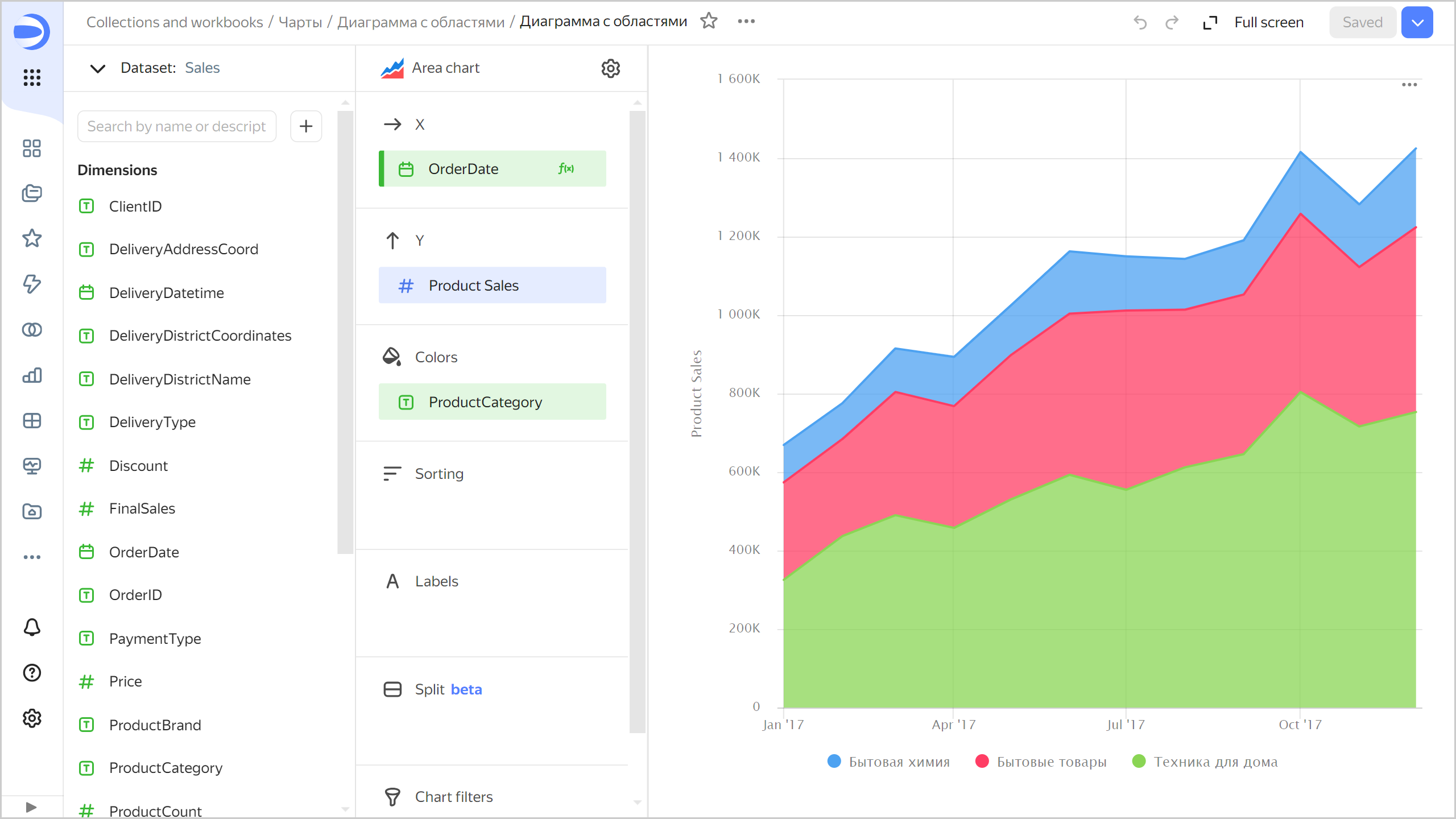
| Y | Measure. You can specify multiple measures. If you add more than one measure to a section, the Colors section will contain a dimension named Measure Names. |
| Colors | Measure Names dimension or field. Affects the color of lines. To remove Measure Names, delete measures from the Y axis. |
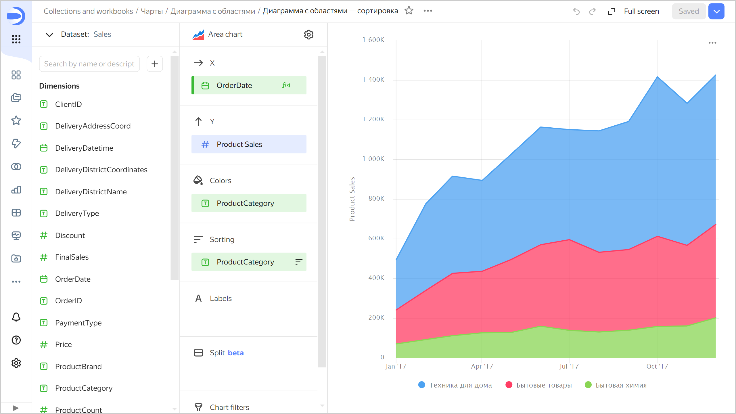
| Sorting | Dimension or measure. You can use a dimension from the X and Color sections or a measure from the Y axis. This section affects the sorting of values on the X axis or areas along the Y axis. The sorting direction is marked with an icon next to the field: for ascending or for descending. To change the sorting direction, click the icon. |
| Labels | Measure. Displays measure values on the chart. If multiple measures are added to the Y section, drag Measure Values to this section. Markup functions are supported. For String type fields, you can configure using basic Markdown syntax: click the icon before the field name and enable Markdown. |
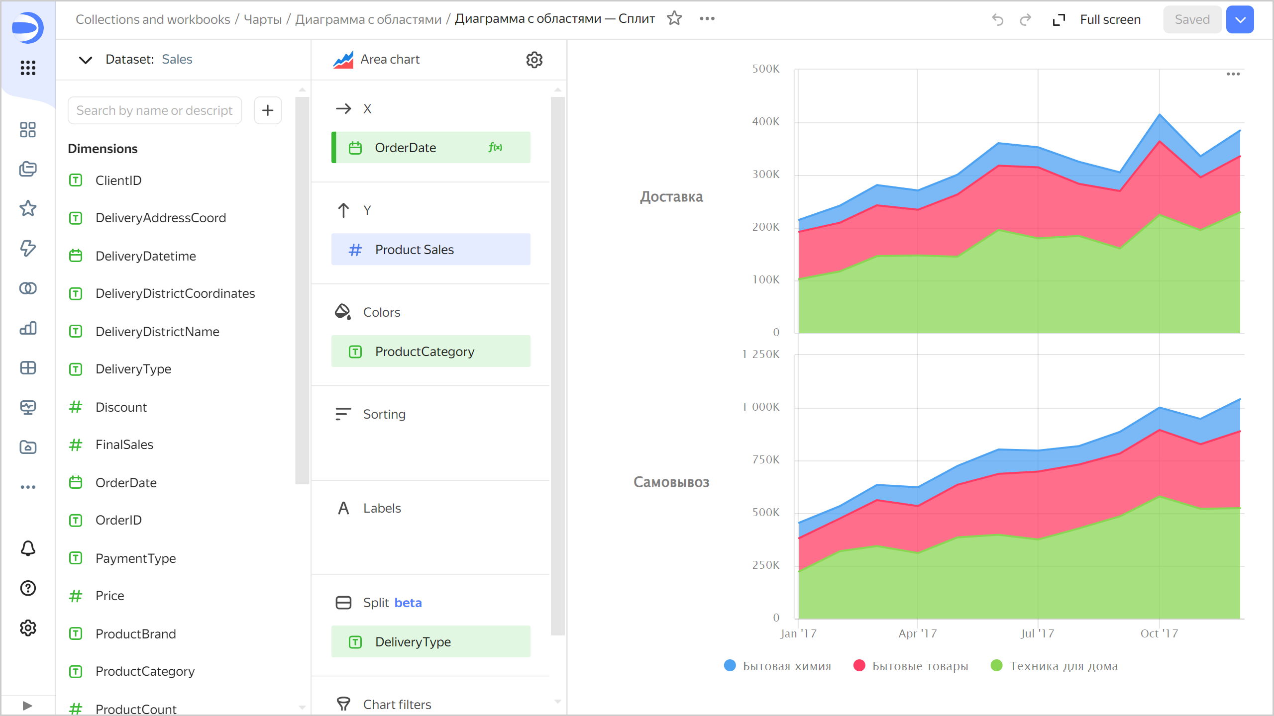
| Split | Dimension. Splits a chart horizontally by the selected dimension's values. The maximum number of splits per chart is 25. |
| Filters | Dimension or measure. Used as a filter. |
Creating an area chart
To create an area chart:
Warning
If you use a new DataLens object model with workbooks and collections:
- Go to the DataLens home page. In the left-hand panel, select Collections and workbooks.
- Open the workbook, click Create in the top-right corner, and select the appropriate object.
Follow the guide from step 4.
- Go to the DataLens home page.
- In the left-hand panel, select Charts.
- Click Create chart → Chart.
- At the top left, click Select dataset and specify the dataset to visualize.
- Select Area chart as the chart type.
- Drag a dimension from the dataset to the X section. The values will be displayed in the lower part of the chart on the X axis.
- Drag one or more measures from the dataset to the Y section. The values will be displayed as areas along the Y axis.
Configuring display of nullvalues
If the source data includes a row where the measure value is null, the chart will not be built for that point at default settings. For example, if the source has a row with a date (20.07.2022) but the sales amount for it is missing.
You can configure how the chart will display null values in the chart section settings:
- In the section with a measure whose values you want to show, in the top-right corner, click (the icon appears when you hover over the section).
- In Empty values (null), select
Display as 0. - Click Apply.
Now, the chart will use 0 instead of null.
If a row is missing from the source data completely, the chart section settings will not change the way the chart is presented. For example, if the source does not have a row with a certain date (20.07.2022), nothing will be shown for this date on the chart.
For more information, see Configuring the display of null values.
Configuring a stacked chart
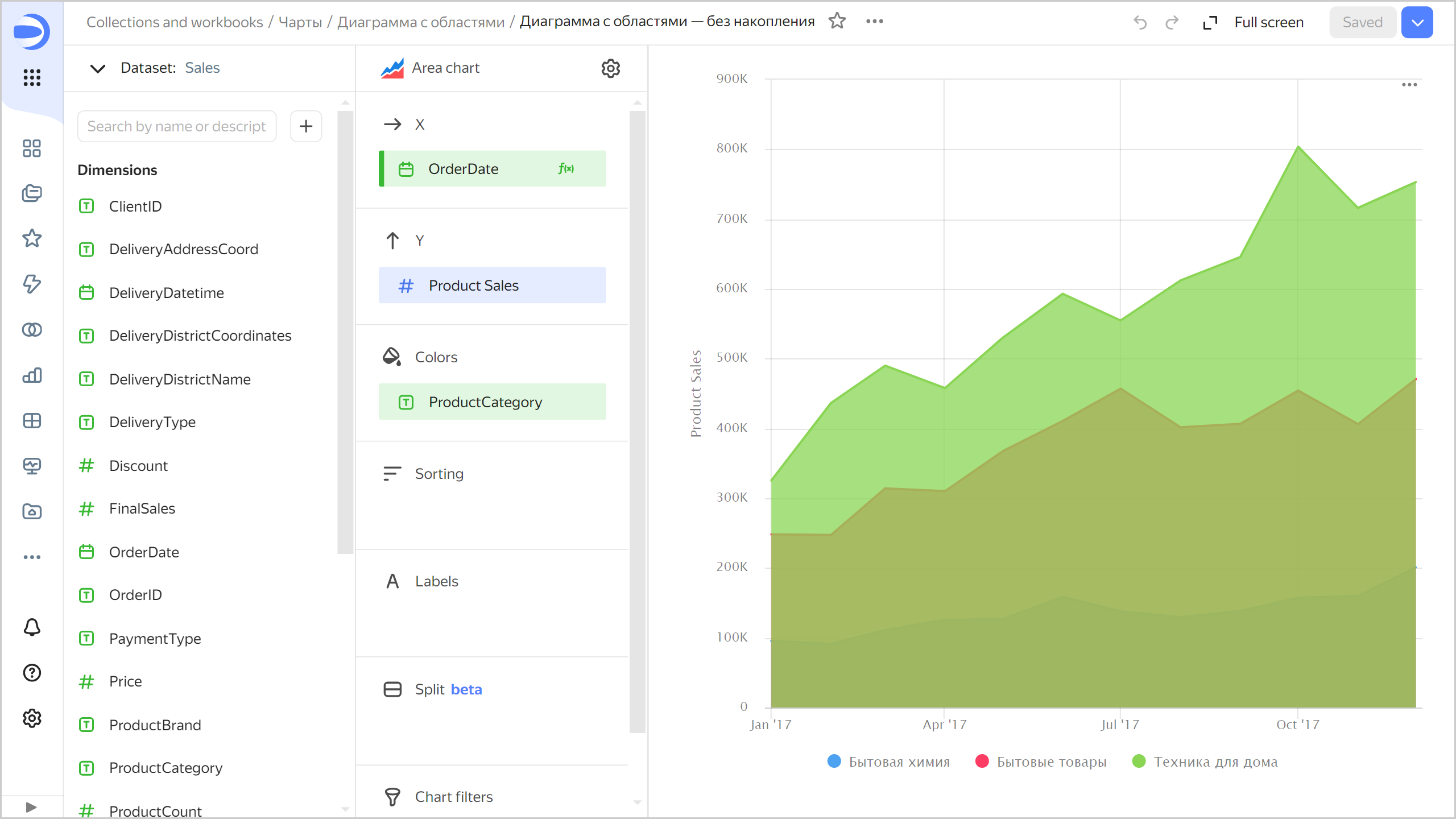
Use the Stacking option in the chart settings to toggle between stacked or unstacked chart display.
A stacked chart shows a ratio of measures by category to the total value. Use this chart type when you need to see how each measure contributes to the total. For example, you can get the breakdown of total sales by product category. If you have multiple data categories, the areas are stacked one on top of the other. The top line represents all data.
An unstacked chart shows the changes in a measure separately for each category. You can use this chart type when you need to compare measures by categories, e.g., total sales in each product category. If you have multiple data categories, the areas overlap. Each line corresponds to measure values for an individual category.
Recommendations
-
If the values of the categories contain a large amount of text, try to reduce it. Then the signatures on the diagram will look more accurate. You can use string functions in the calculated fields or conditional operators CASE.
-
Do not display more than three to five areas on the chart.
-
To make it easier to track the dynamics, place the largest or most important categories closer to the chart base. To do this, drag the measure to the Sorting section or set up their order in the Y section. For example, you can do so to track sales dynamics in the
Household cleanerscategory.Chart example
-
You can split a chart by dimension into a number of small charts that are convenient to compare to one another. To do this, drag a dimension from the dataset to the Split section.
Chart example