Pivot table
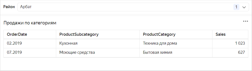
A table is a standard form of data representation with as many details as possible. Tables are most suitable for detailed analysis (a deep dive into figures) and problem detection. It is best to place tables at the end of a dashboard. Graphical representations are simpler for reading information, while tables take you deeper into the data and require more time to read.
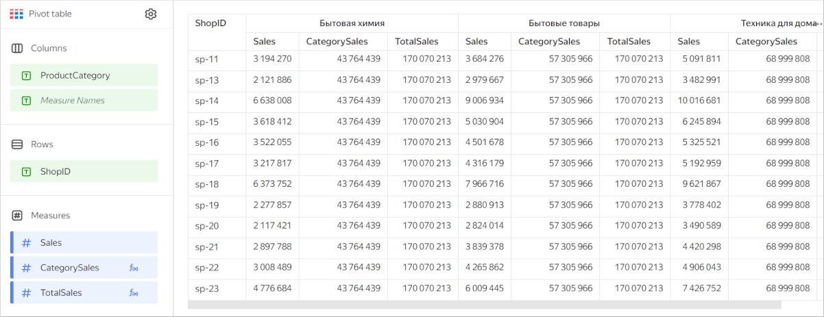
Unlike a flat table, categories in a pivot table can be stored both in columns and rows. They may contain multiple categories, while cells at their intersection contain measure values.
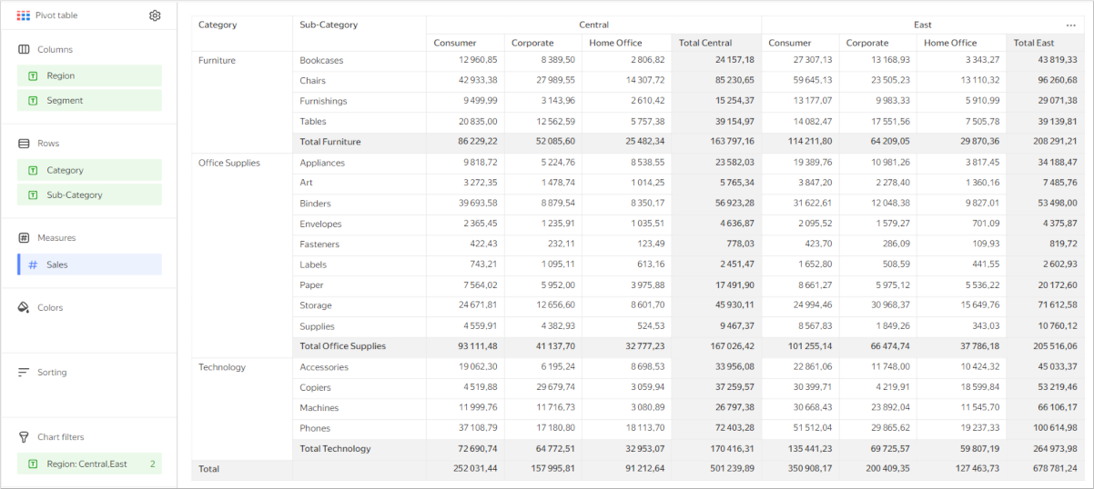
Pivot tables make it easier to work with large amounts of data and let you analyze the relationship between different measures. For example, you can use this type of table to analyze product sales depending on the delivery type by brand and product category over a specific year.

Source table
| Categories | Product brand | Delivery type | 2019 | 2020 | 2021 | 2022 |
|---|---|---|---|---|---|---|
| Household cleaners | BioDom | Delivery | 286 192 | 836 276 | 1 398 283 | 952 801 |
| Household cleaners | City Driver | Delivery | 248 020 | 699 284 | 1 074 216 | 705 072 |
| Household cleaners | Moydodyr | Delivery | 199 737 | 532 997 | 1 090 102 | 807 578 |
| Household cleaners | Chistyy Dom | Delivery | 400 993 | 1 016 930 | 1 658 254 | 1 092 608 |
| Household cleaners | BioDom | Pickup | 795 267 | 2 112 453 | 3 138 349 | 2 184 422 |
| Household cleaners | City Driver | Pickup | 574 643 | 1 665 665 | 2 544 045 | 1 843 545 |
| Household cleaners | Moydodyr | Pickup | 503 241 | 1 455 449 | 2 441 103 | 1 632 025 |
| Household cleaners | Chistyy Dom | Pickup | 815 338 | 2 446 136 | 3 710 564 | 2 837 481 |
| Household goods | 1001 necessary small things | Delivery | 701 548 | 1 630 965 | 2 592 784 | 1 947 613 |
| Household goods | Cedar wood | Delivery | 257 459 | 829 961 | 1 226 510 | 873 104 |
| Household goods | Rostov factory | Delivery | 111 812 | 220 937 | 584 077 | 272 213 |
| Household goods | Hleb-Sol | Delivery | 557 311 | 1 273 523 | 2 394 572 | 1 615 675 |
| Household goods | 1001 necessary small things | Pickup | 1 499 384 | 3 880 210 | 6 257 665 | 4 351 725 |
| Household goods | Cedar wood | Pickup | 703 202 | 1 922 952 | 2 935 546 | 2 323 846 |
| Household goods | Rostov factory | Pickup | 215 243 | 619 117 | 1 078 515 | 780 640 |
| Household goods | Hleb-Sol | Pickup | 1 053 432 | 3 469 672 | 5 271 466 | 3 754 047 |
| Home appliances | Kitchen&Food | Delivery | 307 919 | 926 118 | 1 413 174 | 1 063 128 |
| Home appliances | TechBeauty | Delivery | 271 553 | 768 793 | 1 192 747 | 809 543 |
| Home appliances | Razumnyy Dom | Delivery | 828 609 | 2 320 160 | 3 747 059 | 2 672 810 |
| Home appliances | Fabrika Komforta | Delivery | 364 309 | 1 103 700 | 1 674 297 | 1 146 209 |
| Home appliances | Kitchen&Food | Pickup | 803 667 | 2 254 885 | 3 065 383 | 2 243 507 |
| Home appliances | TechBeauty | Pickup | 623 684 | 1 675 606 | 2 891 334 | 2 029 385 |
| Home appliances | Razumnyy Dom | Pickup | 1 917 822 | 5 520 617 | 8 538 419 | 6 468 868 |
| Home appliances | Fabrika Komforta | Pickup | 1 072 286 | 2 170 431 | 4 178 690 | 2 827 290 |
When creating a pivot table, you can use these advanced settings:
- Renaming table columns and rows.
- Adding a tooltip to table headers.
- Setting the width of table columns and rows.
- Freezing table columns.
- Adding rows with subtotals.
- Setting field fill color.
- Adding a linear indicator to a column with a measure.
Wizard sections
| Wizard section |
Description |
|---|---|
| Columns | Dimensions |
| Rows | Dimensions |
| Measures | Measures. If you add more than one measure to a section, the Columns section will contain the Measure Names dimension that defines the location of the measure headers. You can move Measure Names to Rows. |
| Colors | Measure. Affects shading of all cells containing indicators. It may only contain one measure. |
| Sorting | Dimensions and measures under Columns and Rows. Multiple dimensions and measures can be used. The sorting direction is marked with an icon next to the field: for ascending or for descending. To change the sorting direction, click the icon. DataLens first groups columns or rows in the order they are listed in their respective sections, and only then sorts the groups according to the Sorting section. The order of fields in the section affects the sorting order of the table fields. Sorting by measure affects only the query to the source, not the pivot table. |
| Filters | Dimension or measure. Used as a filter. |
Creating a pivot table
Note
Not supported in QL charts.
To create a pivot table:
Warning
If you use a new DataLens object model with workbooks and collections:
- Go to the DataLens home page. In the left-hand panel, select Collections and workbooks.
- Open the workbook, click Create in the top-right corner, and select the appropriate object.
Follow the guide from step 4.
-
Go to the DataLens home page.
-
In the left-hand panel, select Charts.
-
Click Create chart → Chart.
-
At the top left, click Select dataset and specify the dataset to visualize.
-
Select the Pivot table chart type.
-
Drag a dimension from the dataset to the Columns section.
-
Drag a dimension from the dataset to the Rows section.
Note
In the Columns and Rows sections, you can change the order of dimensions by dragging them.
-
Drag a measure from the dataset to the Measures section. The values are displayed in the table cells.
-
Drag a measure from the dataset to the Color section. Cells with the measure are filled in with a color from the color gradient, depending on the measure value.
Additional settings
Renaming table columns and rows
- Under Columns or Rows, click the icon to the left of the dimension name.
- In the window that opens, change the Name field value and click Apply.
Adding a tooltip to a table header
- Under Rows, click the icon to the left of the dimension or measure name.
- In the window that opens, enable the Tooltip option, enter the text in the field below, and click Apply. By default, with this option enabled, the tooltip text is taken from the field description in the dataset.
When the option is enabled, the icon appears next to the table column header. Hover over the icon to bring up the tooltip.
Setting the width of table columns and rows
-
In the top-right corner of the Columns or Rows section, click (this icon appears when you hover over the section).
-
Under Width, select the values for columns and rows:
Auto: Automatic column/row width.%: Column/row width as a percentage of the table's total width.px: Column/row width in pixels.
You can use
%andpxto make table cell breaks (by word). Thus the number of rows in a cell may grow.Note
The total width of a table always takes up 100% of available space regardless of the specified width of individual columns and rows.
-
Click Apply.
To set the width of any column to Auto, click Reset.
Freezing table columns
Note
You can only freeze columns generated from dimensions in the Rows section.
- In the top-right corner of the Columns or Rows section, click (this icon appears when you hover over the section).
- In the Freeze window that opens, enter the number of columns to freeze. These columns will stay in place as you scroll horizontally.
- Click Apply.
Adding rows with subtotals
- Under Columns or Rows, click the icon in front of the field name.
- In the field settings window, enable Sub-totals.
- Click Apply.
The table will show columns and/or rows with Total <field_name>.
To output the common Total row, enable Sub-totals in the settings for the first fields under Columns and Rows.
Pivot table with subtotals
Note
- The Total row does not support filtering by measure. You can hide the Total row by dragging a measure to the Filters or Dashboard filters section.
- Calculations using LOD expressions, window functions, and time series functions may not work correctly in the row with totals.
Setting the field fill color
-
Under Columns, Rows, or Measures, click the icon to the left of the field name.
-
In the window that opens, enable Column fill color.
-
In the By field list, select the field whose values the fill will be based on.
-
Set the Fill type:
Note
You can use the Palette type for dimensions and the Gradient type for measures.
For a dimensionFor a measure- Click the color scheme selection field and set a color for each dimension value.
- Click Apply.
-
Click the gradient selection field and set the following properties:
-
Gradient type: Select two or three colors.
- Gradient color: Select a color palette for the gradient from the list.
- Gradient direction: Change the gradient direction using the icon.
-
Set threshold values: Set numeric thresholds for each color.
-
-
Click Apply.
-
For the Gradient fill type, specify the coloring option for
nullvalues:Do not colororColor as 0. -
Click Apply.
Adding a linear indicator to a column with a measure
-
Under Measures, click the icon to the left of the measure name.
-
In the window that opens, enable Linear indicator.
-
Specify the indicator settings:
- Fill type: Type of fill color for the indicator.
- Positive values: Indicator color for positive values.
- Negative values: Indicator color for negative values.
- Show labels: This option enables displaying measure values in a cell.
- Show in totals: This option enables displaying the indicator in cells with totals.
- Align: Left or right alignment of the indicator position in a column. Only applies if all numbers in a column are either positive or negative.
- Scale: Sets the indicator scale. If you set a scale manually, specify the min and max values. Make sure the min value is less than or equal to
0and the max value is larger than or equal to0.
Example of linear indicator settings
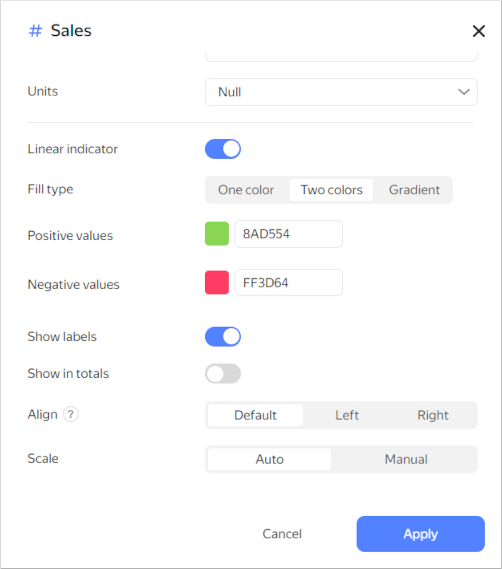
-
Click Apply.
Recommendations
-
Use a pivot table to represent aggregate data in table format.
-
Place dimensions on the left and measures on the right. This makes the data easier to comprehend.
-
Make sure column names you use are short and readable.
-
Limit the size of your table or use filters and sorting. Tables with too many rows or columns are hard to read.
-
You can color table cells depending on the values of a measure. This will help you to highlight the values.
-
Use tables for their intended purpose only. Do not replace all data visualization types with them.
-
When posting a table on a dashboard, enable auto height in the widget settings. This will help you save dashboard space.
Setting up auto height
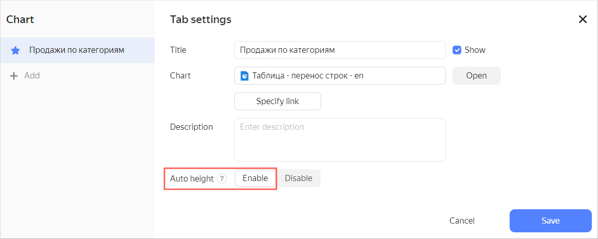
If you use a filter, the table height will automatically adapt to the number of rows.
Using a filter with the auto height option enabled
If no value is set in the filter, a table displays all rows depending on the limit to the number of rows per page.
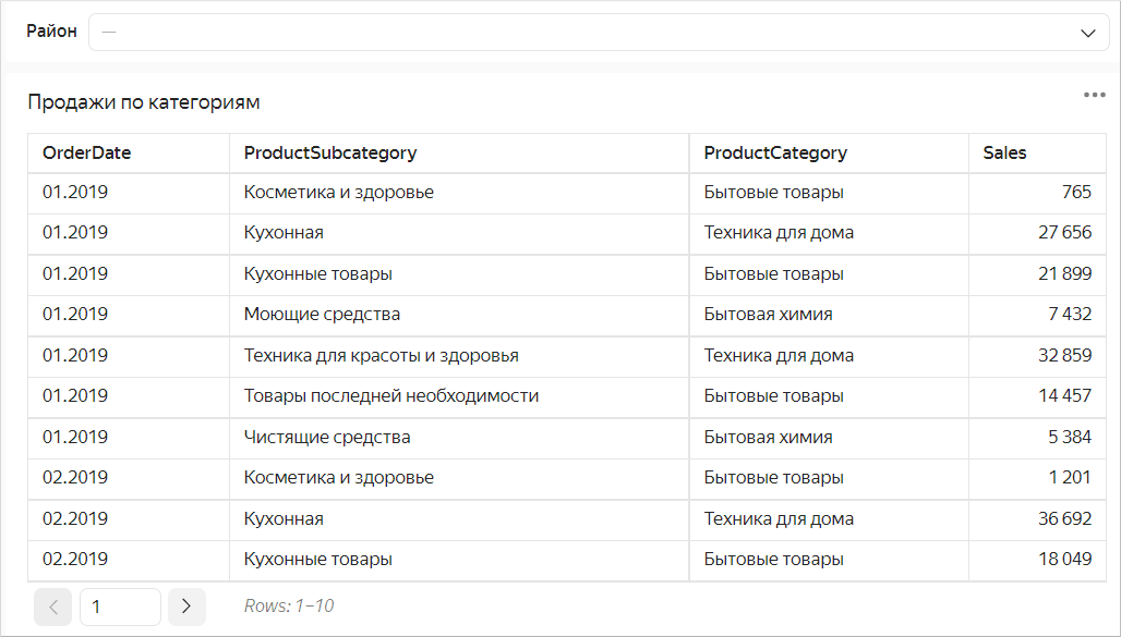
If the number of displayed rows decreases when using the filter, the table height is reduced automatically.
-
Represent totals (or subtotals) as a column. To do this, use calculated fields based on window functions or LOD expressions. For example:
-
Sales subtotal by product category:
CategorySaleswith theSUM(SUM([Sales]) WITHIN [ProductCategory])formula. -
Total sales:
TotalSaleswith theSUM(SUM([Sales]) TOTAL)formula.Table example
-
Maximum order count per month grouped by product category:
MaxCountByCategorywith theMAX(COUNTD([OrderID] INCLUDE [ProductCategory]))formula.Table example

-
-
Use sorting. This makes the data easier to comprehend.
-
Use the URL function in table cells to enable users to follow a link.
-
When displaying numeric data, specify the dimension and the number of decimal places. For example, if you select
Millions, Min the Dimension drop-down list, you will see10,3 Mrather than10 345 234.23. If you set theDecimal placesfield to2, you will see123.12rather than123.1234.