Tree chart
Written by
Updated at March 6, 2025
A tree chart displays hierarchy data as a set of nested rectangles. Each hierarchy level corresponds to a dimension and is shown as a colored rectangle with nested rectangles. The size of each rectangle depends on the measure value: the higher the value, the larger the size. A chart does not take up much space on a dashboard, even if it contains a lot of data.
For example, you can use a tree chart to visualize sales by product category and subcategory.
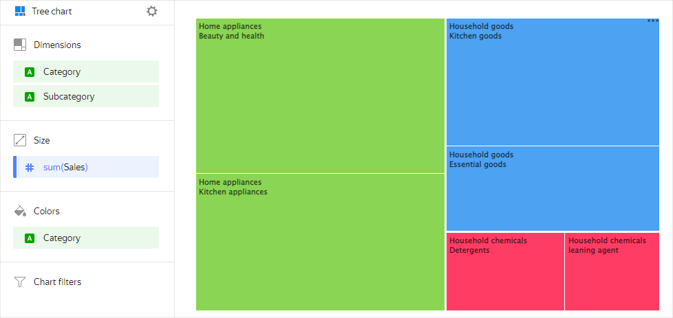
Source table
| Category | Subcategory | Sales |
|---|---|---|
| Home appliances | Kitchenware | 15000000 |
| Home appliances | Beauty and health products | 17000000 |
| Household goods | Kitchen products | 12000000 |
| Household goods | Essential goods | 8000000 |
| Household cleaners | Detergents | 4100000 |
| Household cleaners | Cleaners | 3300000 |
Wizard sections
| Wizard section |
Description |
|---|---|
| Dimensions | Dimensions Determines the hierarchy tree of nested rectangles. For String type fields, you can configure using basic Markdown syntax: click the icon before the field name and enable Markdown. |
| Disk | Measure. One measure that determines the area of a rectangle. |
| Colors | Dimension or measure. Affects the shading of rectangles in a chart. |
| Filters | Dimension or measure. Used as a filter. |
Creating a tree chart
To create a tree chart:
Warning
If you use a new DataLens object model with workbooks and collections:
- Go to the DataLens home page. In the left-hand panel, select Collections and workbooks.
- Open the workbook, click Create in the top-right corner, and select the appropriate object.
Follow the guide from step 4.
- Go to the DataLens home page.
- In the left-hand panel, select Charts.
- Click Create chart → Chart.
- At the top left, click Select dataset and specify the dataset to visualize.
- Select Tree chart as the chart type.
- Drag one or more dimensions from the dataset to the Dimensions section.
- Drag a measure from the dataset to the Size section. The values will be displayed as rectangles. The areas of the rectangles are proportional to the corresponding values of the selected measure.
- Drag a measure or dimension from the Dimensions section to the Color section. As a result, the rectangles will be colored depending on the value of the added measure or dimension. A dimension that you can add to the Color section must be from the **Dimensions **section.
- Drag a dimension or measure from the dataset to the Filters section. The field can be empty. In this case, no filters are applied.
Recommendations
- Use this type of chart to show the relationship between a part and a whole.
- If there are few categories (up to six), use a pie or donut chart.
- You cannot display negative values on a tree chart.