Point map with clusters
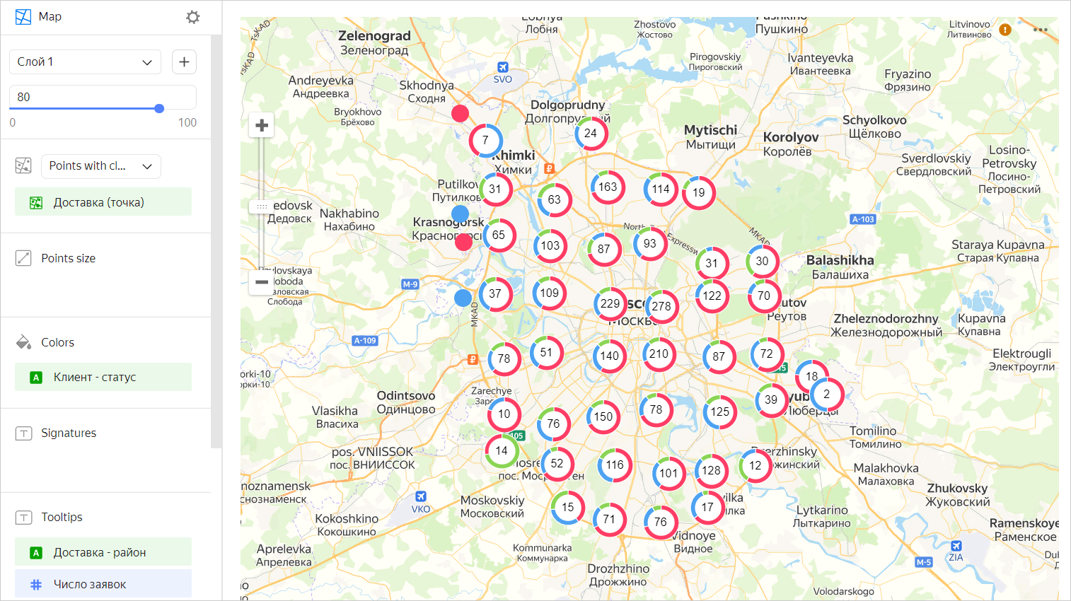
A point map with clusters differs from a regular point map in clustering adjacent points. On the map, a cluster is represented as a donut chart with the number of points displayed in the center.
Note
The cluster center only displays the number of points entering this cluster. You cannot choose a different metric, e.g., the sum of values across all points.
The behavior of points varies depending on the map scale:
- When scaling down, points are clustered.
- When scaling up, the distance between points increases and a cluster is automatically split into smaller clusters and/or individual points.
If a map with the selected scale only contains a single point, it's not clustered. In this case, instead of a donut chart, you will see a point just like in a regular point map.
Clustering on a map improves visualization when there is a large number of points. For example, if you want to show the location of all stores in a city on a map with clustering, points on the map will not overlap.
Wizard sections
Limitations:
- The Point size, Tooltips, and Signatures sections only apply to individual points.
- You can only add a dimension to the Color section.
| Section section |
Description |
|---|---|
| Points with clusters (Geopoints) | Measure of the Geopoint type |
| Point size | Measure. Sets point size depending on the measure value. |
| Colors | Dimension. Sets cluster chart segmentation. |
| Labels | Measure. Displayed as text on a point. When used, point size control is blocked. |
| Tooltips | Dimension or measure. A tooltip that appears when you hover over a point. For String type fields, you can configure using basic Markdown syntax: click the icon before the field name and enable Markdown. |
| Layer filters | Dimension or measure. Used as a filter for the current layer. |
| Filters | Dimension or measure. Used as a filter for the entire chart. |
Creating a point map with clusters
Warning
If you use a new DataLens object model with workbooks and collections:
- Go to the DataLens home page. In the left-hand panel, select Collections and workbooks.
- Open the workbook, click Create in the top-right corner, and select the appropriate object.
Follow the guide from step 4.
- Go to the DataLens home page.
- In the left-hand panel, select Charts.
- Click Create chart → Chart.
- At the top left, click Select dataset and specify the dataset to visualize. If you do not have a dataset, create one.
- Select Map for chart type.
- Select the Points with clusters (Geopoints) layer type.
- Drag a dimension of the Geopoint type from the dataset to the layer type selection section.
- Set the size of the points displayed on the point map. Drag a measure to the Point size section or click in the line with the section name.
- Color the points on the map. Drag a dimension to the Color section.
- Add tooltips to show the dimension and measure values when hovering over a point.
You can also:
- Add, rename, and delete a layer.
- Reorder the layers within a layer type.
- Apply a filter to the whole chart or one layer.
Recommendations
- Use color palettes corresponding to the goals and objectives of visualization.