Selectors in reports
Selectors are filters that affect the results of queries in the linked widgets.
You can add, set up, or delete a selector in your report.
You can also add a JS selector to a report.
Before adding a selector, make sure you have the Write or Admin access to the report. For more information, see Object access permissions.
To start working with selectors:
-
Open the report with the required selector in one of the following ways:
WorkbookNavigation bar- Go to the page with workbooks and collections.
- Open the workbook with the report you need and select it.
- Go to the DataLens home page.
- In the left-hand panel, select Reports and select the report.
-
At the top right, click .
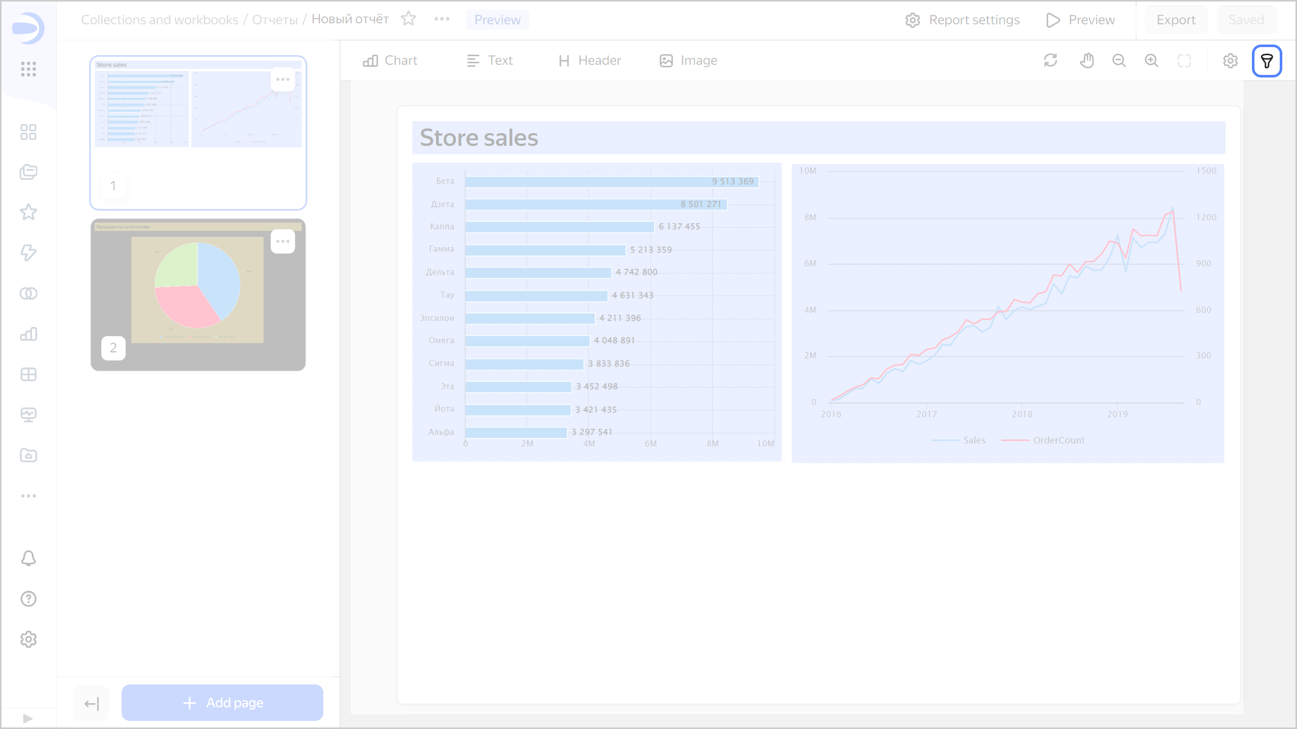
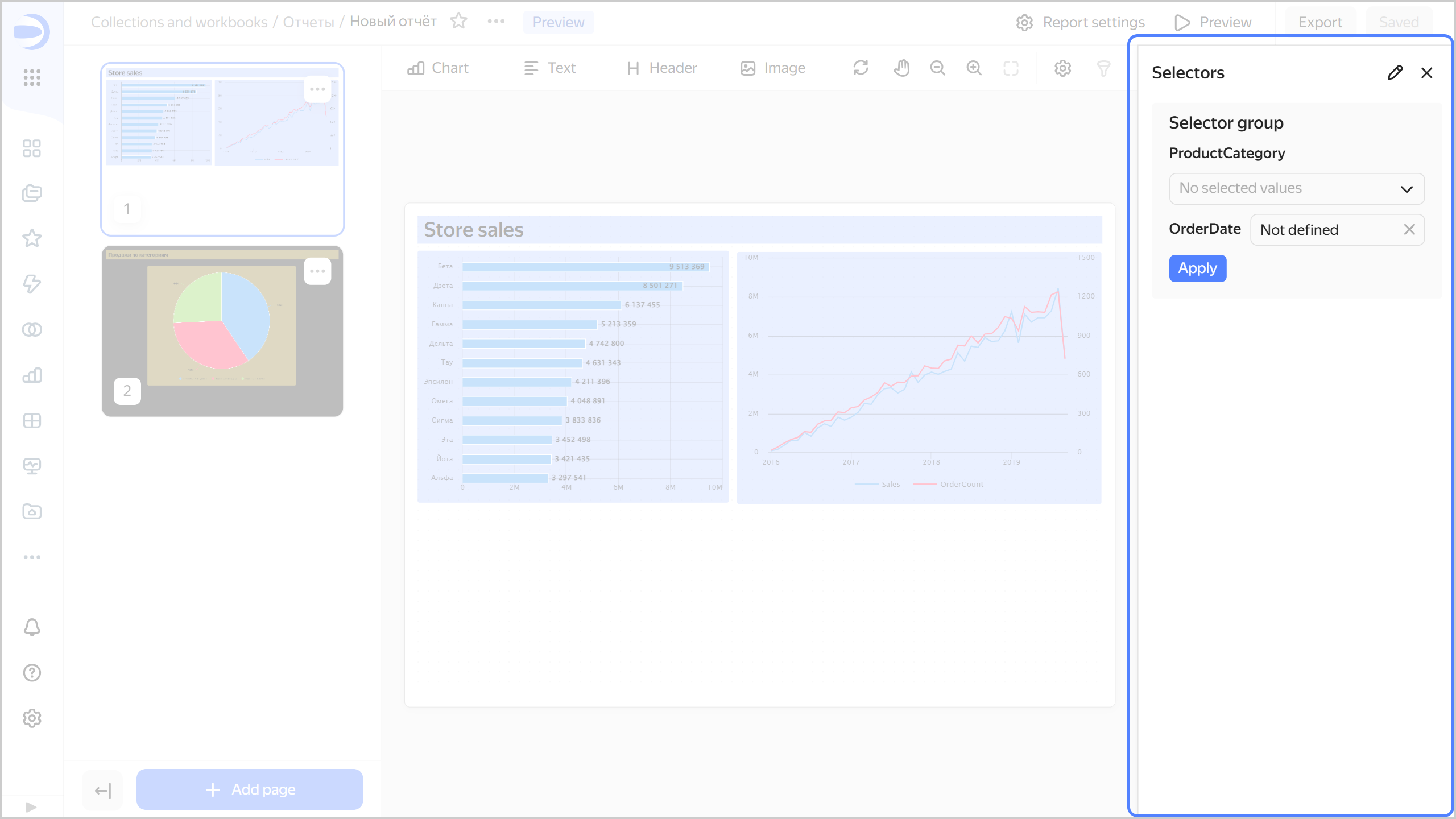
The Selectors window will open on the right:
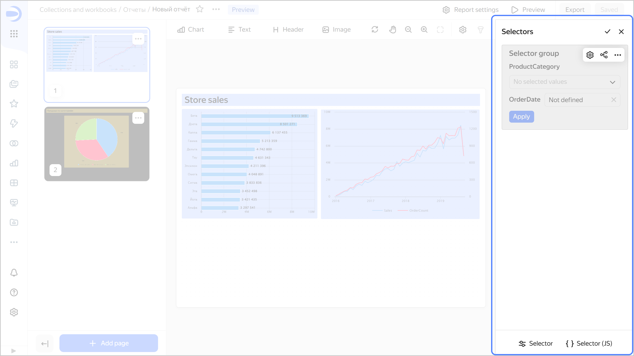
- To enter edit mode, click .
- To get back to filter mode, click .
- To hide the Selectors window, click .
Selectors in filter mode
Selectors in edit mode
Adding a selector
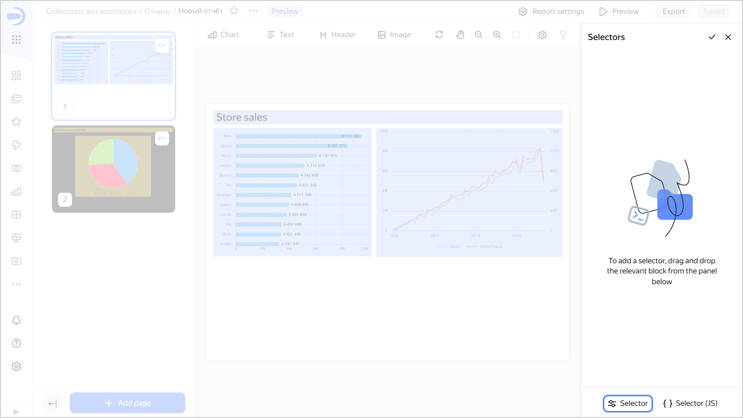
To add a selector to a report:
-
Open the Selectors window. To do this, click at the top right.
If your report already has selectors, switch to edit mode. To do this, click . -
From the panel below, drag the Selector widget to the Selectors section.
Adding a selector
-
Under Selector settings choose the source and specify the selector parameters:
Based on a datasetManual input-
Dataset: Dataset with data for the selector. You can choose a dataset from the list of objects or provide a link. This is a required field.
-
Field: Dataset field with selector values. It can be either a dimension or a measure. For more information, see Data fields. This is a required field.
-
Selector type: Drop-down list, input field, calendar, or checkbox.
Note
- Calendar is only available for fields of the
DateorDate and timetype. - Checkbox is only available for fields of the
Booleantype. - Measure selectors can only have the Input field type.
- Calendar is only available for fields of the
-
Operation: Comparison operation for the selector to filter the chart values (e.g., Equal to, Greater than, or Less than). If the field is left blank, the selector will filter by the Equal to operation by default. The list of available operations depends on the field type. Do not specify an operation if the selector filters the QL chart.
-
Multiple choice: Allows choosing several values in the selector. It is only available for the List selector type.
-
Range: Allows setting a time interval in the selector. It is only available for the Calendar selector type.
-
Required field: Sets the selector value as a required parameter. When enabled,
*is appended to the selector name. It is not available for the Checkbox selector type. -
Default value: Applied initially when you open the report. This is a required field if the Required field option is enabled.
-
Header: To choose the selector for linking with other widgets. By default, when you add a selector, the header text is substituted from the field title in the dataset. This is a required field.
Select the header location below:
Left(default),Top, orHiddento hide it from the report selector settings window. It is not available for the Checkbox selector type. -
Inner title: Allows specifying text inside a selector. For example, you can use it to display an operation inside a selector. It is not available for the Checkbox selector type.
-
Coloring: Allows you to highlight important selectors. It is not available for the Checkbox selector type.
-
Tooltip: This option allows adding a text comment to a selector. By default, with this option enabled, the tooltip text is taken from the field description in the dataset. You can edit the tooltip text using the visual editor or Markdown. Changing the field description in the dataset will not automatically update the text.
When the option is enabled, you will see the icon next to the selector in the report selector settings window. Hover over the icon to bring up the tooltip.
-
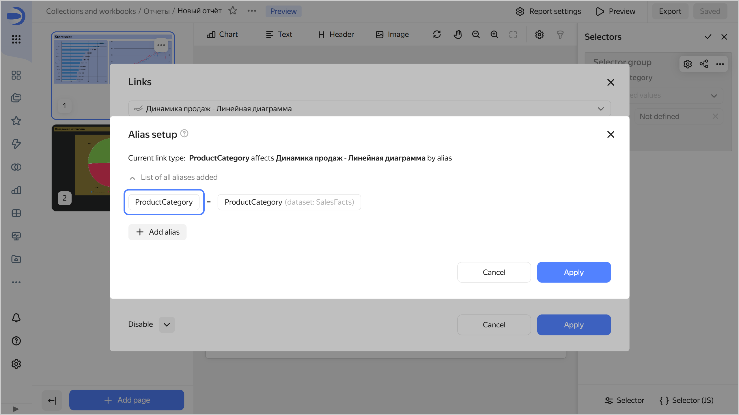
Field or parameter: Field name you can use to link the selector with other widgets in the alias configuration window. This is a required field.
-
Selector type: Drop-down list, input field, calendar, or checkbox.
Note
- Calendar is only available for fields of the
DateorDate and timetype. - Checkbox is only available for fields of the
Booleantype. - Measure selectors can only have the Input field type.
- Calendar is only available for fields of the
-
Operation: Comparison operation for the selector to filter the chart values (e.g., Equal to, Greater than, or Less than). If the field is left blank, the selector will filter by the Equal to operation by default. The list of available operations depends on the field type. Do not specify an operation if the selector filters the QL chart.
-
Required field: Sets the selector value as a required parameter. When enabled,
*is appended to the selector name. It is not available for the Checkbox selector type. -
Multiple choice: Allows choosing several values in the selector. It is only available for the List selector type.
-
Possible values: List of values to select. It is only available for the List selector type.
-
Range: Allows setting a time interval in the selector. It is only available for the Calendar selector type.
-
Time: Allows specifying time. It is only available for the Calendar selector type.
-
Default value: Applied initially when you open the report. This field must be set for the List type; otherwise, no value will be available in the selector. This is a required field if the Required field option is enabled.
-
Header: To choose the selector for linking with other widgets. This is a required field.
Select the header location below:
Left(default),Top, orHiddento hide it from the report selector settings window. It is not available for the Checkbox selector type. -
Inner title: Allows specifying text inside a selector. For example, you can use it to display an operation inside a selector. It is not available for the Checkbox selector type.
-
Coloring: Allows you to highlight important selectors. It is not available for the Checkbox selector type.
-
Tooltip: This option allows adding a text comment to a selector. By default, with this option enabled, the tooltip text is taken from the field description in the dataset. You can edit the tooltip text. Changing the field description in the dataset will not automatically update the text.
When the option is enabled, you will see the icon next to the selector in the report selector settings window. Hover over the icon to bring up the tooltip.
In QL charts, you can manage selector parameters from the Parameters tab in the chart editing area and use the Query tab to specify a variable in the query in
{{ variable }}format. -
-
Optionally, add another selector to the widget. To do this, on the left side under Selectors, click Add selector and repeat the actions from the previous step. You can also duplicate the new selector or copy it to the clipboard. To do this, under Selectors, click next to the selector and select:
-
Duplicate: This will add a new selector with the same parameters to the widget.
-
Copy to clipboard: You can paste the selector you copied into a different widget using the Paste button in the Selectors section or to a report using the Insert button on the bottom panel of the report page.
Inserting a selector
-
-
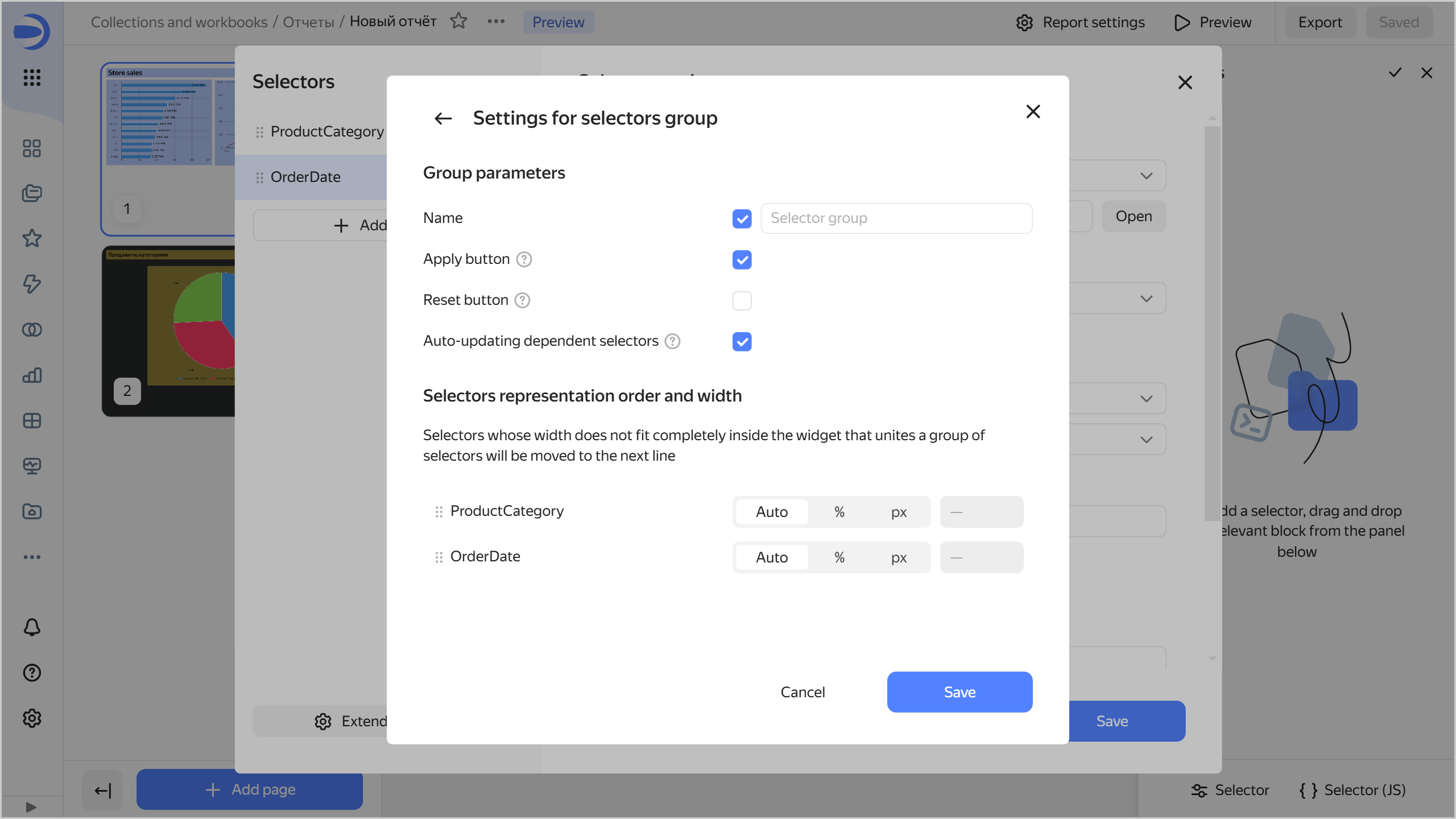
Optionally, click Advanced settings and specify widget settings:
-
Name: If you enable this option, the
Selector groupname will be displayed at the top of the widget. In the field on the right, you can enter your own name. -
Apply button: Adds a widget button which applies the values of all selectors in the widget. The selector values are not applied until you click the button.
-
Reset button: Adds a widget button which resets the values of all the widget selectors to their defaults.
-
Dependent selector autoupdate: Enables dependent selectors to influence one another before you click the Apply button. Available for widgets with multiple selectors and the Apply button option enabled.
-
Optionally, for a widget with multiple selectors, customize the selector arrangement. To do this, arrange the selectors as needed by dragging them and adjust the width of each one:
Auto: Automatic selector width.%: Selector width as a percentage of the widget's total width.px: Selector width in pixels.
Click Save.
-
-
Click Save. The widget will appear in the Selectors window. The selectors section will automatically scroll to the added widget.
-
Optionally, add another widget to the report. To do this, repeat steps 4-7.
-
Return to filter mode. To do this, click .
-
In the top-right corner, click Save.
You can now control filtering in a report by choosing values in selectors.
Warning
If you add a field selector to a report, filters added at the chart level will no longer apply to the chart in the report.
Adding a JS selector
To add a JS selector to a report:
-
Open the Selectors window. To do this, click at the top right.
If your report already has selectors, switch to edit mode. To do this, click . -
From the panel below, drag the Selector (JS) widget to the Selectors section.
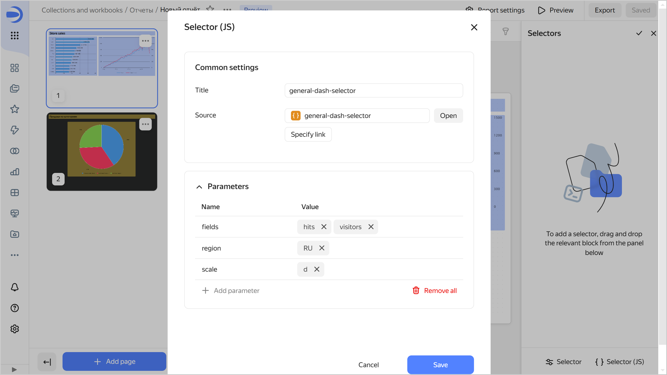
Adding a JS selector
-
Under Selector settings choose the source and specify the selector parameters:
-
Header: To choose the selector for linking with other widgets. By default, when you add a selector, the header text is substituted from the object name. This is a required field.
-
Source: Sets the selector created in Editor. Choose the selector:
From the list of objectsUsing a linkClick Select and choose the selector from the list of objects. If you have already chosen the selector, you can proceed to edit it by clicking Open next to the selector.
Click Specify link. Enter the selector URL into the input field and click OK below.
-
Parameters: Sets a list of selector parameters and their default values. For the widget to work correctly, specify the selector parameters listed on the Params tab.
-
-
Click Save. The widget will appear in the Selectors window. The selectors section will automatically scroll to the added widget.
Setting up and deleting a selector
-
Open the report in which you want to change the selector settings.
-
Open the Selectors window. To do this, click at the top right.
-
Go to edit mode. To do this, click .
-
To the right of the widget, select:
-
Return to filter mode. To do this, click .
-
In the top-right corner of the report, click Save.
Limits
- You can only add selectors to a separate report area.
- Selectors filter data across all report pages.
- For measure selectors, only one type is available: Input field.
- We recommend that you always make your measure selectors independent from other selectors. To do this, set their link type to Not linked to other selectors in the Links section when editing the selector widget.