Analyzing public data on road accidents in Russia
- Getting started
- Create a workbook
- Create a connection to files
- Create a dataset
- Analyze accident distribution density
- Analyze the number of accidents and death rate
- Analyze the statistics by week, day of week, and time of day
- Create a map with color fill by region
- Create a dashboard and add charts to it
- Add selectors to the dashboard
- Add a map with color fill by region to the dashboard
- Publish the dashboard
Note
In this tutorial, all objects will be created and stored in a workbook. If using legacy folder navigation, create an individual folder to work in.
Create a folder
- Go to the DataLens home page.
- In the left-hand panel, select All objects or Personal folder.
- In the top-right corner, click Create → Folder.
- Enter a name for the folder.
- Click Create.
This tutorial analyzes public data on road accidents in Russia. In addition to exploring the accident statistics in Russia, you will learn how to:
- Work with the DataLens key entities: connections, datasets, charts, and dashboards.
- Merge multiple sources at the single dataset level.
- Use the
Date and timedata type and edit chart-level groupings. - Work with geodata: geopoints and geopolygons.
- Create public dashboards that will be available to everyone from any device without authentication.
The following files will provide the source data:
- Traffic accident statistics for April-December 2018 in CSV format.
- Polygon reference for regions of Russia in CSV format.
Download them before you proceed with this guide.
To visualize and explore data, set up DataLens and follow the steps below:
- Create a workbook.
- Create a connection to files.
- Create a dataset.
- Analyze accident distribution density.
- Analyze the number of accidents and death rate.
- Analyze the statistics by week, day of week, and time of day.
- Create a map with color fill by region.
- Create a dashboard and add charts to it.
- Add selectors to the dashboard.
- Add a map with color fill by region to the dashboard.
- Publish the dashboard.
Getting started
To get started with DataLens:
- Log in to your Yandex account. If you do not have an account, create one.
- Open the DataLens home page.
- Click Start in cloud.
- Confirm that you have read the Terms of use and click Log in.
-
Log in to your Yandex account.
-
Open the DataLens home page.
-
Click Start in cloud.
-
Select one of these options:
-
If you already have an organization, select it from the drop-down menu in the Organizations tab and click DataLens.
Note
To activate a DataLens instance, the user must have the
adminorownerrole. For more information about roles, see Access management in Yandex Identity Hub. -
If you have a cloud but no organization, click Add new DataLens. In the window that opens, enter a name and description for your organization and click Create organization and DataLens. For more information about working with organizations, see Getting started with organizations.
-
If you encounter a technical issue with the service, contact Yandex Cloud support. To ask for advice, discuss a solution to your issue, or explore current best practices, join the DataLens chat in Telegram.
Create a workbook
- Go to the DataLens home page.
- In the left-hand panel, select Collections and workbooks.
- In the top-right corner, click Create → Create workbook.
- Enter
Tutorialsfor the workbook name. - Click Create.
Create a connection to files
Create a connection to the source data files:
-
In the top-right corner of the workbook, click Create → Connection.
-
Under Files and services, select the Files connection.
-
Click Upload files.
-
Select
dtp201804-1.csv. Wait until the table content appears on the screen.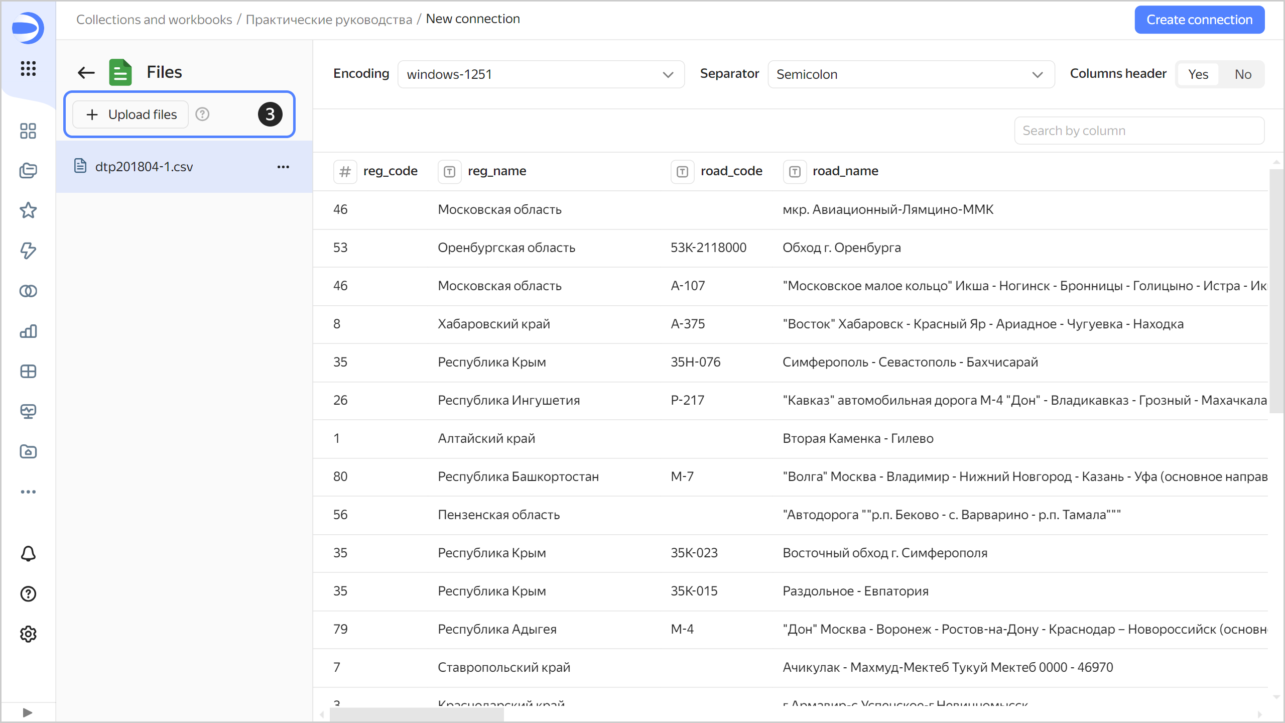
-
Add a table with region geolayers. Click Upload files.
-
Select
Regions.csv. Wait for the data to load. -
Select the uploaded
Regions.csvfile from the list on the left. -
Set the Column header parameter to
Yes. -
Click Create connection.
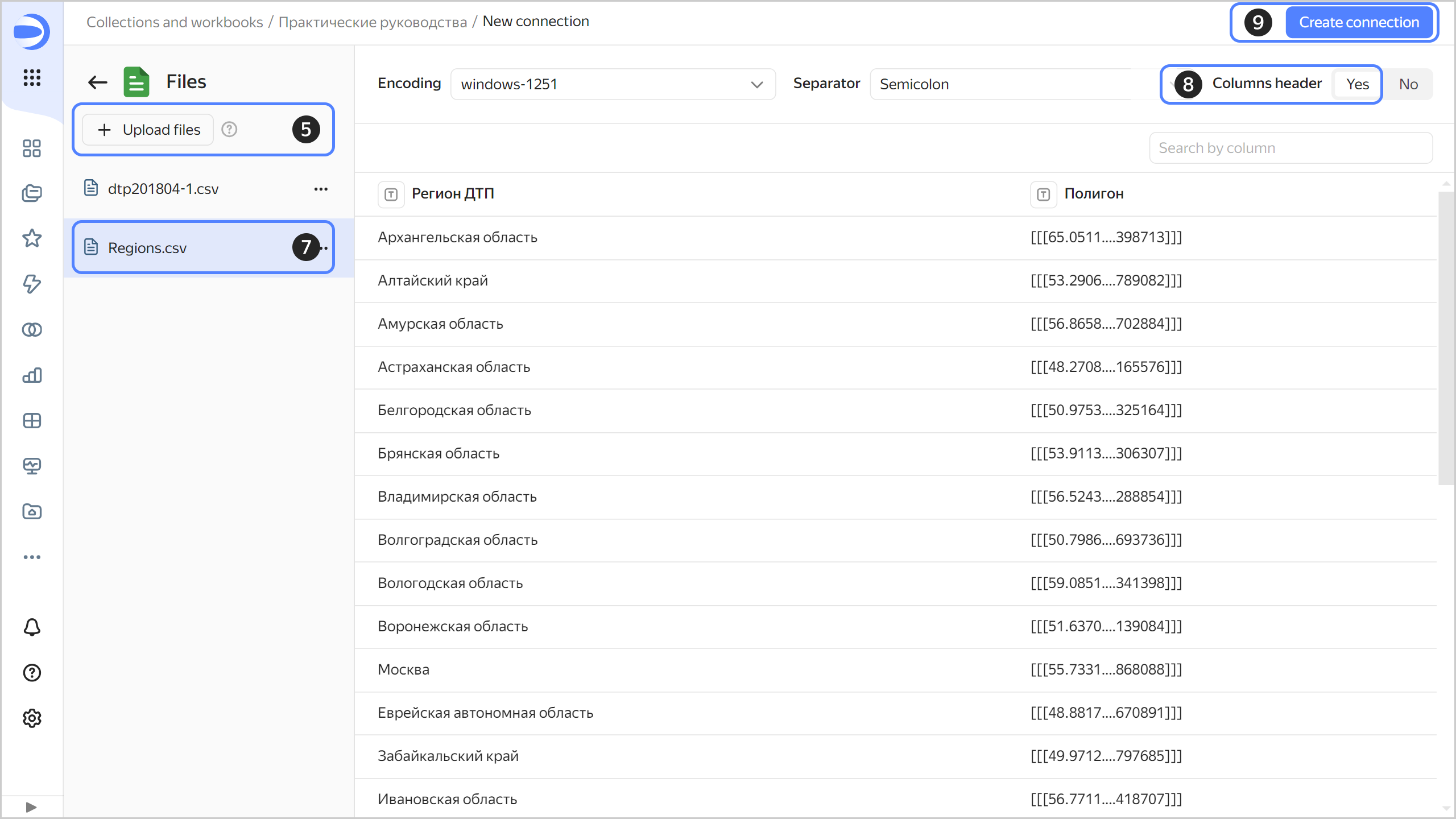
-
Enter
dtp_datafor the connection name and click Create.
Create a dataset
Create a dataset based on the dtp_data connection:
-
In the top-right corner of the connection page, click Create dataset.
-
Drag the
dtp201804-1.csvtable to the workspace. -
Drag the
Regions.csvtable to the workspace. Since the tables’ data has not yet been merged, an error message will appear. -
Click the link icon between the tables.
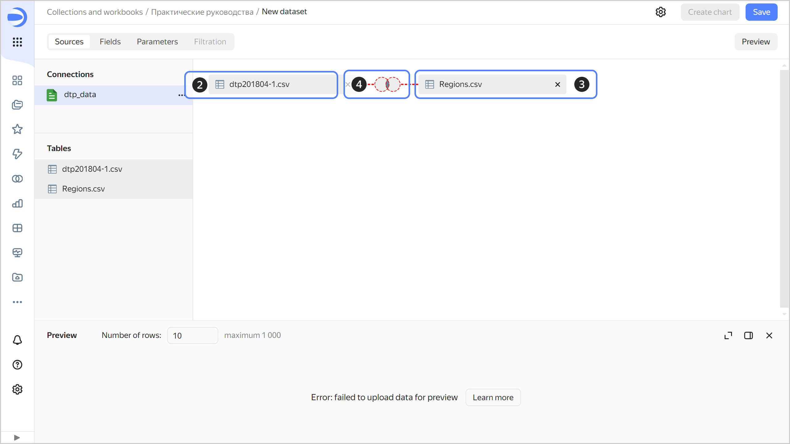
-
Click Add link.
-
Select the fields to link:
reg_nameandAccident region. -
Click Apply.
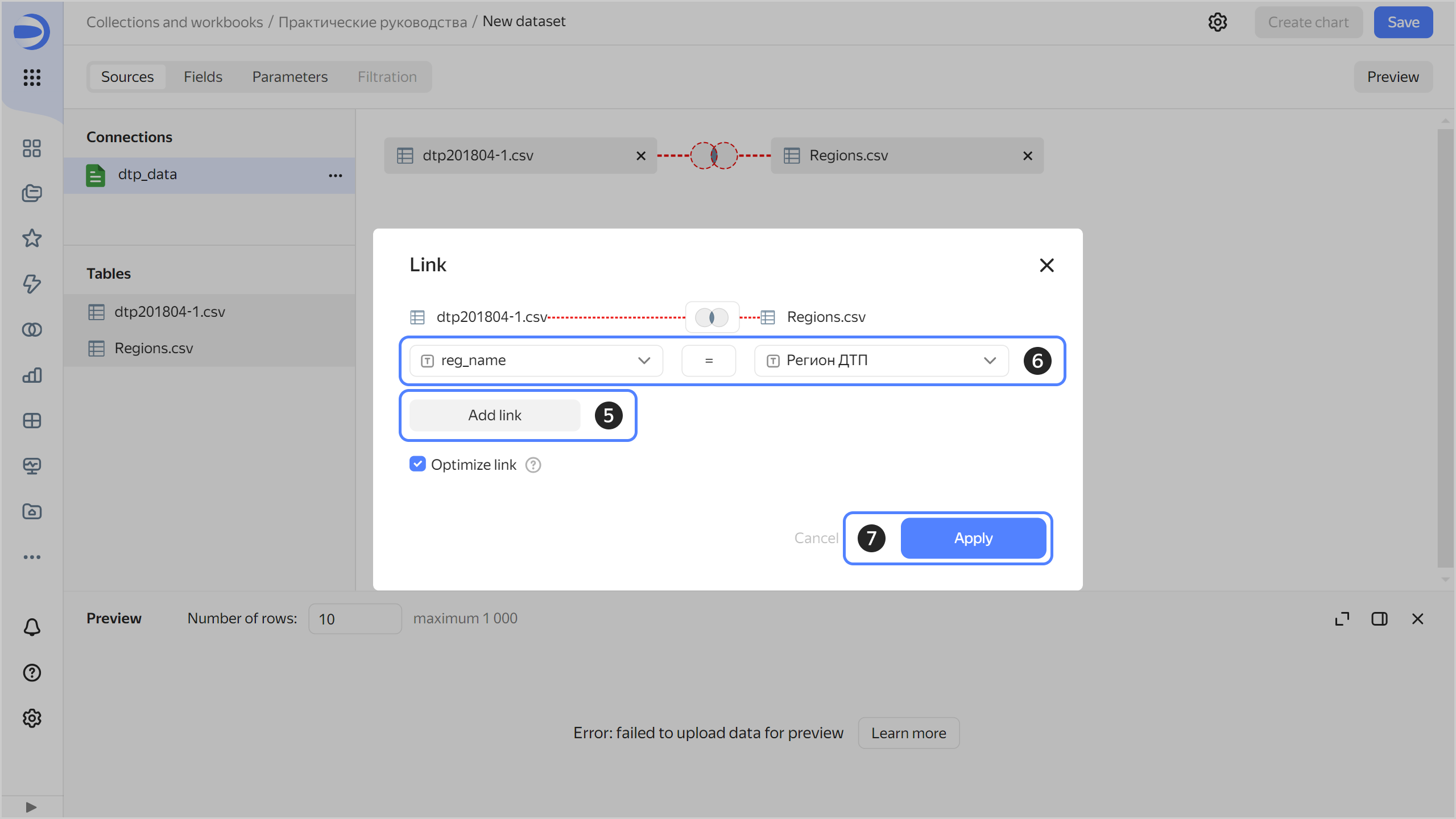
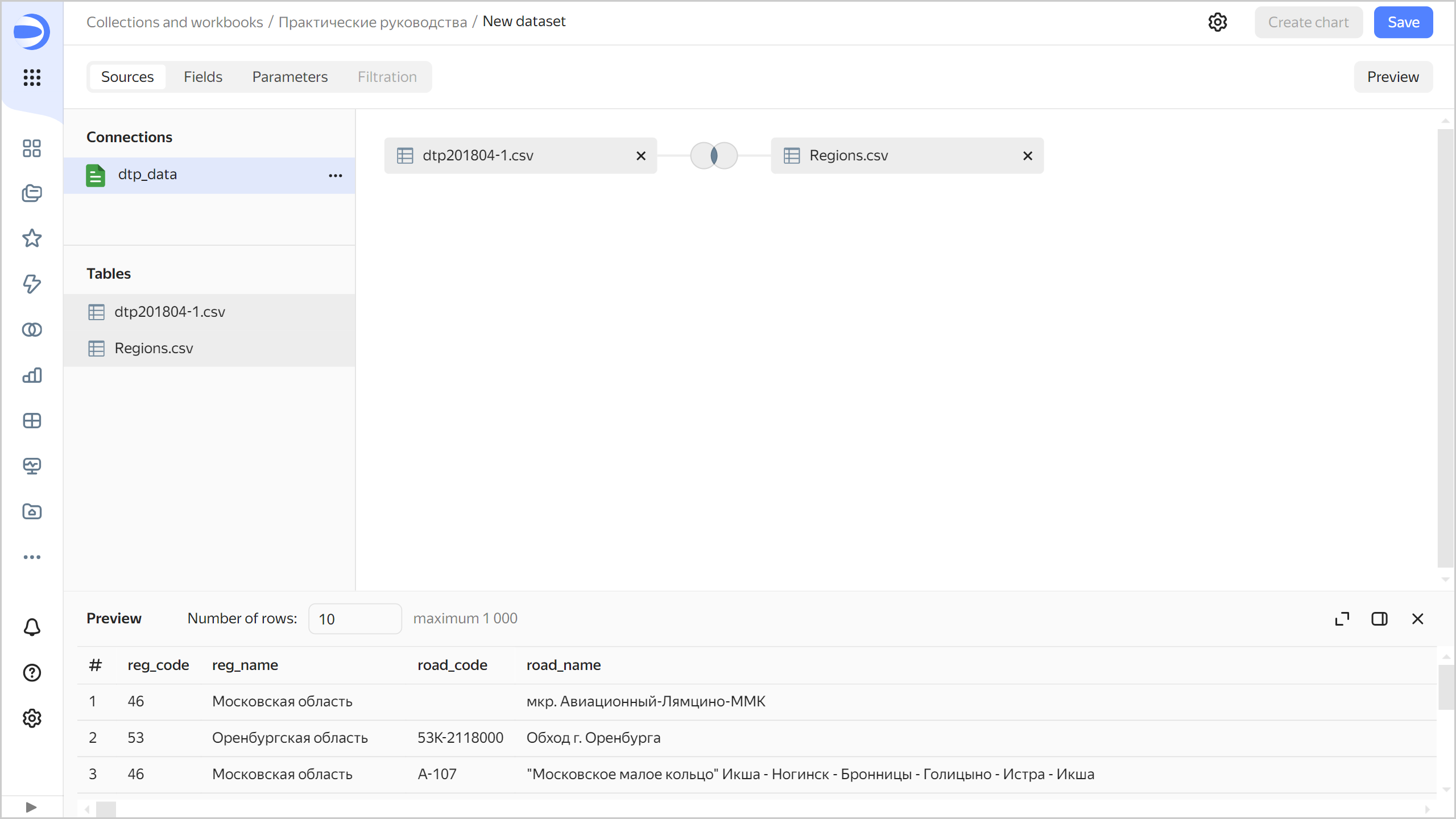
Make sure the data in the preview is displayed correctly.
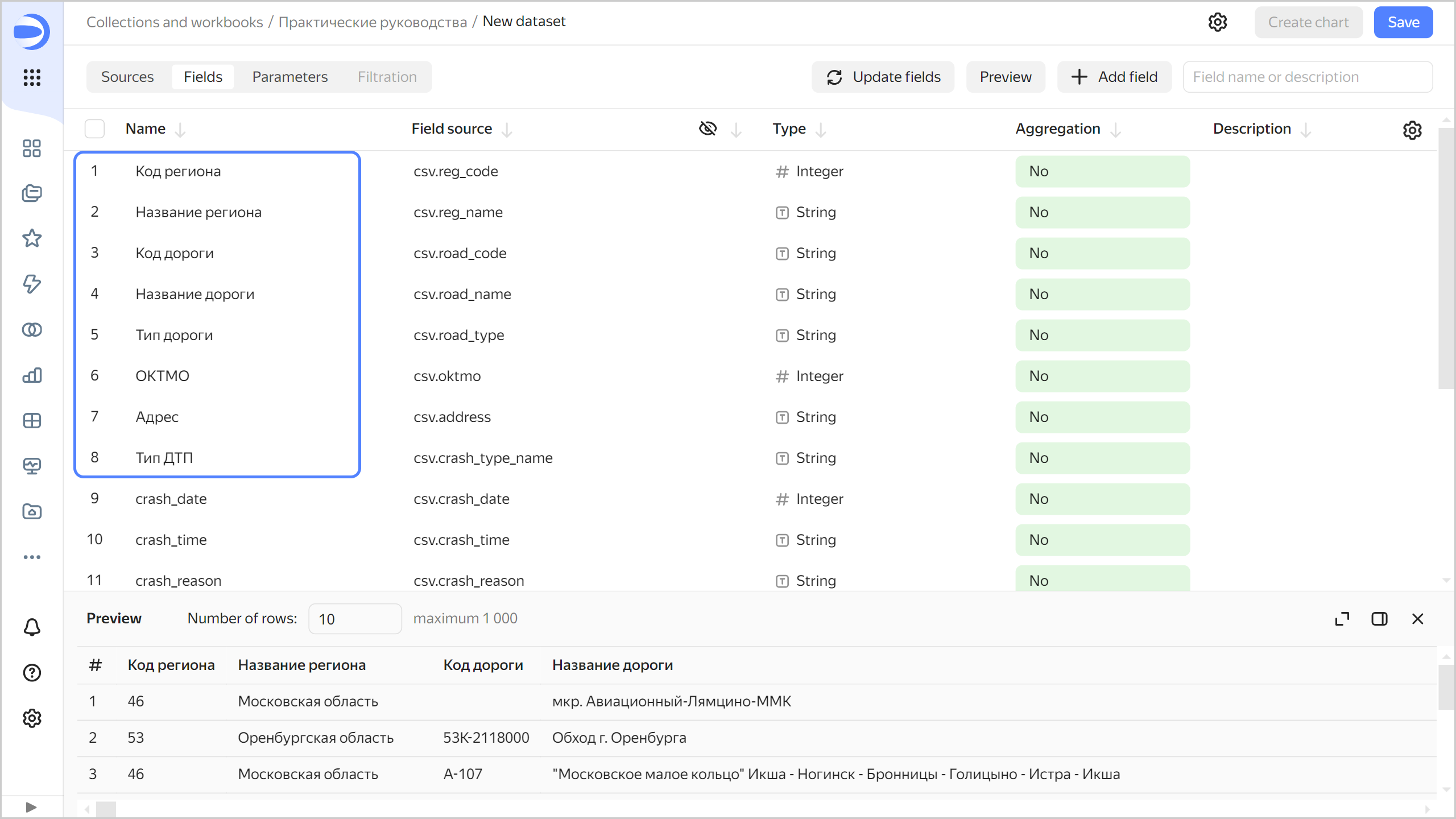
-
Navigate to the Fields tab. On this tab, you can add data fields and calculated fields, change field data types and aggregation rules, as well as rename fields.
-
Rename the fields as follows:
reg_codetoRegion codereg_nametoRegion nameroad_codetoRoad coderoad_nametoRoad nameroad_typetoRoad typeoktmotoOKTMO codeaddresstoAddresscrash_type_nametoAccident type
To rename a field, click its current name, delete it, and enter a new one.
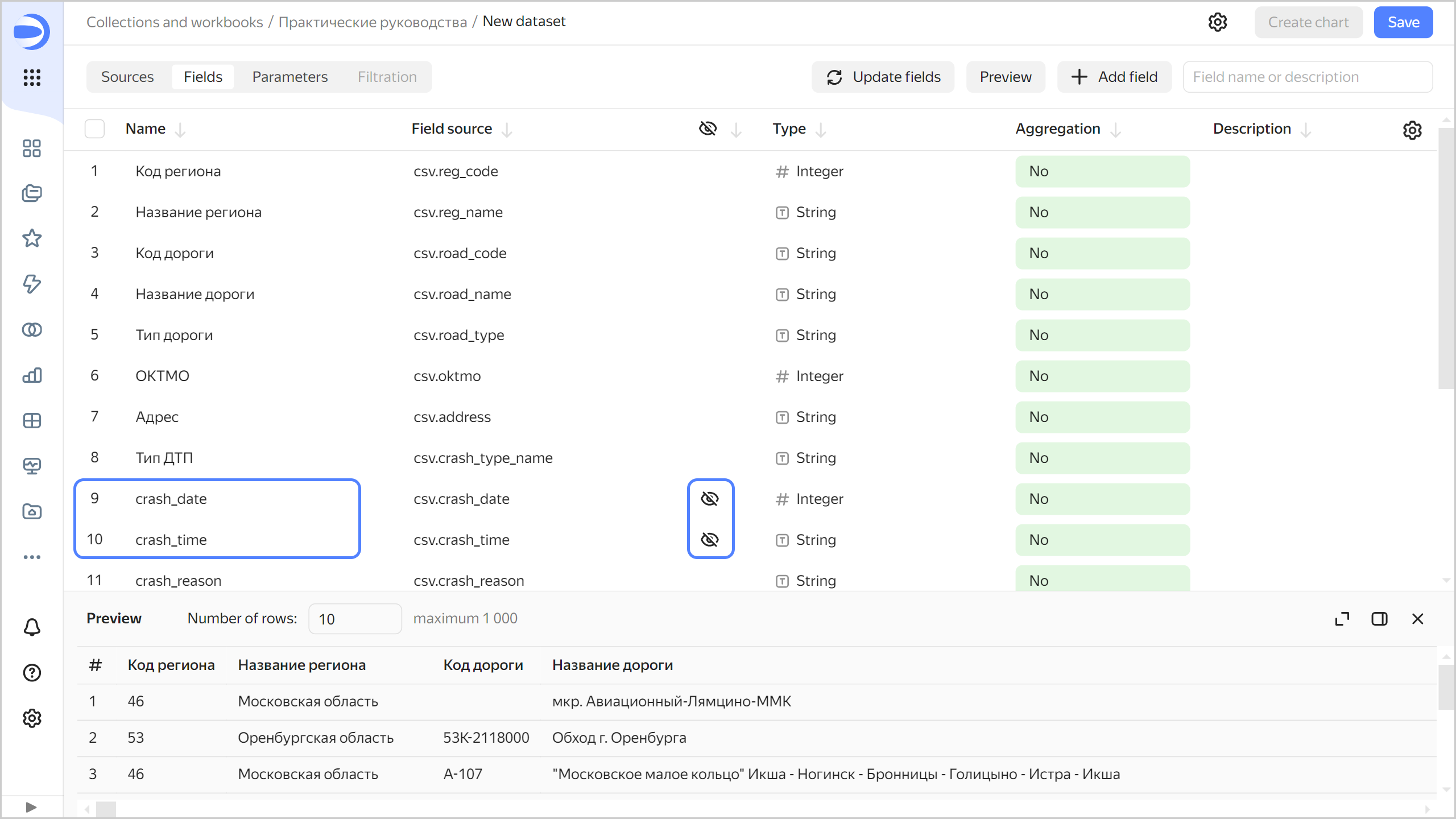
-
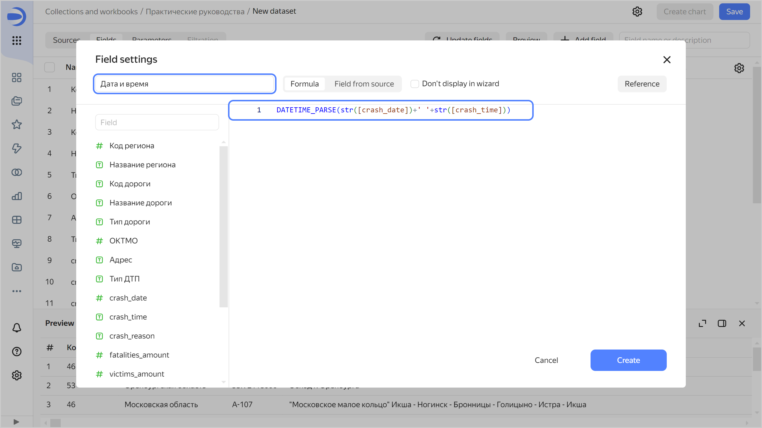
The accident date and time appear in the following fields:
crash_date: Numeric date in20190218format.crash_time: Time in19:34text format.
They will not be used in charts in this format. Click to hide them (the icon appears when you hover over the field).
-
Create a calculated field to display information about the accident date and time:
-
In the top-right corner, click Add field.
-
At the top-left, specify the field name:
Date and time. -
In the formula field, enter
DATETIME_PARSE(str([crash_date])+' '+str([crash_time])).Tip
- To avoid errors, select fields for the formula from the list on the left rather than entering them manually.
- To display information about functions, click Reference at the top right.
-
Click Create.
The preview section now correctly displays the accident date and time as a
Date and timetype value withTas a separator. The new field is at the top of the table. Click to edit the field formula.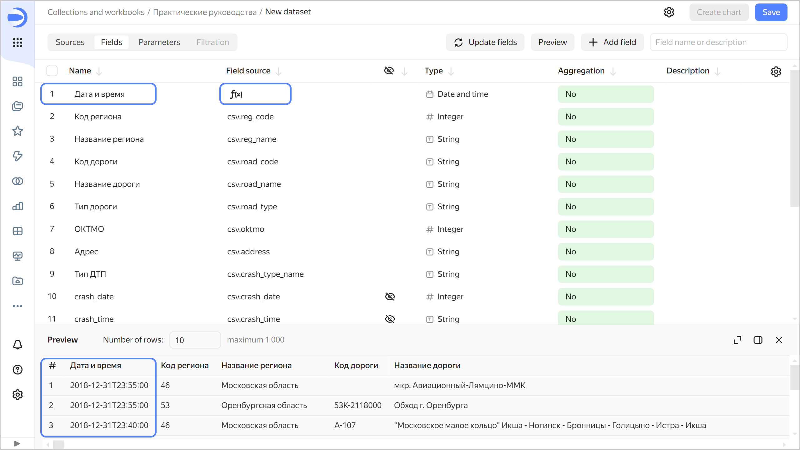
-
-
Rename the fields as follows:
crash_reasontoCause of accidentfatalities_amounttoDeath tollvictims_amounttoNumber of victimsvehicles_amounttoNumber of vehiclesparticipants_amounttoNumber of participants
-
For the
Death toll,Number of victimsNumber of vehiclesandNumber of participantsfields, specify the Sum aggregation type. The fields with defined aggregation functions become measures and change their color to blue.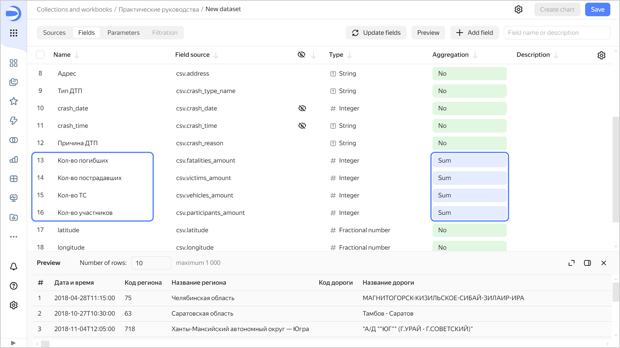
-
Create a field with accident coordinates:
-
In the top-right corner, click Add field.
-
At the top-left, specify the field name:
Geopoint. -
In the formula field, enter
GEOPOINT([latitude],[longitude]). -
Click Create.
Note
The example is based on ready-to-use data as coordinates.
A new field of the
Geopointtype will appear in the list of fields; the data for this field will appear in the preview section.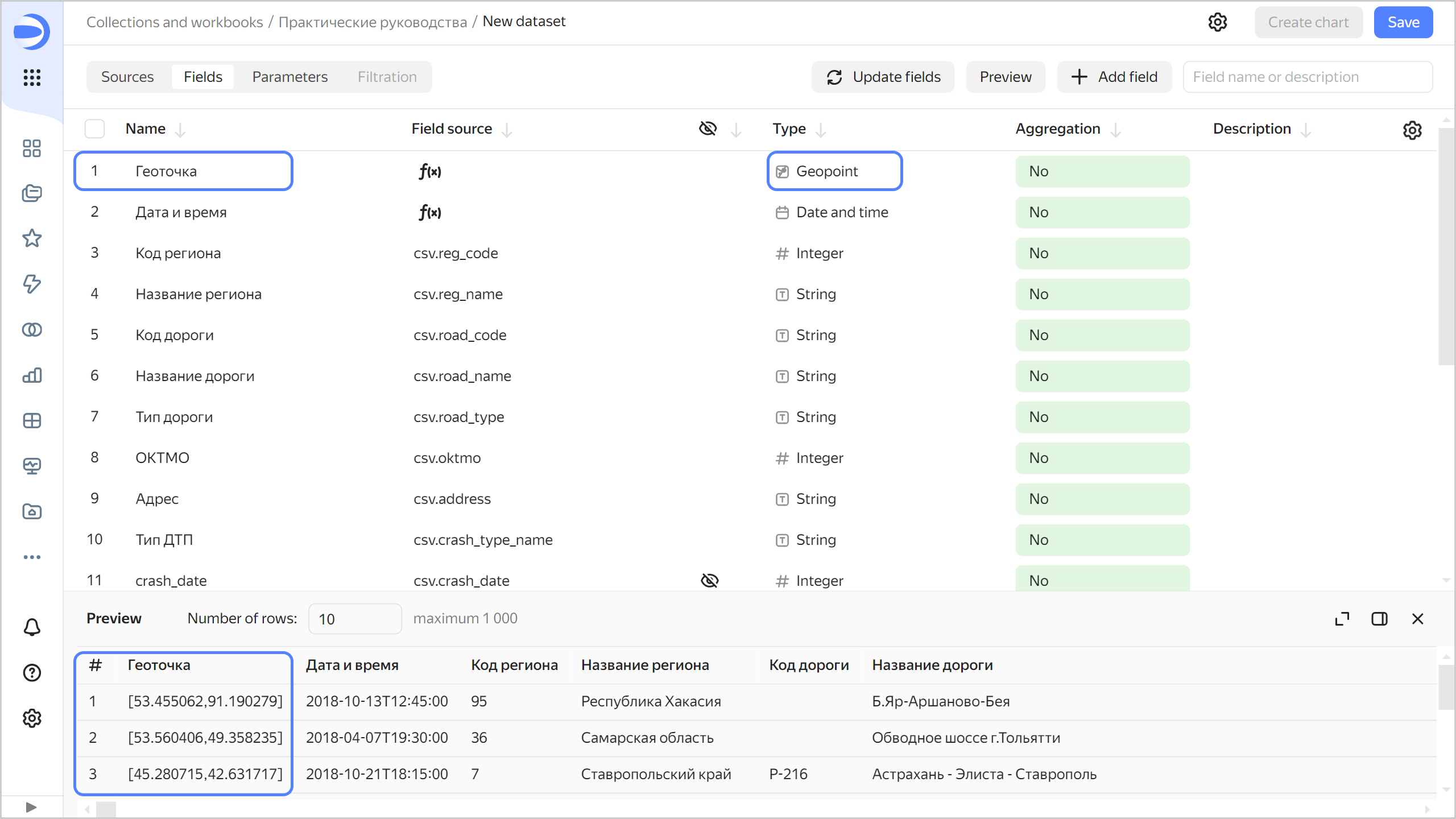
-
-
Create the following fields:
Number of accidentswith theSUM(1)formula. You do not need to set the aggregation type for this field: when you add it to the chart, DataLens will apply the aggregation function automatically.Accident death ratewith the[Death toll]/[Number of accidents]formula.
-
For the
Polygonfield, change the data type to Geopolygon.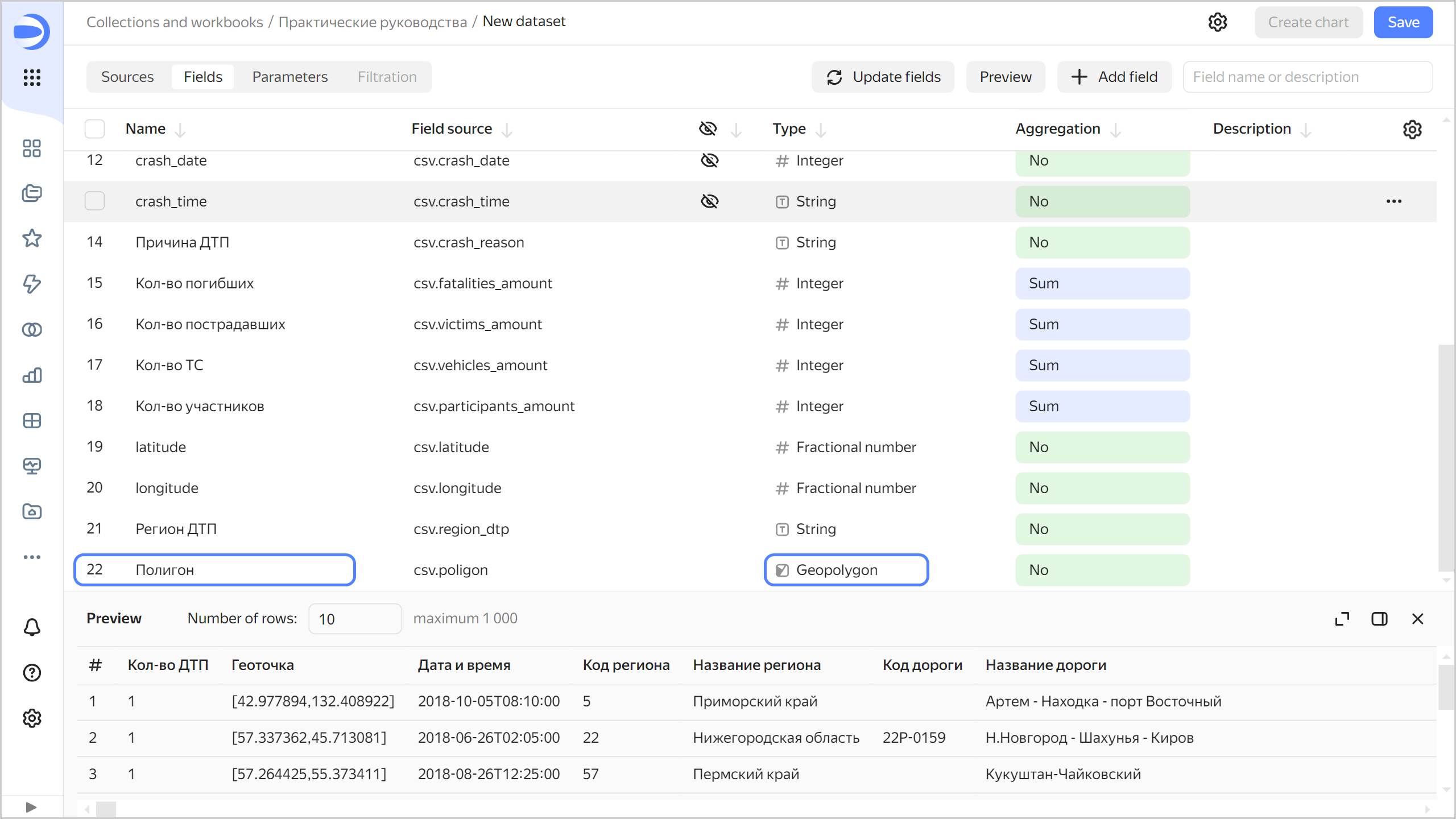
-
Save the dataset:
- In the top-right corner, click Save.
- Enter
Accidentas the dataset name and click Create.
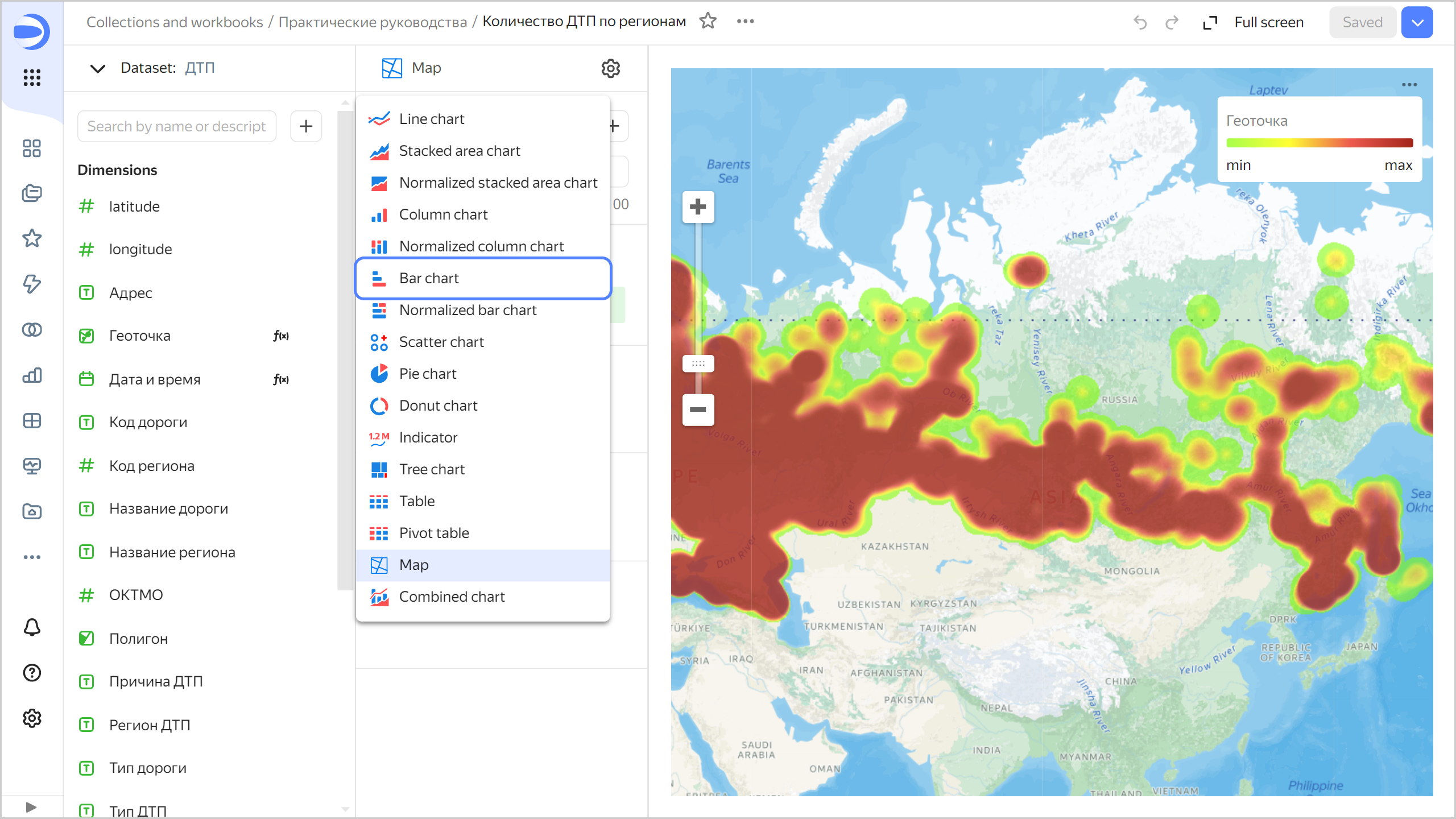
Analyze accident distribution density
To visualize accident distribution density by region, create a heat map:
-
Click Create chart in the top-right corner of the dataset page.
-
Select the Map visualization type.
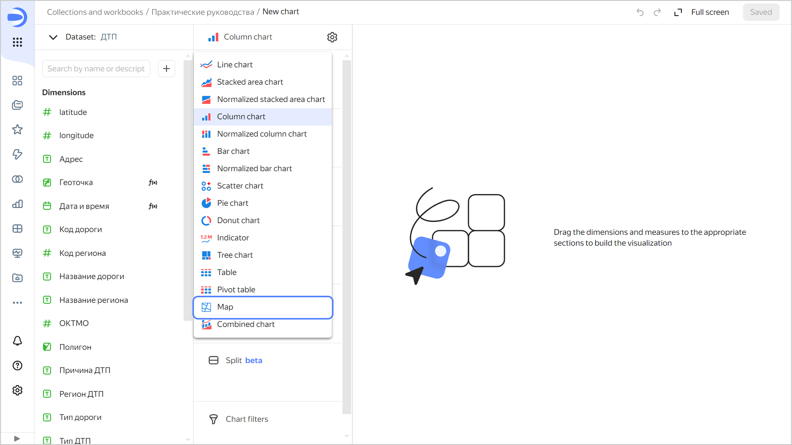
-
Select the Heat map (Geopoints) layer type.
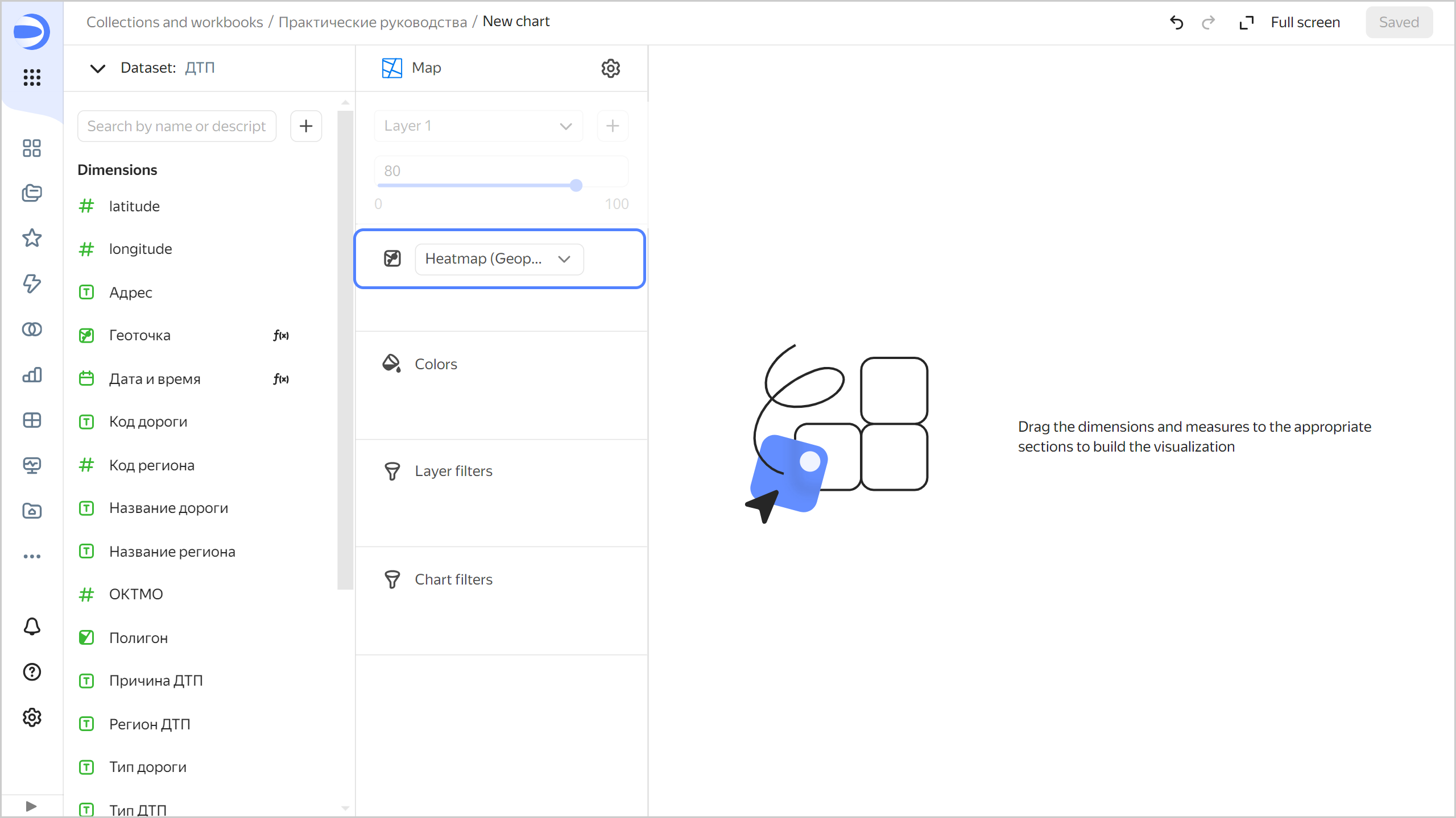
-
Add points with coordinates to the map. To do this, drag the
Geopointfield from Dimensions to the Heatmap (Geopoints) section. -
Save the chart:
-
In the top-right corner, click Save.
-
In the window that opens, enter
Accident heat mapas the chart name and click Save.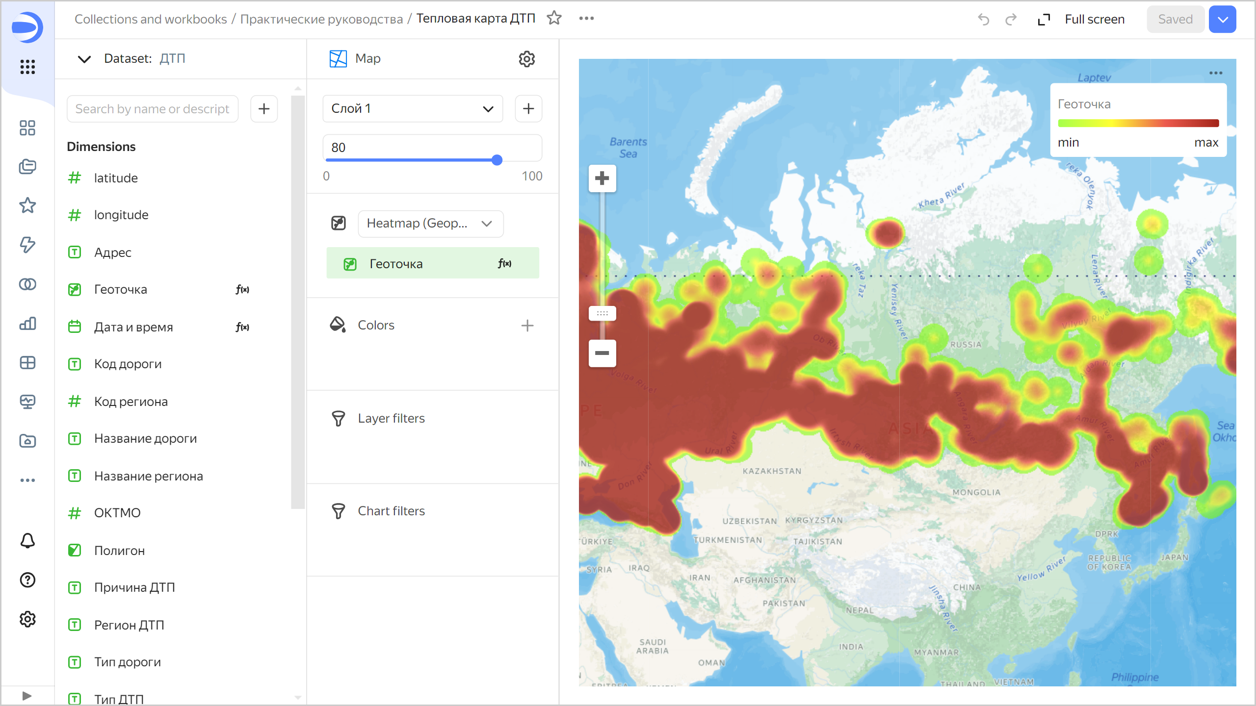
-
Analyze the number of accidents and death rate
To analyze the number of accidents by region, create a bar chart.
-
Copy the chart you created in the previous step:
-
In the top-right corner, click → Save as copy.

-
In the window that opens, enter
Number of accidents by regionas the new chart name and click Save.
-
-
For the visualization type, select Line chart.
-
Add region names to your chart. To do this, drag the
Region namefield from Dimensions to the Y section. -
Add the number of accidents to your chart. Drag the
Number of accidentsfield from Measures to the X section. -
Sort the chart by the number of accidents in descending order. Drag the
Number of accidentsfield from Measures to the Sorting section.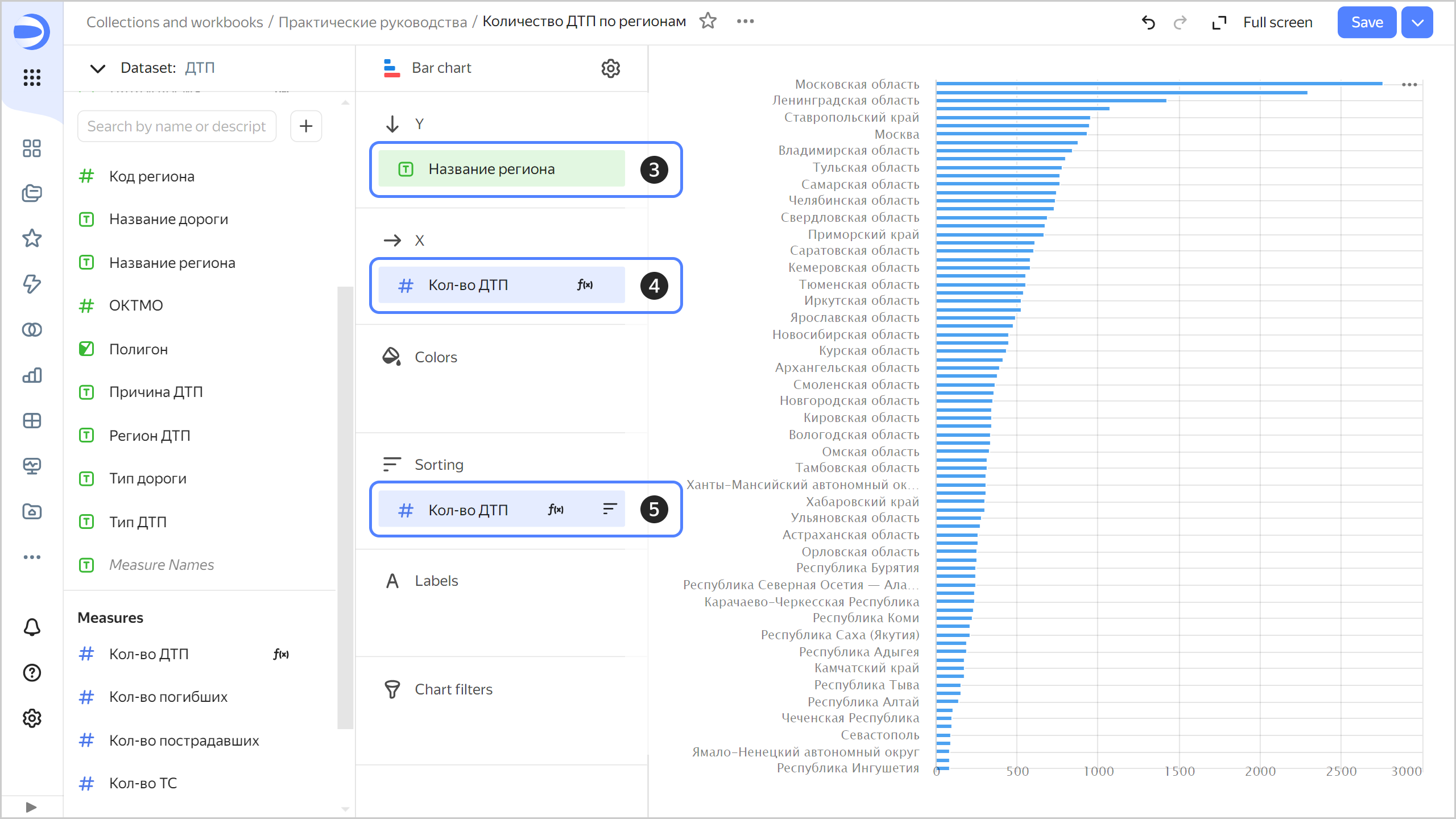
The chart will show the number of accidents by region. Most accidents occurred in the Moscow region.
Note
The legend may be missing for some of the chart lines. If this is the case, hover over the line and you will see a tooltip with the region name.
-
Save your chart: click Save in the top-right corner.
To analyze the accident death rate by region, create another bar chart:
-
Create a copy of the
Number of accidents by regionchart.- In the top-right corner, click → Save as copy.
- In the window that opens, enter
Death rate by regionas the new chart name and click Save.
-
Replace the number of accidents measure with the accident death rate measure on the X axis. To do this, drag the
Accident death ratefield from Dimensions to the X section and hold it over theNumber of accidentsfield until the latter turns red. -
Change from sorting by the number of accidents to sorting by descending accident death rate. To do this, drag the
Accident death ratefield from Dimensions to the Sorting section and hold it over theNumber of accidentsfield until the latter turns red.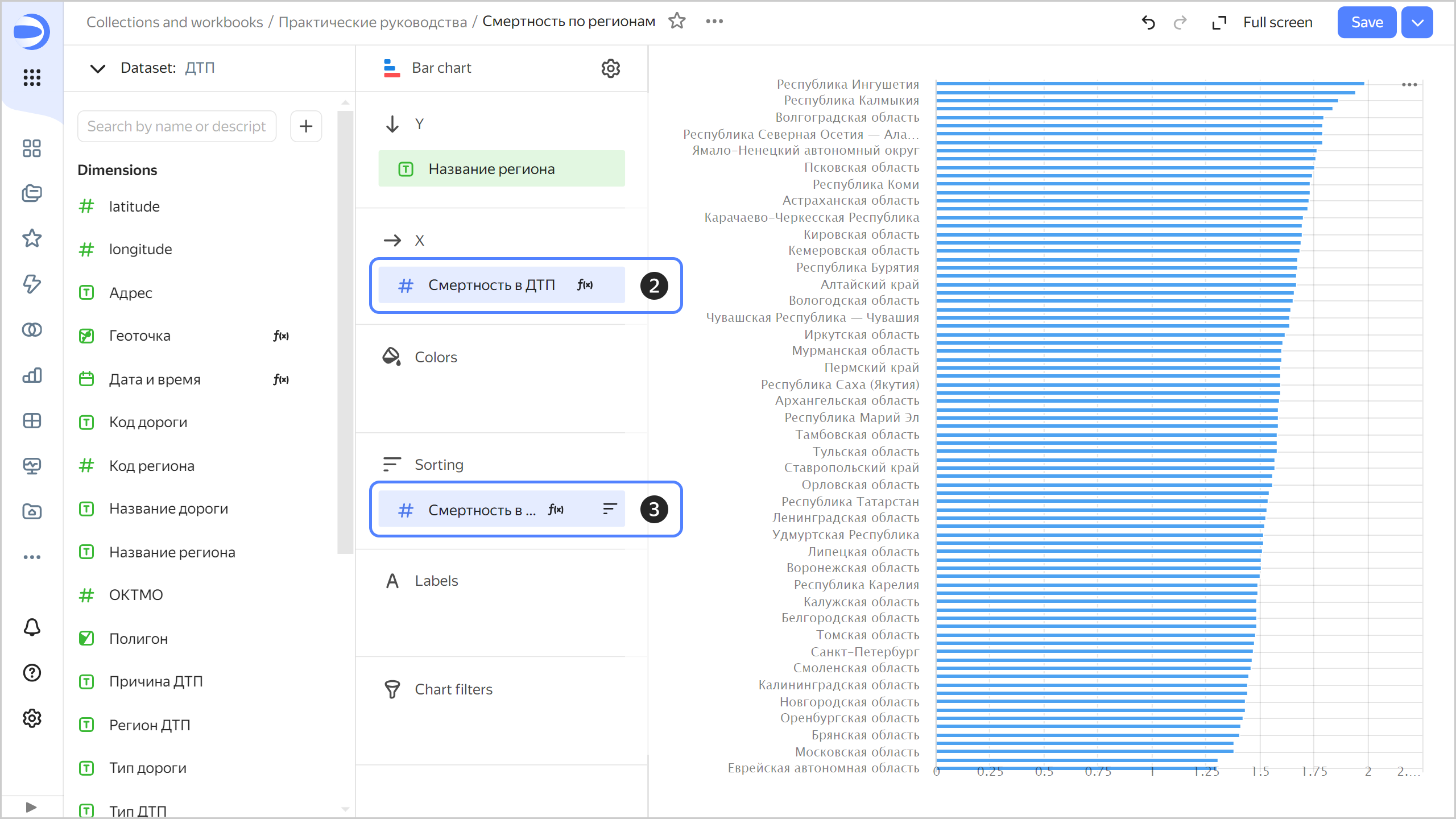
This time, Ingushetia, Kalmykia, and the Volgograd region are far ahead in the number of deaths.
-
Save your chart: click Save in the top-right corner.
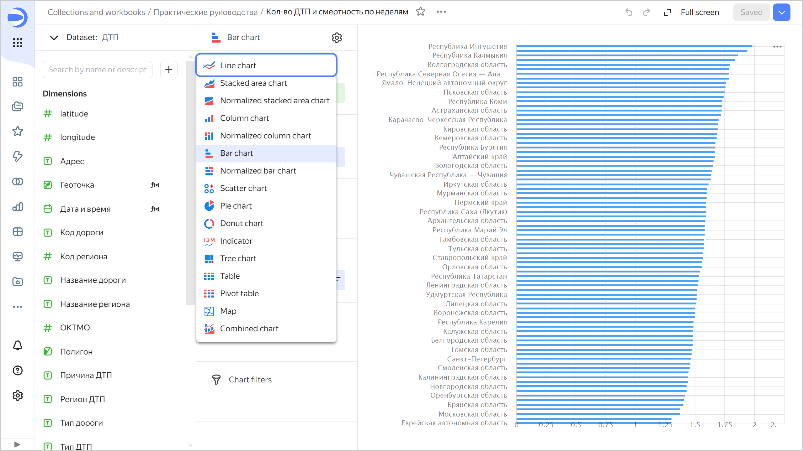
Analyze the statistics by week, day of week, and time of day
Let's see how the number of accidents and related deaths are distributed by week, day of week, and time of day.
-
Analyze the number of accidents and death rate by week:
-
Copy the chart you created in the previous step:
- In the top-right corner, click → Save as copy.
- In the window that opens, enter the
Number of accidents and death rate by weekas the new chart name and click Save.
-
Select Line chart as the visualization type.
-
Delete the fields in all sections of the chart. To do this, click (the icon appears when you hover over the field) next to a field in a section.
-
Add the accident date and time to your chart. To do this, drag the
Date and timefield from Dimensions to the X section. -
Group dates by week:
- Click the calendar icon next to the
Date and timefield in the X section. - In the Grouping field, choose Date portion ⟶ Week and click Apply.
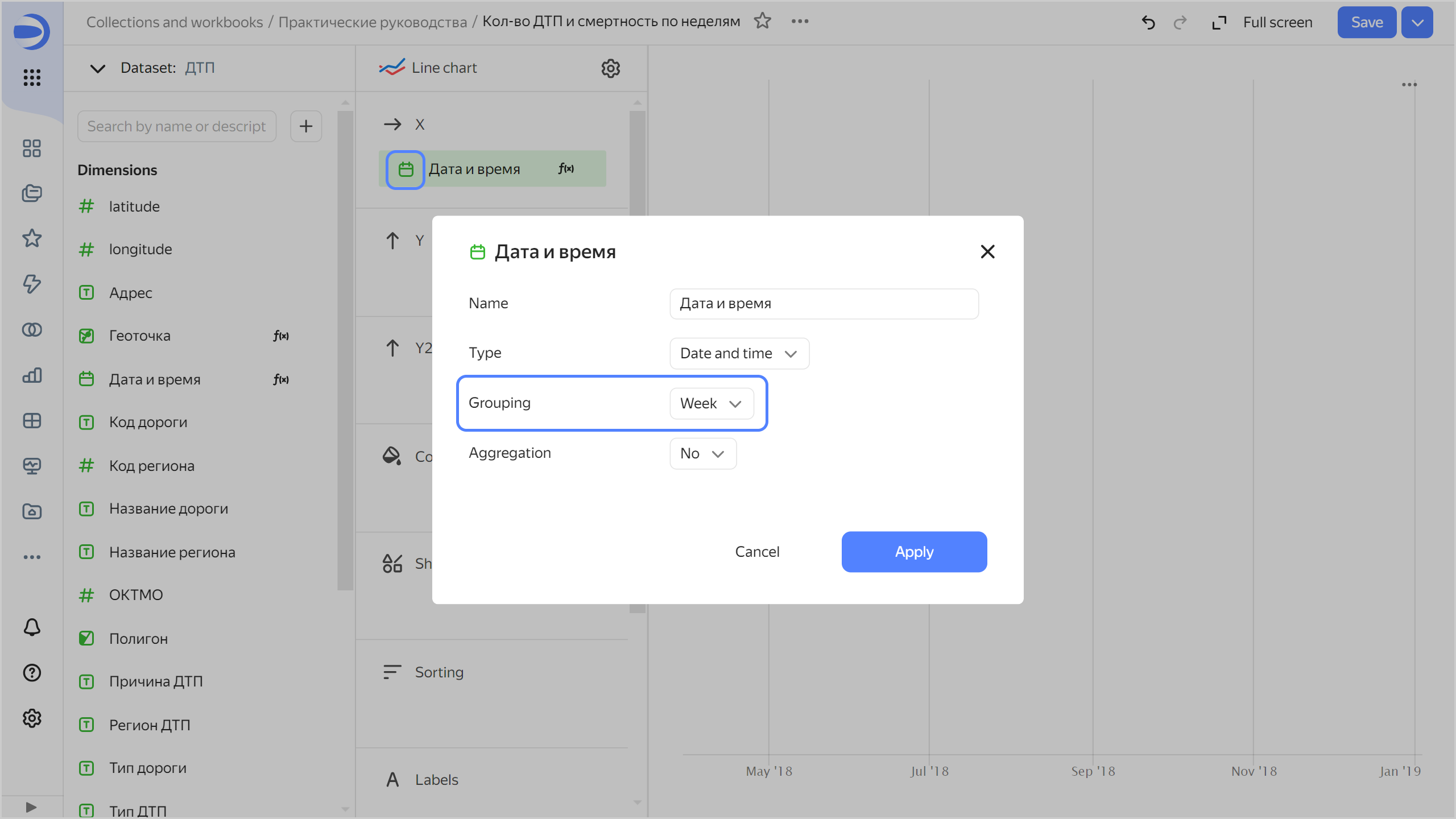
- Click the calendar icon next to the
-
Drag:
Number of accidentsfield to the Y section.Accident death ratefield to the Y2 section.
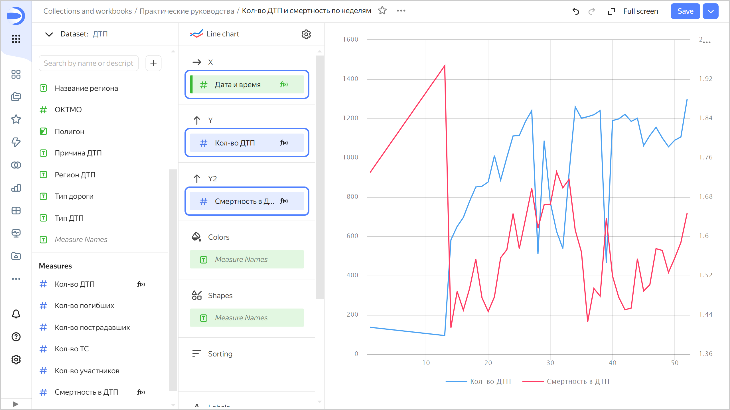
Now you can see a chart with two graphs: number of accidents and death rate. If you hover over a point on the chart, a tooltip appears with specific values.
-
Save your chart: click Save in the top-right corner.
-
-
Now analyze the number of accidents and death rate by day of week:
-
Copy the chart you created in the previous step:
- In the top-right corner, click → Save as copy.
- In the window that opens, enter the
Number of accidents and death rate by day of weekas the name for the new chart and click Save.
-
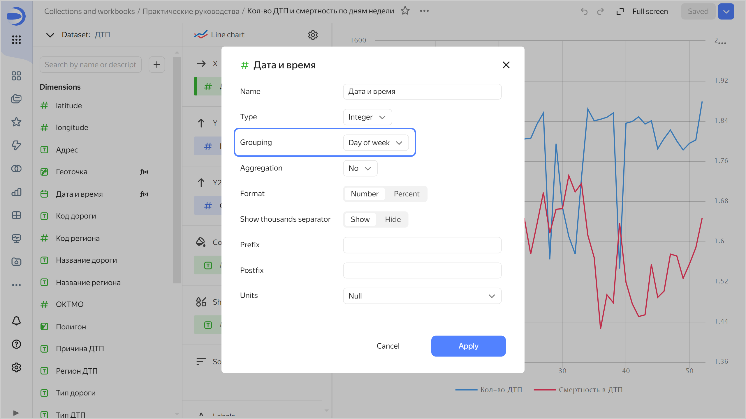
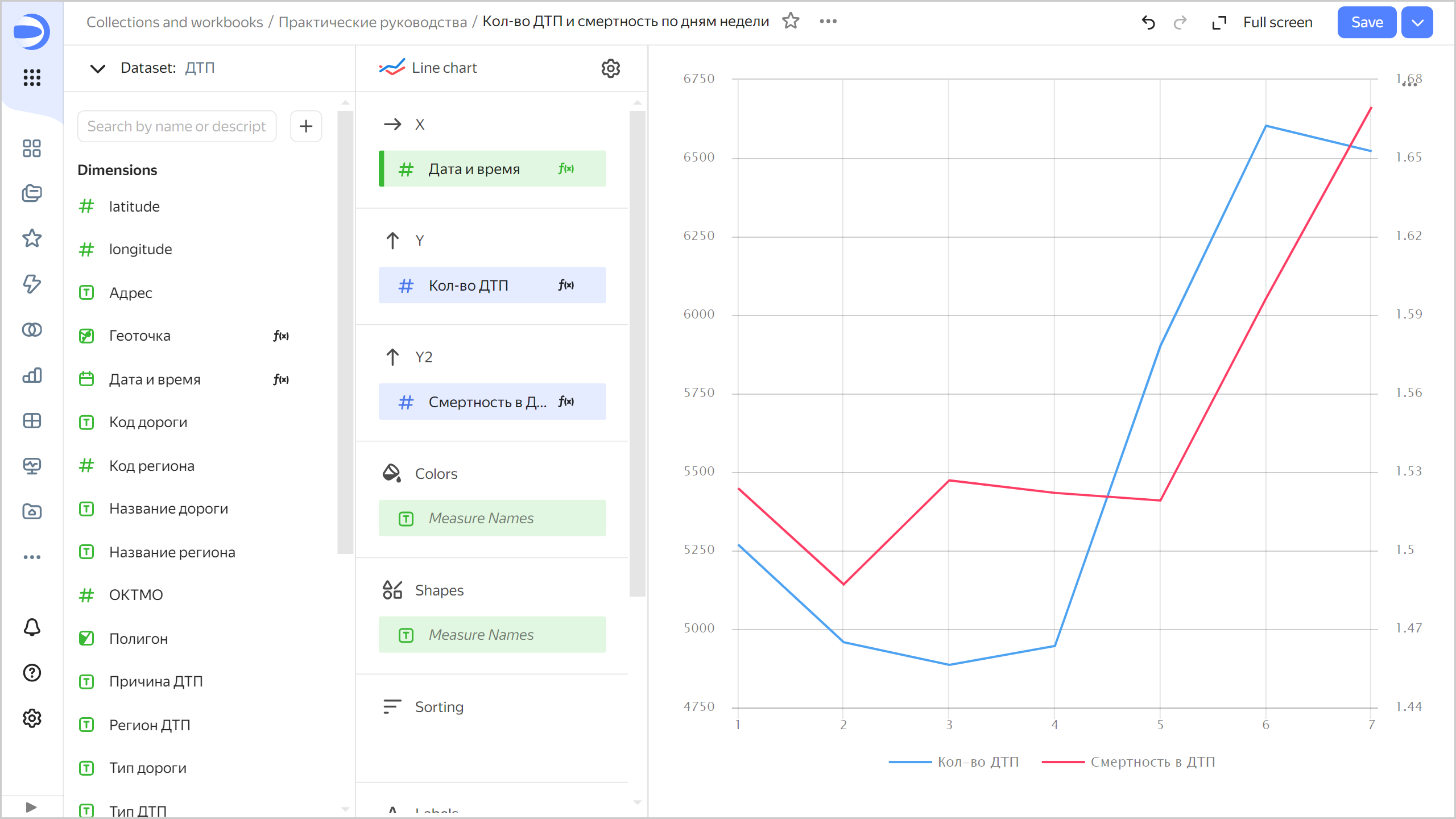
Change grouping by date and time to Date portion ⟶ Day of week.
This chart reveals more obvious trends: both measures increase towards the end of the week.
-
Save your chart: click Save in the top-right corner.
-
-
Analyze the number of accidents and death rate by time of day.
-
Copy the chart you created in the previous step:
- In the top-right corner, click → Save as copy.
- In the window that opens, enter
Number of accidents and death rate by time of dayas the new chart name and click Save.
-
Change grouping by date and time by specifying: Date portion ⟶ Hour.
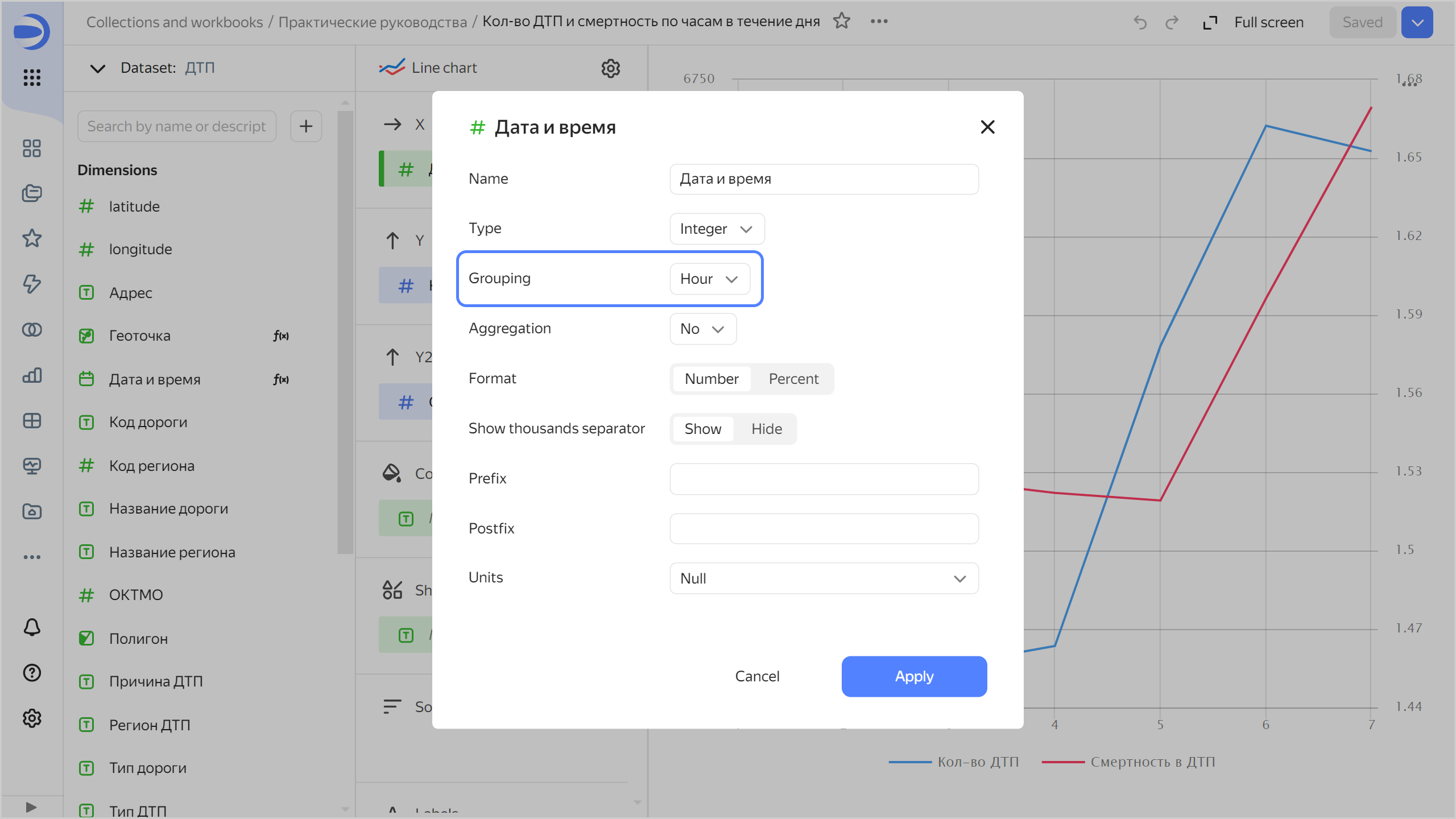
The chart shows that less accidents occur at night, but they result in more casualties.
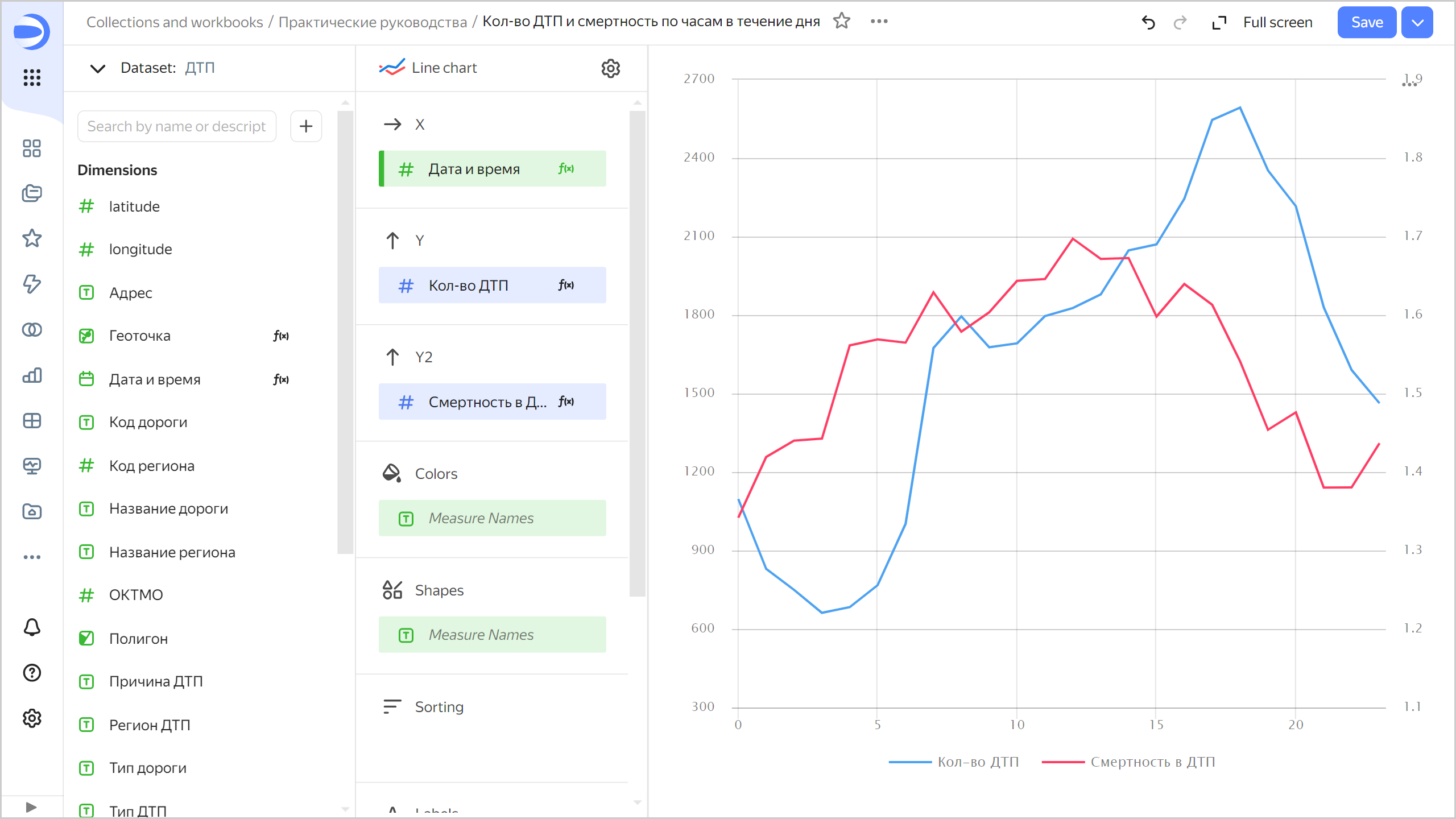
-
Save your chart: click Save in the top-right corner.
-
Create a map with color fill by region
-
Copy the chart you created in the previous step:
- In the top-right corner, click → Save as copy.
- In the window that opens, enter the
Regions mapas the new chart name and click Save.
-
Select the Map visualization type.
-
Select Polygons (Geopolygons) as the layer type.
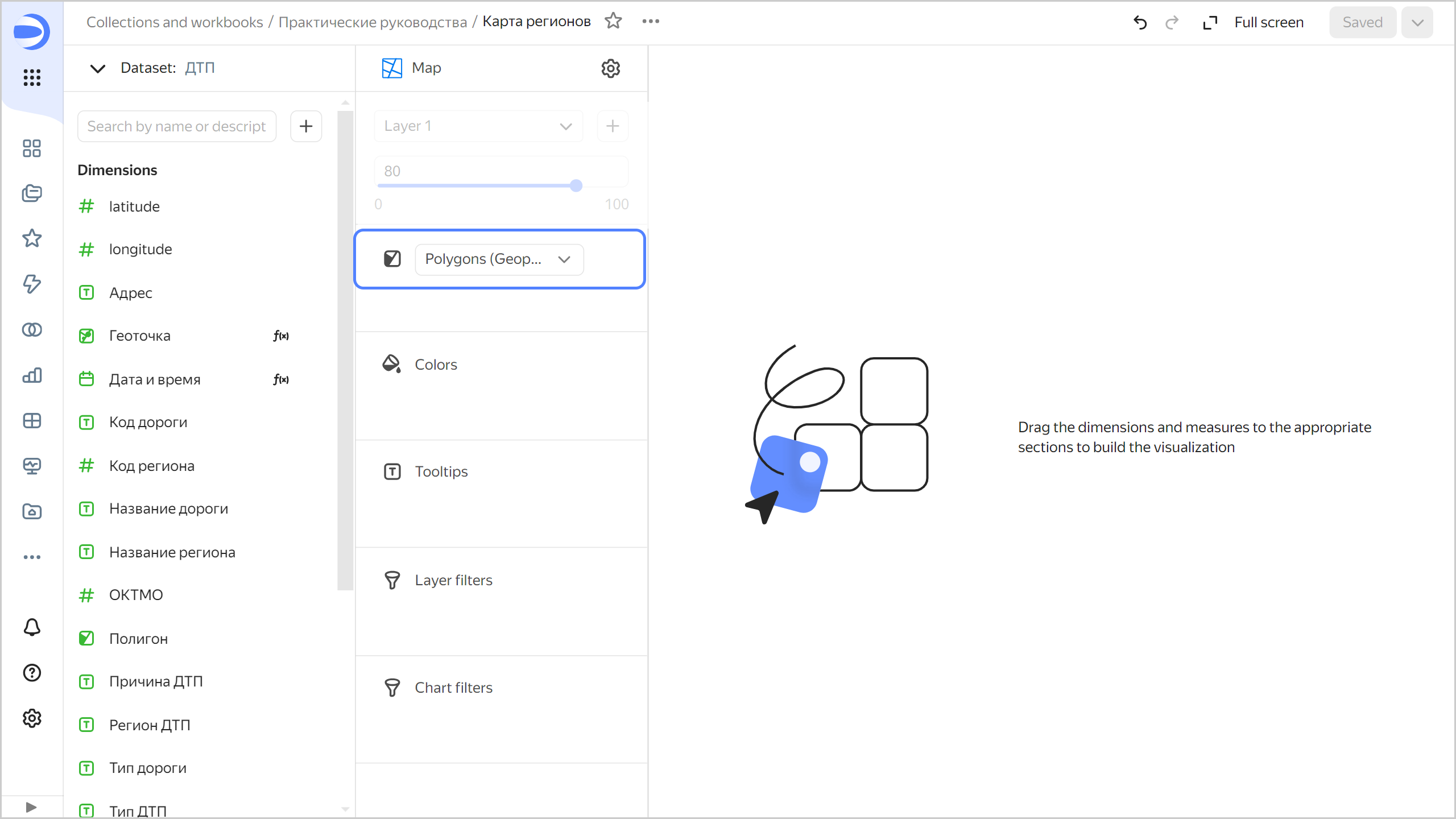
-
Add polygons to the map. Drag the
Polygon** field from **Dimensionsto the Geopolygons section. -
Change colors of the polygons based on the number of accidents. To do this, drag the
Number of accidentsfield from Measures to the Colors section. -
Drag the following fields to the Tooltips section:
Region nameNumber of accidentsDeath tollNumber of victimsNumber of vehiclesNumber of participantsAccident death rate
The chart will show a map with color fill by region. If you hover over a region, information for that region appears.
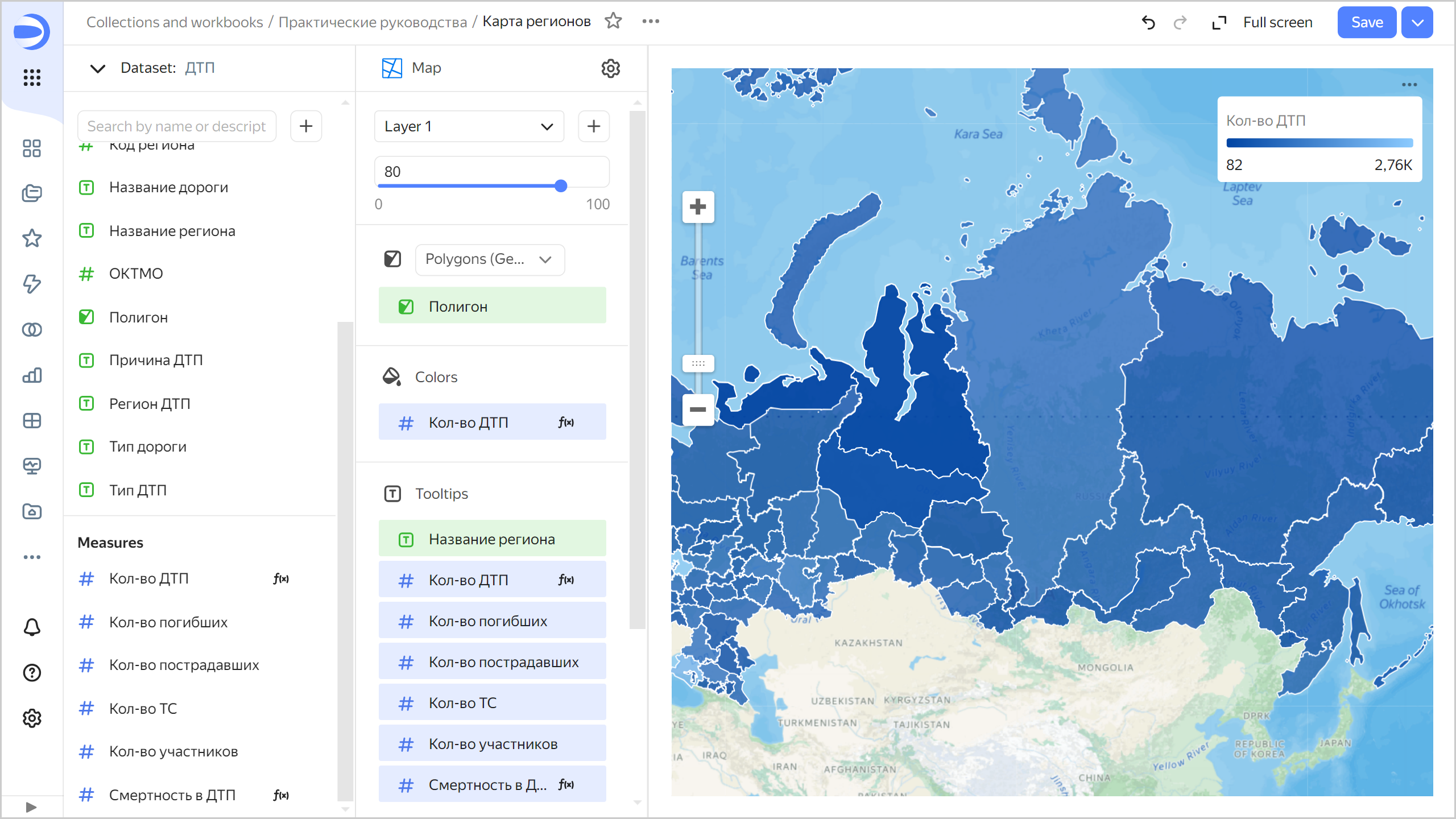
-
Save your chart: click Save in the top-right corner.
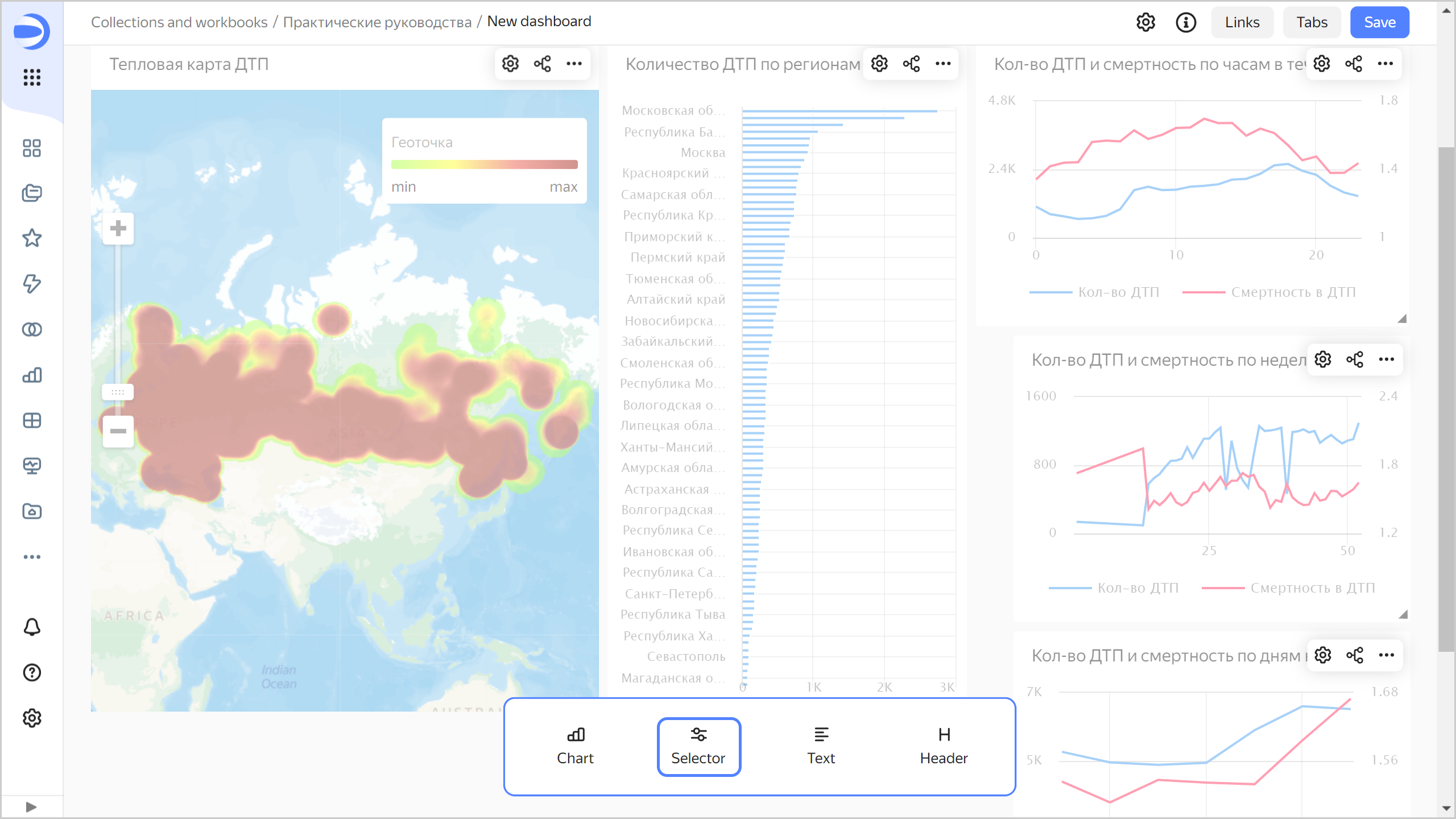
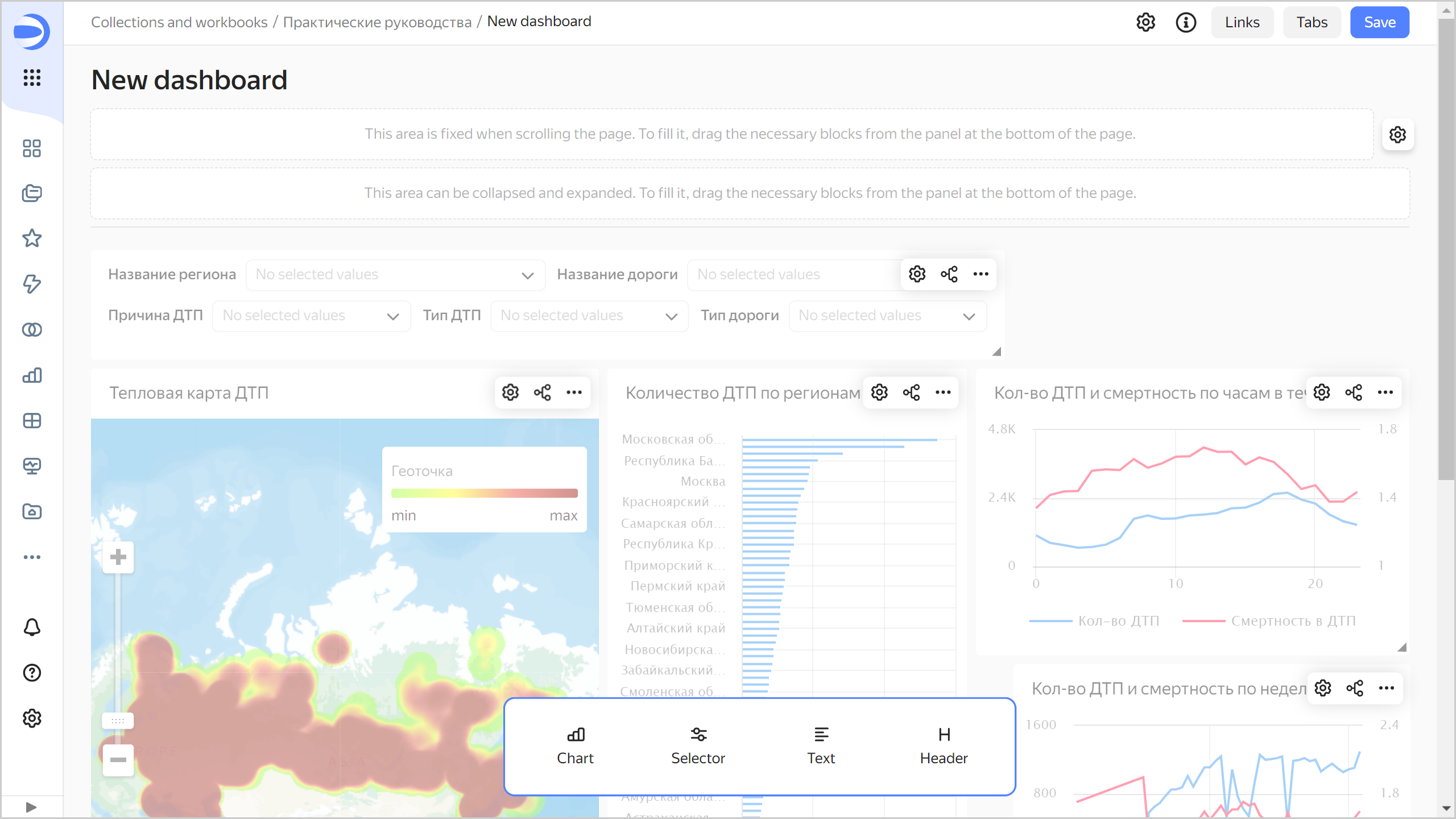
Create a dashboard and add charts to it
Create a dashboard to add charts and other widgets to:
-
In the left-hand panel, select Collections and workbooks and go to the
Tutorialsworkbook. -
In the top-right corner, click Create → Dashboard.
-
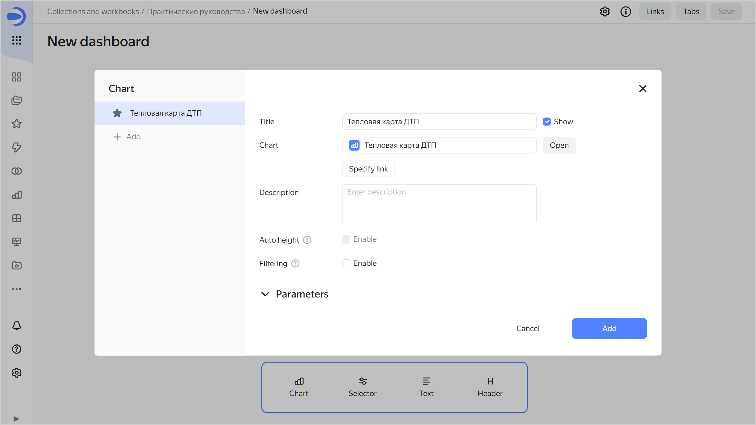
In the panel at the bottom of the page, click Chart and drag it where you want it to be.
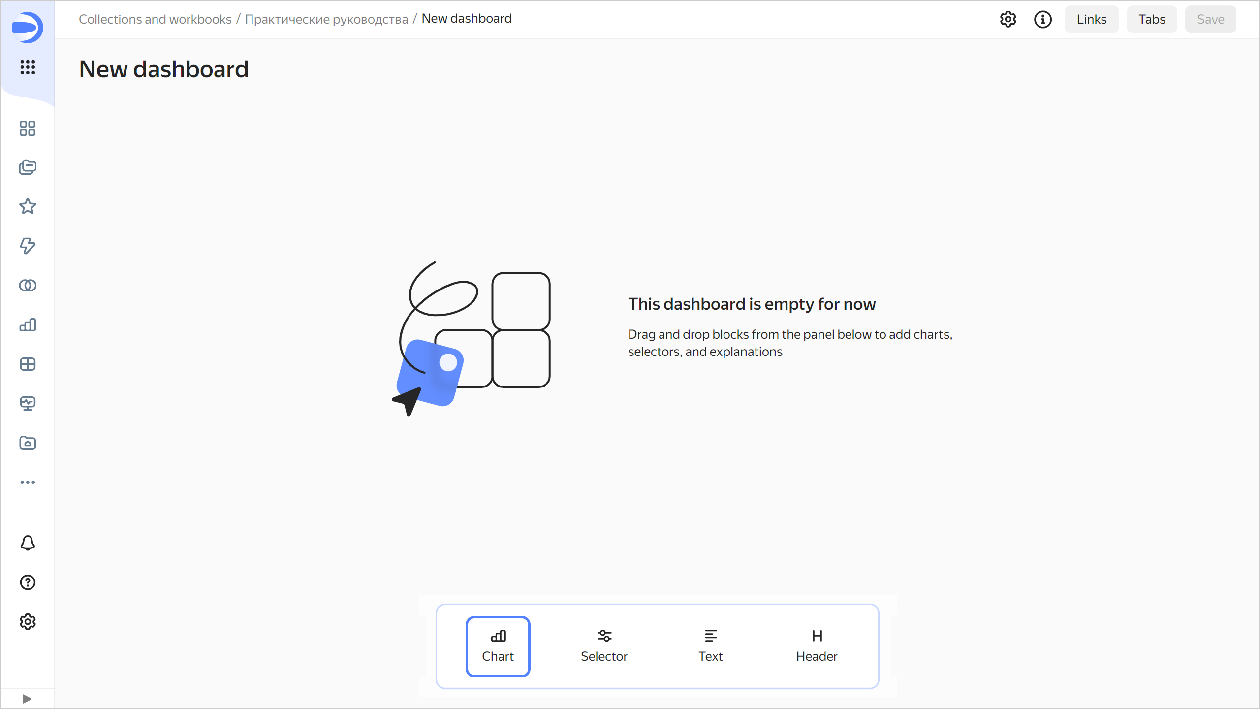
-
In the window that opens, click Select.
-
Select the
Accident heat mapchart. -
Click Add.
-
Repeat steps 3-6 to add the following charts to the dashboard:
Number of accidents by regionNumber of accidents and death rate by weekNumber of accidents and death rate by day of weekNumber of accidents and death rate by hour of day
-
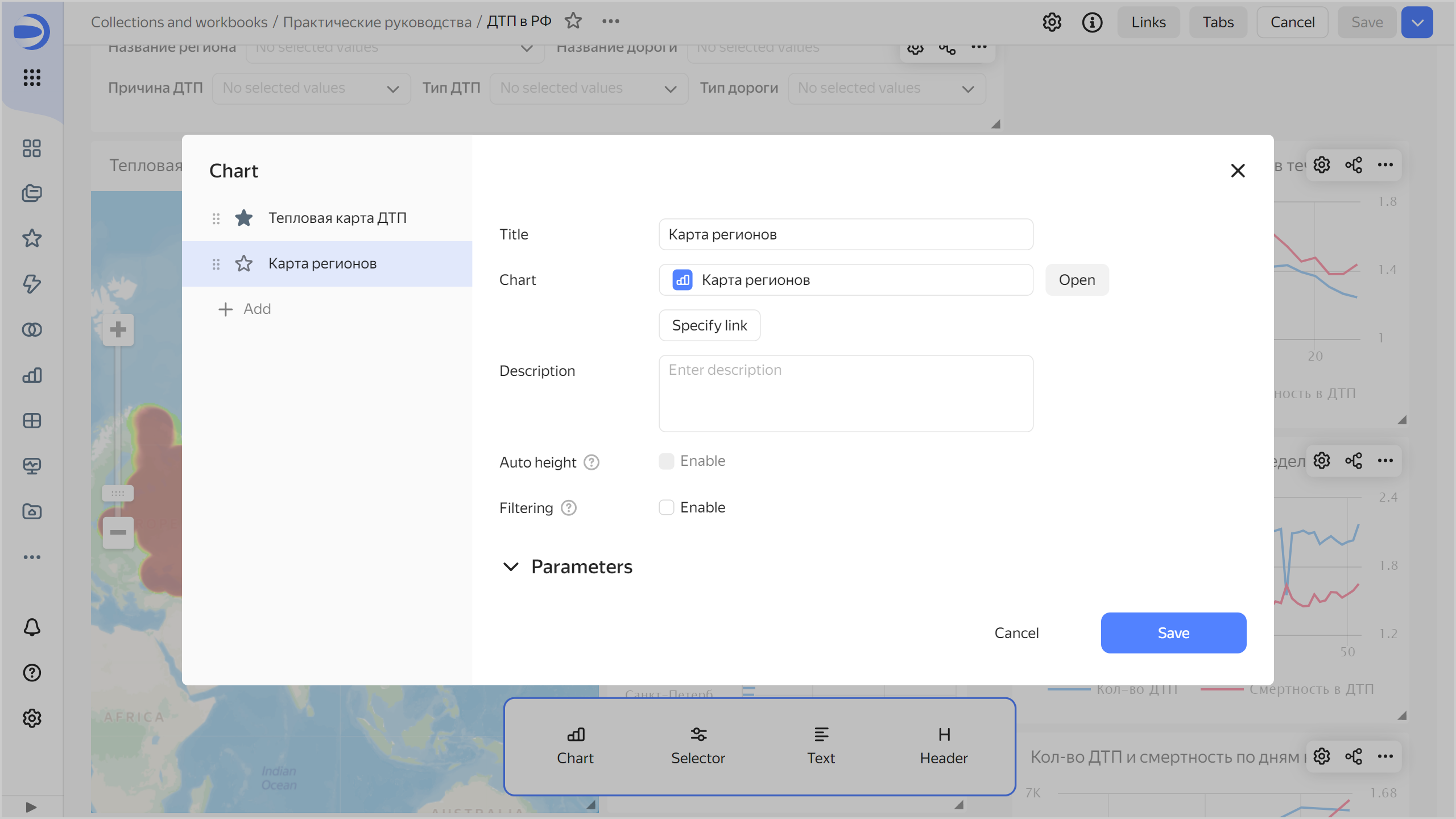
On the dashboard, create a widget with two tabs:
- In the top-right corner of the
Number of accidents by regionchart, click . - In the left part of the window, click Add.
- In the new tab, click Select.
- Select the
Death rate by regionchart. - Click Save.
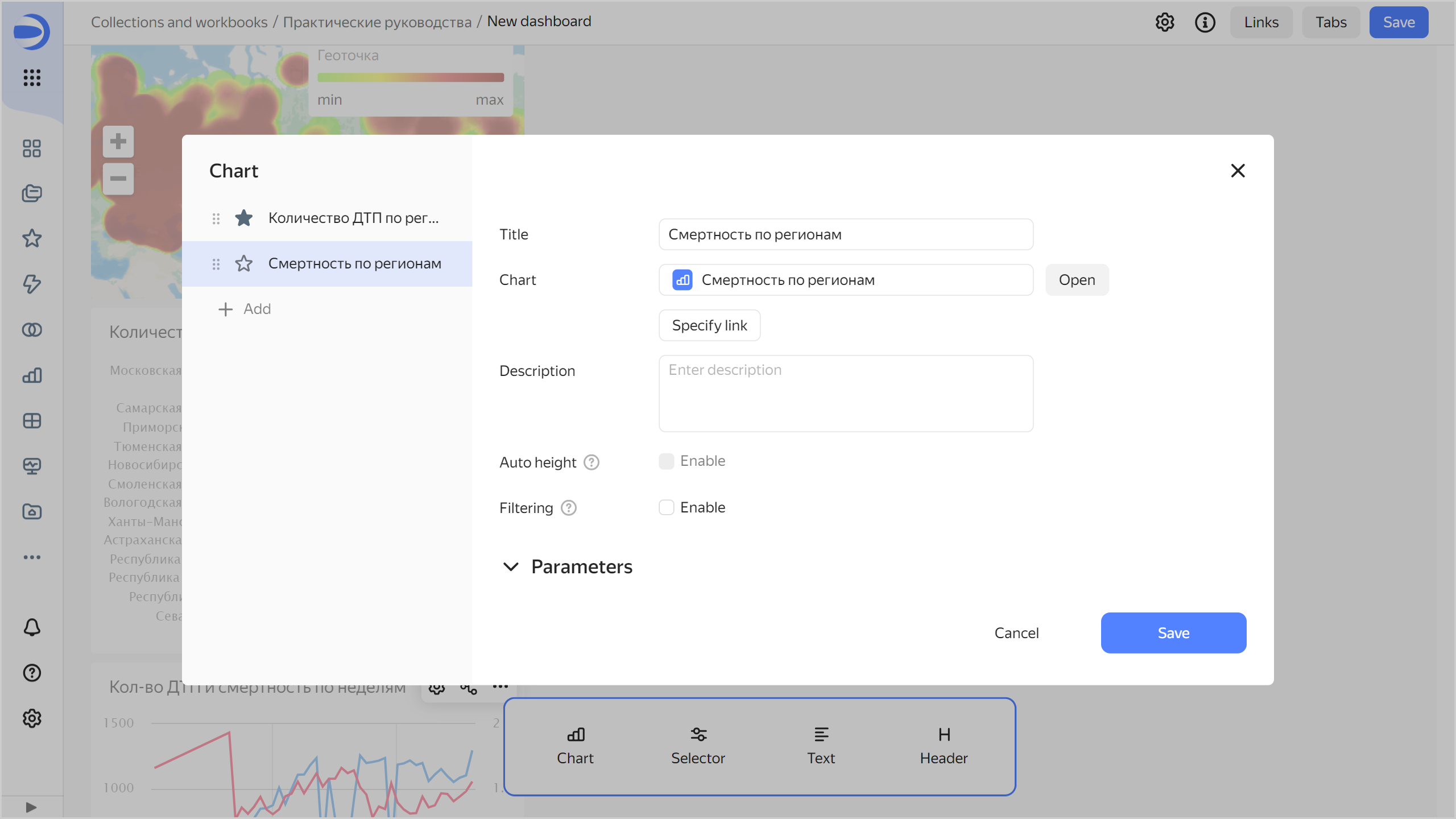
- In the top-right corner of the
-
Adjust the size of the charts with your mouse and place them on the dashboard as you prefer.

Add selectors to the dashboard
Selectors allow you to filter data by value.
-
Add a widget for data filtering:
-
In the panel at the bottom of the page, click Selector and drag it where you want it to be.
-
Select the
Accidentsdataset. -
Select the
Region namefield.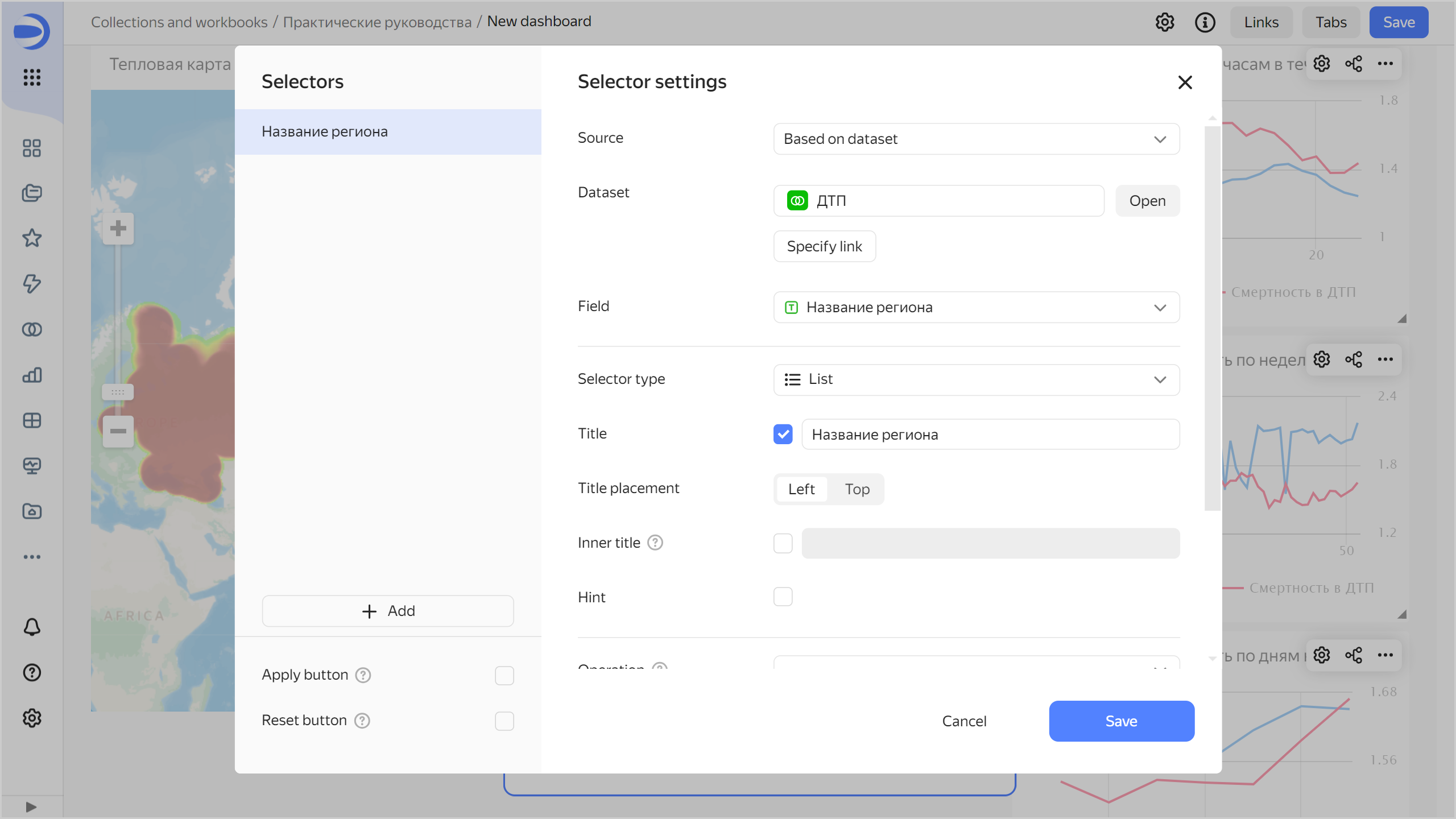
-
Add selectors by the following fields to the widget:
Road nameCause of accidentAccident typeRoad type
To do this, on the left side under Selectors, click Add and select a field name.
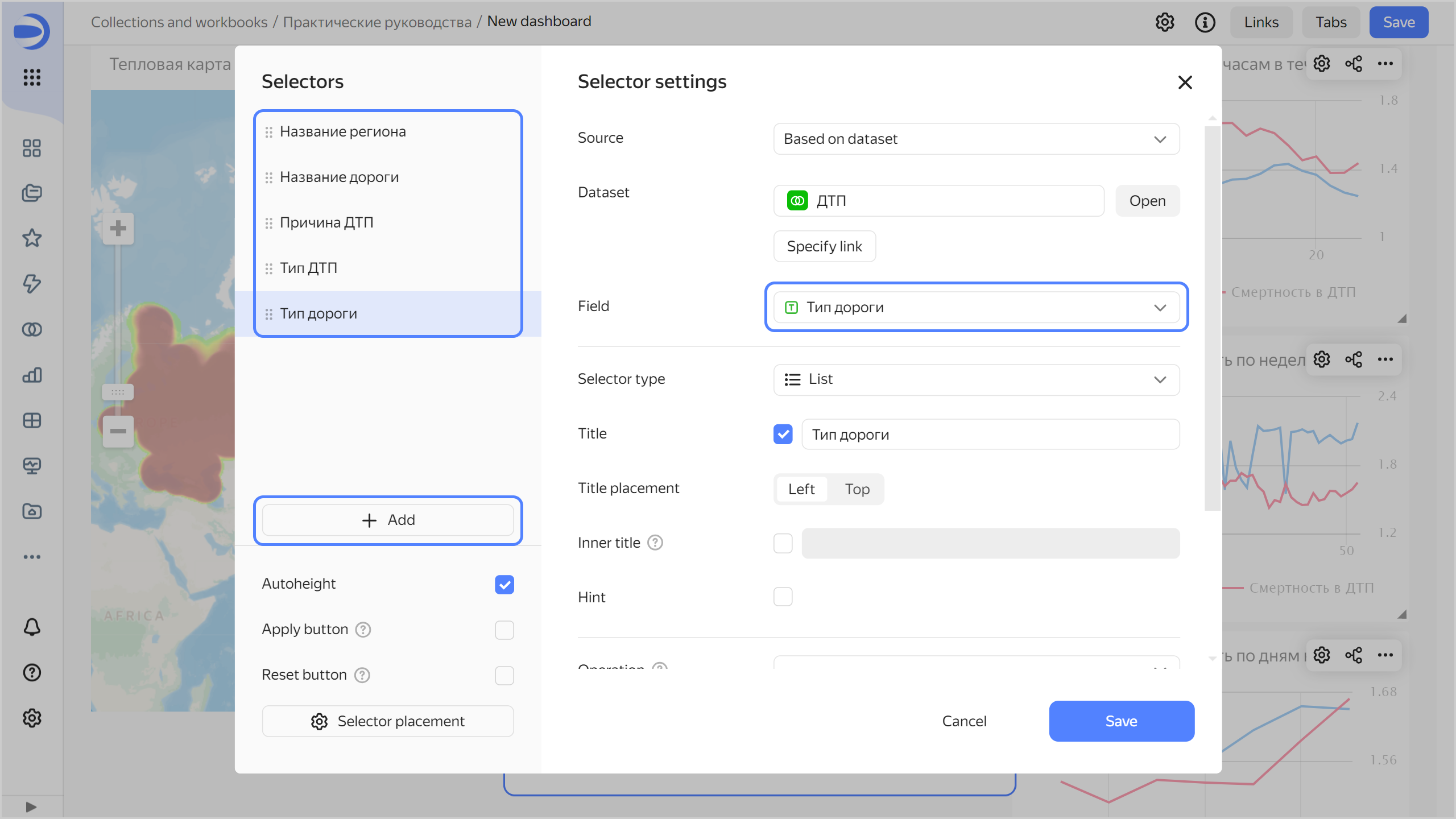
-
Click Save.
-
-
Position the widget on the dashboard however you prefer.
-
Save the dashboard:
- In the top-right corner of the dashboard, click Save.
- Enter
Accidents in Russiaas the dashboard name and click Create.
Your dashboard is ready for use.
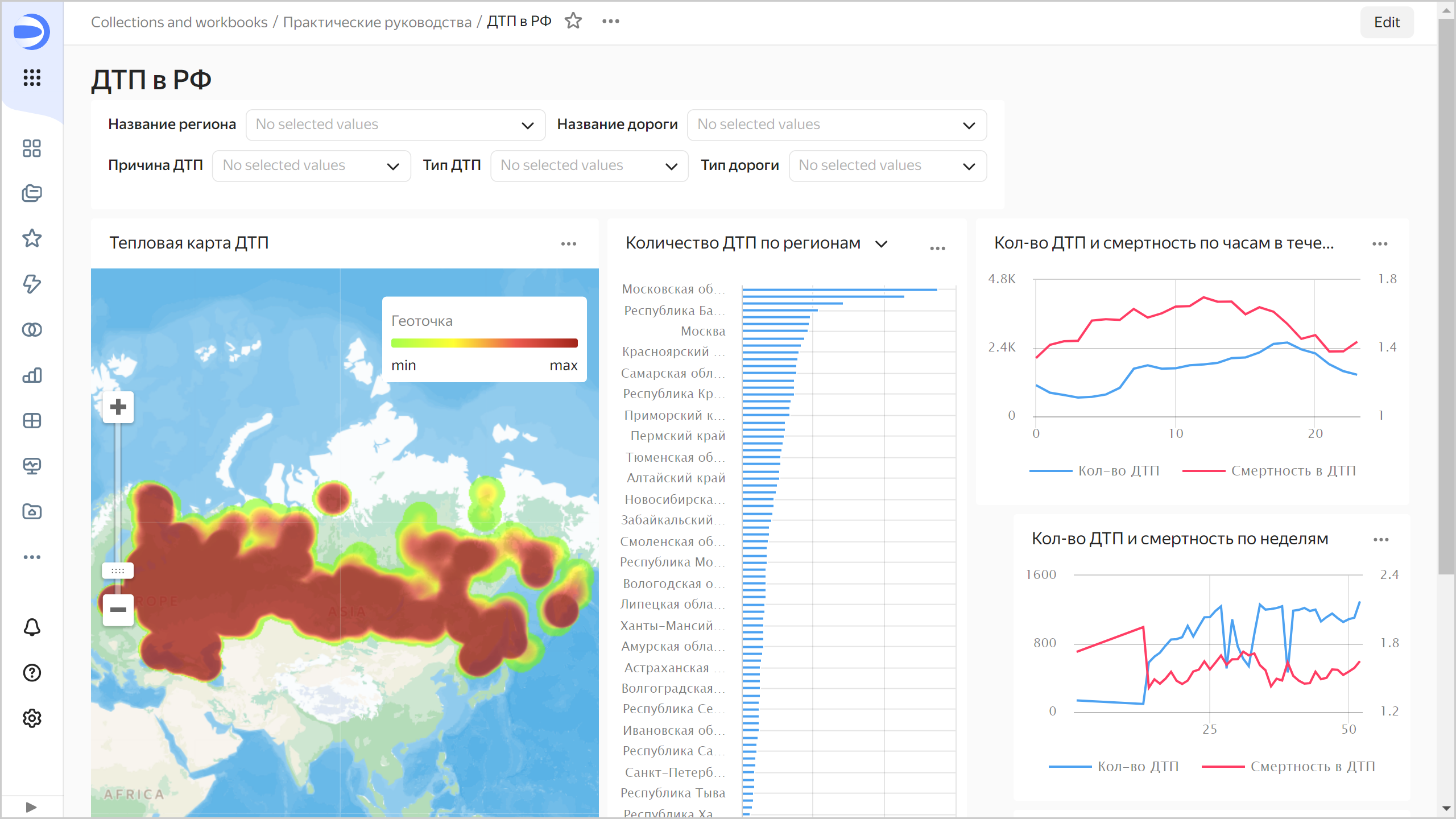
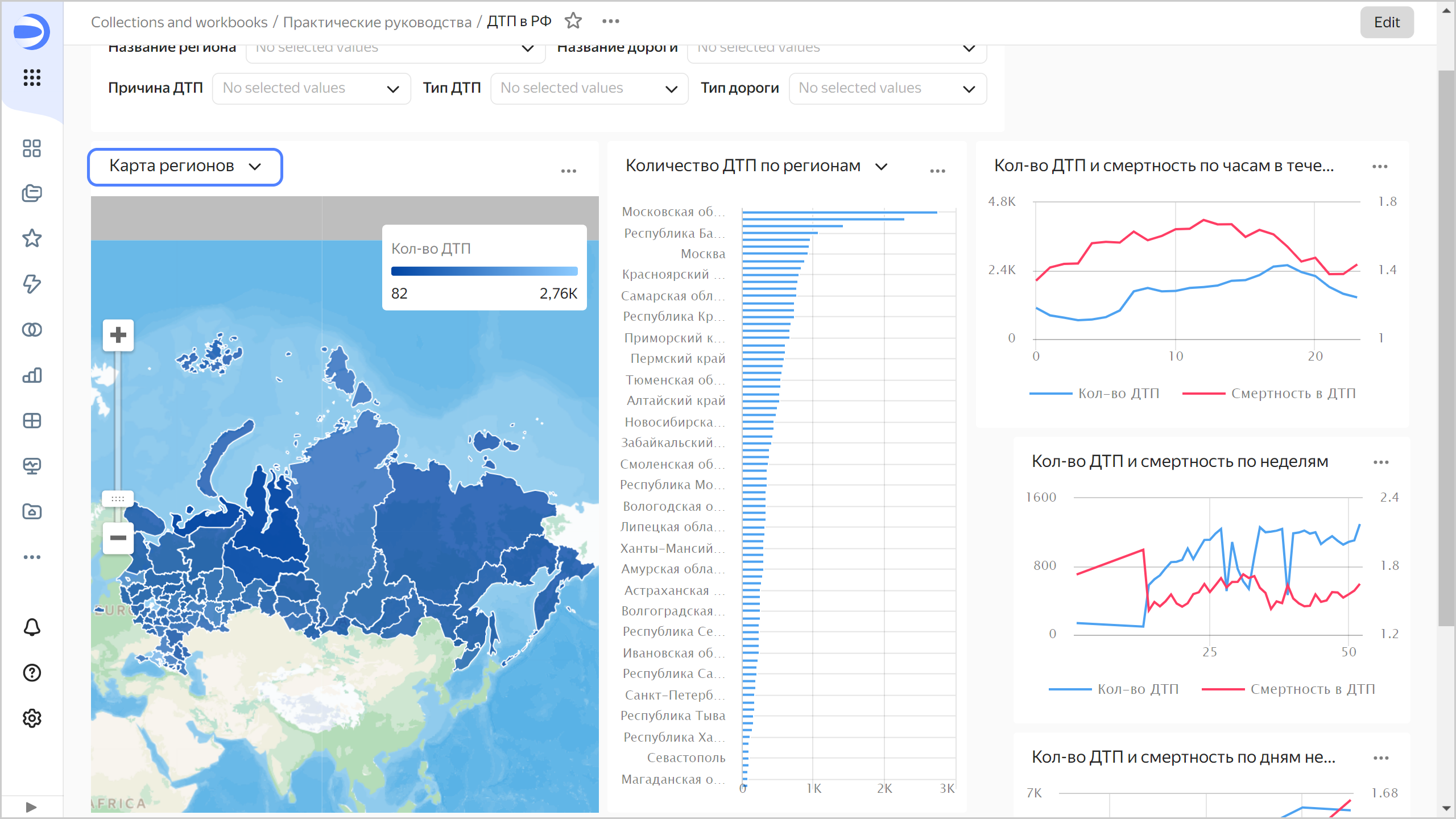
On the dashboard, you can:
- Select selector values for data filtering.
- Rescale the map.
- Switch the
Number of accidents by regionchart toDeath rate by regionand back. To do this, click to the right of the chart name and select the appropriate tab.
Add a map with color fill by region to the dashboard
-
Click Edit at the top right.
-
In the top-right corner of the
Accident heat mapchart, click . -
In the left part of the window, click Add.
-
In the new tab, click Select.
-
Select the
Regions mapchart. -
Click Save.
-
In the top-right corner, click Save.
Now you can switch between charts: the heat map with accident density or the color fill map.
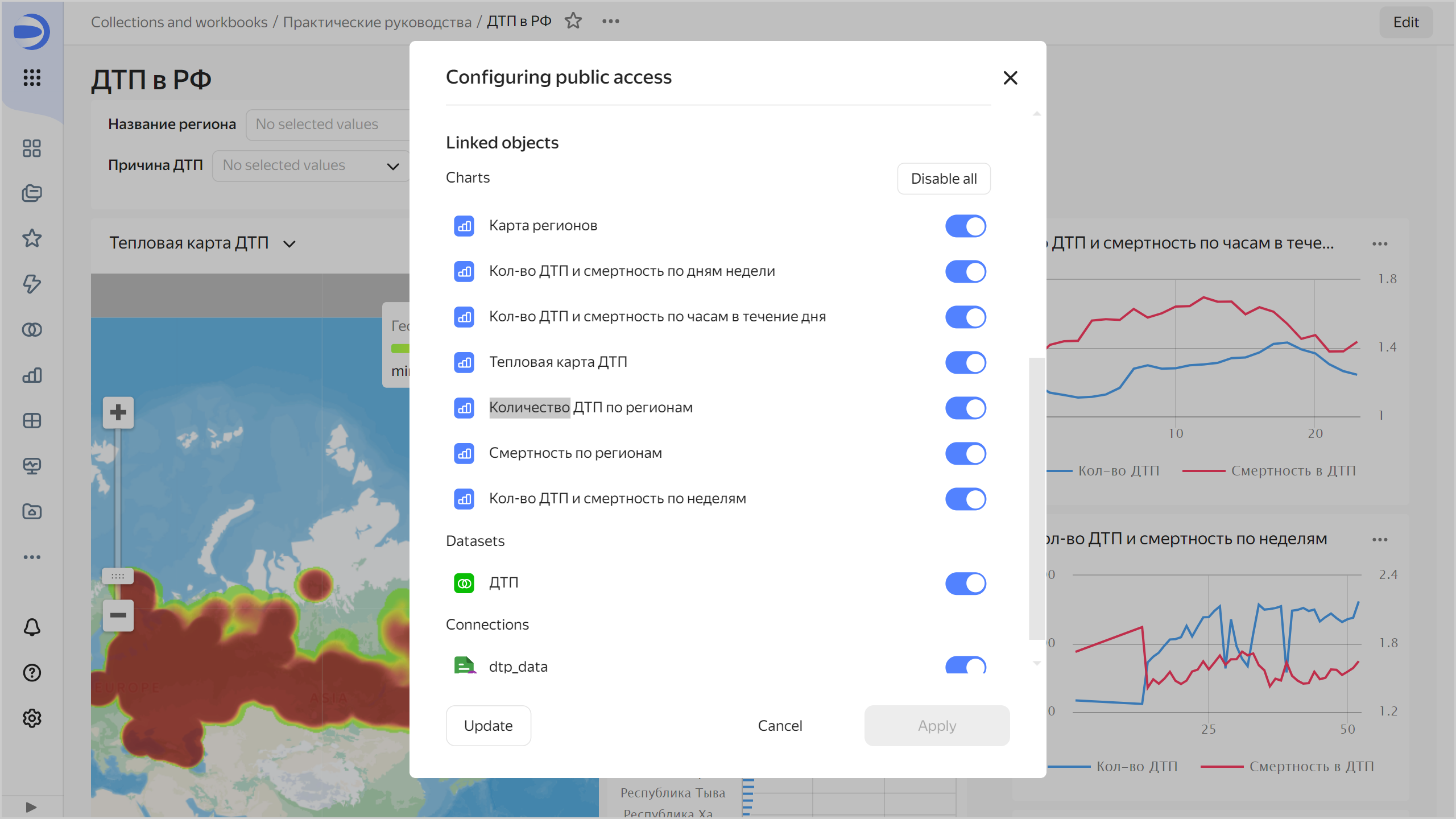
Publish the dashboard
To configure public access to the dashboard:
-
At the top of the screen, click → Public access.
-
In the window that opens, enable the link sharing option next to the dashboard name.
-
Click Continue to confirm publication of the dashboard and its linked data.
-
Click Copy link to copy the dashboard's unique URL.
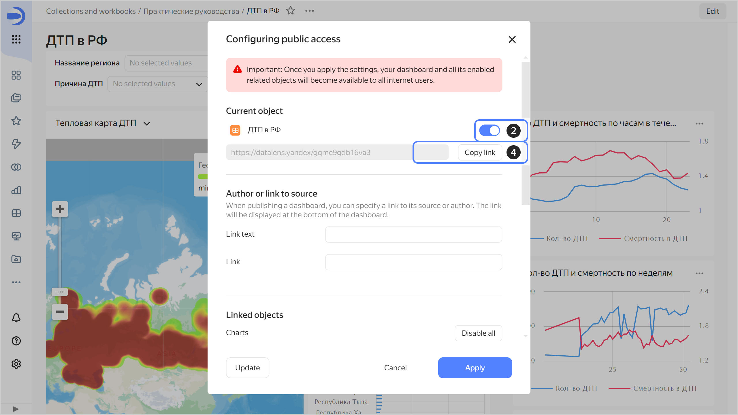
-
Click Apply.
-
Open a new tab in the browser and go to the copied link.
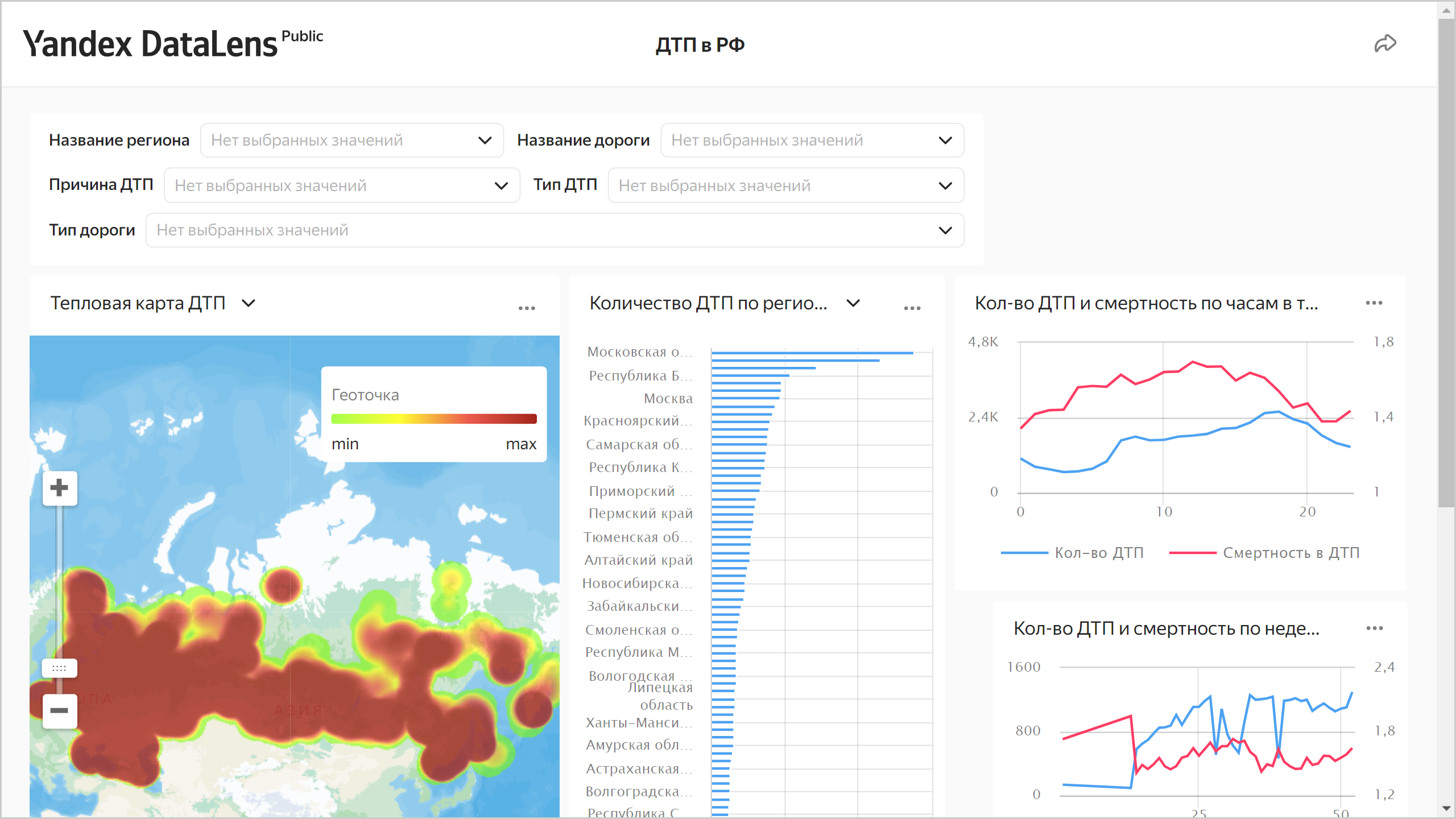
You can share this link with your colleagues, partners, and friends. When opening the dashboard link, no authorization and authentication is required.
Note
You can enable or disable public access separately for each chart and dataset linked with the dashboard.
Configuring public access for objects