Yandex DataLens UI customization
Note
This feature is only available with the Business service plan.
With UI customization, you can achieve a custom DataLens look by editing colors, logo, and redesigning individual elements.
Customization settings can be edited by the DataLens instance administrator (datalens.admin role).
For UI customization:
-
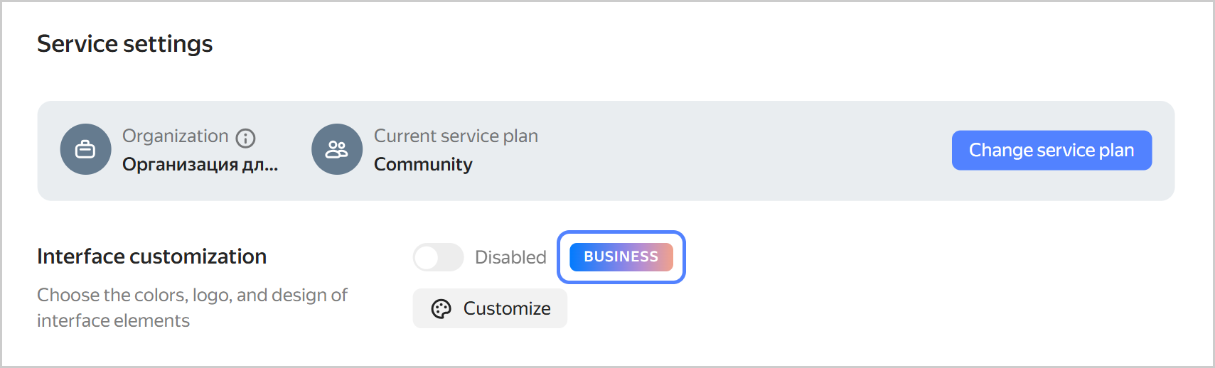
Go to the DataLens home page.
-
In the left-hand panel, select Service settings. For the Community plan administrator, the features available in the Business service plan are highlighted.
-
In the UI customization section, click Configure.
-
Customize the design:
-
UI theme: Select the UI theme for which you want to set the color palette.
-
Contrast: Select the contrast for which you want to set the color palette.
-
Color palette: Select colors for the UI theme and contrast. You can customize a unique palette for each combination of theme and contrast.
You can set the colors manually or generate them:
ManuallyGenerate- Main color: Used as a background for buttons and controls: switches, checkboxes, and selectors. Additionally, the main color is used as a theme for tooltips.
- Main color on hovering the cursor: When manually customized, you can select any color. When generating a palette, a darker shade of the main color is set automatically.
- Page background: Page background color. For a light theme, white is the most commonly used color. Dark themes have more options, from neutral gray shades to warm or cool colors.
- Additional color: Used as a background for cards and other elements placed on top of the page background.
- Selected elements: Color for selected elements, e.g., clicked buttons, selected rows, or selected text.
- Selected items when hovering the cursor: Color for selected items (e.g., clicked buttons or selected rows) when hovering over them.
- Text on selected items: Text color on selected items. Set it to contrast with the color of the selected elements.
- Lines and outlines: Color of the active card or tab, as well as the color of the loading indicator.
- Link: Link text color.
- Link on hover: Link text color when the cursor hovers over it.
Click Generate palette and select the main color. Other colors will be automatically generated based on it. If required, edit the color settings manually.
-
Contrasting color: Select a color for the text on the button.
-
Logo and favicon: To replace the logo and favicon, upload a 1:1 aspect ratio SVG file to Yandex Object Storage. Then copy the link to the file in the storage and paste it into this field. Click Apply next to the field.
-
Rounding: Sets the rounding of the corners of UI elements.
Note
The preview area displays how the UI elements will look like with the specified settings.
-
-
At the top right, click Save.
-
To apply your custom UI settings, select Enabled at the top of the screen.
Note
With the Community plan, you cannot apply your changes to the UI; however, you can learn how UI customization works, i.e., generate palettes and save your settings.
Customization settings can be tested by the DataLens instance administrator (
datalens.adminrole).