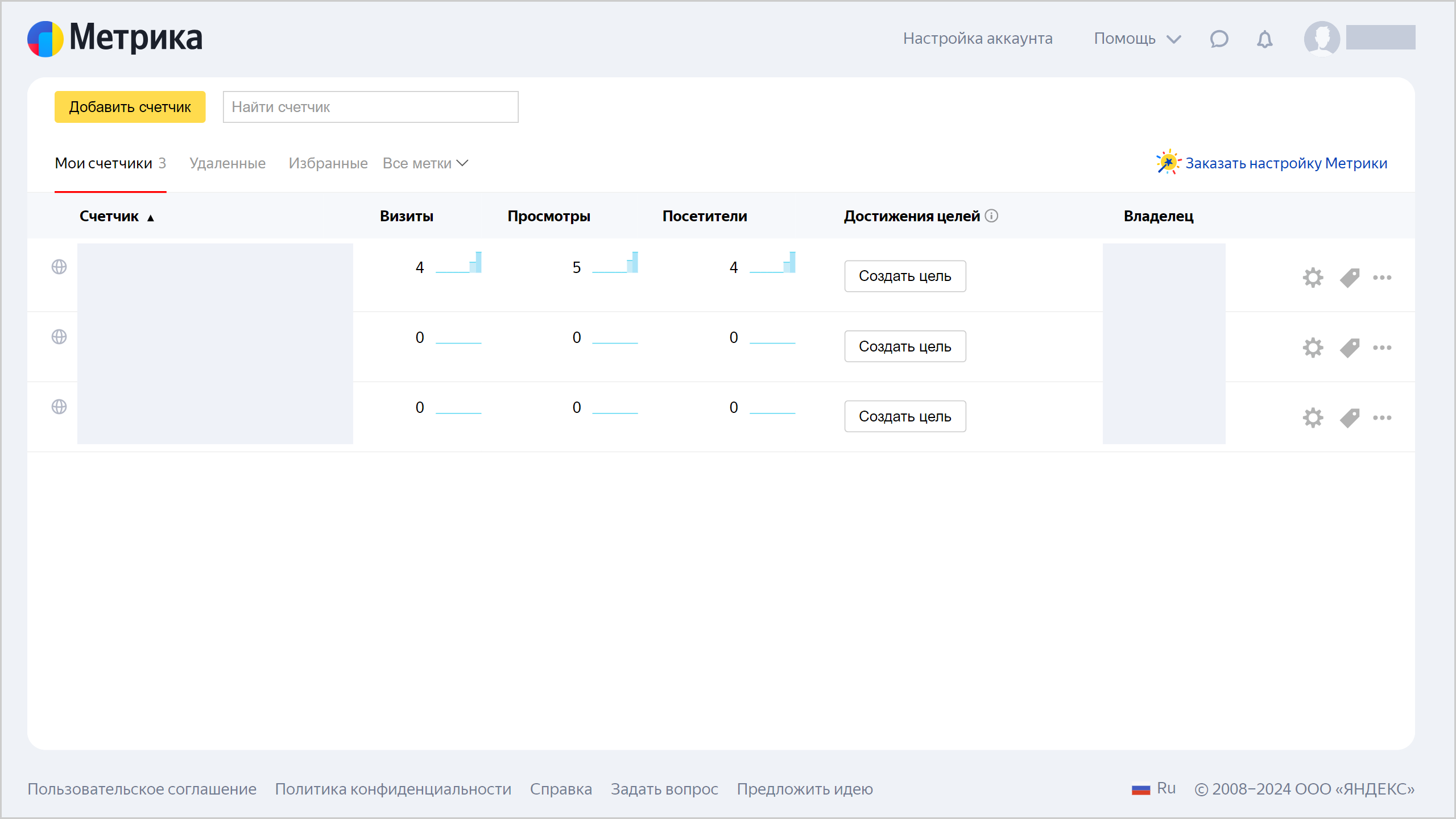
Yandex Metrica: direct connection
Note
For the Metrica Pro package, real-time data streaming is available. For more information, see this guide
This tutorial demonstrates how to use Yandex DataLens with Yandex Metrica in direct access mode.
As the data source, use a Yandex Metrica tag you have access to. View the list of available tags here

If there are no available tags in the list, use the Yandex Metrica demo dashboard
Note
In this tutorial all objects will be created and stored in a workbook. If using legacy folder navigation, create an individual directory to work in.
Create a directory
- Go to the DataLens home page
- In the left-hand panel, select
- In the top-right corner, click Create → Directory.
- Enter a name for the directory.
- Click Create.
To visualize and explore data, set up DataLens and follow the steps below:
- Create a workbook.
- Create a connection and standard dashboard.
- Edit the standard dashboard.
- Edit the chart.
Getting started
To get started with DataLens:
- Log in
- Open the DataLens home page
- Click Open DataLens.
- Confirm that you have read the Terms of use
-
Log in
-
Open the DataLens home page
-
Click Open DataLens.
-
Select one of the options:
-
If you already have an organization, select it from the drop-down menu in the Organizations tab and click DataLens.
Note
To activate a DataLens instance, the user must have the
adminorownerrole. For more information about roles, see Access management in Yandex Cloud Organization. -
If you have a cloud but no organization, click Add new DataLens. In the window that opens, enter your organization's name and description and click Create organization and DataLens. For more information about working with organizations, see Getting started with organizations.
-
If you have any technical questions about the service, contact Yandex Cloud support
Create a workbook
- Go to the DataLens home page
- In the left-hand panel, select
- In the top-right corner, click Create → Create workbook.
- Enter a name for the workbook:
Metrica Live Demo. - Click Create.
Create a connection and a standard dashboard
Warning
This step describes actions for users with permissions for any Yandex Metrics tag. If you do not have permissions for a tag, deploy a dashboard from DataLens Marketplace
-
In the top-right corner of the workbook, click Create →
-
Under Files and services, select the Yandex Metrica connection.
-
Click Get token.
If this is your first connection to a Yandex Metrica tag, grant the necessary permissions to the service.
-
Select the tag from the drop-down list.
-
Select the accuracy
-
Enable Automatically create a dashboard, charts, and a dataset on the connection.
-
Click Create connection.

- Enter the connection name:
Demo Connection to Metrica Live. - Click Create.
When the connection is created, a workbook or folder containing the datasets, charts, and dashboard will open.

Note
By default, Metrica data is exported for the last 60 days. If you add a filter by date to the chart, the Metrica filter will be reset. We recommend adding a filter by date as an offset relative to the current date.
- Enter the connection name:
Edit the standard dashboard
Warning
If you skipped the Create a connection and a standard dashboard step, deploy the dashboard from DataLens Marketplace
You can customize the standard dashboard by deleting, moving, or editing charts.
-
Open
Metrica Live Demo Dashboard. -
In the top-right corner of the dashboard, click Edit.
-
Delete the
Page depthchart. Click
-
Position the
Bounce rateandTime on sitecharts so that they fill in the empty space left after deleting the chart in the previous step:
-
Remove the
Percentage of visits by browserandSessions, views, and users by browsercharts. -
In the top-right corner of the dashboard, click Save.
Edit the chart
You can edit any chart on the dashboard. For example, change the visualization type for the Sessions by device type and OS chart from the Technologies section.
-
In the top right corner of the
Session by device type and OSchart, click -
Select Edit.

-
Select a different chart type: Pie chart.

-
In the top-right corner, click Save.
-
Close the chart editing page and go back to the dashboard window.
-
Update the dashboard and make sure that the chart changed in the Technologies section.
