Analyzing sales and locations of pizzerias based on data from ClickHouse® and Marketplace databases
- Getting started
- Create a workbook
- Import geolayers from Marketplace
- Review the dashboard
- Create a connection
- Create a dataset
- Analyze the rate of opening new pizzerias
- Analyze the revenue of pizzerias
- Calculate the total revenue and number of pizzerias
- Analyze order density on the map
- Create a dashboard
- Add geolayers to the dashboard
- Optional
Note
In this tutorial all objects will be created and stored in a workbook. If using legacy folder navigation, create an individual directory to work in.
Create a directory
- Go to the DataLens home page.
- In the left-hand panel, select All objects or Personal directory.
- In the top-right corner, click Create → Directory.
- Enter a name for the directory.
- Click Create.
In this tutorial, you will prepare a dashboard for selecting locations to open new Dodo pizzerias.
With DataLens, you will analyze locations based on real data:
- Revenue from current Dodo pizzerias.
- Search queries to pizzerias by location (Yandex data).
- Number of all pizzerias by location (Yandex data).
We will use a ClickHouse® demo DB and the Companies: supply and demand product from Marketplace as a source.
You can also watch this tutorial on the Yandex Cloud YouTube channel.
To visualize and explore data, set up DataLens and follow the steps below:
- Create a workbook.
- Import geolayers from Marketplace.
- Review the dashboard.
- Create a connection.
- Create a dataset.
- Analyze the rate of opening new pizzerias.
- Analyze the revenue of pizzerias.
- Calculate the total revenue and number of pizzerias.
- Analyze order density on the map.
- Create a dashboard.
- Add geolayers to the dashboard.
Getting started
To get started with DataLens:
- Log in to your Yandex account. If you do not have an account, create one.
- Open the DataLens home page.
- Click Open DataLens.
- Confirm that you have read the Terms of use and click Log in.
-
Log in to your Yandex account.
-
Open the DataLens home page.
-
Click Open DataLens.
-
Select one of the options:
-
If you already have an organization, select it from the drop-down menu in the Organizations tab and click DataLens.
Note
To activate a DataLens instance, the user must have the
adminorownerrole. For more information about roles, see Access management in Yandex Cloud Organization. -
If you have a cloud but no organization, click Add new DataLens. In the window that opens, enter your organization's name and description and click Create organization and DataLens. For more information about working with organizations, see Getting started with organizations.
-
If you have any technical questions about the service, contact Yandex Cloud support. To ask for advice, discuss the solution to your problem or best practices of the service, write to the DataLens chat in Telegram.
Create a workbook
- Go to the DataLens home page.
- In the left-hand panel, select Collections and workbooks.
- In the top-right corner, click Create → Create workbook.
- Enter the workbook name:
Companies: supply and demand. - Click Create.
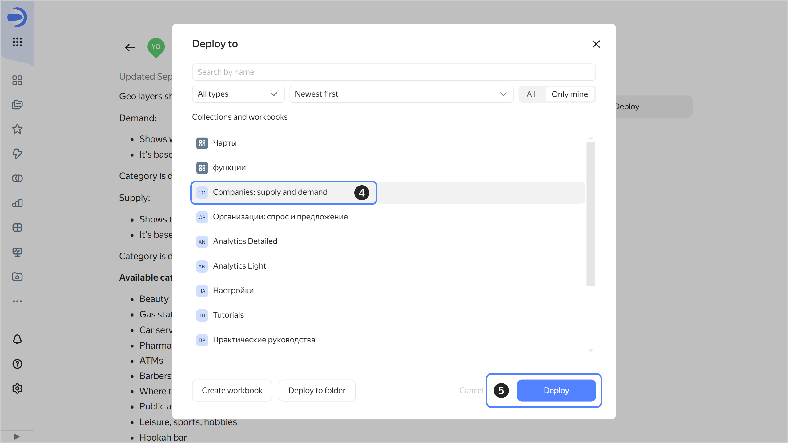
Import geolayers from Marketplace
-
Go to DataLens in Marketplace.
-
Select the Geolayers category and the Companies: supply and demand product.
-
Click Expand in the product card that opens.
-
Select the
Companies: supply and demandworkbook. -
Click Deploy.
Review the dashboard
-
Open the
Companies: supply and demanddashboard. -
Review the dashboard:
-
At the top, there are filters by city, category, and polygon type.
-
The tables gives information on demand and supply:
Demandis the number of search queries made by users of Yandex geoservices to the selected category of companies or services. The category is determined from the query. Local queries from mobile devices within a search radius of 3 km are included.Supplyis the number of existing companies in the selected category. This is based on company data in the Yandex Business Directory.Demand-to-supply ratioshows the extent to which the supply meets the demand in a polygon compared to the entire city.
-
The map visualizes the distribution of supply and demand across the city.
-
-
Select the
Pizzeriacategory and check the map forDemand,Supply, andDemand-to-supply ratio per citymeasures.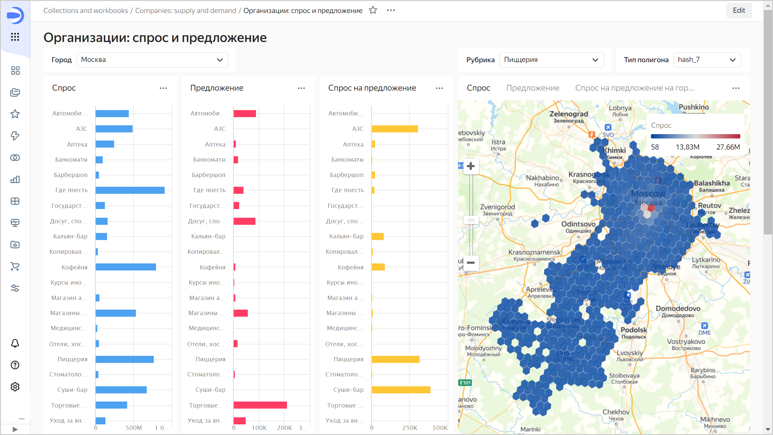
Create a connection
-
Go to the
Companies: supply and demandworkbook by clicking its name in the dashboard path.
-
In the top-right corner, click Create → Connection.
-
Under Databases, select the ClickHouse® connection.
-
In the window that opens, select
Specify manuallyfor the connection type and provide the following connection parameters:- Host name:
rc1a-g1gicp3imcc0pnsg.mdb.yandexcloud.net,rc1b-vbbl6tob599tr3oi.mdb.yandexcloud.net,rc1d-qf1ven1igeihhbep.mdb.yandexcloud.net(comma-separated). - HTTP interface port:
8443(default). - Username:
datalens-marathon-2020-11-ro. - Password:
/4b+xBF6aSCgN9wKTevYGuDjxC9IO4Fa.
- Host name:
-
Click Check connection and make sure you get a green check mark.
-
Click Create connection.
-
Enter the connection name:
DODO Con. -
Click Create.
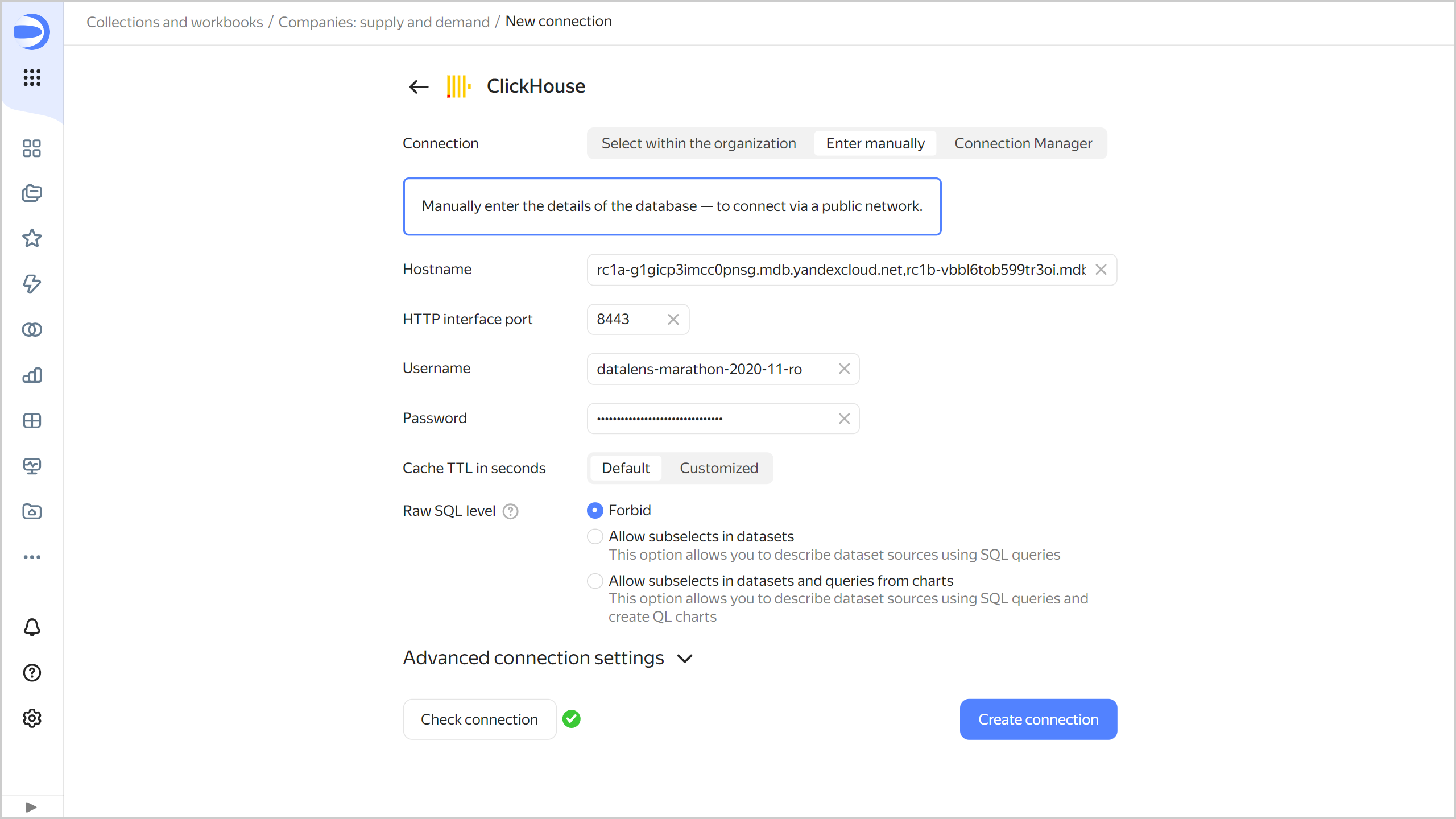
-
Wait for the connection to be saved.
Create a dataset
Create a dataset based on the DODO Con connection:
-
In the top-right corner of the connection page, click Create dataset.
-
Drag the
marathon-2020-11.DODO_opendatatable to the workspace.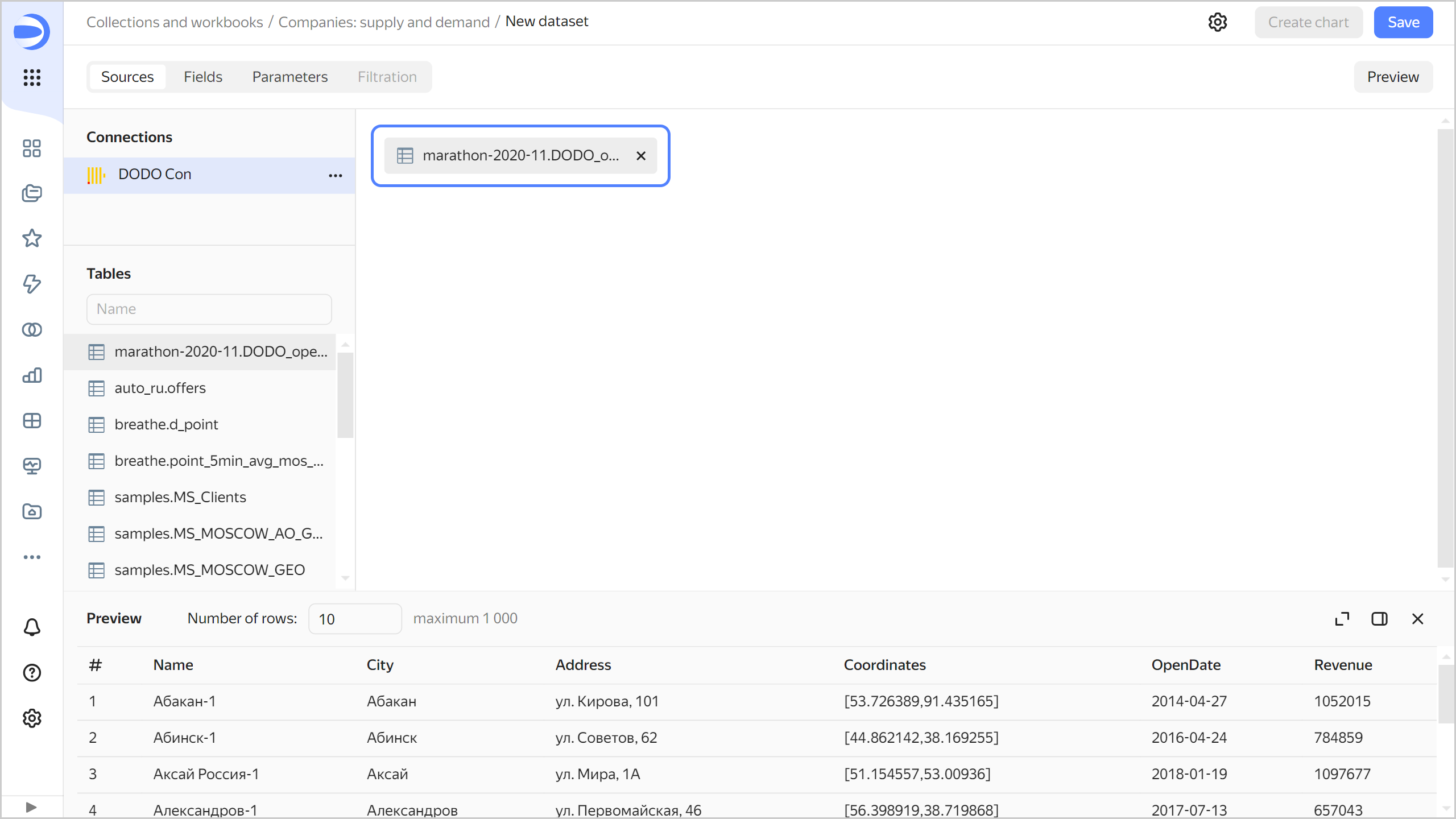
-
Navigate to the Fields tab.
-
Rename the
Namefield toPizzerias. To rename a field, click its current name, delete it, and enter a new one. -
For the
Coordinatesfield, select Geopoint in the Type column. -
For the
Revenuefield, set the aggregation type to Sum. The fields with defined aggregation functions become measures and change their color to blue.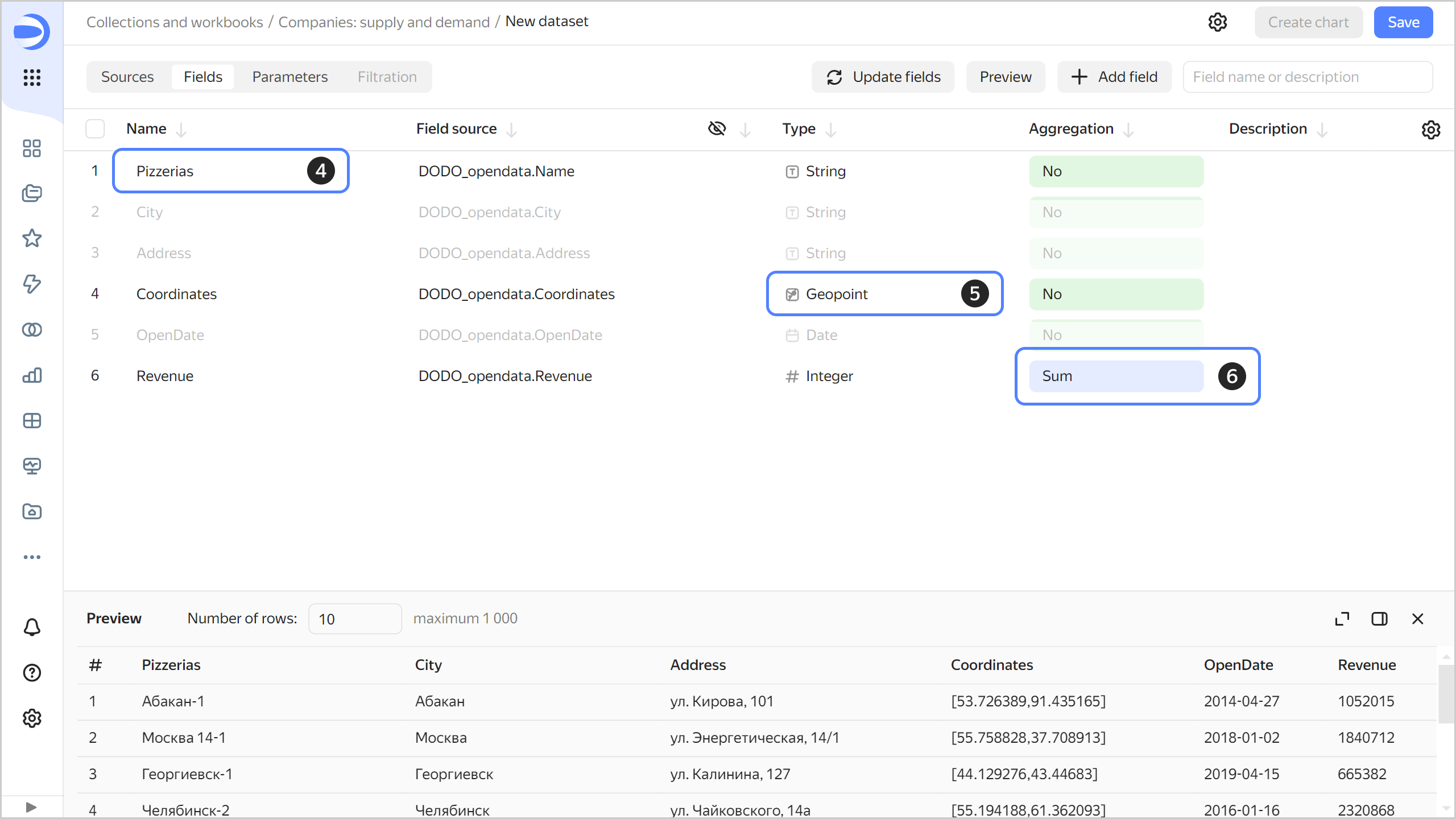
-
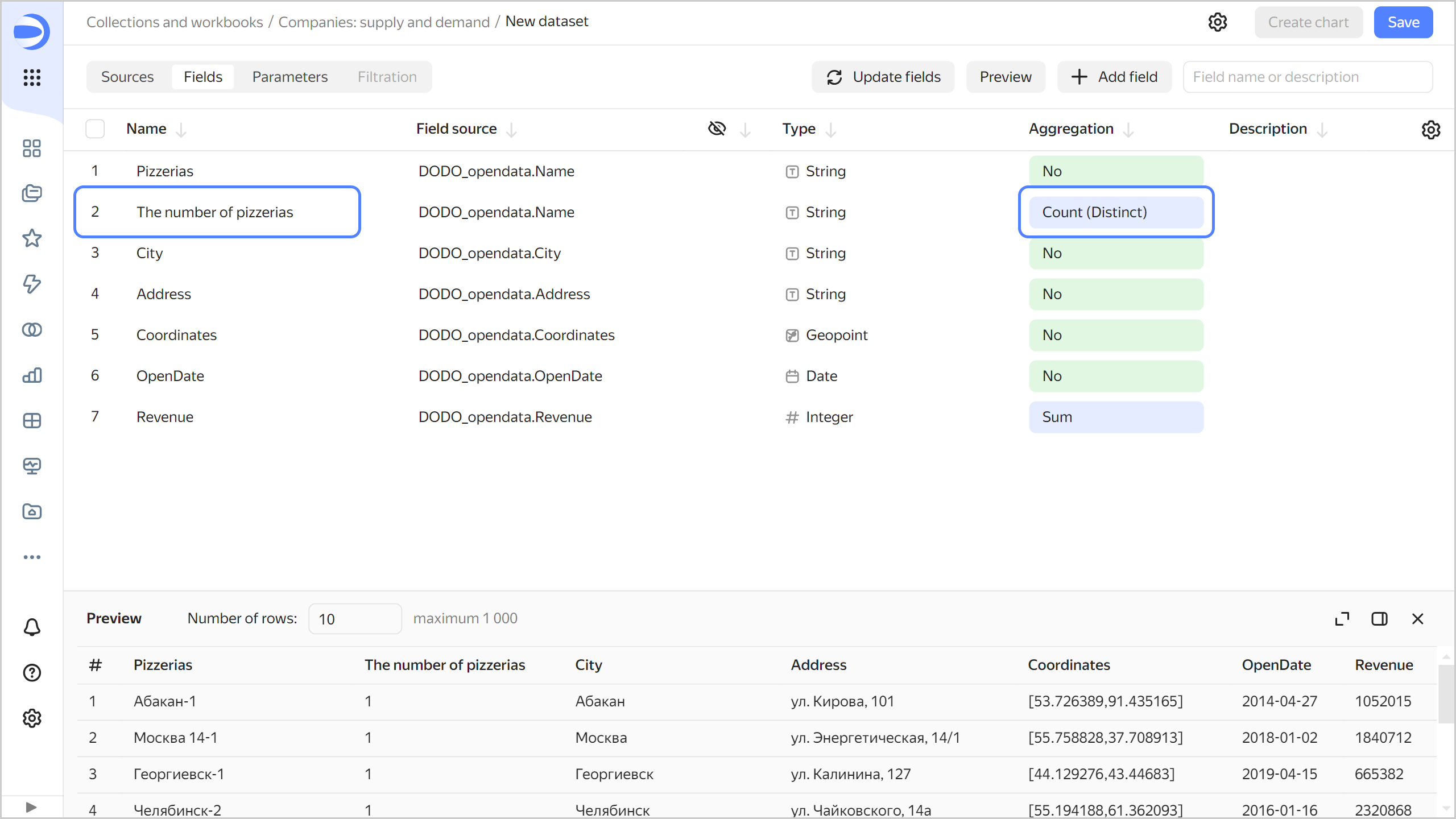
Create a measure for the number of pizzerias.
-
Duplicate the
Pizzeriasfield: on the right side of the row with the field, click and select Duplicate. -
Rename the
Pizzerias (1)duplicate field toThe number of pizzerias. -
Change the aggregation type to Number of unique.
-
-
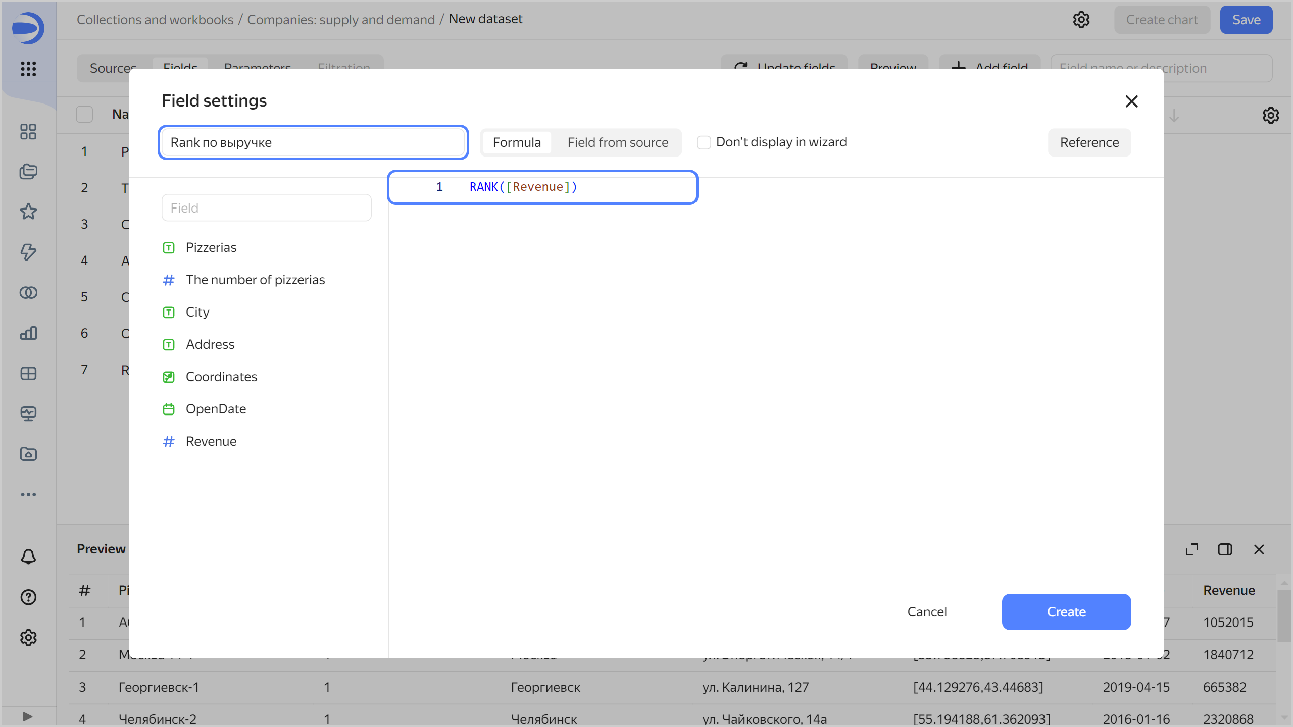
Create a calculated field to rank pizzerias by revenue:
-
In the top-right corner, click Add field.
-
At the top-left, specify the field name:
Rank by revenue. -
In the formula field, enter
RANK([Revenue]). -
Click Create.
-
-
Save the dataset:
- In the top-right corner, click Save.
- Enter
DODOfor the dataset name and click Create.
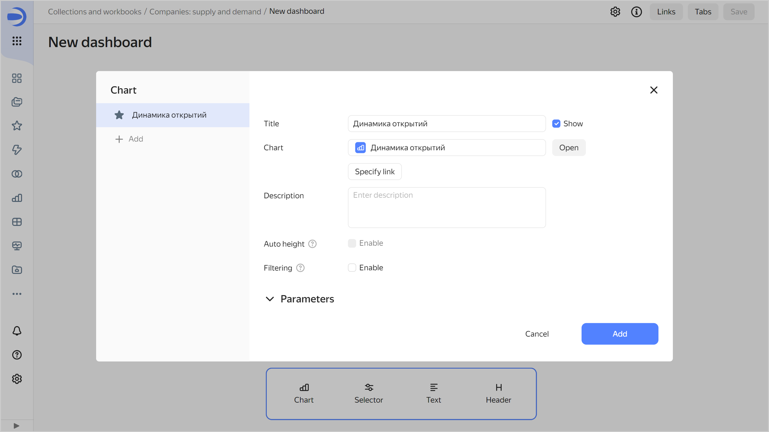
Analyze the rate of opening new pizzerias
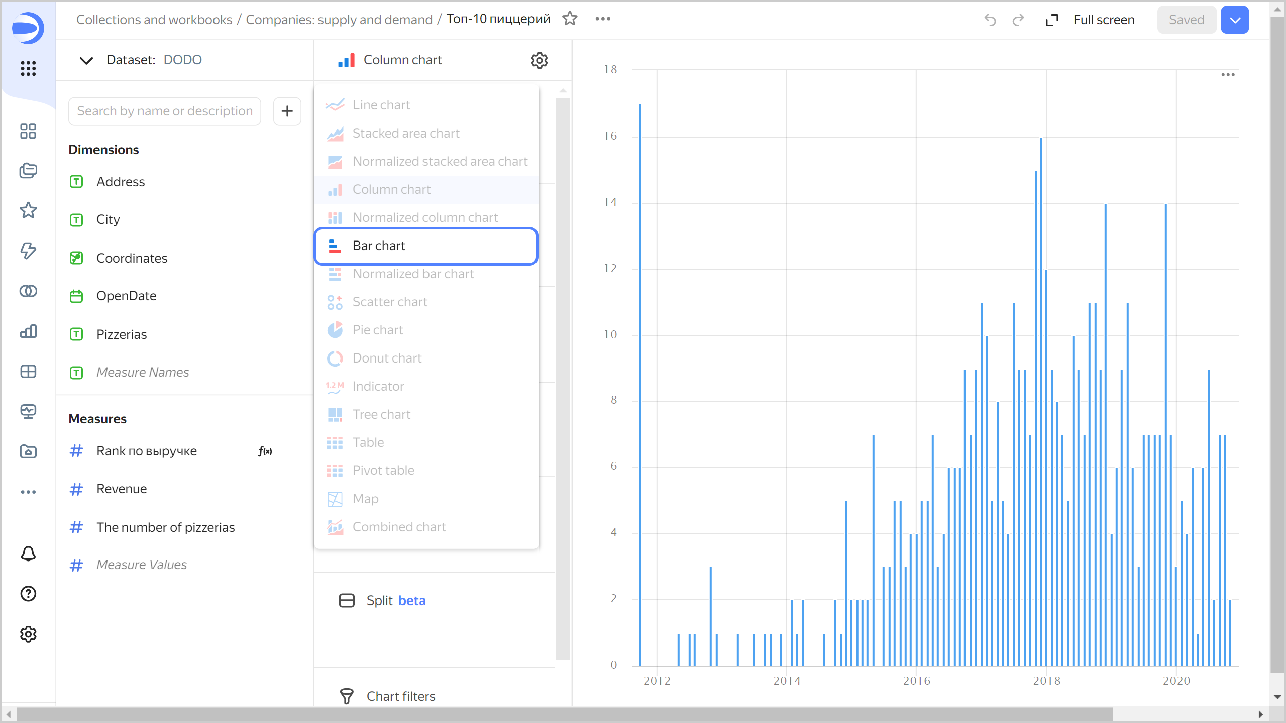
Create a bar chart to visualize the monthly rate of opening pizzerias:
-
Click Create chart in the top-right corner of the dataset page.
-
Add the opening date to your chart. To do this, drag the
OpenDatefield from Dimensions to the X section. -
Add the number of pizzerias as a measure to your chart. To do this, drag the
The number of pizzeriasfield from Measures to the Y section.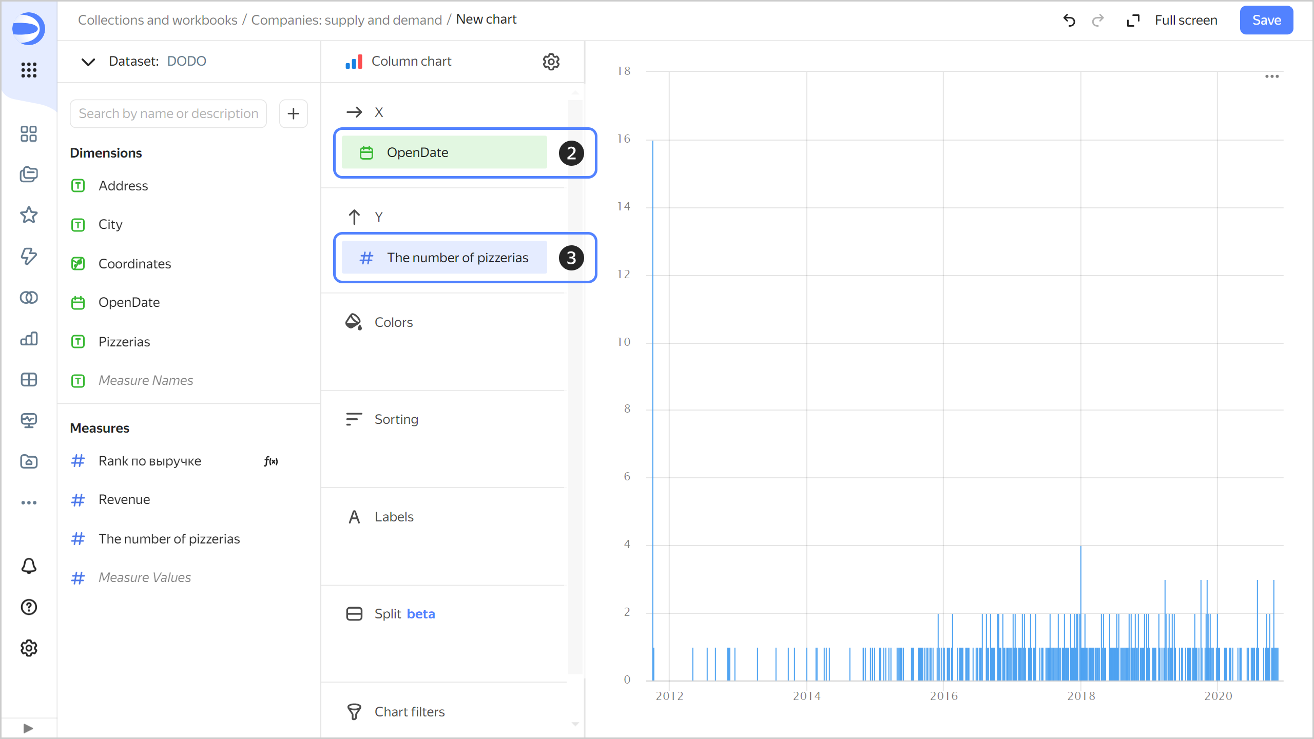
The chart will show how many new pizzerias opened on a certain day.
-
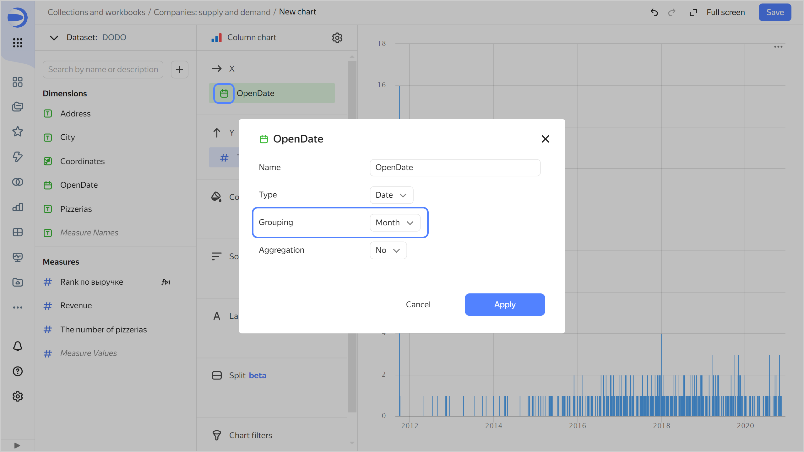
Display the chart by month:
-
Click the calendar icon next to the
OpenDatefield in the X section. -
In the Grouping field, select Rounding ⟶ Month and click Apply.
-
-
Save the chart:
-
In the top-right corner, click Save.
-
In the window that opens, enter
Opening ratefor the chart name and click Save.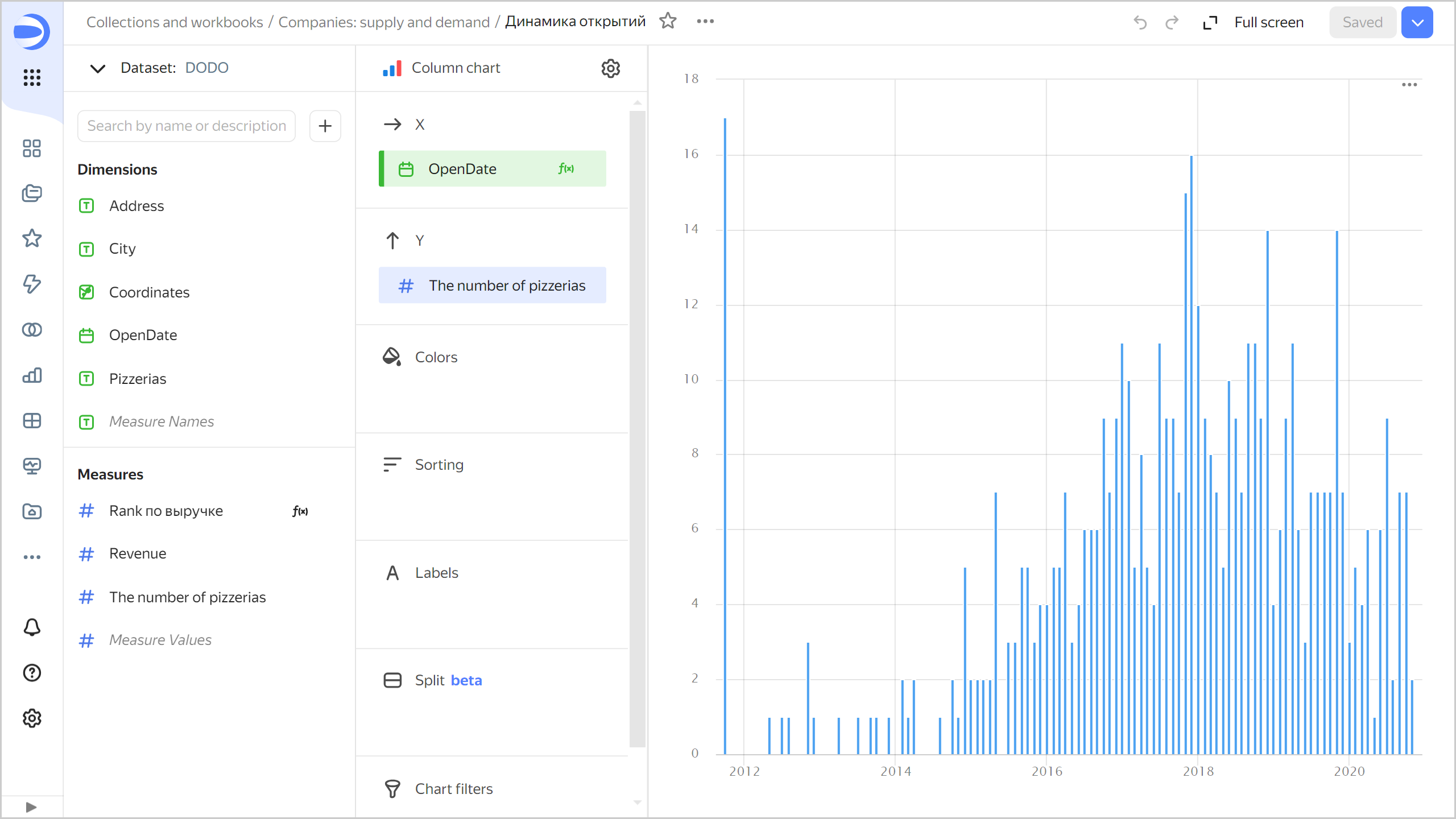
-
Analyze the revenue of pizzerias
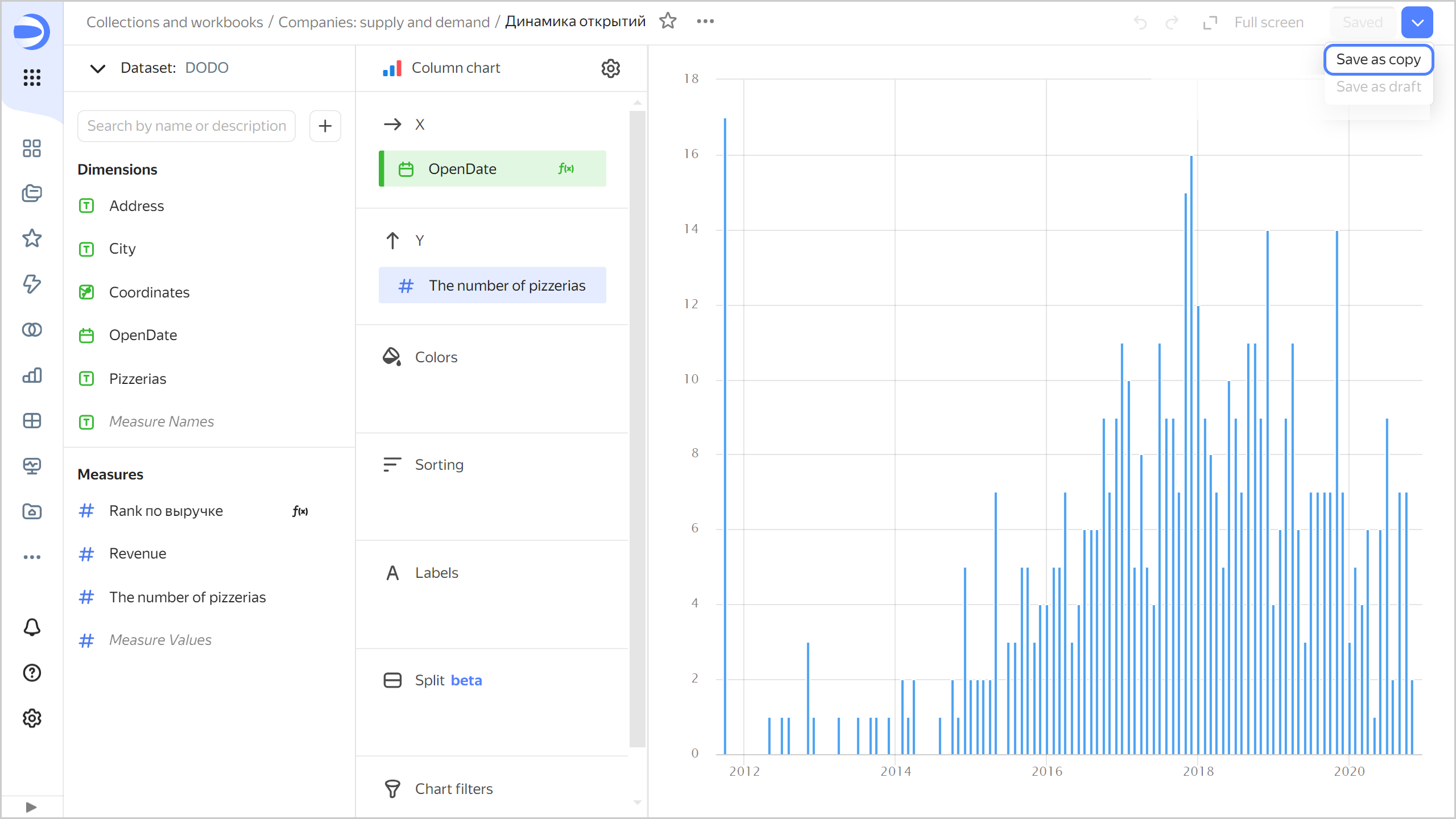
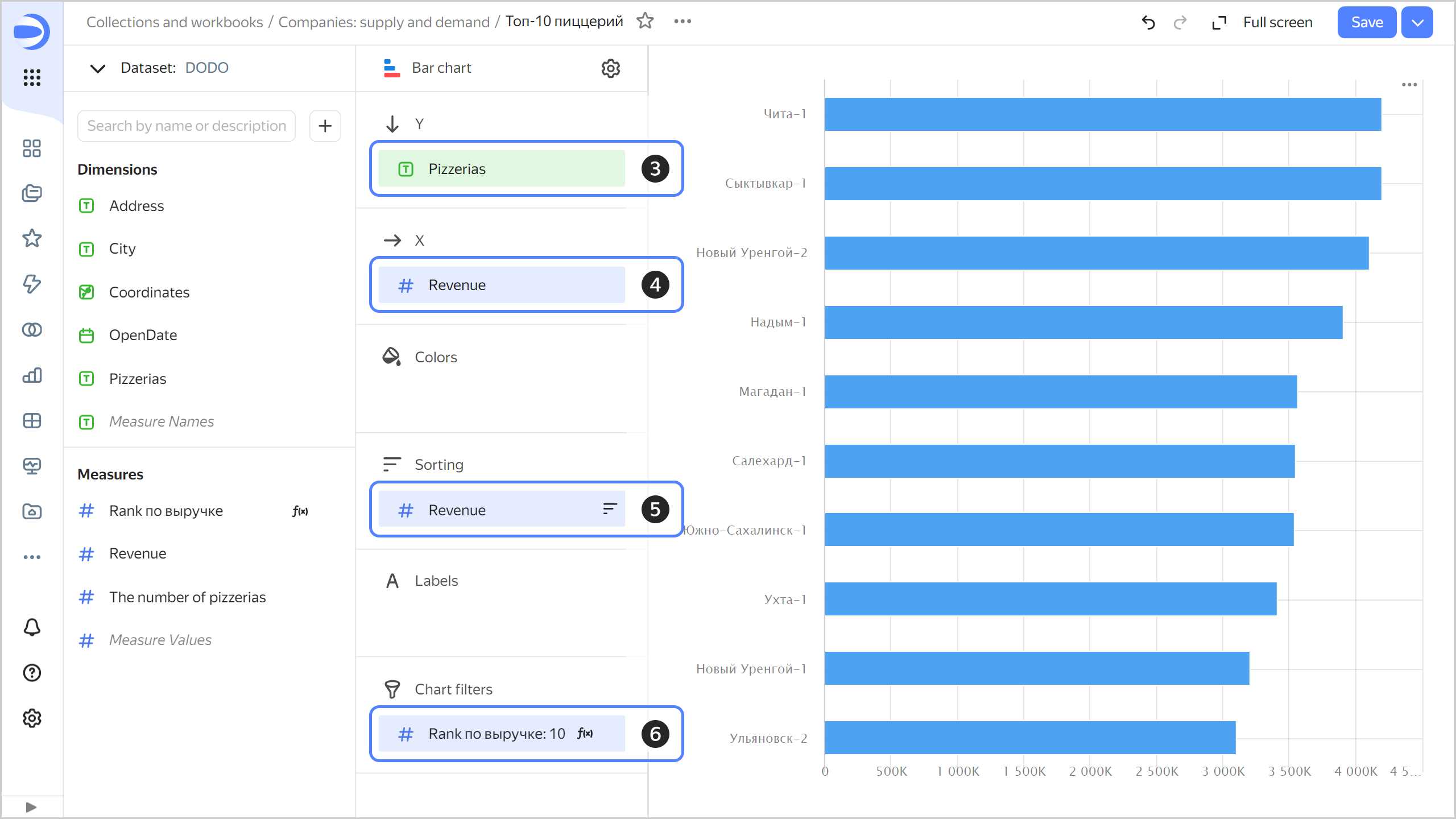
Create a bar chart to display the top 10 pizzerias by revenue:
-
Copy the chart you created in the previous step:
-
In the top-right corner, click → Save as copy.
-
In the window that opens, enter
Top 10 pizzeriasfor the new chart name and click Save.
-
-
For the visualization type, select Line chart.
-
Replace the months with pizzeria names on the Y axis. To do this, drag the
Pizzeriasfield from Dimensions to the Y section and hold it over theOpenDatefield until the latter turns red. -
Replace the number of pizzerias with the total revenue on the X axis. To do this, drag the
Revenuefield from Measures to the X section and hold it over theThe number of pizzeriasfield until the latter turns red. -
Sort the chart by revenue in descending order. To do this, drag the
Revenuefield from Measures to the Sorting section. The chart now displays the total revenue by pizzeria. -
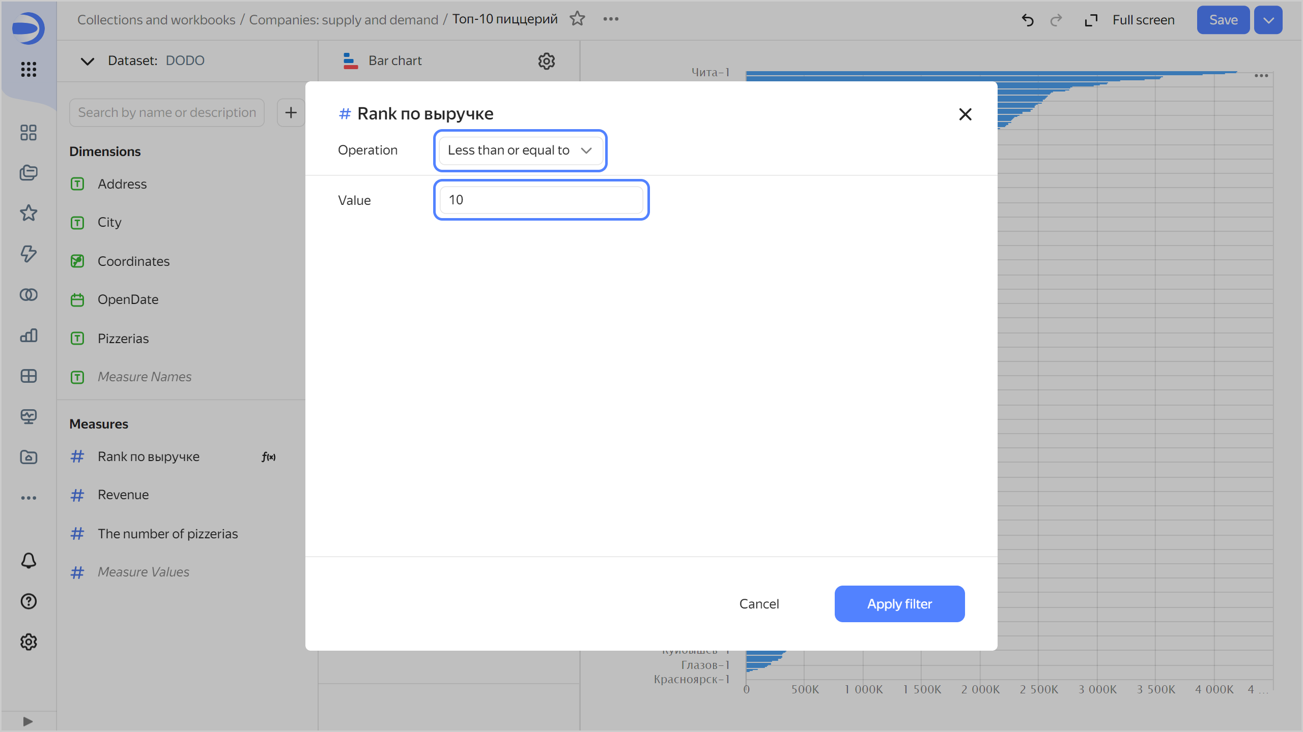
Add a filter to get the top 10 pizzerias by revenue:
-
Drag the
Rank by revenuefield from Measures to the Filters section. -
Select
Less than or equal tofrom the Operation list. -
Set Value to
10.
-
Click Apply filter.
The chart will show the top 10 pizzerias in Russia.
-
-
In the top-right corner, click Save.
Calculate the total revenue and number of pizzerias
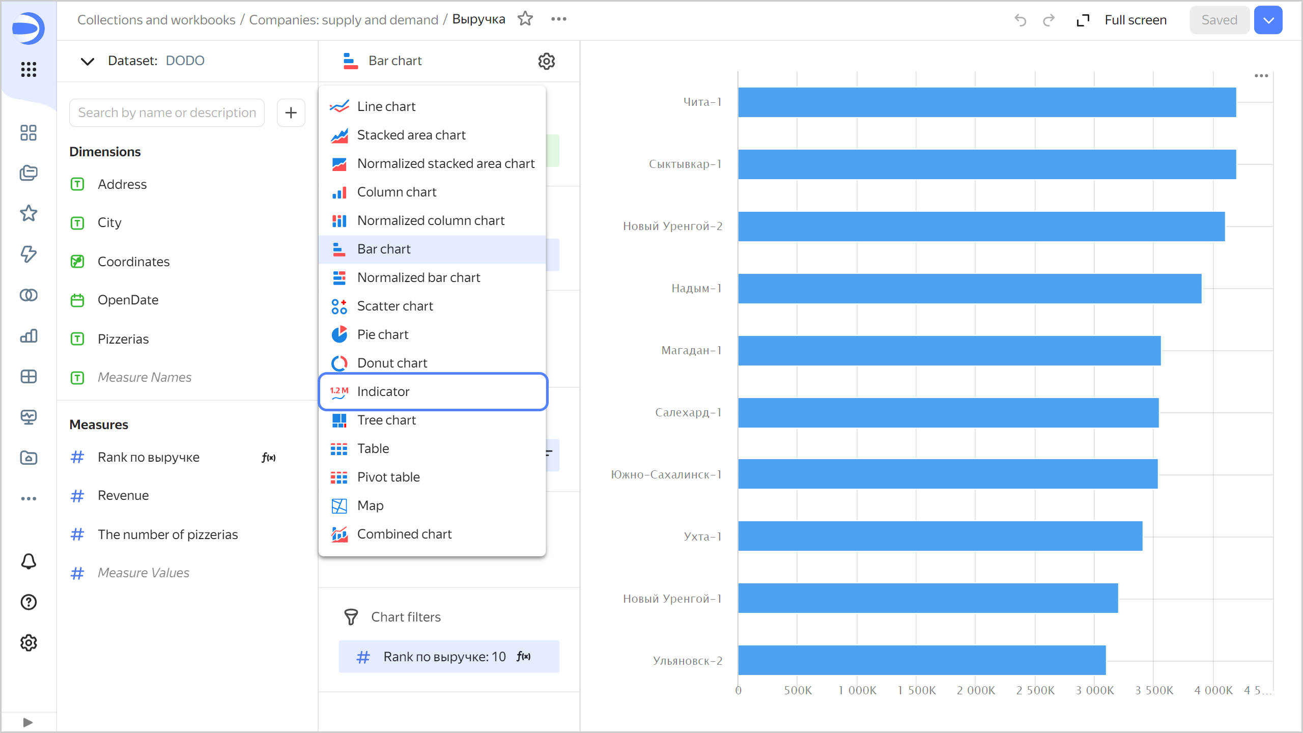
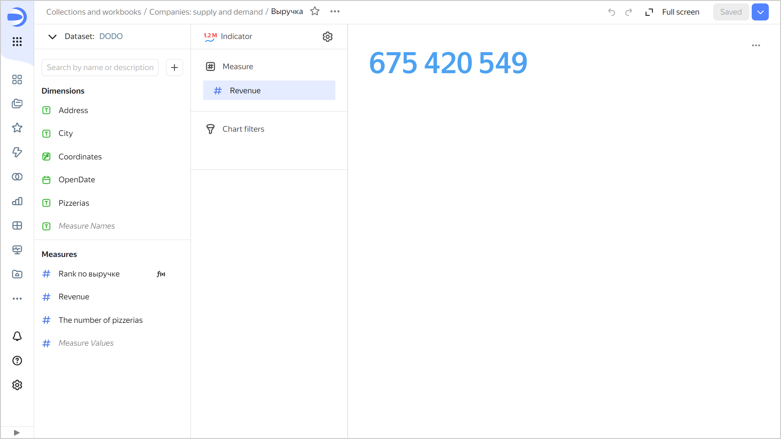
Create an indicator to display the total revenue:
-
Copy the chart you created in the previous step:
- In the top-right corner, click → Save as copy.
- In the window that opens, enter
Revenuefor the new chart name and click Save.
-
Select the Indicator visualization type.
-
Clear the filter for the top 10 pizzerias by revenue. To do this, click (the icon appears on when you hover over the field) next to the
Rank by revenuefield in the Filters section. -
Drag the
Revenuefield from Measures to the Measure section. -
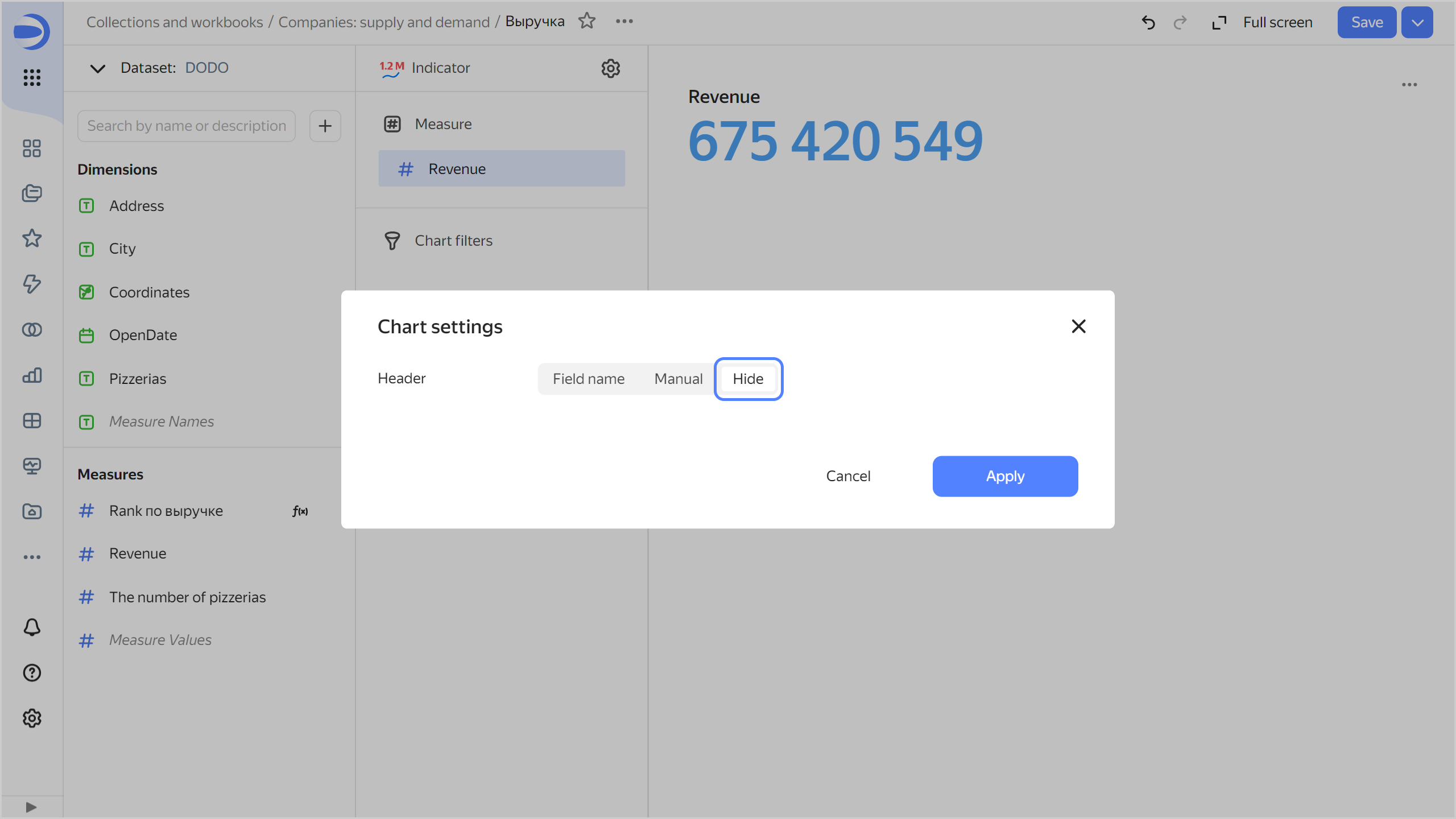
Disable the header display in the chart settings:
-
Click to the right of the visualization type.
-
Set the header to Hide.
-
Click Apply.
-
-
In the top-right corner, click Save.
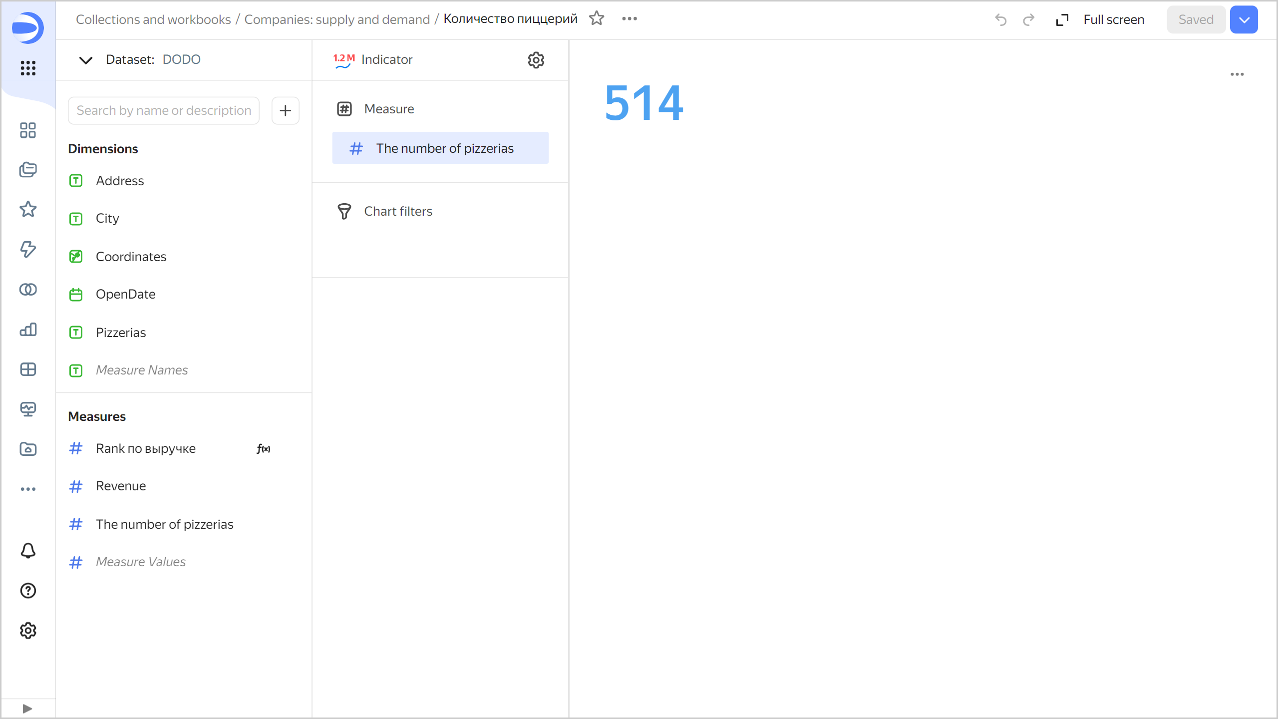
Create another indicator to display the number of pizzerias:
-
Copy the chart you created in the previous step:
- In the top-right corner, click → Save as copy.
- In the window that opens, enter
Number of pizzeriasfor the new chart name and click Save.
-
Replace the revenue with the number of pizzerias. To do this, drag the
The number of pizzeriasfield from Measures to the Measure section and hold it over theRevenuefield until the latter turns red. -
In the top-right corner, click Save.
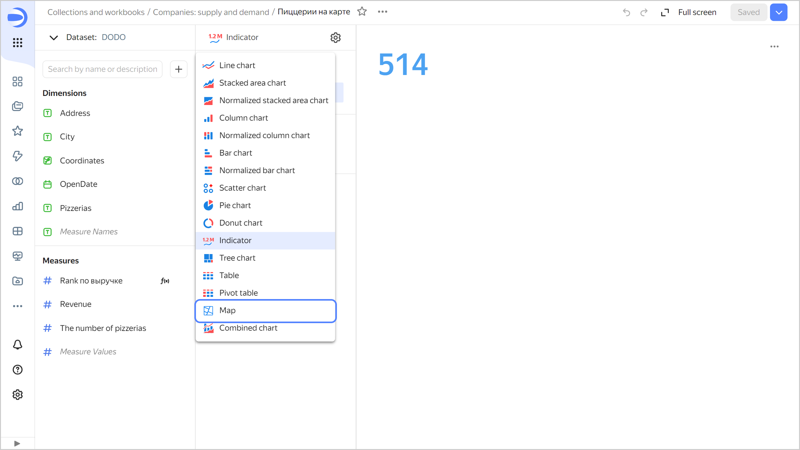
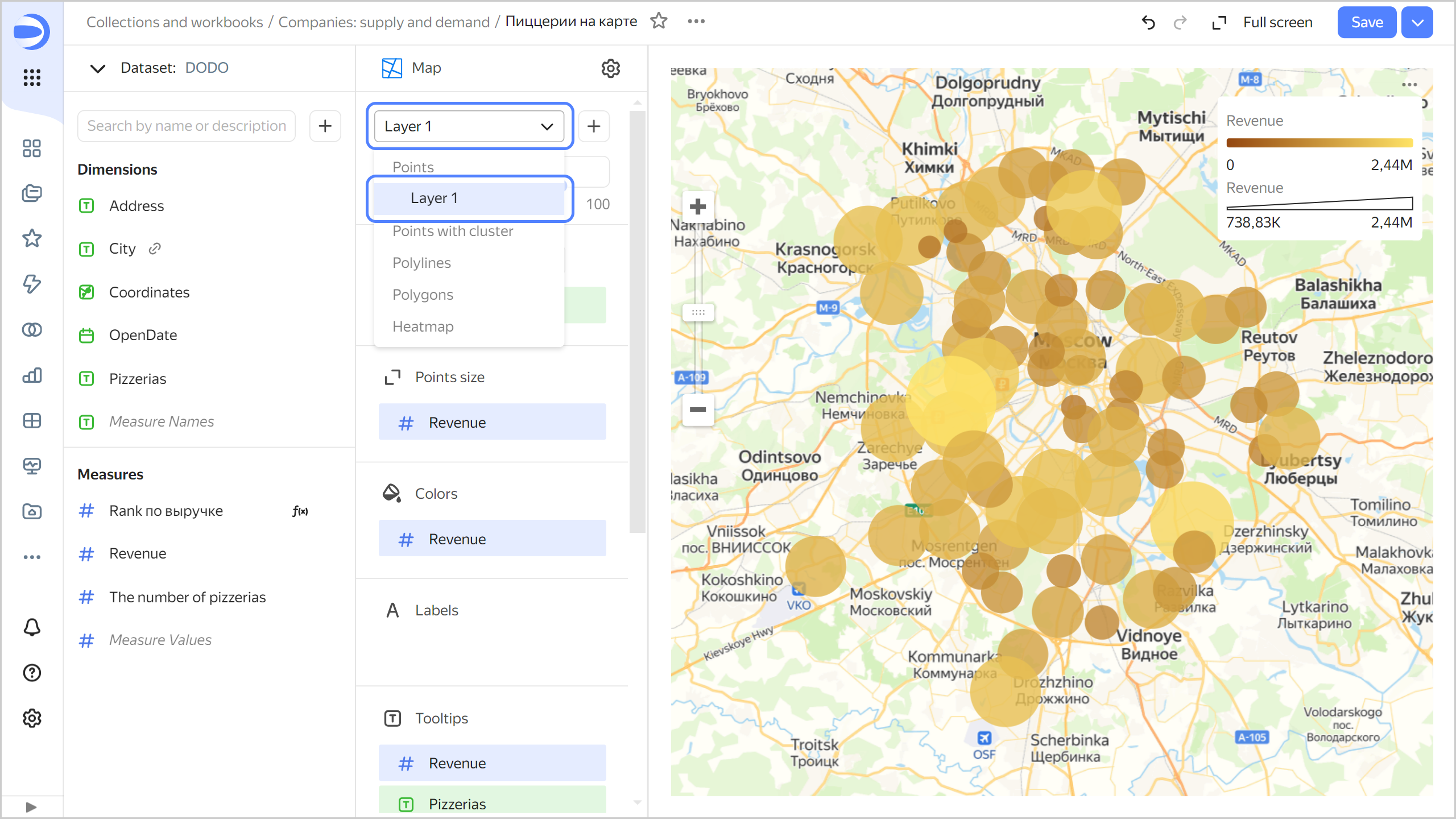
Analyze order density on the map
To visualize order density across Russia, create a map.
-
Copy the chart you created in the previous step:
- In the top-right corner, click → Save as copy.
- In the window that opens, enter
Map of pizzeriasfor the new chart name and click Save.
-
Select the Map visualization type.
-
Add the coordinates of pizzerias to the map. To do this, drag the
Coordinatesfield from Dimensions to the Points (Geopoints) section. -
Change the point size based on the revenue measure. To do this, drag the
Revenuefield from Measures to the Size section. -
Change the point color based on the revenue measure. To do this, drag the
Revenuefield from Measures to the Colors section. -
Add the following fields to the Tooltips section:
-
Pizzerias -
Address -
OpenDate -
Revenue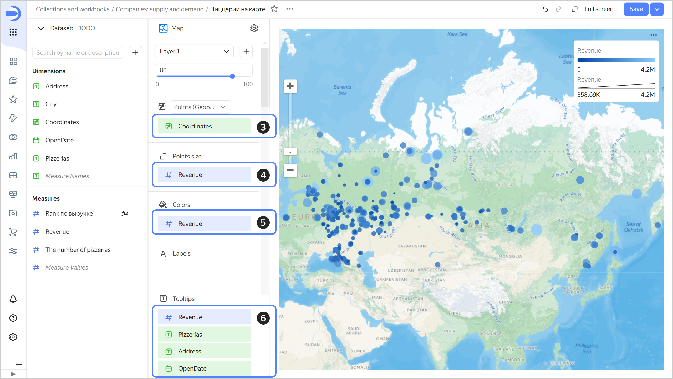
-
-
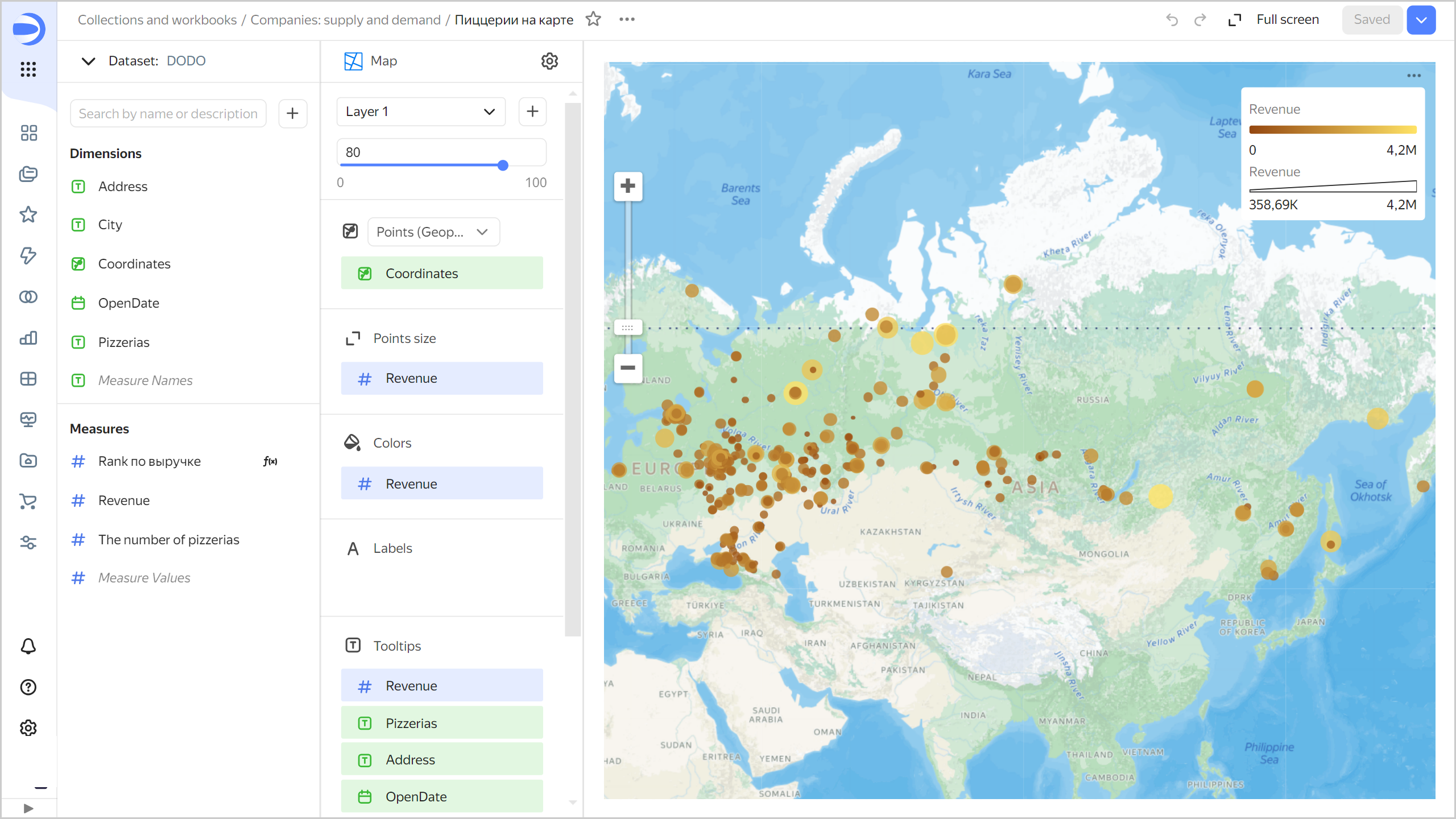
Update the Colors settings:
-
Click in the Colors section (the icon appears when you hover over the section).
-
Select the Two-color gradient type and the Yellow (shades) color.
-
Click Apply.
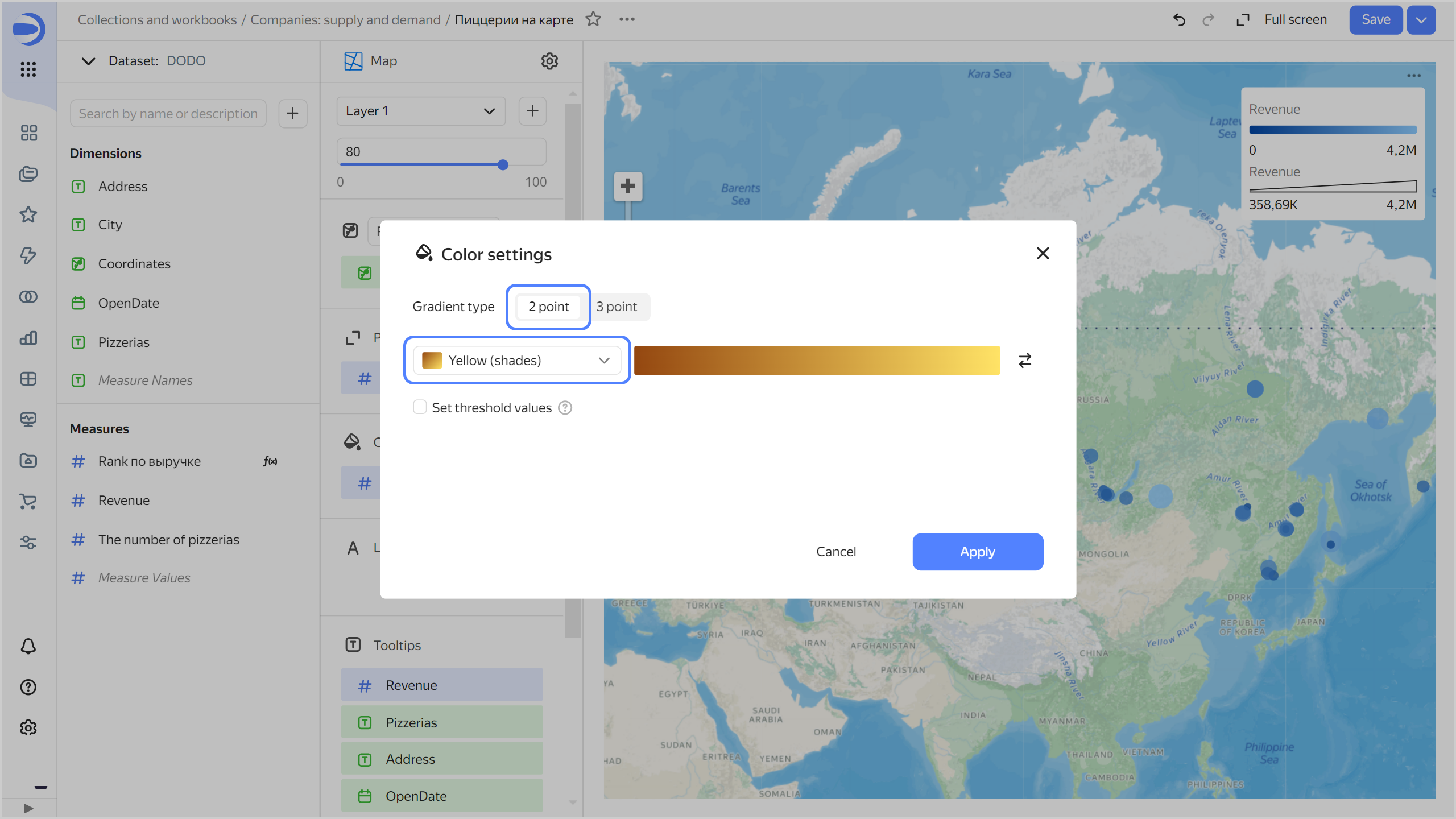
-
-
In the top-right corner, click Save.
Create a dashboard
-
Go to the
Companies: supply and demandworkbook by clicking its name in the dashboard path. -
In the top-right corner, click Create → Dashboard.
-
In the panel at the bottom of the page, hold down Chart and drag it to the required area.
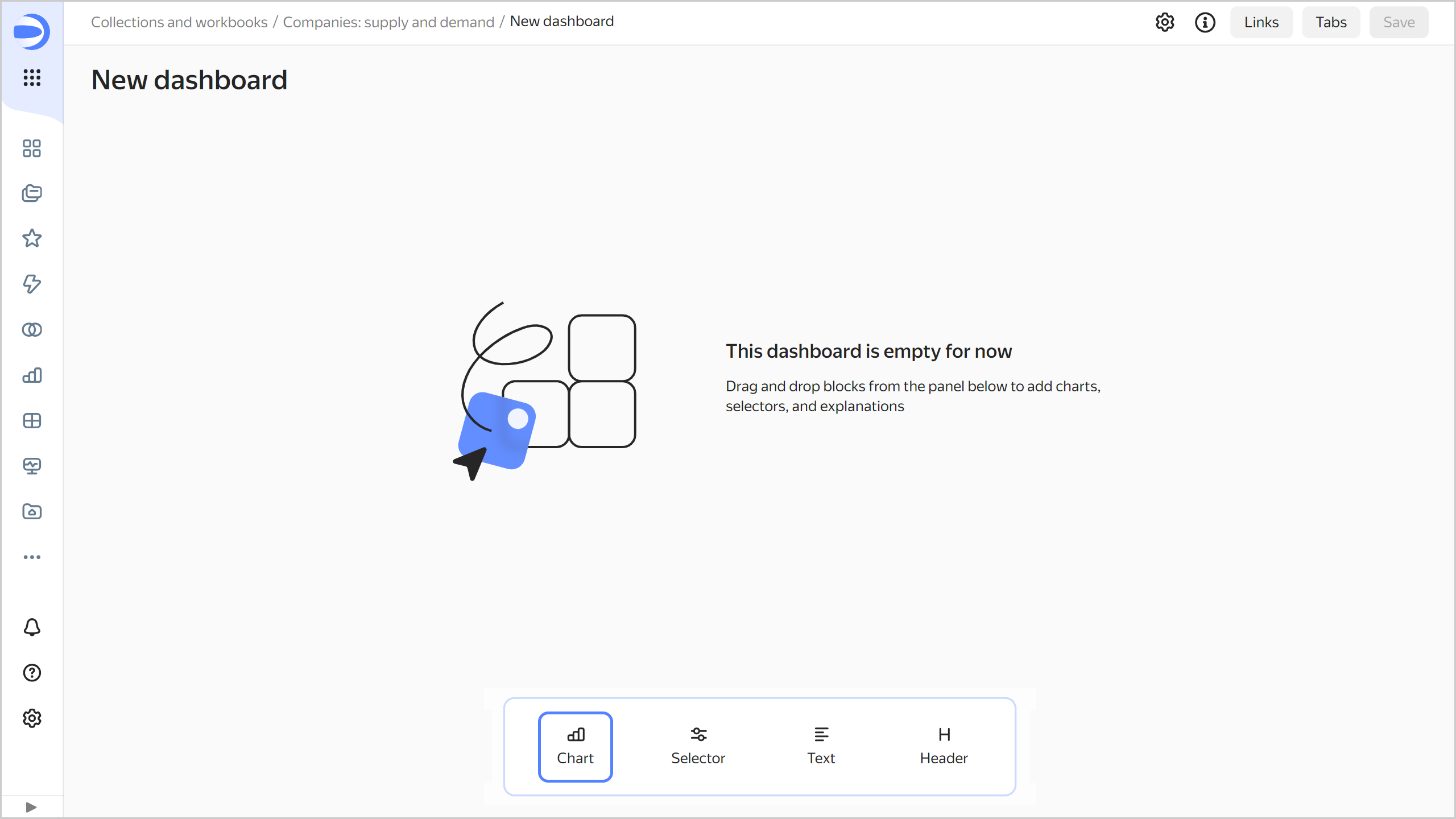
-
In the window that opens, click Select.
-
Select the
Opening ratechart. This will automatically fill in the Name field. -
Click Add.
-
Repeat steps 3-6 to add these charts:
Top 10 pizzerias.Revenue.Number of pizzerias.Map of pizzerias.
-
Adjust the size of the charts with your mouse and place them on the dashboard as you prefer.

Add a selector to filter charts by city:
-
In the panel at the bottom of the page, hold down Selector and drag it to the required area.
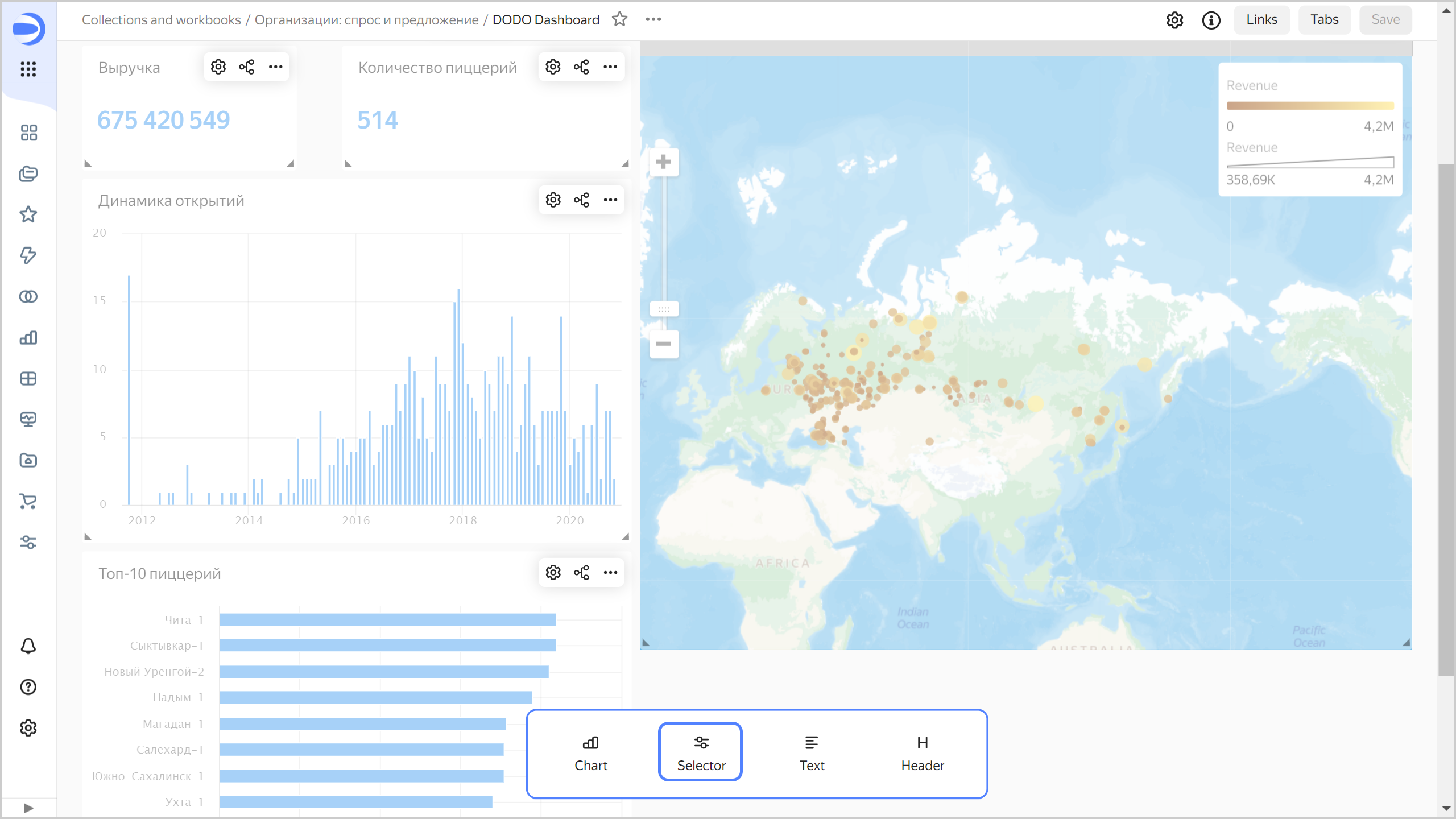
-
Add the calendar selector for the order date:
-
Select
DODO. -
Select the
Cityfield. -
Specify the header:
City. -
Click Save.
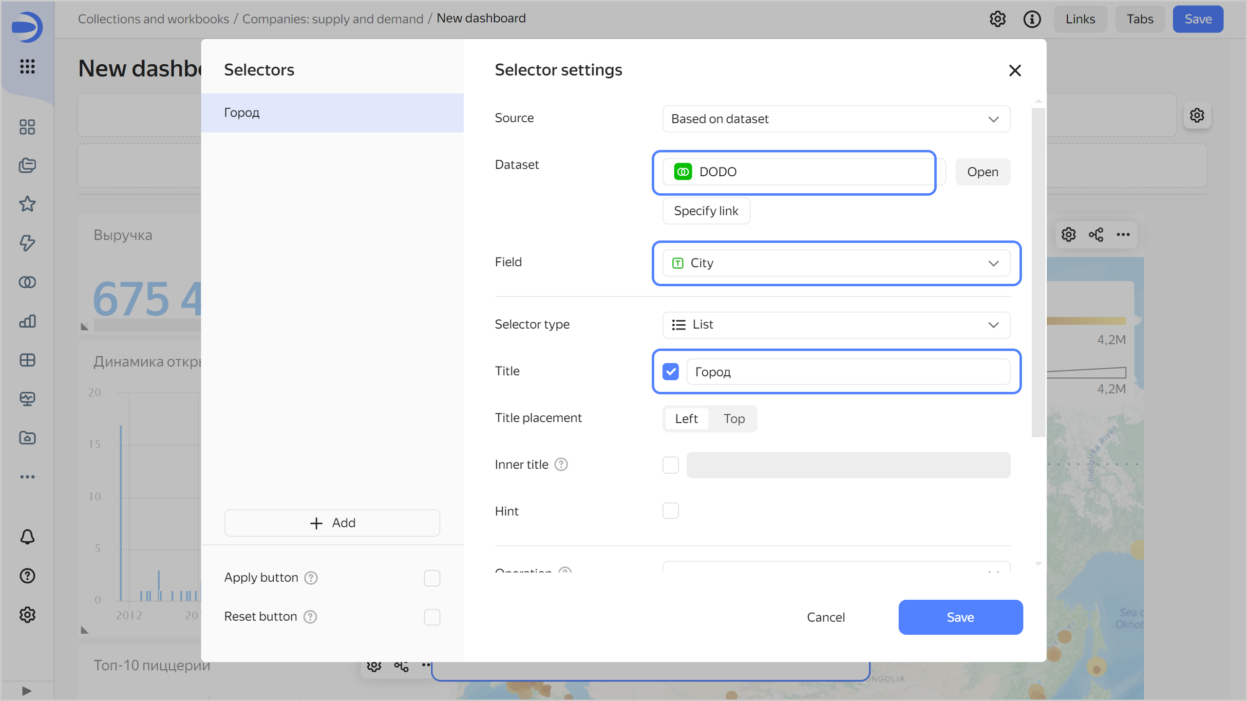
-
-
Drag the selector to the top of the dashboard.
-
Save the dashboard:
- In the top-right corner of the dashboard, click Save.
- Enter
DODO Dashboardfor the dashboard name and click Create.
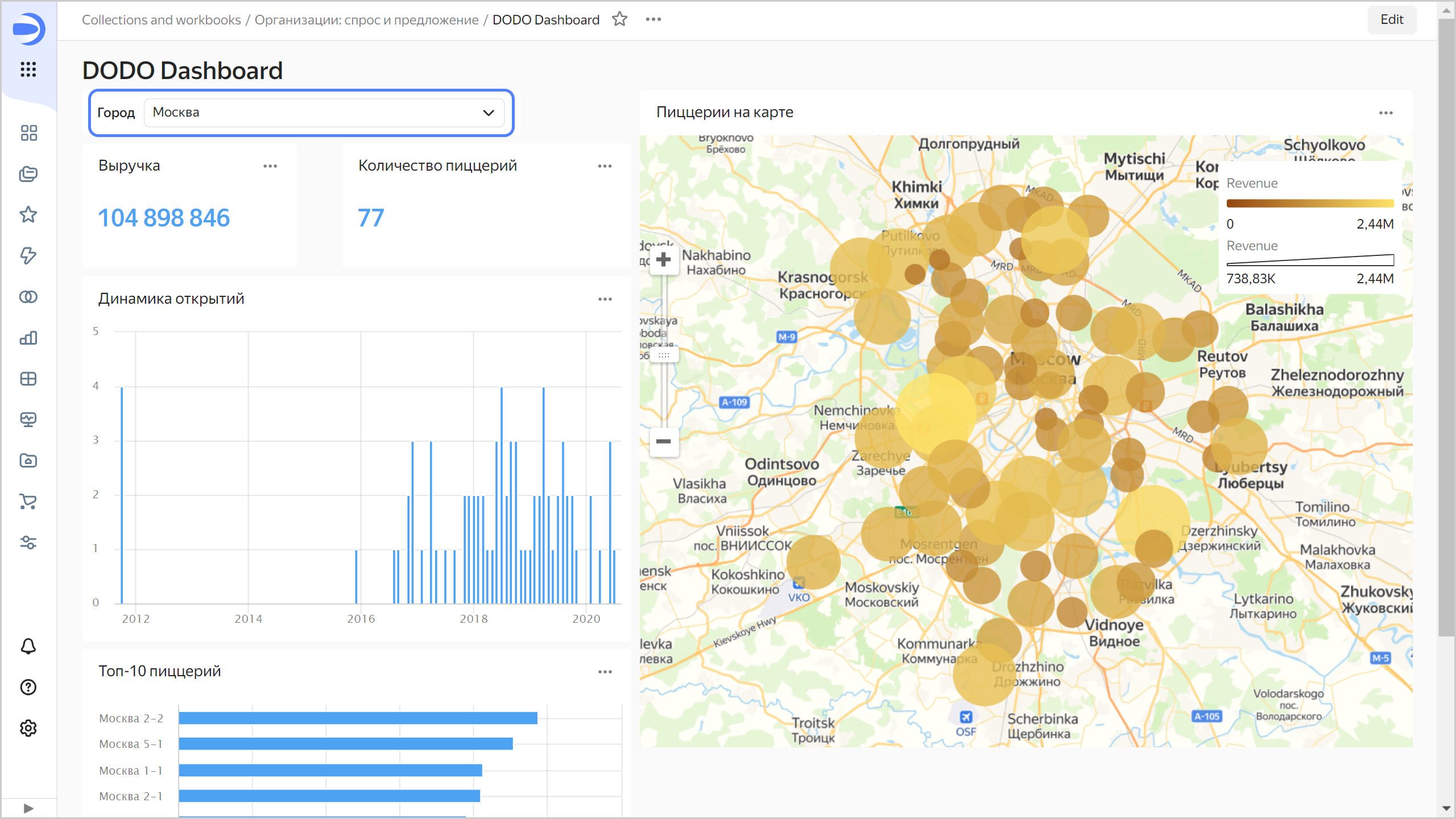
Your dashboard is ready.
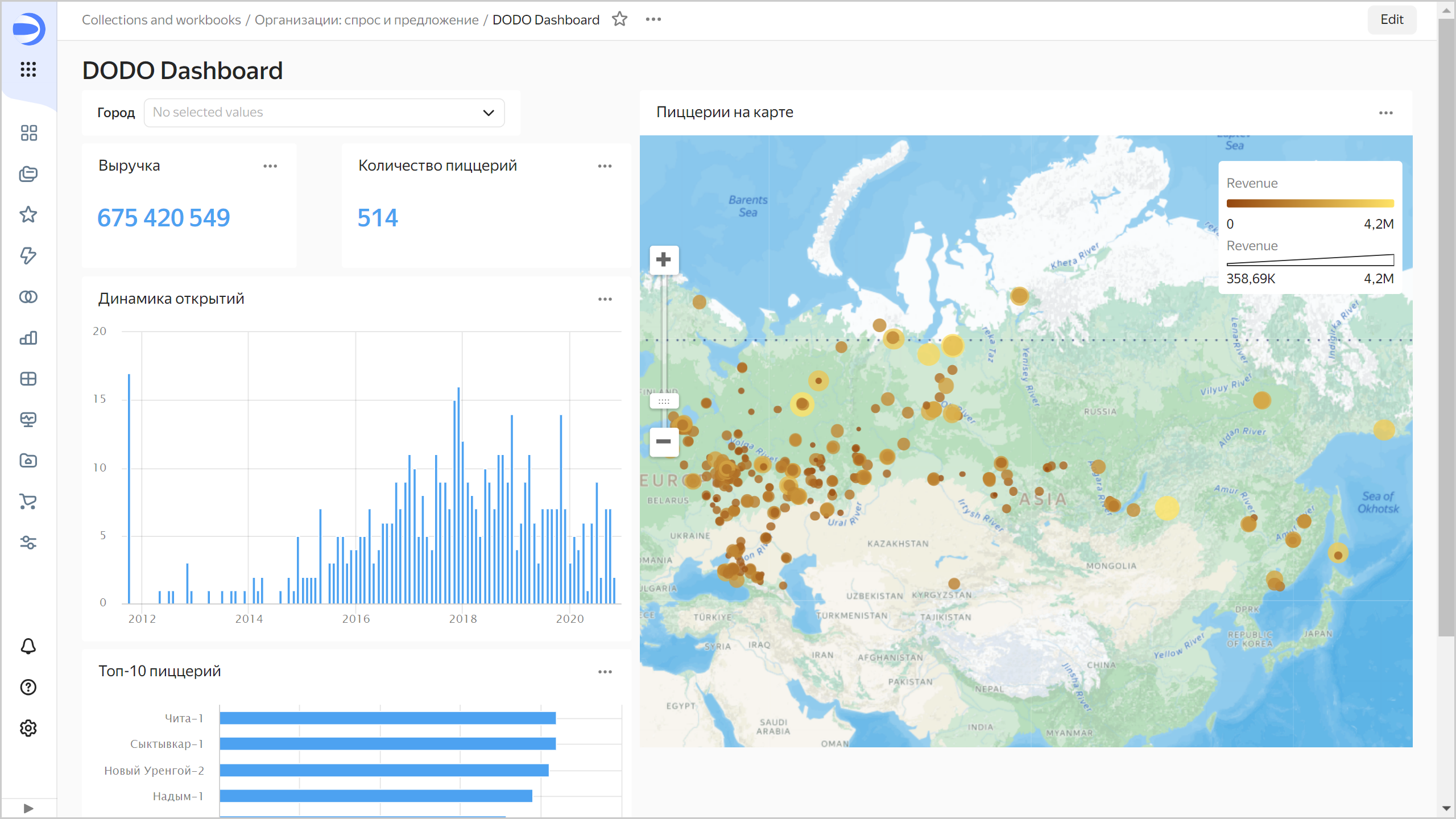
Choose Moscow in the selector. If the map focus remains at the same location, refresh the page in your browser. DataLens captures the map scale and location if you change them during the current session.
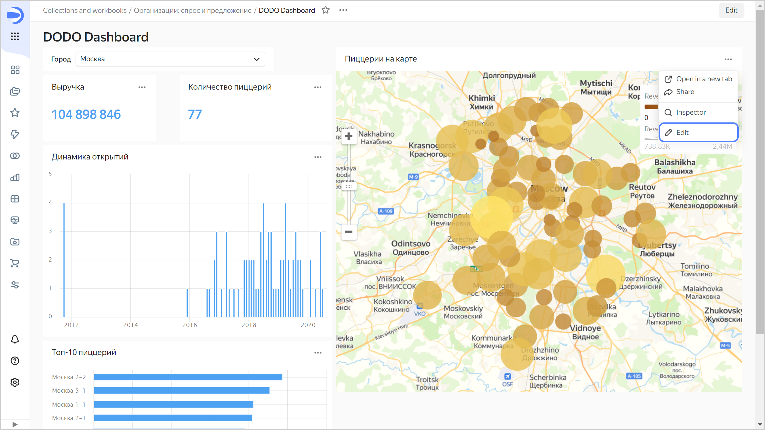
Add geolayers to the dashboard
-
Make sure you only selected Moscow in the city filter of your dashboard. Click → Edit in the top-right corner of the map.
-
Click the DODO dataset name.
-
Click Add dataset.
-
Select the
Companiesdataset imported from Marketplace.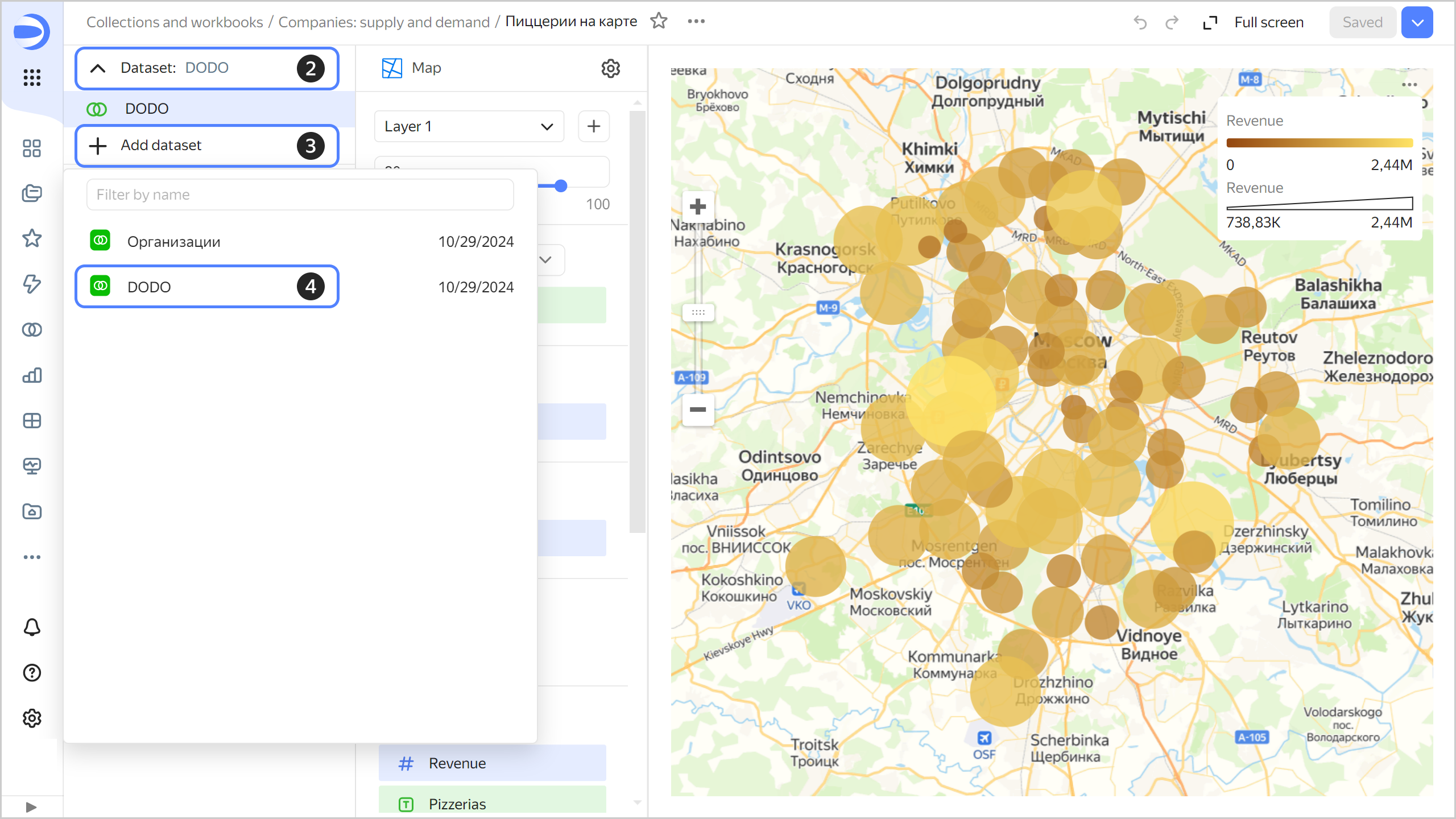
-
Once the dataset is selected, the link setup window appears. By default, a link is established between fields with the same names.
-
Click Add link.
-
Add a link between the
Cityfields in theDODOandCompaniesdatasets and click Save.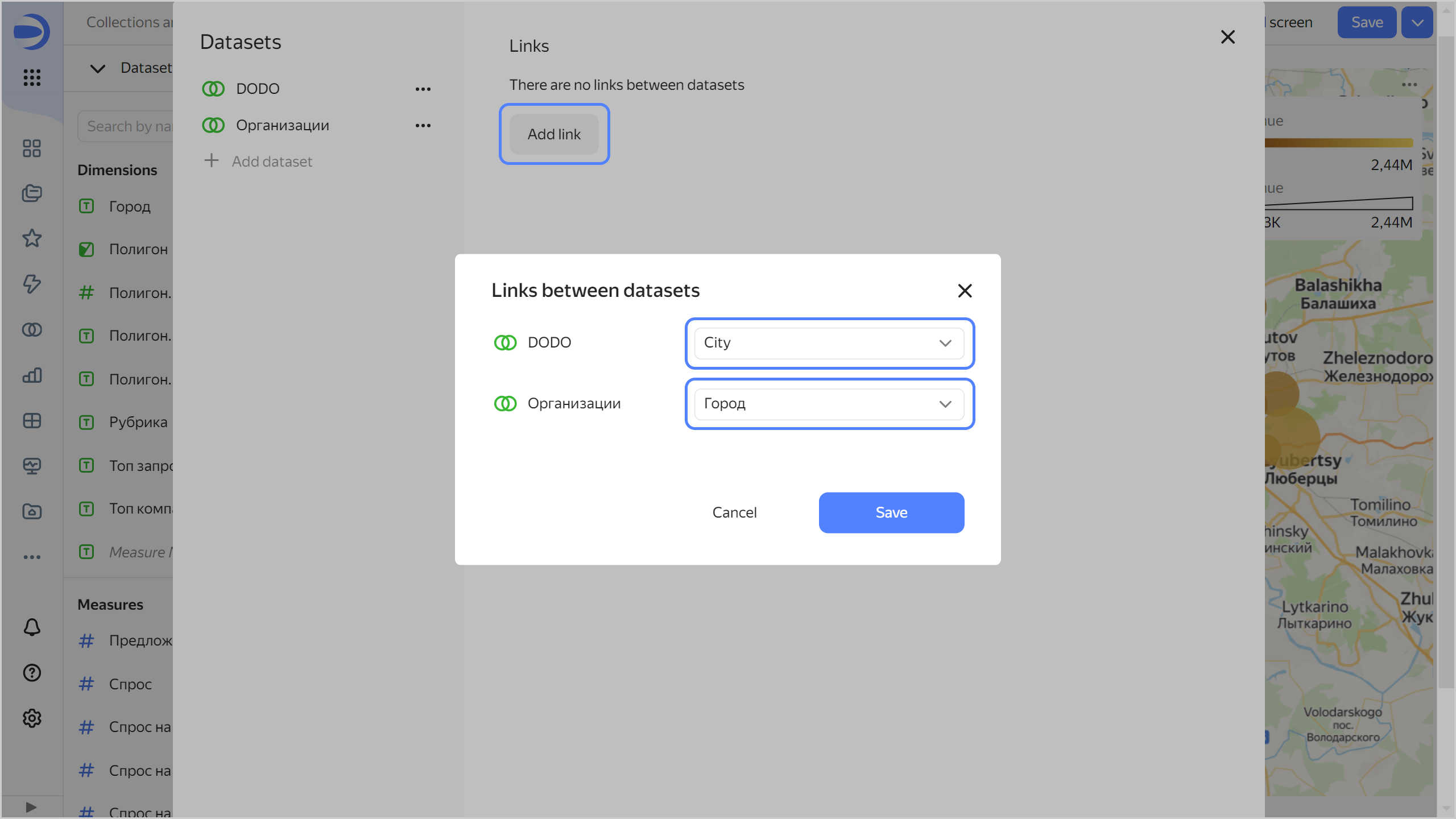
-
-
Click Save to close the Links window.
-
Rename Layer 1:
-
Click the layer and then (the icon appears when you hover over the layer) to the right of its name.
-
In the Layer settings window that opens, enter
DODOas the name and click Apply.
-
-
Add another layer:
- Click to the right of the current layer.
- Rename the new layer to
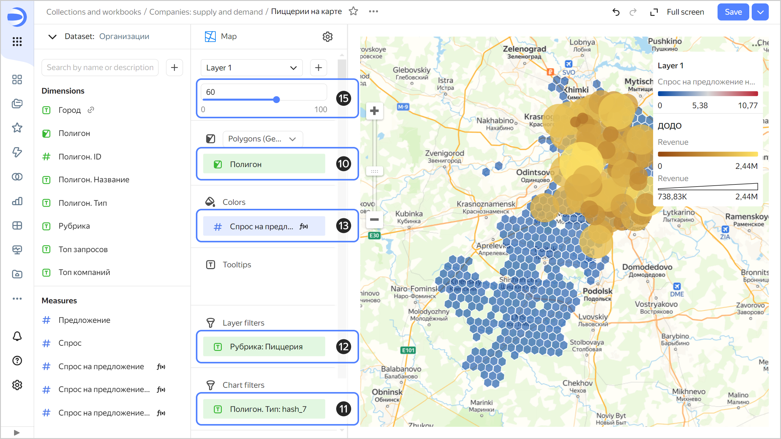
Demand-to-supply ratio. - Change the geolayer type from Points (Geopoints) to Polygons (Geopolygons).
-
Make sure your current dataset is
Companies, notDODO. If the current dataset isDODO, click its name in the top-left corner and selectCompanies.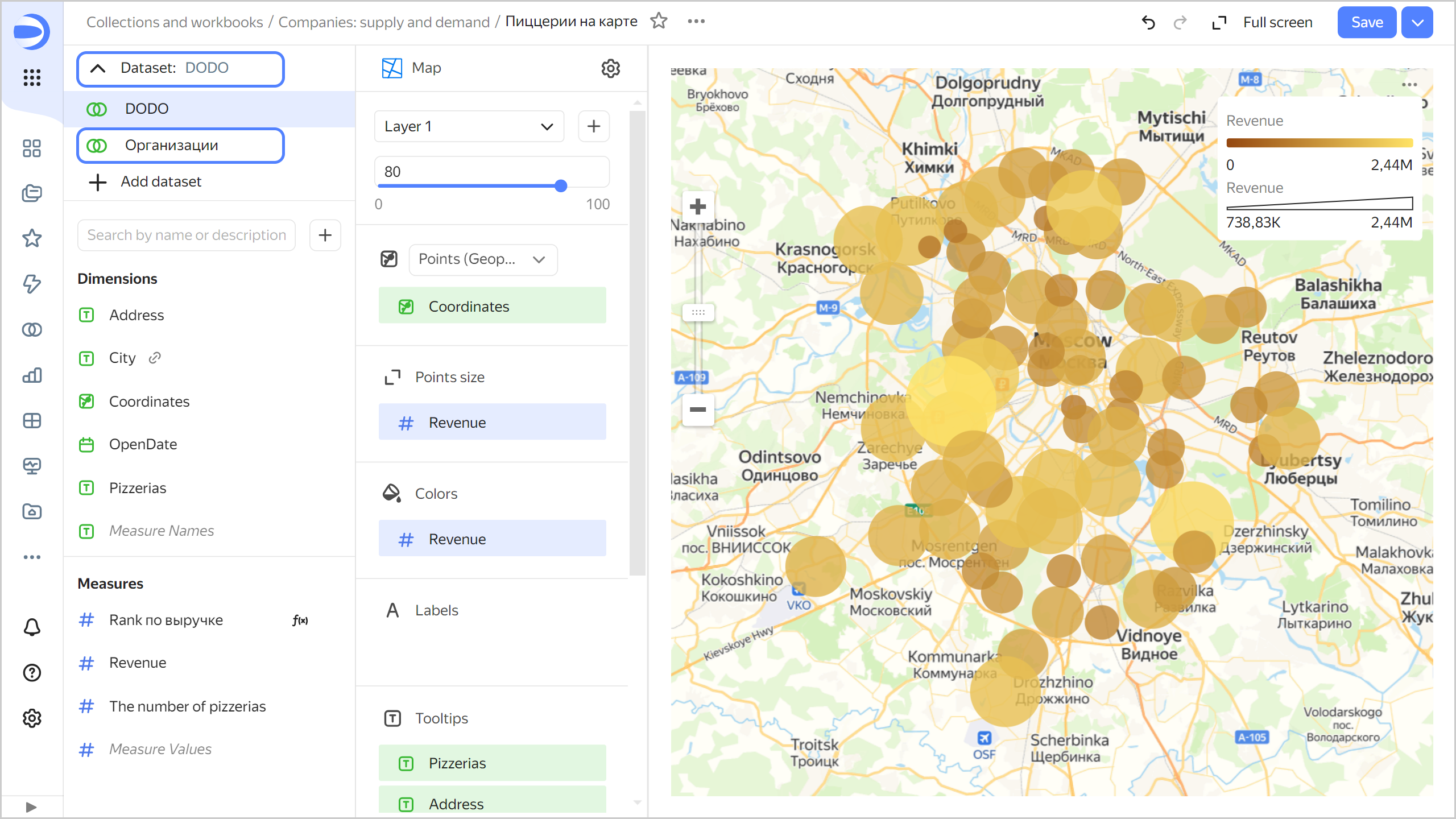
-
Drag the
Polygondimension to the Polygons section. -
Add the
Polygon.Typedimension to the Filters section and set it tohash7. Click Apply filter. -
Add the
Categorydimension to the Layer filters section and choosePizzeria. Click Apply filter. -
Add the
Demand-to-supply ratio per citymeasure to the Colors section. -
In the color settings, select the
Blue-Grey-Redthree-color gradient and click Apply.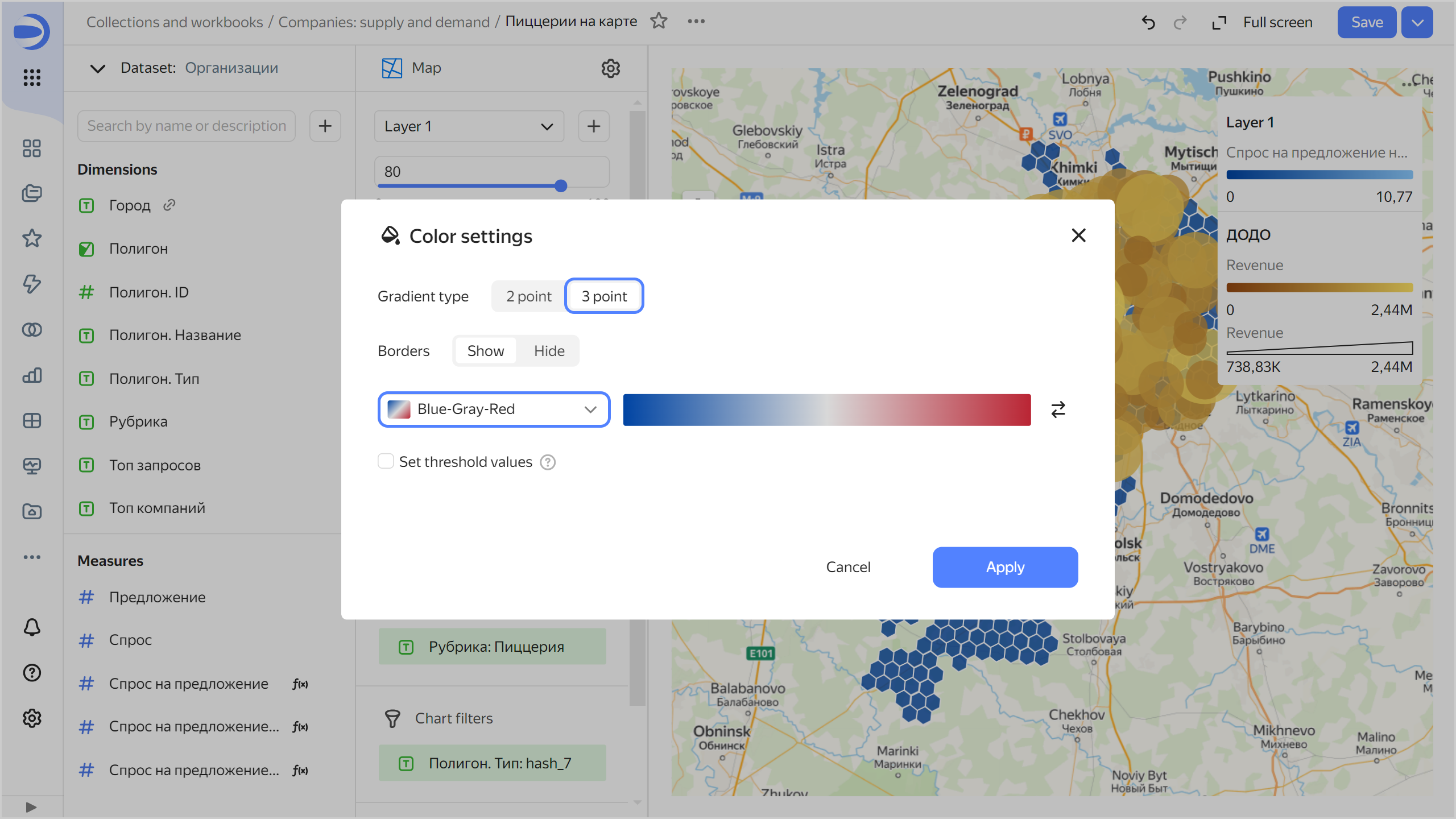
-
Change the transparency level to
60.
-
Add the following fields to the Tooltips section:
-
Demand. -
Supply. -
Demand-to-supply ratio per city. -
Top queries. -
Top companies.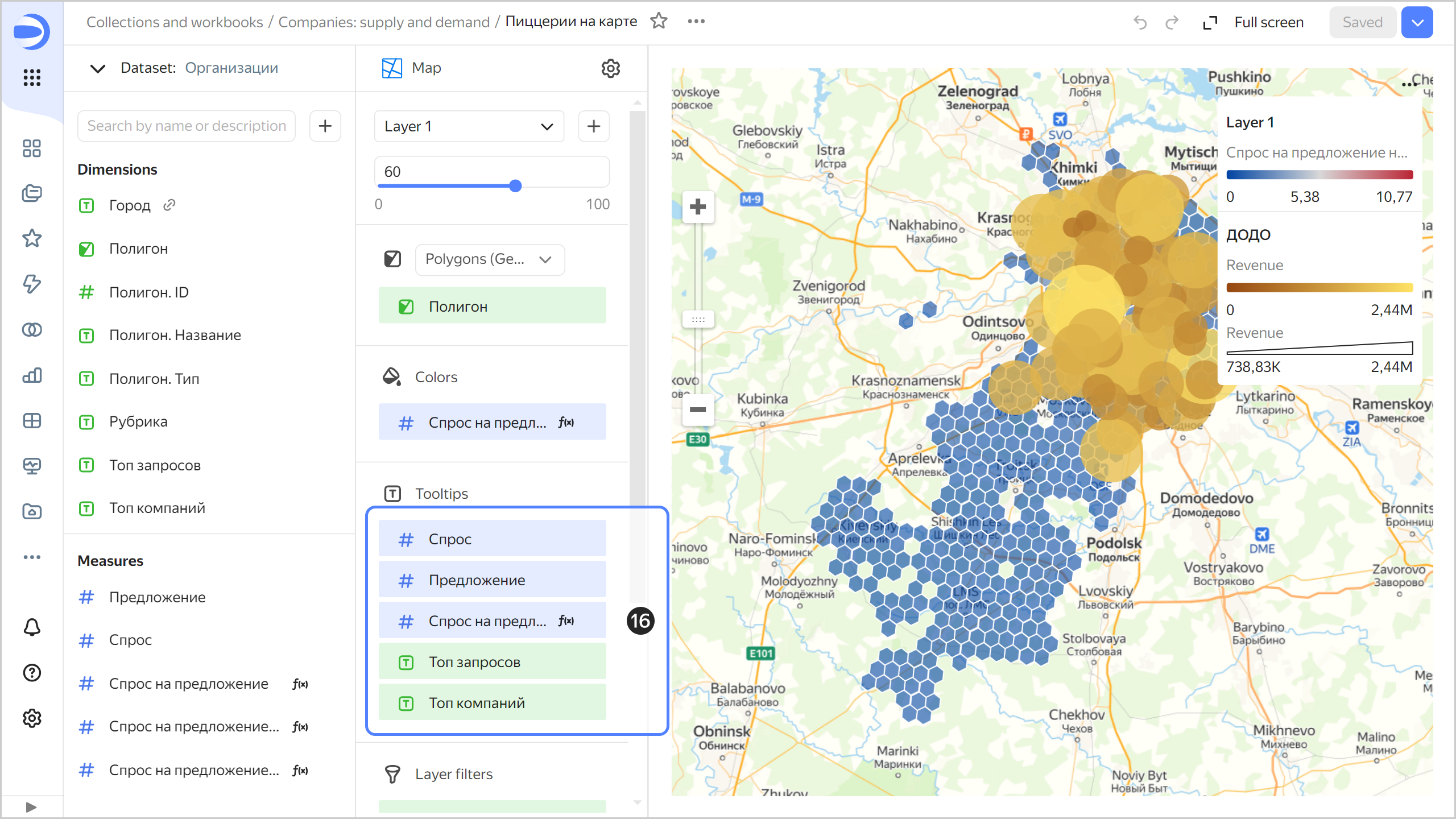
-
-
Save your chart: click Save in the top-right corner.
-
Go back to the dashboard opened in the previous tab in your browser and refresh the page.
-
Choose
Saint Petersburgin the selector. This will filter the entire dashboard, including the map and external geolayer, by this selector.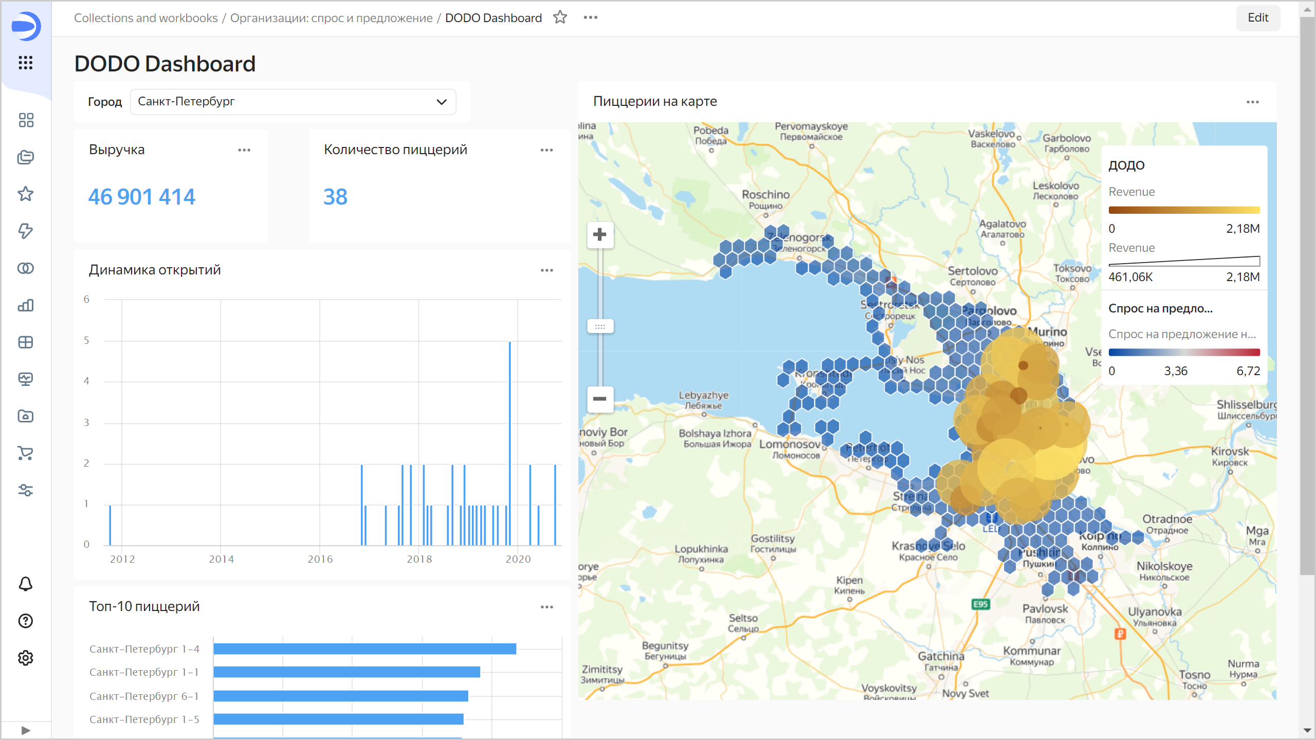
If the map focus remains at the same location when changing the city in the filter, refresh the page in your browser. DataLens captures the map scale and location if you change them during the current session.
Optional
Here are some ideas you might want to work on by yourself:
- Adding a geolayer with businesses from the
Where to eatcategory (restaurants and fast food chains in general, not only pizzerias). - Adding the Audience: interests and social demographics product from Marketplace to display the city audience data on the map in a similar way.
- You can use the city of Voronezh as an example to study the free geolayers by Geointellect. The demo set offers calculated indexes representing the location's business potential for fast food.
ClickHouse® is a registered trademark of ClickHouse, Inc.