Simple dashboard from a CSV file
Note
In this tutorial all objects will be created and stored in a workbook. If using legacy folder navigation, create an individual directory to work in.
Create a directory
- Go to the DataLens home page.
- In the left-hand panel, select All objects or Personal directory.
- In the top-right corner, click Create → Directory.
- Enter a name for the directory.
- Click Create.
This guide demonstrates how to use DataLens to analyze dependencies, for example:
- Superhero’s eye and hair color on their gender.
- Superhero’s eye and hair color on their good or evil alignment.
For source data, we are going to use the SuperHeroes.csv file with data about the superheroes: name, gender, race, comics publisher, etc. Download it before going through the guide.
To visualize and explore data, set up DataLens and follow the steps below:
- Create a workbook.
- Create a connection.
- Create a dataset.
- Create a bar chart.
- Create a donut chart.
- Create a dashboard and add charts to it.
- Add selectors to the dashboard.
- Start analyzing superhero dependencies and data.
Getting started
To get started with DataLens:
- Log in to your Yandex account. If you do not have an account, create one.
- Open the DataLens home page.
- Click Open DataLens.
- Confirm that you have read the Terms of use and click Log in.
-
Log in to your Yandex account.
-
Open the DataLens home page.
-
Click Open DataLens.
-
Select one of the options:
-
If you already have an organization, select it from the drop-down menu in the Organizations tab and click DataLens.
Note
To activate a DataLens instance, the user must have the
adminorownerrole. For more information about roles, see Access management in Yandex Cloud Organization. -
If you have a cloud but no organization, click Add new DataLens. In the window that opens, enter your organization's name and description and click Create organization and DataLens. For more information about working with organizations, see Getting started with organizations.
-
If you have any technical questions about the service, contact Yandex Cloud support. To ask for advice, discuss the solution to your problem or best practices of the service, write to the DataLens chat in Telegram.
Create a workbook
- Go to the DataLens home page.
- In the left-hand panel, select Collections and workbooks.
- In the top-right corner, click Create → Create workbook.
- Enter a name for the workbook:
Tutorials. - Click Create.
Create a connection
Create a connection to the source data file.
-
In the top-right corner of the workbook, click Create → Connection.
-
Under Files and services, select the Files connection.
-
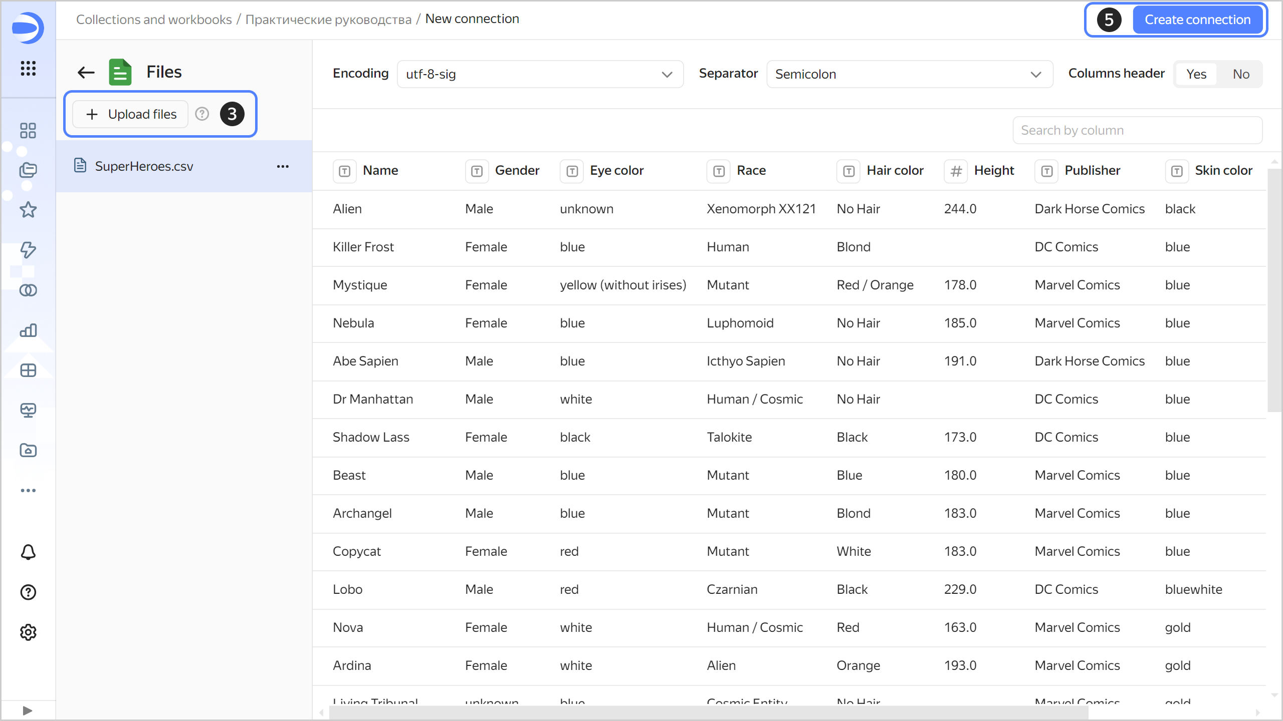
Click Upload files.
-
Select the SuperHeroes.csv file. Wait until the table content appears on the screen.
-
Click Create connection.
-
Enter
SuperHeroesfor connection name and click Create.
Create a dataset
Create a dataset based on the SuperHeroes connection:
-
In the top-right corner of the connection page, click Create dataset.
-
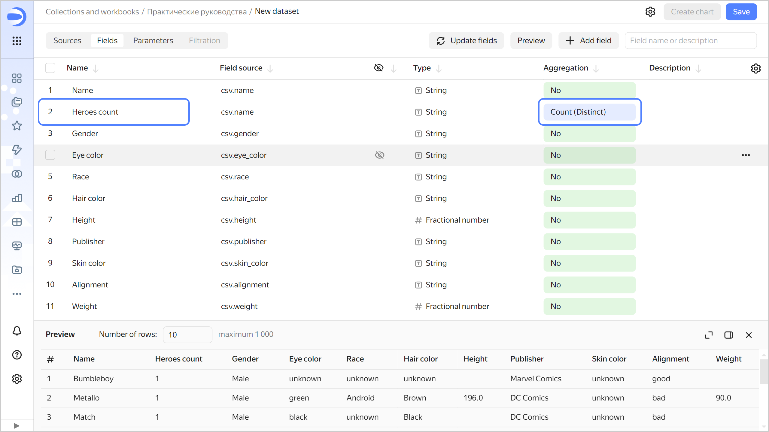
Navigate to the Fields tab.
-
Create a measure field with the number of superheroes:
-
Duplicate the
Namefield: on the right side of the row with the field, click and select Duplicate. -
Rename the
Name (1)duplicate field asHeroes count: click the field name, delete the current name, and enter the new one. -
In the Aggregation column, select Number of unique. The aggregation field will change its color to blue: it is now a measure.
-
-
Save the dataset:
- In the top-right corner, click Save.
- Enter
SuperHeroes datasetfor the dataset name and click Create.
Create a column chart
To visualize superheroes split into good and evil, create a chart, e.g., a column chart:
-
Click Create chart in the top-right corner of the dataset page.
-
Add the good or evil property to your chart. To do this, drag the
Alignmentfield from Dimensions to the X section. -
Add the number of superheroes to your chart. To do this, drag the
Heroes countfield from Measures to the Y section. -
Sort the columns by number of superheroes. To do this, drag the
Heroes countfield from Measures to the Sorting section.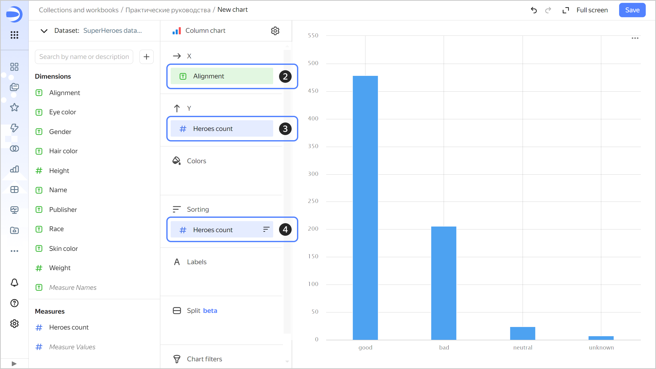
-
Color code superheroes in the chart based on whether they are good or evil. To do this, drag the
Alignmentfield from Dimensions to the Colors section. -
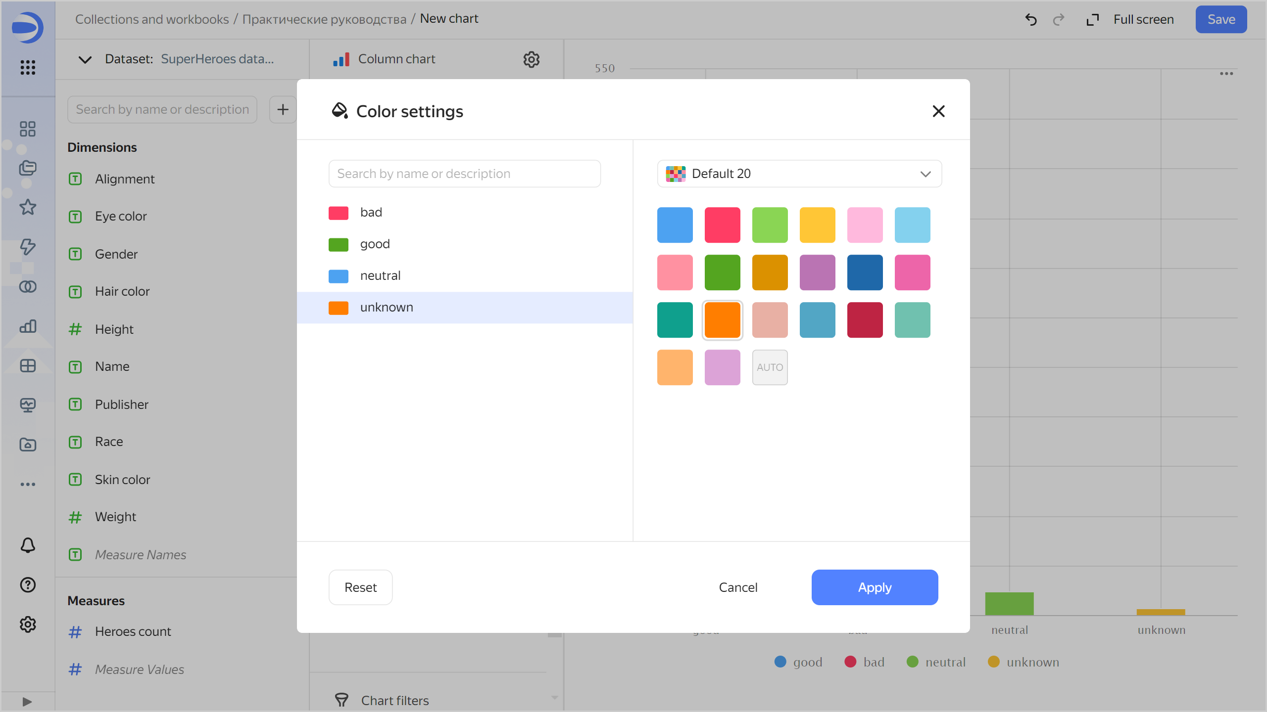
Redefine the colors for the
Alignmentdimension:-
Click in the Colors section (the icon is displayed when you hover over the section).
-
Select the colors: green for good; blue for neutral; red for evil; orange for unknown.
-
Click Apply.
-
-
Add labels to your chart with the number of superheroes. To do this, drag the
Heroes countfield from Measures to Labels.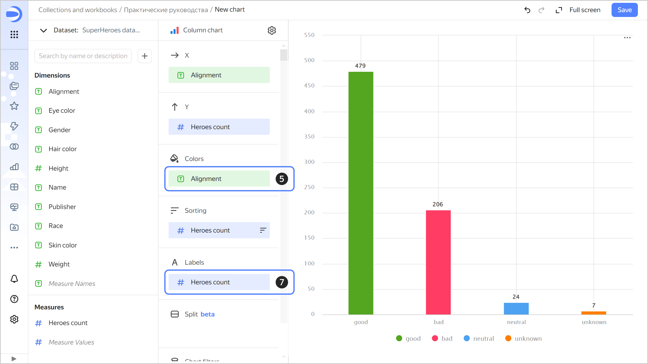
-
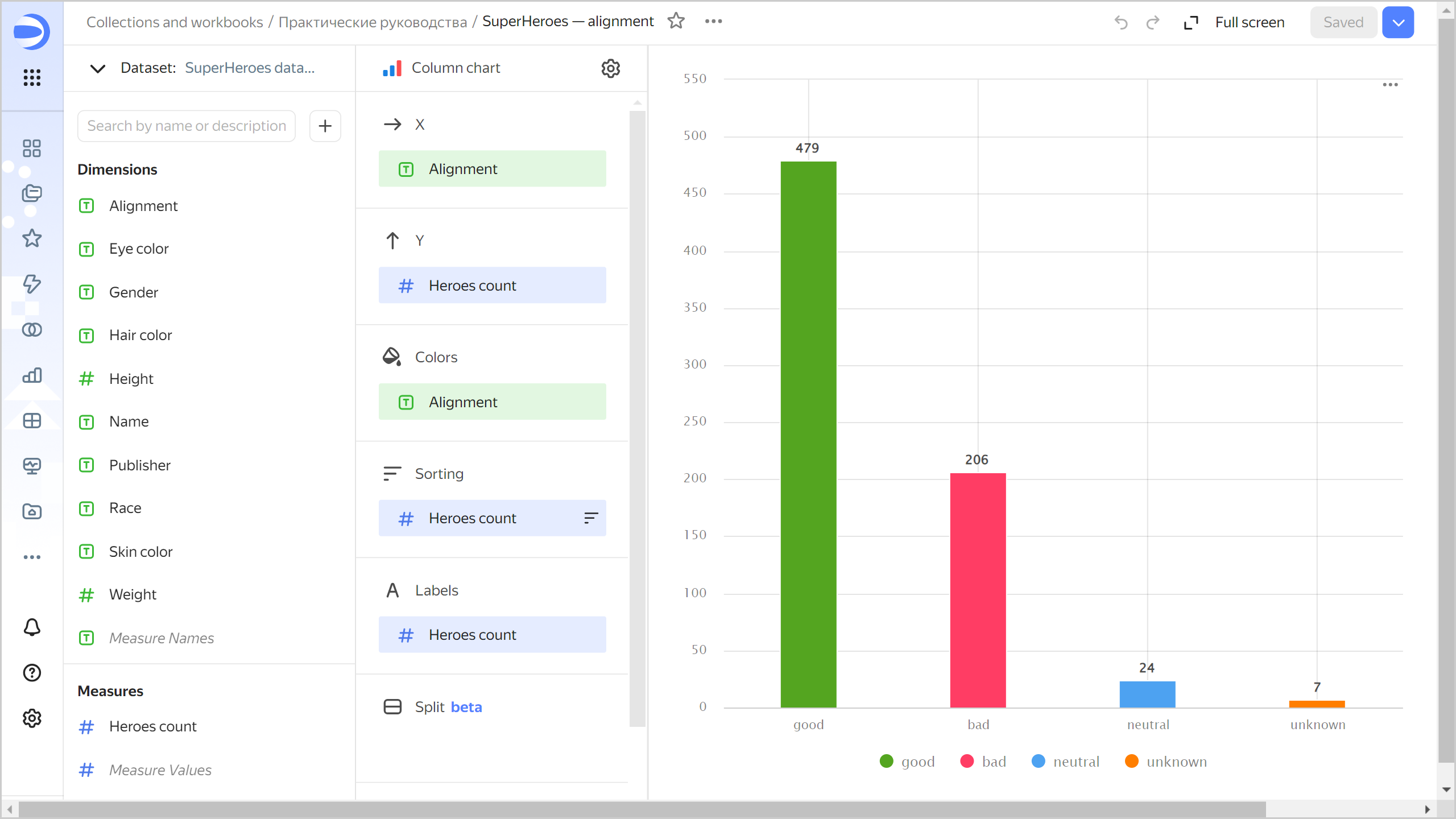
Save the chart:
- In the top-right corner, click Save.
- In the window that opens, enter a name for the chart:
SuperHeroes: Alignment, then click Save.
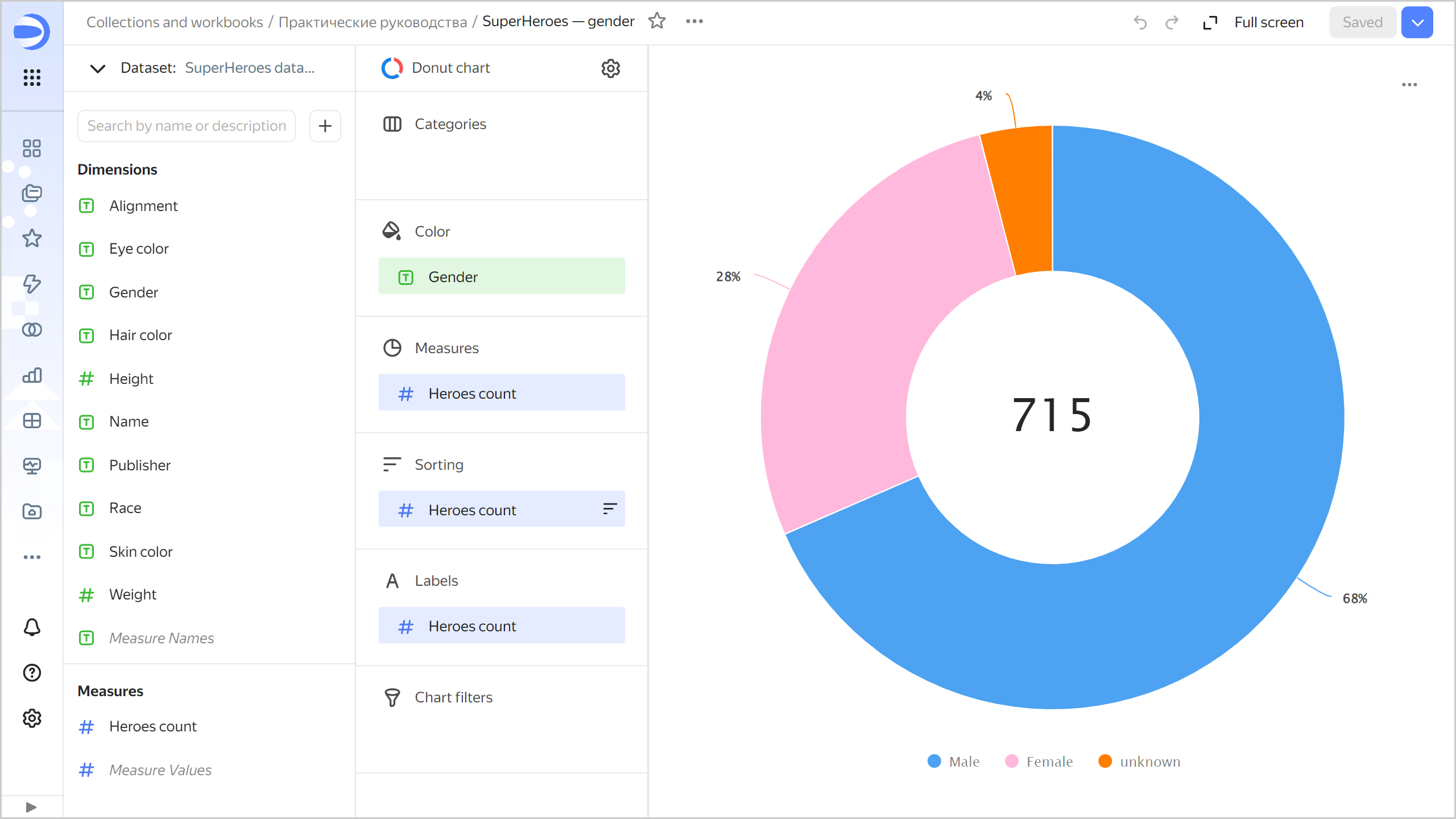
Create a donut chart
To display the number of heroes of each gender, create a donut chart.
-
Copy the chart you created in the previous step:
-
In the top-right corner, click → Save as copy.
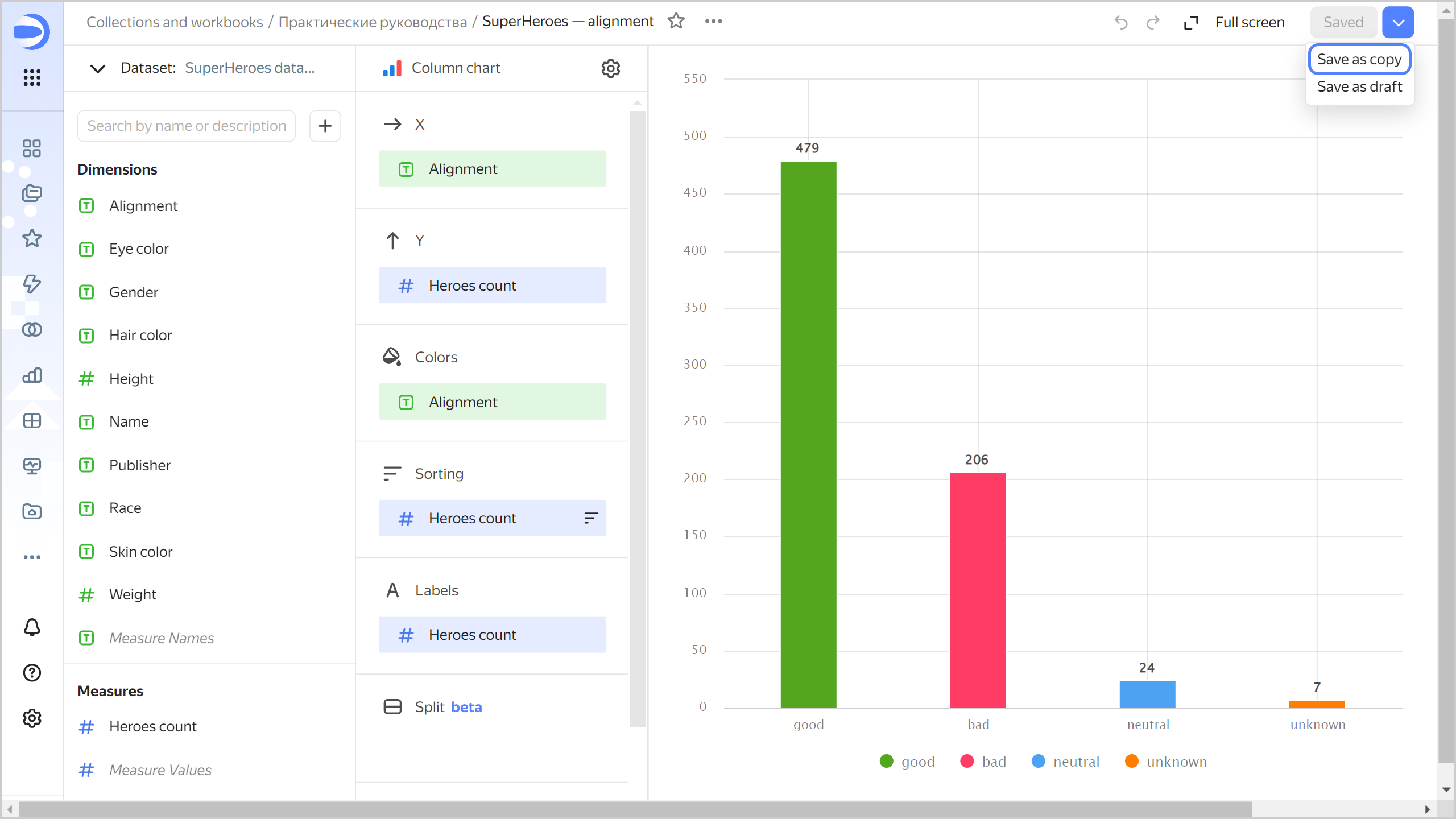
-
In the window that opens, enter a name for the new chart:
SuperHeroes: Gender, then click Save.
-
-
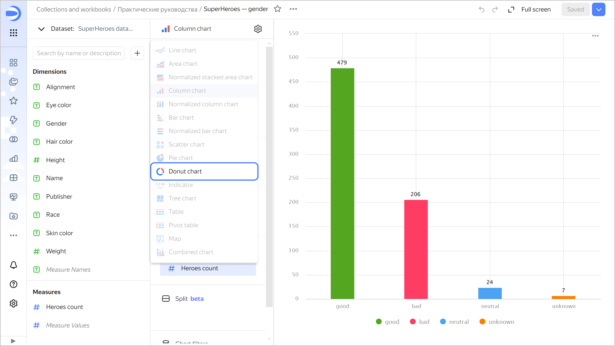
Select the Donut chart visualization type.
-
Replace the good-evil color code with the gender color code. To do this, drag the
Genderfield from Dimensions to Color and hold it over theAlignmentfield until the latter turns red. -
Redefine the colors for the
Genderdimension:- Click in the Colors section (the icon is displayed when you hover over the section).
- Select colors: Pink for Female; blue for Male; orange for unknown.
- Click Apply.
-
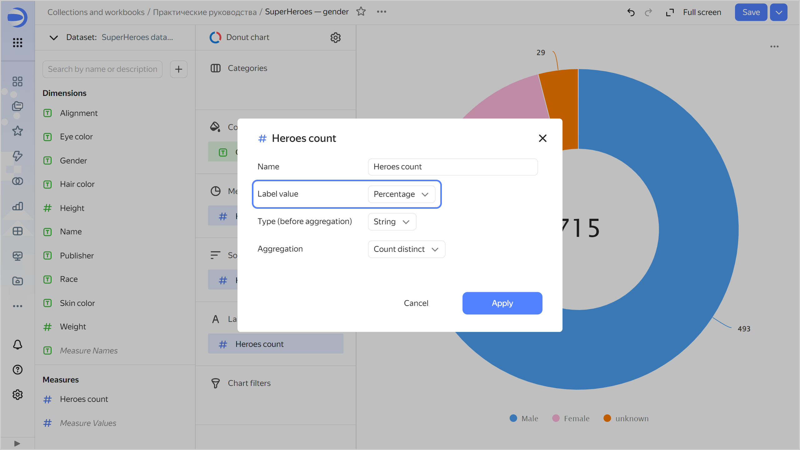
Set the chart to display the number of superheroes by gender as a percentage:
- Click the icon before the field name in the Labels section.
- In the Label value field, select
Percentage, then click Apply.
-
Save your chart: click Save in the top-right corner.
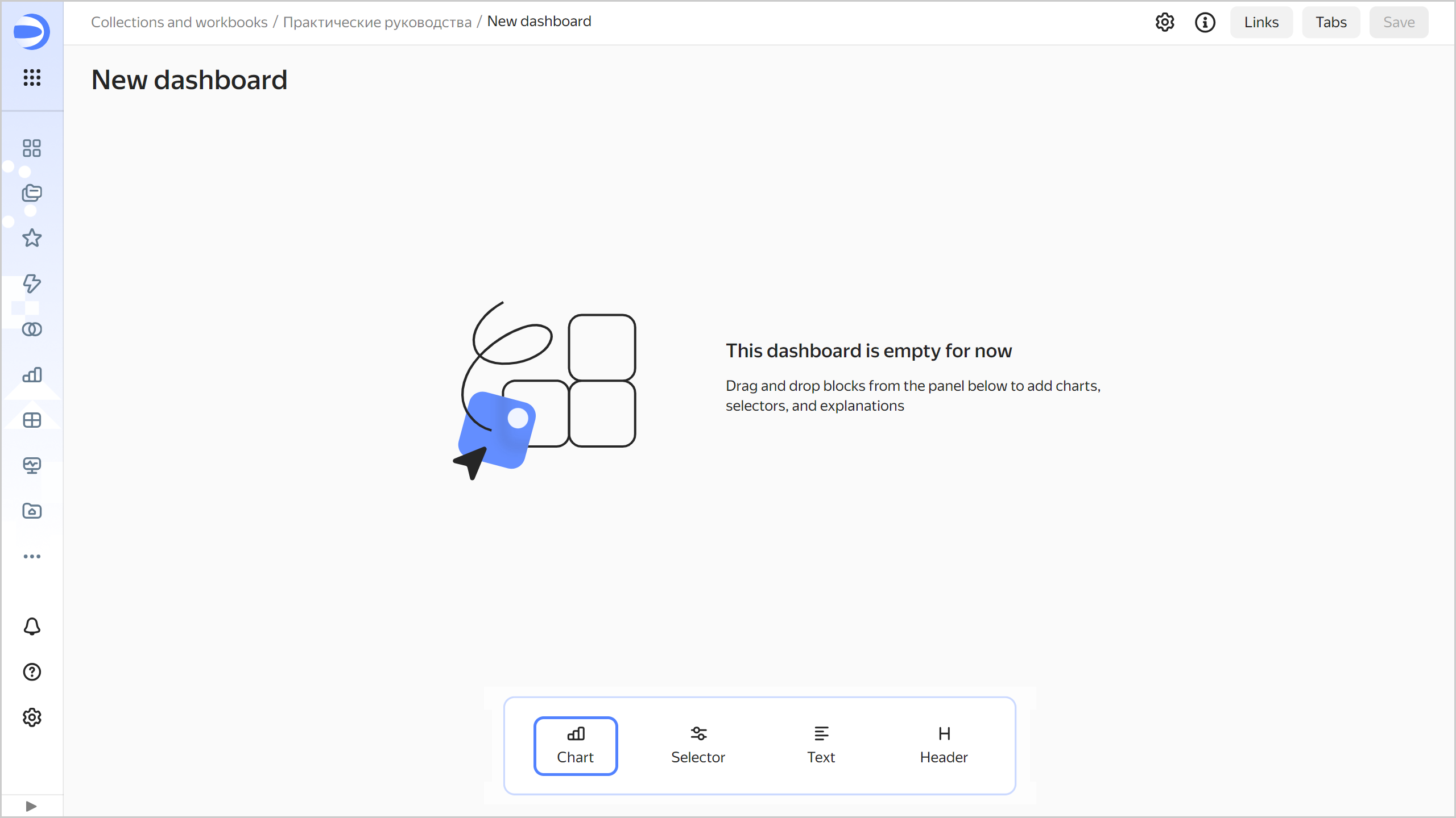
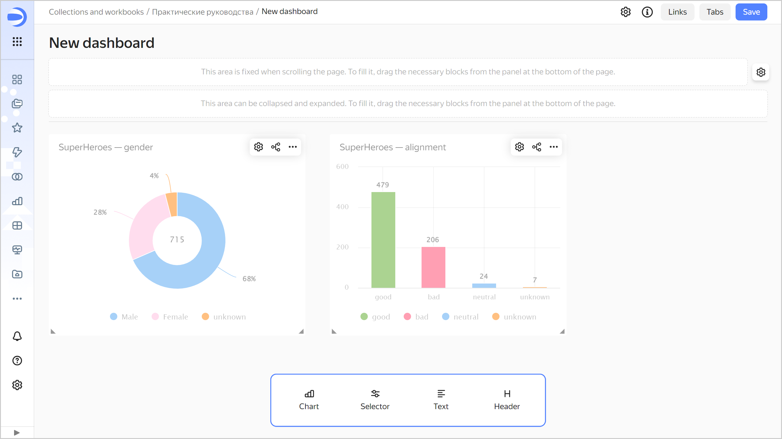
Create a dashboard and add charts to it
Create a dashboard to add charts and other widgets to:
-
In the left-hand panel, select Collections and workbooks and go to the
Tutorialsworkbook. -
In the top-right corner, click Create → Dashboard.
-
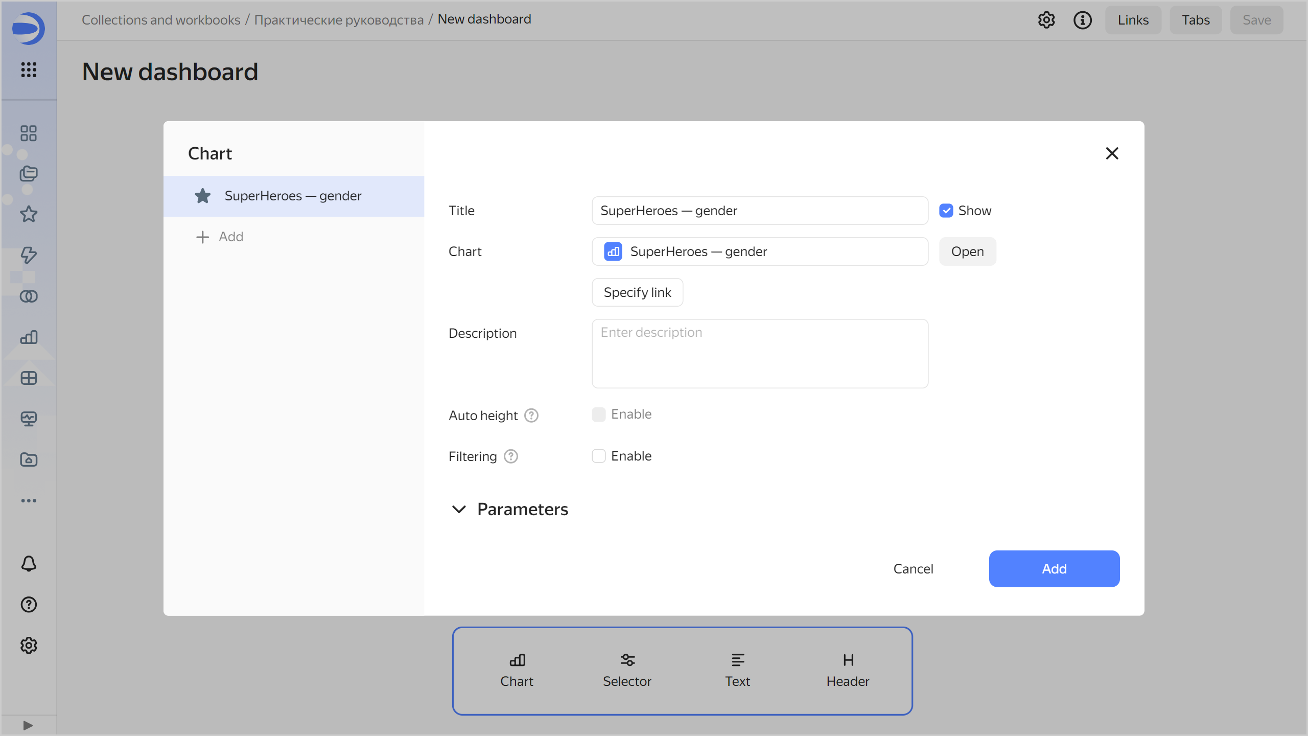
In the panel at the bottom of the page, hold down Chart and drag it to the required area.
-
In the window that opens, click Select.
-
Select the
SuperHeroes: Genderchart. -
Click Add.
-
Repeat steps 3-6 to add the
SuperHeroes: Alignmentchart. -
Adjust the size of the charts with your mouse and place them on the dashboard as you prefer.
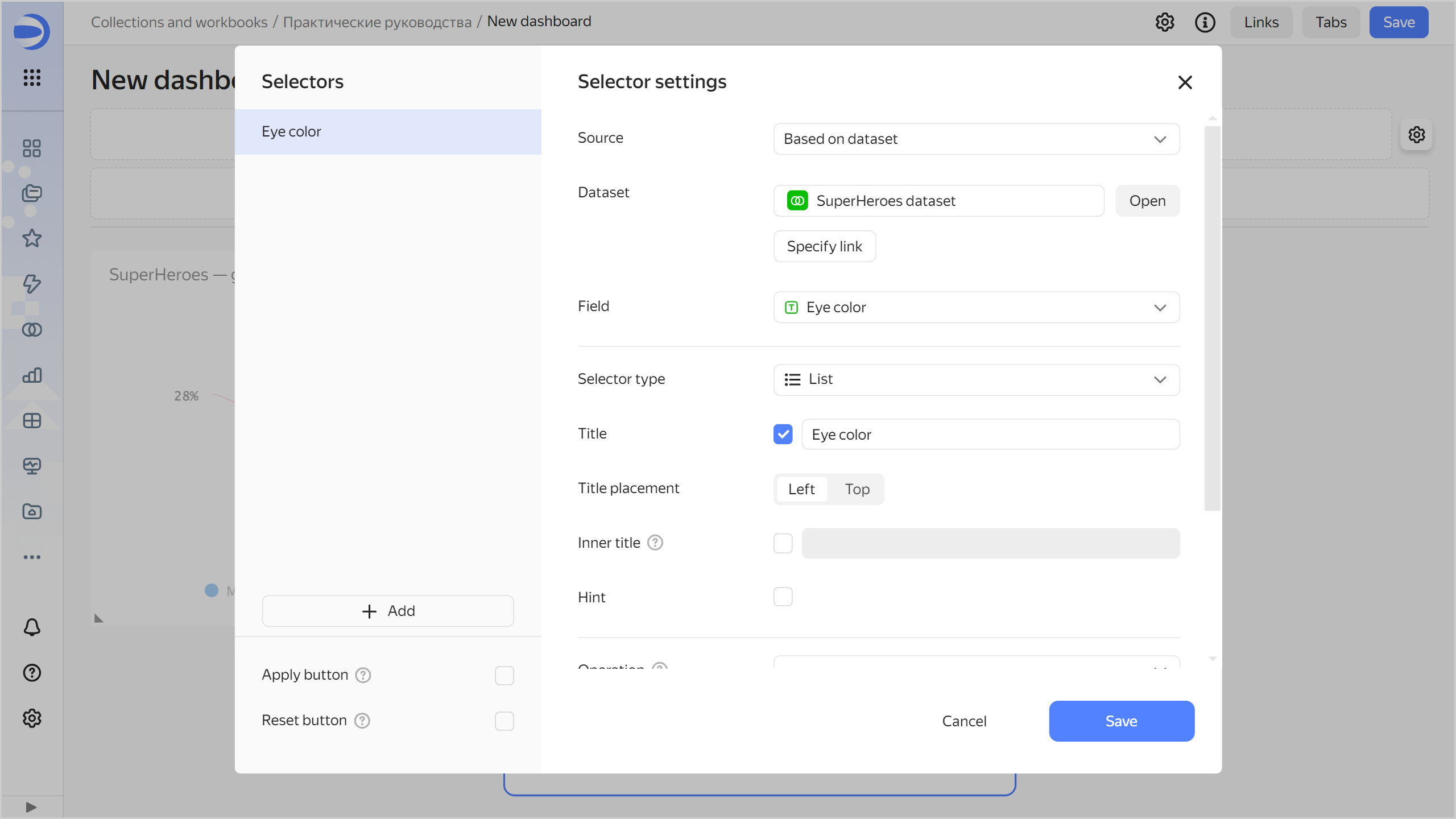
Add selectors to the dashboard
Add selectors to filter superheroes by Eye color and Hair color:
-
In the panel at the bottom of the page, hold down Selector and drag it to the required area.
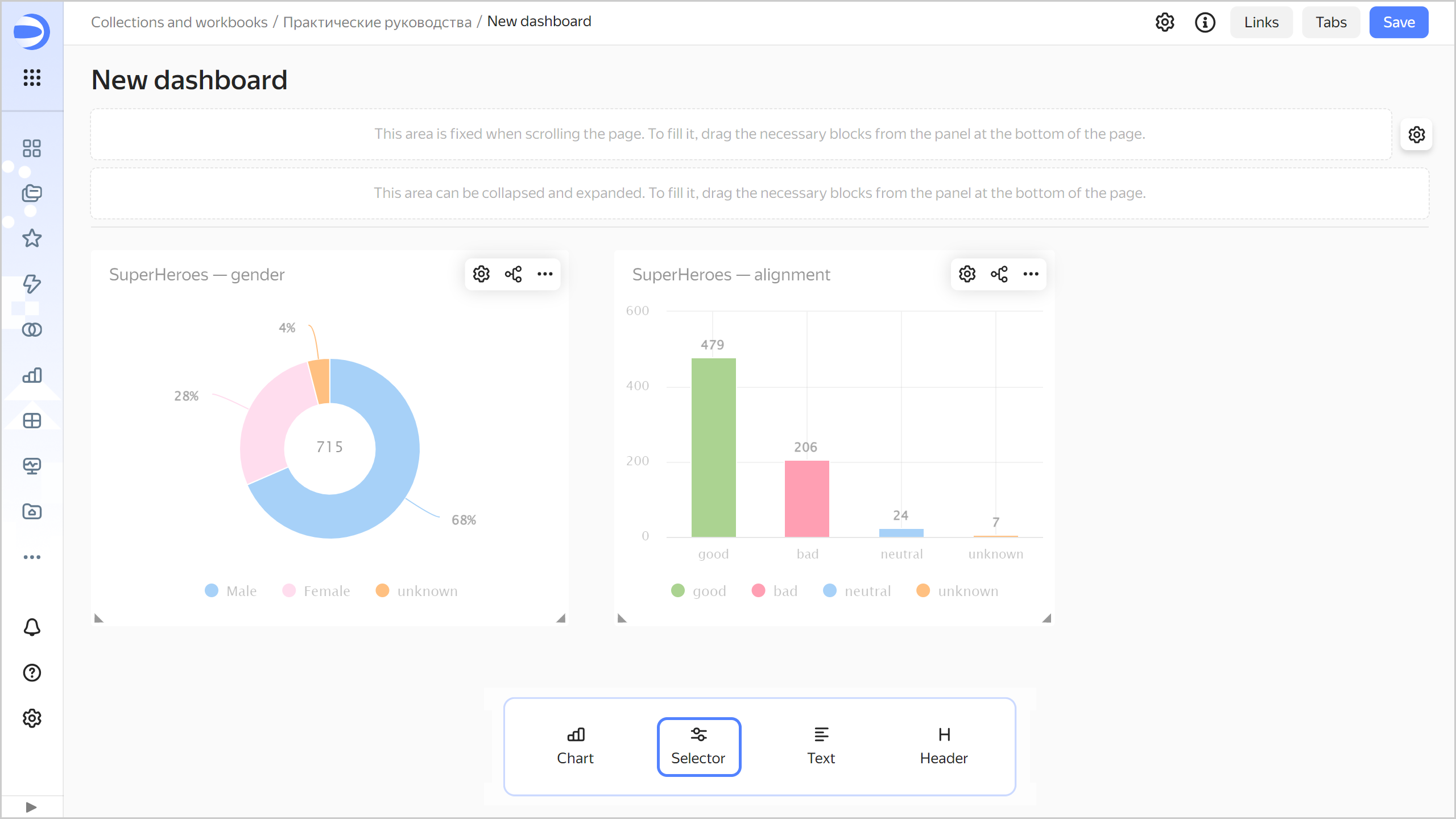
-
Add a selector for eye color:
- Select
SuperHeroes dataset. - Select the
Eye colorfield. - Enable Multiple choice.
- Click Save.
- Select
-
Add a selector for hair color:
- Make sure you selected the
SuperHeroes datasetdataset. - Select the
Hair colorfield. - Enable Multiple choice.
- Click Save.
- Make sure you selected the
-
Position the selectors on the dashboard however you like.
-
Save the dashboard:
- In the top-right corner of the dashboard, click Save.
- Enter
SuperHeroes dashboardfor the dashboard name and click Create.
-
Your dashboard is ready.
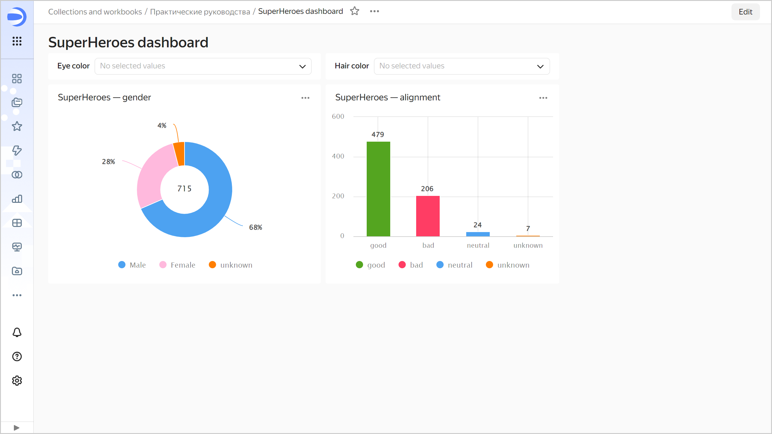
Analyze data about superheroes
-
Apply various filters and analyze the eye and hair color dependencies on a superhero's gender and good or bad alignment.
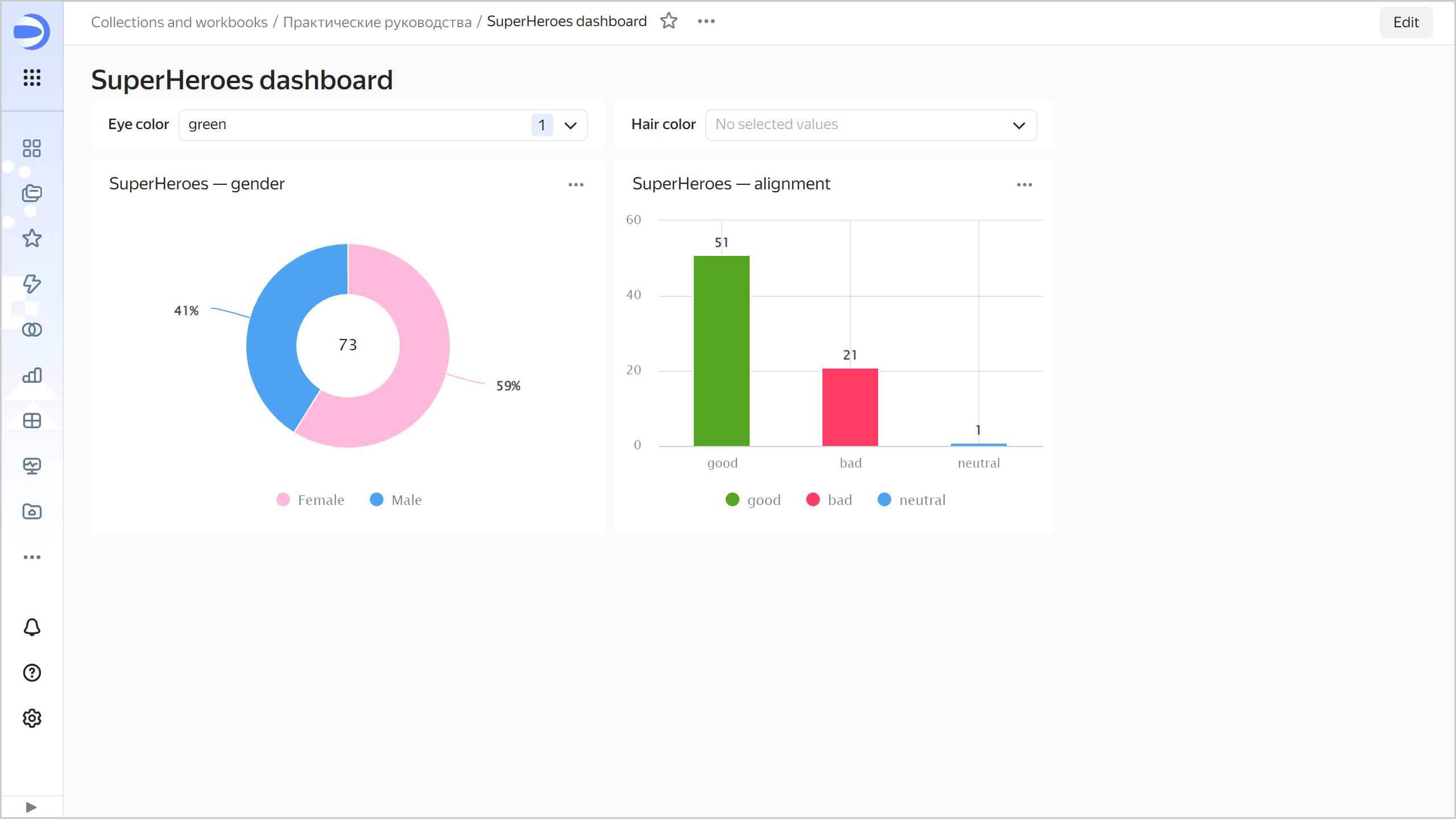
The dataset analyzed shows the following dependencies:
- There are more men with black eyes and more women with green eyes.
- There are more good ones with blue eyes and evil ones with red eyes.
- There are more women with red hair and more men with black hair.
- There are more evil ones with gray hair and more good ones with brown hair.
-
Next, you can:
- Create new measures in the dataset, e.g., average height (
Heightfield average) and average weight (Weightfield average) of superheroes. - Add new charts to the dashboard, e.g., an indicator with the number of superheroes or a bar chart with the number of superheroes by publisher.
- Add new selectors to the dashboard, e.g., to select a publisher or superhero race.
- Explore more patterns.
- Create new measures in the dataset, e.g., average height (