Visualizing Yandex Monitoring data
This tutorial will be useful if you have already deployed and started one of the Yandex Cloud services.
You will create a chart using the Yandex Monitoring query language and add it to the dashboard.
To visualize and explore data, set up DataLens and follow the steps below:
- Create a connection.
- Create a QL chart.
- Create a dashboard.
- Add the QL chart to the dashboard.
- Add selectors to the dashboard.
Getting started
To get started with DataLens:
-
Log in to your Yandex account.
-
Open the DataLens home page.
-
Click Open Datalens.
-
Select one of these options:
-
If you already have an organization, select it from the drop-down menu in the Organizations tab and click Open DataLens.
Note
To activate a DataLens instance, the user must have the
adminorownerrole. For more information about roles, see Access management in Yandex Identity Hub. -
If you have a cloud but no organization, click Add new DataLens. In the window that opens, enter a name and description for your organization and click Create organization and DataLens. For more information about working with organizations, see Getting started with organizations.
If you encounter a technical issue with the service, contact Yandex Cloud support. To ask for advice, discuss a solution to your issue, or explore current best practices, join the DataLens chat in Telegram.
-
Create a connection
Note
To create a connection, you need a service account with the monitoring.viewer or viewer role.
To write queries in QL charts, use the Yandex Monitoring query language.
Connecting to Monitoring
To create a Monitoring connection:
-
Go to the connections page.
-
Click Create connection.
-
Select the Monitoring connection.
-
Configure the connection as follows:
- Cloud and folder: Select the folder with your service account.
- Service account: Select an existing service account or create a new one.
-
Click Create connection.
-
Enter a name for the connection and click Create. The connection will appear in the list.
Create a QL chart
-
Go to the connection you created.
-
In the top-right corner, click Create QL chart.
-
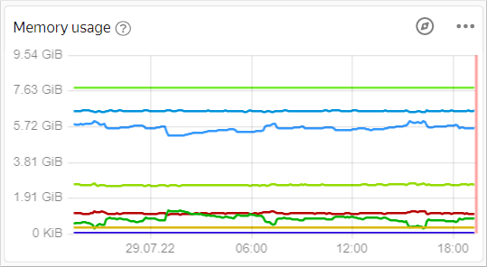
On the Query tab, enter the query text. You can either write it yourself or copy it from Monitoring.
How to copy a query from Monitoring
-
Go to the dashboard you need in Monitoring. To make your dashboards accessible, you need to have at least one of the Yandex Cloud services running.
-
Open the chart you need in Metric Explorer by clicking in the top-right corner of the chart.
-
At the bottom of the screen, go to the Queries tab.
-
In the row with the query, click and select Copy as text. In DataLens, enter the query, skipping the
folderIdparameter.Example of a query in Monitoring:
"cpu_usage"{folderId="b1g9r5h41935********", service="compute", resource_id="charts-prod-vla-1"}In DataLens, enter the query, skipping the
folderIdparameter:"cpu_usage"{service="compute", resource_id="charts-prod-vla-1"}
-
-
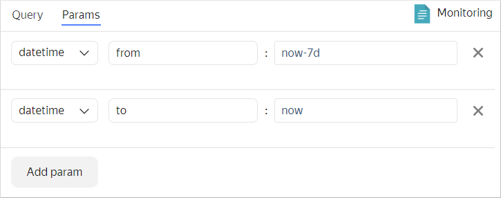
On the Parameters tab, specify the time interval.
-
Click Start. Check that the query runs without errors and the chart displays the data.
-
In the top-right corner, click Save.
-
Enter
Monitoring Data Chartfor the chart name and click Save.
You can add the chart to the dashboard. You can also add a selector to the dashboard to manage the interval parameter in the QL chart.
Create a dashboard
Create a dashboard for the charts.
- In the left-hand panel, click Dashboards.
- Click Create dashboard.
Add the QL chart to the dashboard
-
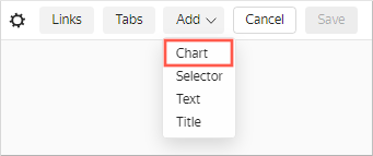
At the top of the page, click Add and select Chart.
-
In the Chart field, click Select and select the chart you created in the previous steps,
Monitoring Data Chart, from the chart list.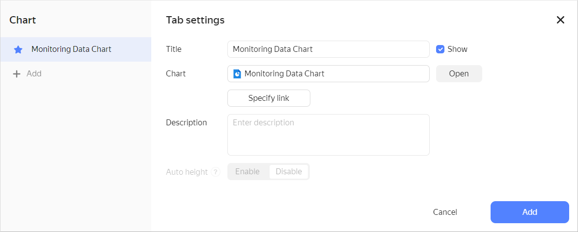
Click Add.
-
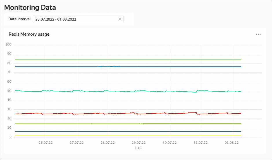
The chart is now on the dashboard. Expand it for better visualization.
-
Save the dashboard:
- In the top-right corner, click Save.
- Enter
Monitoring Datafor the dashboard name and click Create.
Add selectors to the dashboard
Add a selector so that you can select the time interval for the displayed data:
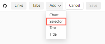
-
At the top of the page, click Add.
-
Choose Selector.
-
Select Manual input as the source type.
-
In Field or parameter name, enter
interval. This query variable will get the selected values from the selector. -
Select Calendar as the selector type.
-
Enable Range.
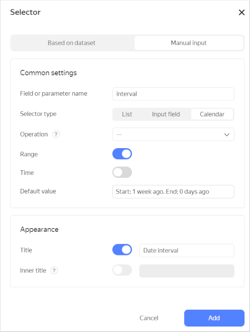
-
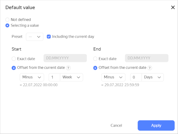
In the Default value field, specify an offset from the current date and click Apply.
-
Enable Name and enter
Date interval. -
Click Add.
-
Place the selector on the dashboard above the chart.
-
Save the dashboard.
-
Your dashboard is ready for use. You can now select the time interval using the selector.