Visualizing Yandex Object Storage data in Yandex DataLens
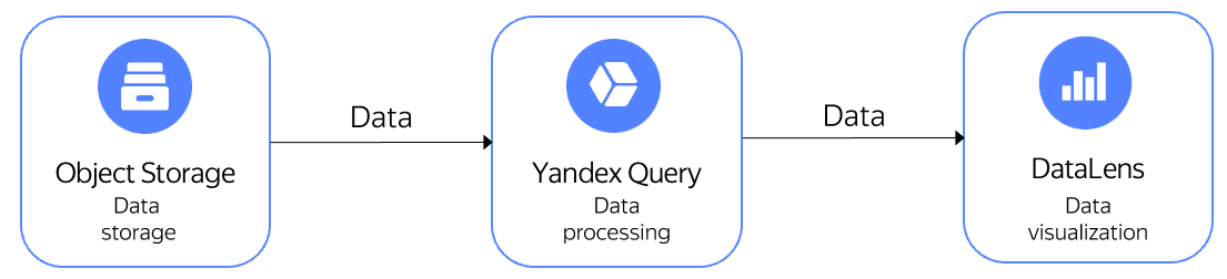
By integrating Yandex Query with Yandex DataLens, you can visualize data stored in Yandex Object Storage. DataLens generates a YQL query, while Yandex Query runs it and returns the results, which are visualized using charts.
For the solution architecture, see below.
As an example, let's visualize how the number and average cost of New York City yellow taxi rides depend on the time of day. The data was pre-uploaded to a public Yandex Object Storage bucket named yq-sample-data, in the nyc_taxi_csv folder.
Note
Yandex Cloud provides the New York City taxi trips dataset as is. Yandex Cloud makes no representations, explicit or implicit, warranties, or conditions pertaining to your use of the specified dataset. To the extent allowed by your local laws, Yandex Cloud shall not be liable for any loss or damage, including direct, consequential, special, indirect, incidental, or exemplary, resulting from your use of the dataset.
NYC Taxi and Limousine Commission (TLC):
The data was collected and provided to the NYC Taxi and Limousine Commission (TLC) by technology providers authorized under the Taxicab & Livery Passenger Enhancement Programs (TPEP/LPEP). The taxi trip data is not generated by the TLC, and the TLC makes no representations whatsoever about the accuracy of this data.
Take a look at the dataset source and its terms of use.
To visualize and explore data, set up your cloud and follow these steps:
- Connect to the data in Object Storage.
- Create a connection in Yandex DataLens.
- Configure the dataset fields.
- Configure visualization.
Getting started
Sign up for Yandex Cloud and create a billing account:
- Navigate to the management console and log in to Yandex Cloud or create a new account.
- On the Yandex Cloud Billing page, make sure you have a billing account linked and it has the
ACTIVEorTRIAL_ACTIVEstatus. If you do not have a billing account, create one and link a cloud to it.
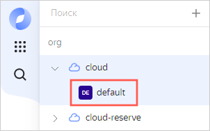
If you have an active billing account, you can create or select a folder for your infrastructure on the cloud page.
Learn more about clouds and folders here.
Note
To create a DataLens connection to Yandex Query, you will need a service account with the editor role for the folder where you will create the Object Storage bucket connection.
Connect to the data in Object Storage
-
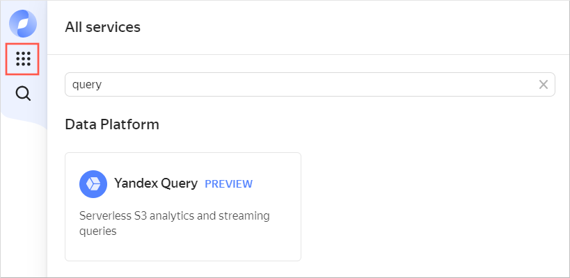
In the management console, select the folder where you want to create a connection.
-
Navigate to Yandex Query.
-
In the left-hand panel, select Tutorial.
-
Click Create connection. In the Create connection section, all the parameter fields are pre-filled. Just enter an optional description and click Create. You will see the screen for creating a data binding.
-
Enter the optional data binding description and click Create. This will create the resources required for this tutorial.
Create a connection in Yandex DataLens
To create a Yandex Query connection:
-
Go to the DataLens home page.
-
In the left-hand panel, select Connections and click Create connection.
-
Select the Yandex Query connection.
-
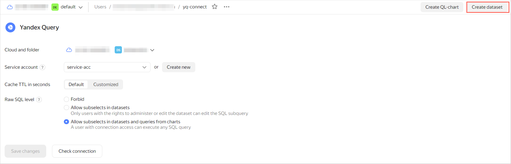
Configure the connection as follows:
- Cloud and folder: Select the folder with your service account.
- Service account: Select an existing service account or create a new one.
- Cache TTL in seconds: Specify the cache TTL or leave the default value.
- Raw SQL level: Select Allow subqueries from datasets and queries from charts.
-
Click Create connection.
-
Enter
yq-connectas your connection name and click Create.
Configure the dataset fields
-
In the top-right corner of the page where you created the connection, click Create dataset.
-
In the window that opens, enter the query text below and click Create.
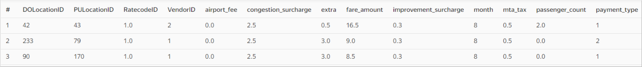
SELECT
    *
FROM
    bindings.`tutorial-analytics`
If the configuration is correct, the Preview section at the bottom of the screen will contain the following data:
-
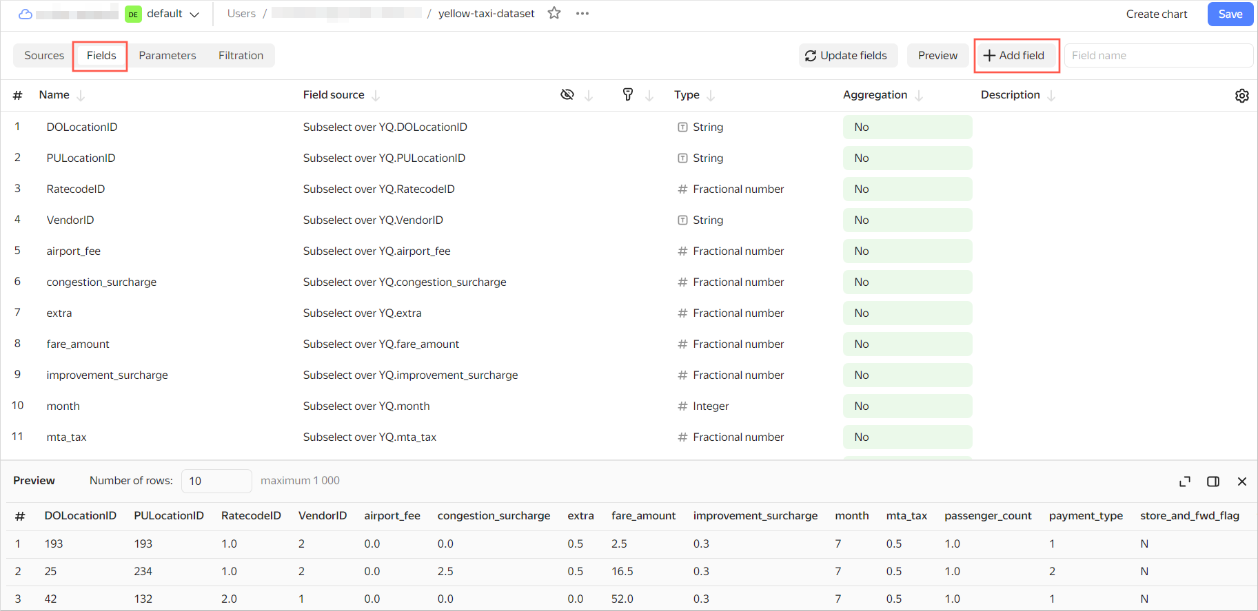
Create a calculated field with the pick-up time data:
-
Navigate to the Fields tab and click Add field.
-
In Field name, specify
hour_trip. -
In the formula line, enter:
HOUR([tpep_pickup_datetime]) -
Click Create. The new
hour_tripfield will appear in the list of dataset fields.
-
-
In the Aggregation column, select the Average aggregation type for the
total_amountfield.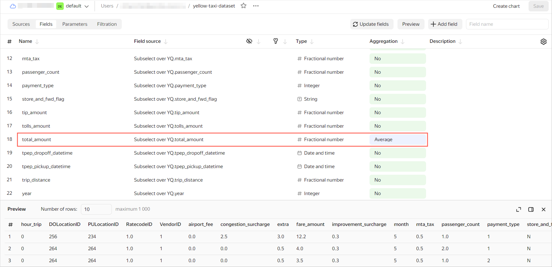
-
In the top-right corner, click Save. Enter
yellow-taxi-datasetfor the dataset name and click Create. -
Once the dataset is saved, click Create chart in the top-right corner.
Configure visualization
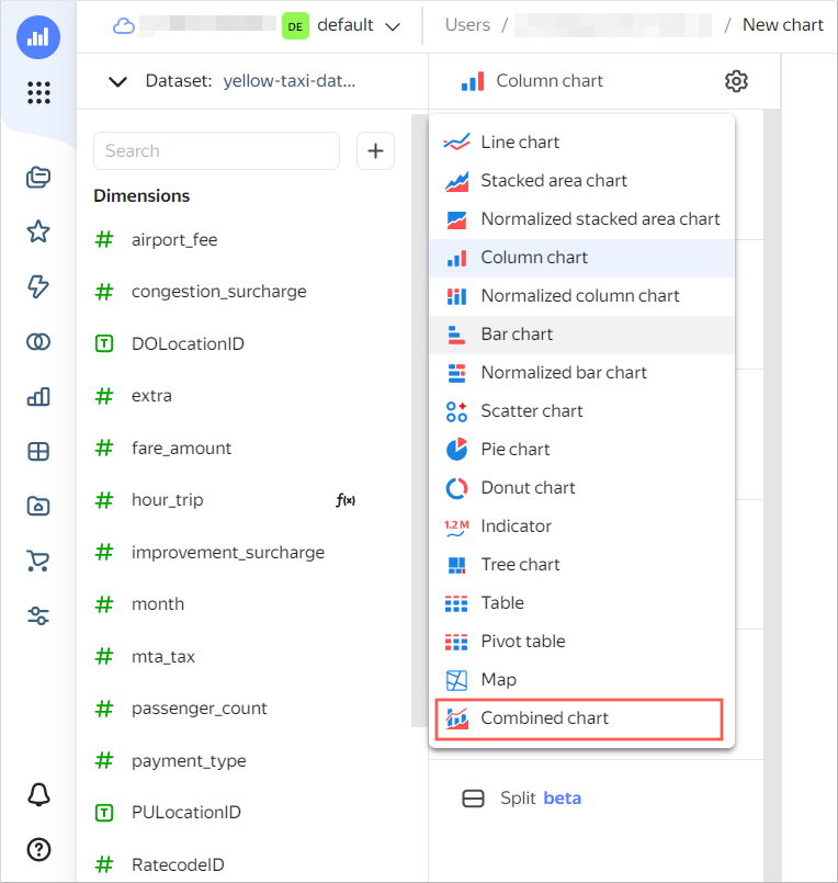
To visualize and analyze the data, use a combined chart.
-
Select Combined chart as the visualization type.
-
Drag the
hour_tripdimension to the X section. The dimension in the X section will be shared by all layers. -
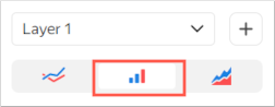
For the first layer, select Bar chart.
-
Drag the
total_amountmeasure to the Y section. You will see a bar chart in the visualization area. -
Add a layer by clicking next to the first layer's name.
-
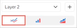
For the second layer, select Line chart.
-
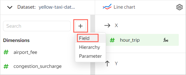
Add a field to the chart:
-
At the top left, click and select Field.
-
In the window that opens:
-
Under Field name, enter
count_trip. -
In the formula line, enter
COUNT().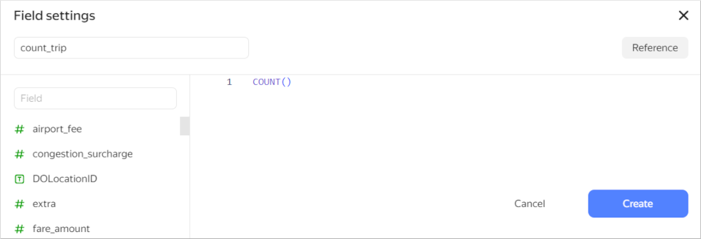
-
-
Click Create.
-
-
Drag the new
count_tripmeasure to the Y2 section. You will see a line chart on top of the first chart in the visualization area. -
In the top-right corner, click Save. Enter
yellow-taxi-combo-chartas the chart name and click Save.
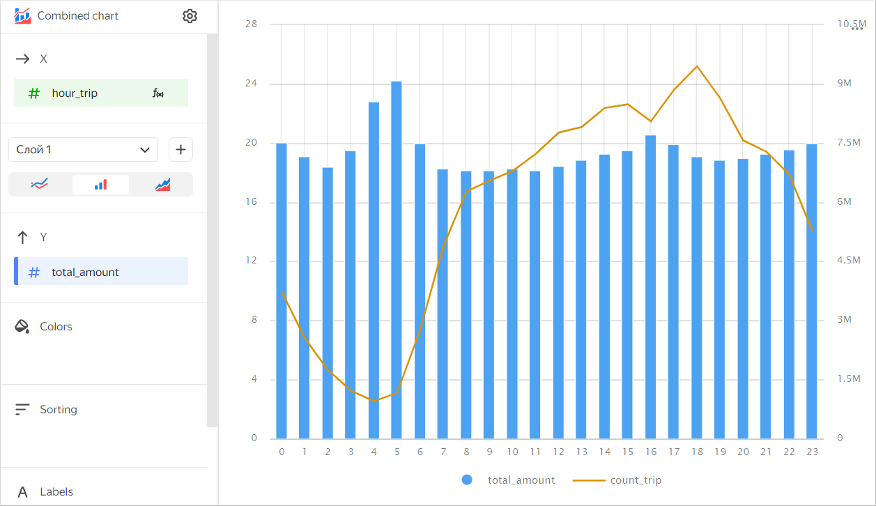
The chart you created shows how the number of trips (line chart) and the average ride cost (bar chart) depend on the time of day.
Similarly, you can build additional charts and dashboards or share the results with your teammates.