AppMetrica: data export, post-processing, and visualization
In this tutorial, you will analyze user behavior in a mobile app based on AppMetrica data:
- Process the data using Python scripts in Jupyter Notebooks in Yandex DataSphere.
- Build charts and dashboards in Yandex DataLens.
- Compare products by reach and frequency.
Customer journey is a sequence of user actions. User behavior analysis helps you find out how people use your product: pages they visit, functions they use, and issues they face. This information makes it easier for you to find the right solutions to develop your product.
As a data source, we will use sampled and anonymized data from the auto.ru mobile app, exported from AppMetrica.
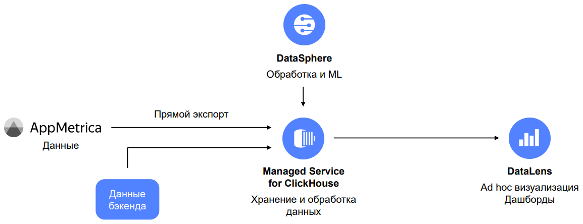
Data architecture scheme
Tip
This tutorial uses a file with pre-exported AppMetrica data so you can follow this tutorial without accessing the mobile app and AppMetrica.
For your own tasks, we recommend directly exporting data from AppMetrica to ClickHouse®.
First get your cloud ready and then explore and visualize the data step-by-step:
- Connect ClickHouse® and DataSphere.
- Get and upload data to ClickHouse®.
- DataSphere. Compare products by reach and frequency.
- Connect DataLens and create charts.
- Create and configure a dashboard in DataLens.
- Customer journey. Create a QL chart and a Sankey chart.
Get your cloud ready
Sign up for Yandex Cloud and create a billing account:
- Navigate to the management console and log in to Yandex Cloud or create a new account.
- On the Yandex Cloud Billing page, make sure you have a billing account linked and it has the
ACTIVEorTRIAL_ACTIVEstatus. If you do not have a billing account, create one and link a cloud to it.
If you have an active billing account, you can create or select a folder for your infrastructure on the cloud page.
Learn more about clouds and folders here.
1. Connect ClickHouse® and DataSphere
1.1. Connect ClickHouse®
-
Navigate to the management console.
-
Navigate to Managed Service for ClickHouse.
-
Click Create cluster.
-
Configure your ClickHouse® cluster.
-
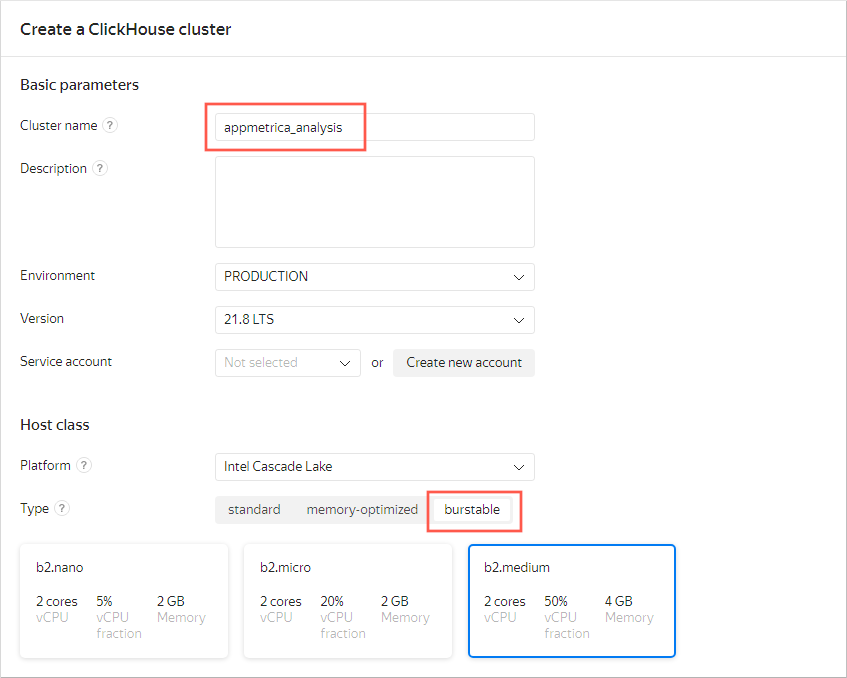
Basic parameters: Enter
appmetrica_analysisas the cluster name. -
Host class: Select burstable as the virtual machine type and b2.medium as the host type.
Warning
We do not recommend using burstable VM configurations in production environments. This tutorial uses them as an example. For production solutions, use standard or memory-optimized configurations.
-
Storage size: Leave 10 GB.
-
Database: Specify the database name (
autoru_appmetrica), username, and password. Memorize these credentials.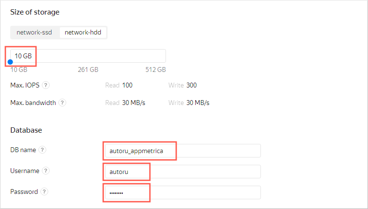
-
Hosts: Click the icon. Enable Public access and click Save.
-
Advanced settings: Enable these four options:
- Access from DataLens
- Access from the management console
- Access from Yandex Metrica and AppMetrica
- Access from Serverless
-
After specifying all the settings, click Create cluster.
-
1.2. Connect DataSphere
- Navigate to the management console.
- Navigate to DataSphere.
- Click Create project.
- Specify
appmetrica-analysisas the project name and click Create. - Open your project. To do this, in the row with the project name, click → Open.
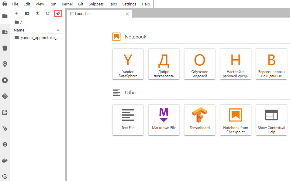
1.3. Clone the repository to DataSphere
-
In the top-left corner, click the Git Clone icon: .
-
In the window that opens, specify the repository URI,
https://github.com/firstsvet/yandex_appmetrika_cloud_case, and click CLONE.
2. Get and upload data to ClickHouse®
If you do not have a Yandex Metrica app, it has not accumulated enough data, or if you want to make sure that you will get a result by completing all the tutorial steps, go to step 2.1 (skip step 2.2).
If you have an AppMetrica app and access to it, go to step 2.2. We recommend this for experienced users as you might need to edit scripts (skip step 2.1).
2.1. DataSphere. Download the test app data via Yandex Disk
Note
Skip this step if you are using your own app data.
-
In the left-hand menu, open the yandex_appmetrika_cloud_case folder → 1.upload_data_from_yadisk.ipynb notebook.
-
Complete all the steps, i.e., run cells with code, in the 1.upload_data_from_yadisk.ipynb notebook.
To run a step, click the number to the left of the cell, then the run button at the top. The number will change to
[*]. After the number appears again, run the next step.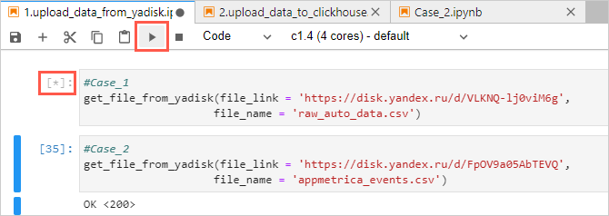
2.2. Export the data from AppMetrica
To set up the connection and export data from your app, see the guide in Exporting data in Yandex Cloud.
2.3. ClickHouse®. Get the cluster address
-
Go to the
appmetrica_analysisClickHouse® cluster you created in step 1.1. Wait for the cluster status to change to Alive. Then open the cluster by clicking it.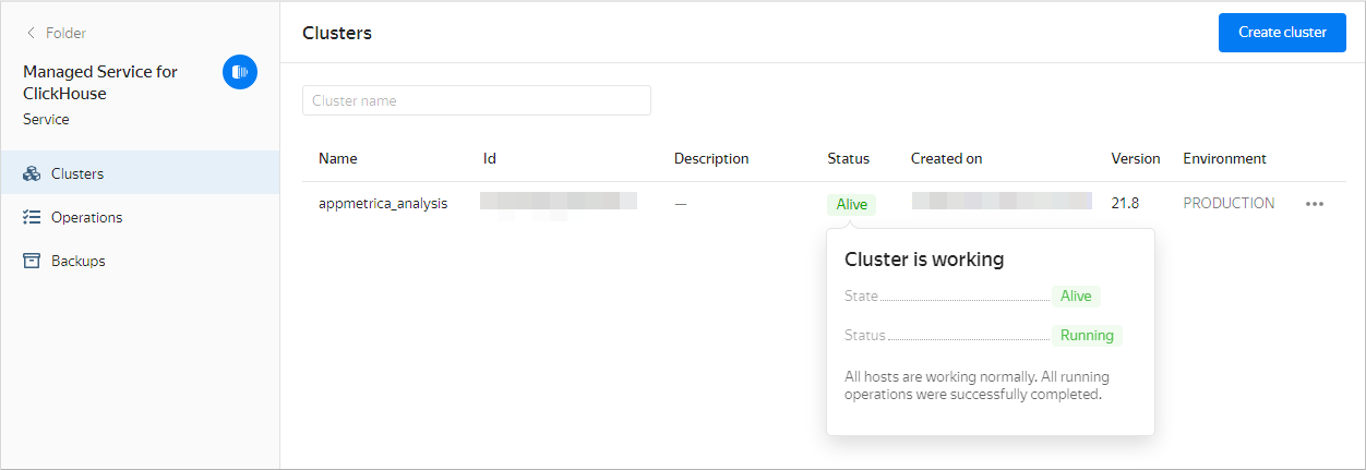
-
Select Hosts from the list on the left.
-
On the Overview tab, go to the Host name column. To copy a host name, point to the right of the host name and click the copy icon.
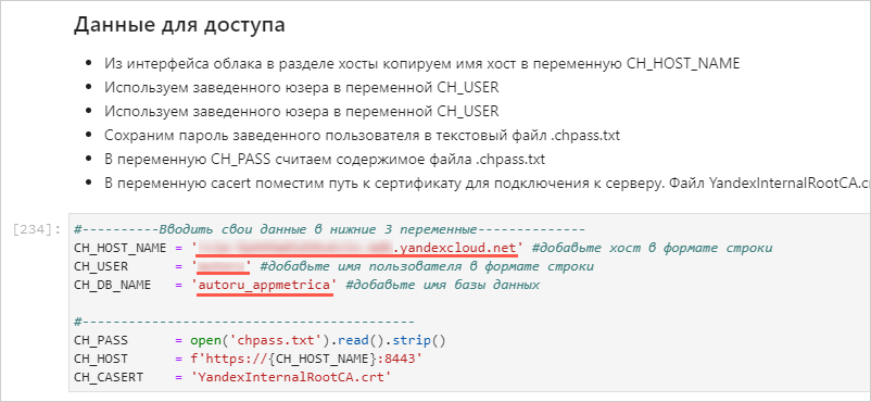
2.4. DataSphere. Upload the data to ClickHouse®
-
Open the yandex_appmetrika_cloud_case folder → 2.upload_data_to_ClickHouse®.ipynb notebook.
-
Insert the data into the variables:
-
In the yandex_appmetrika_cloud_case folder, create a new text file named
chpass.txt.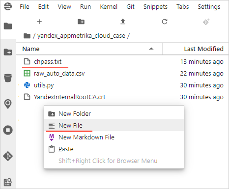
-
Specify the password of the logged-in user in the chpass.txt file. Save and close the file.
-
Complete all the steps, i.e., run the cells with code, in the notebook.
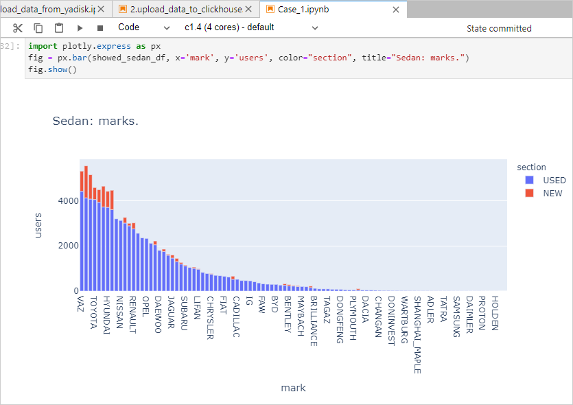
3. DataSphere. Compare products by reach and frequency
-
Open the yandex_appmetrika_cloud_case folder → Case_1.ipynb notebook.
-
Insert the data into the variables:
-
Complete all the steps, i.e., run the cells with code, in the notebook.
-
View the intermediate results.
4. Connect DataLens and create charts
4.1. Connect to DataLens
- In the management console, open the page of the new ClickHouse® cluster.
- On the left side of the window, select DataLens.
- Click Create connection.
4.2. Create a connection to ClickHouse® in DataLens
-
Set up your connection:
- Enter
AppMetrica_workshopfor the name. - Select the ClickHouse® host from the Host name drop-down list.
- Select the username and enter the password from step 1.1.
- Enable the SQL to read option.
- Click Check connection.
- Enter
-
After a successful check, click Create connection. In the window that opens, enter the connection name and click Create.
4.3. Create a dataset based on the connection
-
In the top-right corner, click Create dataset.
-
Select the
autoru_appmetrica.auto_datatable as the source by dragging the table from the list on the left to the editing area. -
Open the Fields tab.
-
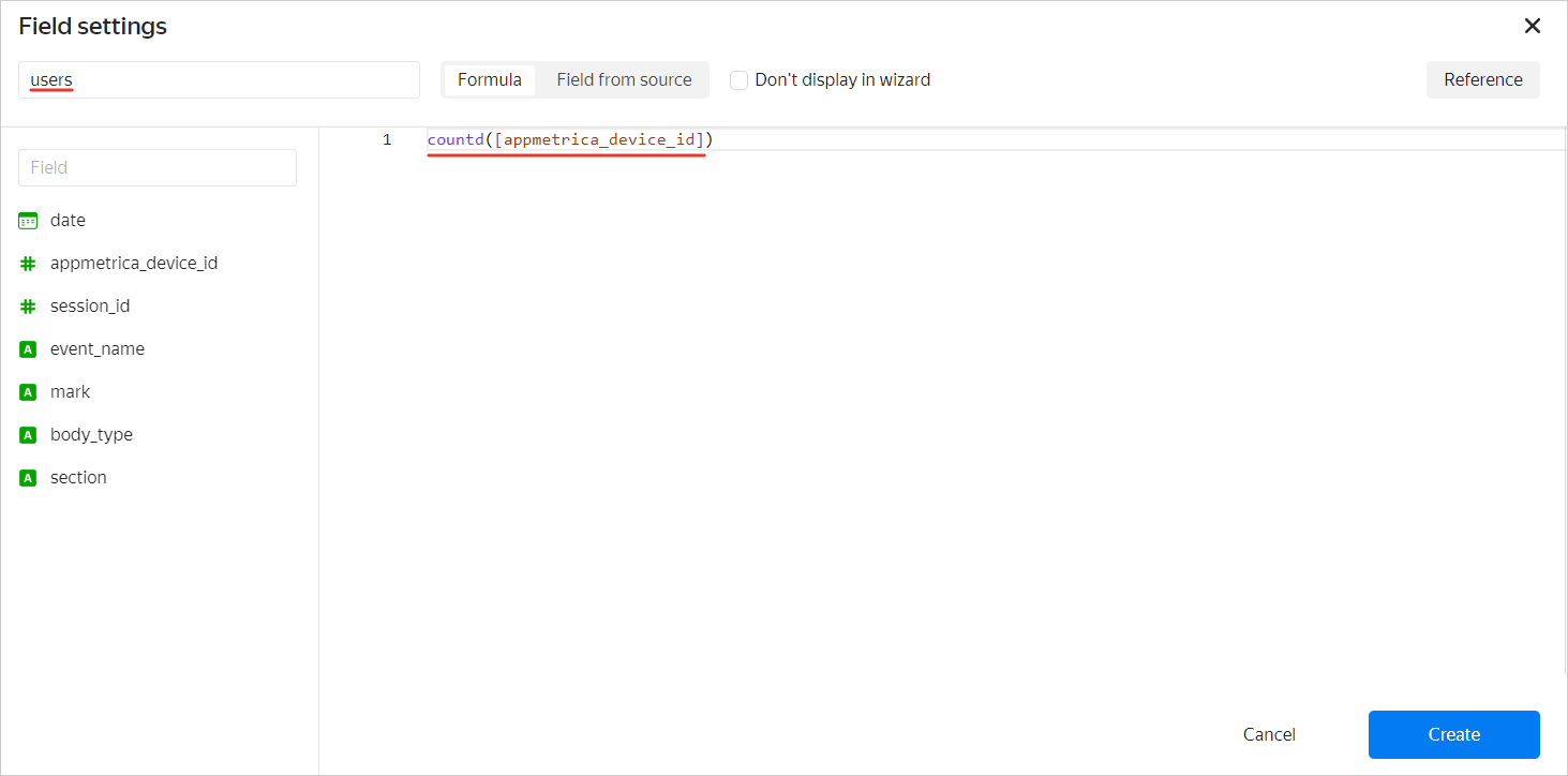
Create the users calculated field:
- In the top-right corner, click Add field.
- At the top left, enter
usersfor the field name. - Paste the
countd([appmetrica_device_id])formula in the area on the right. - Click Create.
-
Repeat the previous step for other fields:
- Field name: reach, formula:
COUNTD([appmetrica_device_id])/COUNTD([appmetrica_device_id] FIXED). - Field name: events, formula:
COUNT([session_id]). - Field name: events per user, formula:
[events]/[users].
- Field name: reach, formula:
-
In the top-right corner, click Save.
-
Name the dataset
autoru_backend_dataand click Create.
4.4. Create a scatter chart
-
In the top-right corner, click Create chart.
-
Select Scatter chart as the type.
-
Drag these fields to the chart section:
- reach measure to the X section.
- events per user measure to the Y section.
- mark dimension to the Points section.
- event_name dimension to the Colors section.
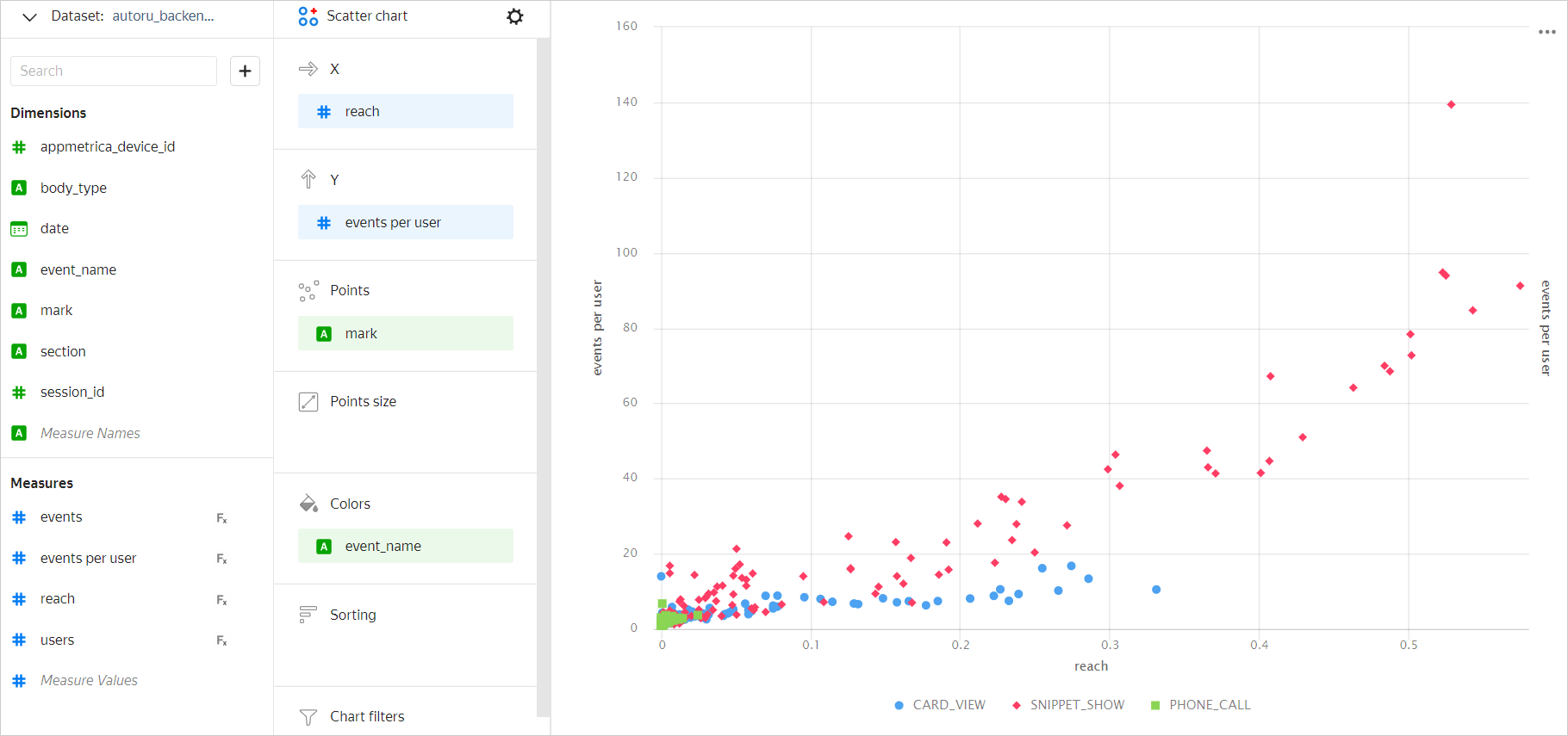
-
In the top-right corner, click Save.
-
In the window that opens, enter
Coverage and eventsas the chart name and click Save.
4.5. Create a table chart
-
Select the Table type.
-
Drag these fields to the chart section:
- mark measure to the Columns section.
- users measure to the Columns section.
- users measure to the Sorting section.
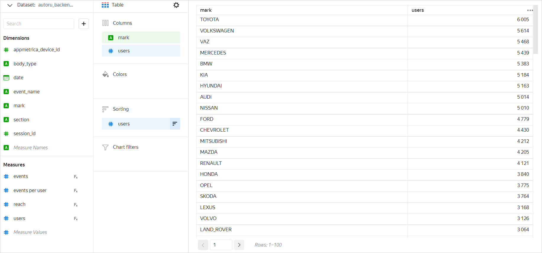
-
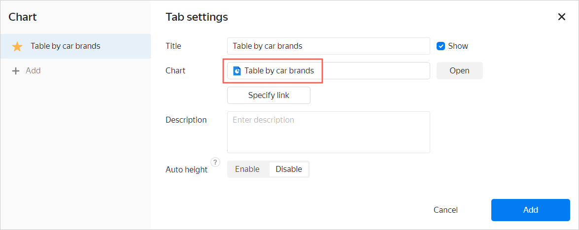
In the top-right corner, click the button to the right of Save, then click Save as.
-
In the window that opens, enter
Table by car brandsas the chart name, then click Save.
5. Create and configure a dashboard in DataLens
-
Open the DataLens home page.
-
In the left-hand panel, click Dashboards.
-
Click Create dashboard.
-
Add a chart to your dashboard.
- In the top-right corner, click Add → Chart.
- From the Chart drop-down list, select Table by car brands. The Name field will be populated automatically.
- Click Add.
-
Repeat the previous step for the Coverage and events chart.
-
Add and configure a selector.
- In the top-right corner, click Add → Selector.
- In the Dataset list, select autoru_backend_data.
- In the Field list, select event name.
- In the Default value list, select any option.
- Click Add.
-
Position the charts and selector on the dashboard. To resize an element, drag it by the bottom-right corner.
-
Save the dashboard:
- In the top-right corner, click Save.
- Enter
auto.ru appfor the dashboard name and click Create.
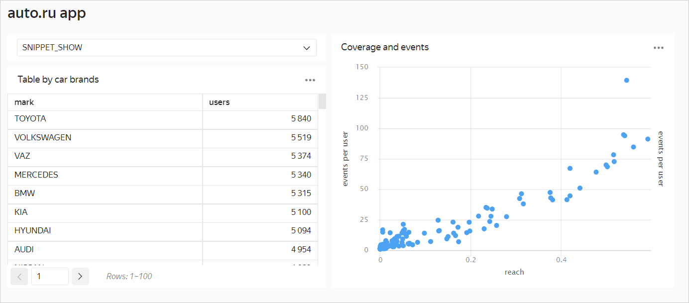
Try to change event name in the selector to another value to see how the dashboard changes.
6. Customer journey. Create a QL chart and a Sankey chart
6.1. Create a QL chart in DataLens
Use QL charts to delve into event sequences and experiment in DataLens.
-
Open the DataLens home page and select Connections in the left-hand menu.
-
Select the
AppMetrica_workshopconnection you created in step 4.2. -
At the top right, click Create QL chart.
-
Enter this query:
SELECT uniqExact(t.appmetrica_device_id) as counts, events_seq, if(events_seq like '%Call%', 'Call', if(events_seq like '%Message%', 'Message', 'Contact failed')) as contact FROM ( SELECT appmetrica_device_id, num_steps, arrayStringConcat(filt_events, ' -> ') as events_seq FROM (SELECT appmetrica_device_id, groupArray(event_name) as events, count(event_name) as cnt_events, groupArray(datetime) as times, arrayEnumerate(events) as indexes, arrayDifference(arrayMap(x -> toUInt64(x), times)) as times_diffs, arrayFilter(e, i -> (i = 1) or (events[i - 1] != events[i]) or (times_diffs[i] >= 1800), events, indexes) as filt_events, length(filt_events) as num_steps FROM (SELECT appmetrica_device_id, datetime, event_name FROM autoru_appmetrica.raw_appmetrica_auto_data ORDER BY appmetrica_device_id, datetime) GROUP BY appmetrica_device_id HAVING cnt_events <= 30)) as t where t.num_steps<10 GROUP BY t.events_seq HAVING counts>10 ORDER BY counts desc -
Click Start.
-
Select the Bar chart type.
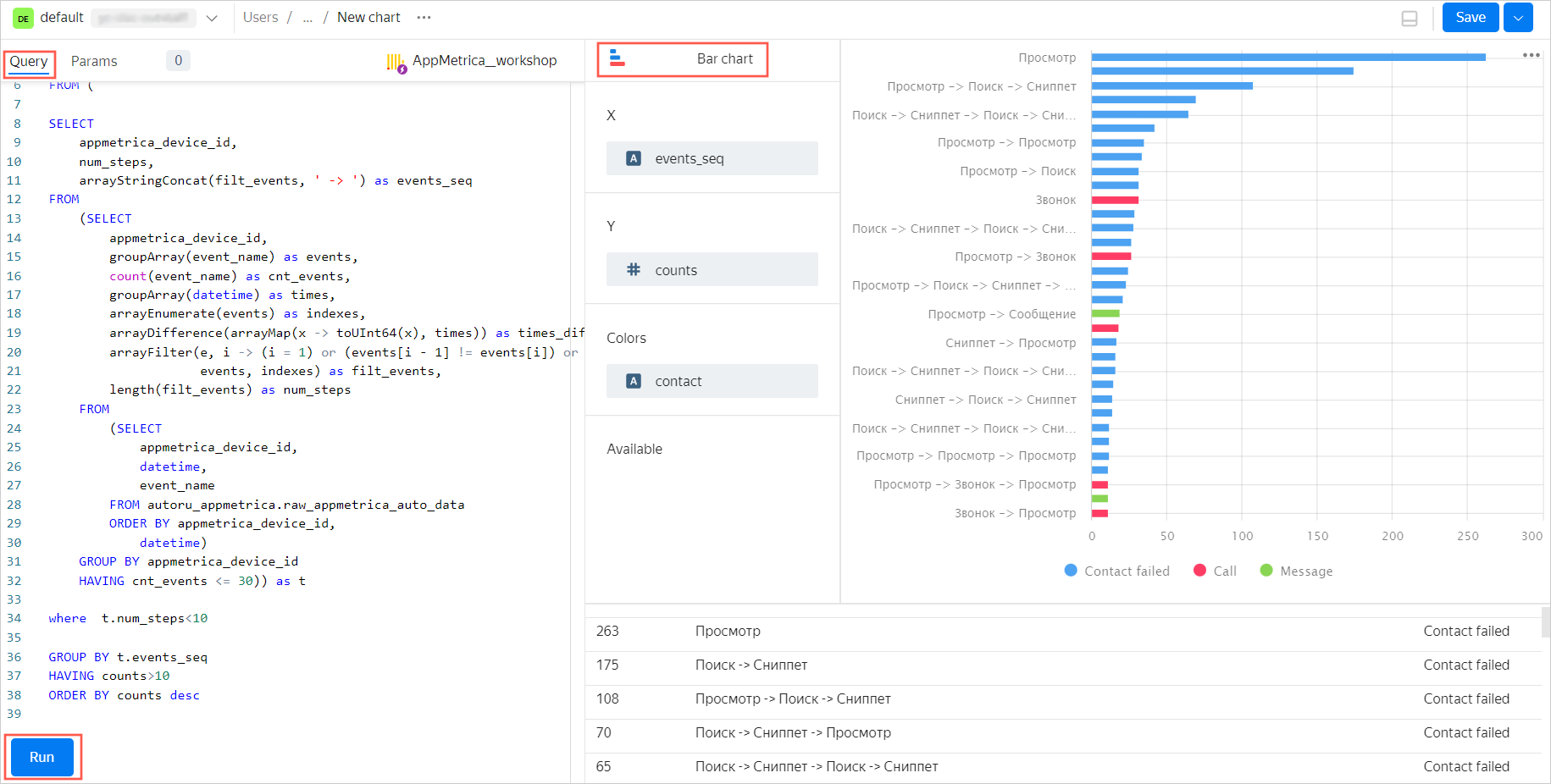
-
In the top-right corner, click Save, then enter the chart name:
Event chains. -
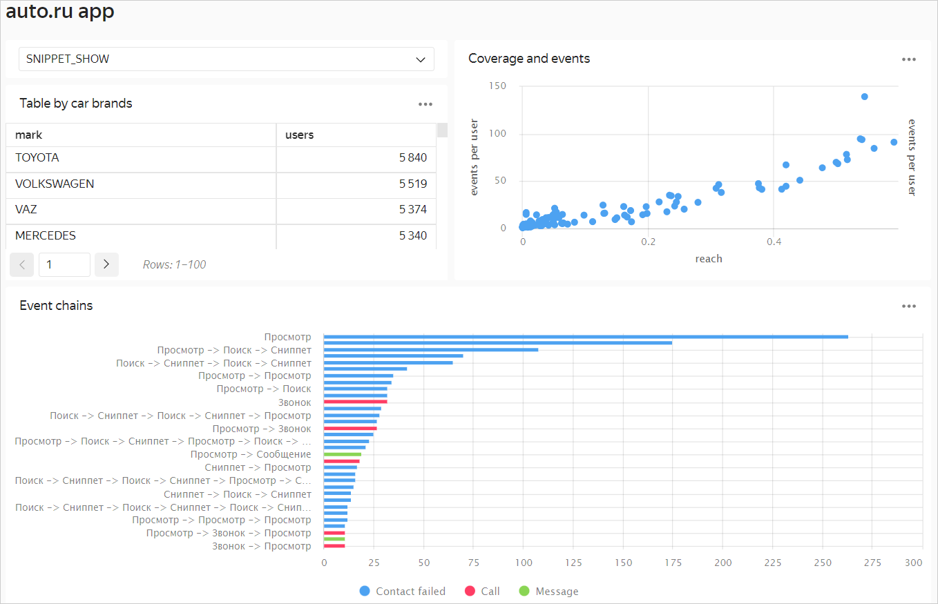
Add the QL chart to the dashboard.
- In the left-hand menu, click Dashboards.
- Select the auto.ru app dashboard from the list.
- Click Edit at the top right.
- Click Add → Chart.
- In the Chart list, select Event chains and click Add.
- Customize the dashboard layout and click Save.
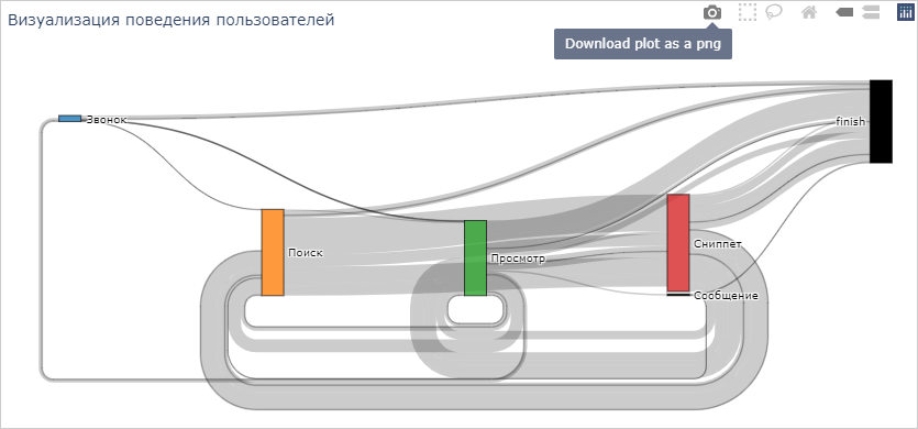
6.2. Create a Sankey chart in DataSphere
-
Navigate to the management console.
-
Navigate to DataSphere.
-
Open the yandex_appmetrika_cloud_case folder → Case_2.ipynb notebook.
-
Complete all the steps, i.e., run the cells with code, in the Case_2.ipynb notebook.
-
You will get an interactive Sankey chart that shows user behavior scenarios. You can move the chart blocks and save the result as an image.
ClickHouse® is a registered trademark of ClickHouse, Inc.