Visualizing data using Heat Maps
As a source, we will use data from Heat Maps, a tool that visualizes supply and demand polygons by Yandex Direct category based on set criteria.
Heat maps provide statistics that show supply and demand for companies and their services:
- Demand shows where Yandex users are searching for companies within 3 km of your location.
- Supply shows the number of existing companies on Yandex Maps.
- Supply geography shows how companies are placed on Yandex Maps.
You can use Heat maps to:
- Choose a good location for your offline point of sale.
- Launch ads in the Yandex Advertising Network where your potential customers can see them.
- Analyze your competitors.
Note
Users are granted access to data on the Heat Maps dashboard if:
- They have a Yandex Direct account.
- They have permissions to the Heat Maps dashboard.
User access to the Heat Maps dashboard is arranged by a manager who should submit an internal activation request.
To visualize and analyze the data, follow these steps:
- Set up a connection.
- Learn how to get started with Heat Maps.
- Share supply and demand statistics with other users.
- Make a dashboard or chart public.
- Add a chart or dashboard to your website.
We recommend checking out this FAQ section covering questions commonly asked by supply and demand statistics users.
1. Set up a connection
1.1 Set up DataLens
Yandex DataLens is deployed on the Yandex Cloud platform.
Set up DataLens depending on your experience:
- You are a new user (you want to use Yandex DataLens only for podcast analysis).
- You are already using Yandex DataLens (for other purposes).
To get started with DataLens:
- Log in to your Yandex account. If you do not have an account, create one.
- Open the DataLens home page.
- Click Start in cloud.
- Confirm that you have read the Terms of use and click Log in.
-
Log in to your Yandex account.
-
Open the DataLens home page.
-
Click Start in cloud.
-
Select one of these options:
-
If you already have an organization, select it from the drop-down menu in the Organizations tab and click DataLens.
Note
To activate a DataLens instance, the user must have the
adminorownerrole. For more information about roles, see Access management in Yandex Identity Hub. -
If you have a cloud but no organization, click Add new DataLens. In the window that opens, enter a name and description for your organization and click Create organization and DataLens. For more information about working with organizations, see Getting started with organizations.
-
If you encounter a technical issue with the service, contact Yandex Cloud support. To ask for advice, discuss a solution to your issue, or explore current best practices, join the DataLens chat in Telegram.
1.2. Create a connection
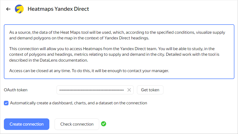
To connect to the Heat Maps dashboard:
-
Follow the link and click Get token.
-
Once the token is authorized, check a connection. To do this, click Check connection.
-
Leave the Automatically create a dashboard, charts, and a dataset on the connection option enabled.
-
Click Create connection. Enter Heatmaps Connection or any other connection name and click Create.
2. Learn how to get started with Heat Maps
2.1. Review the contents of the folder
-
When the connection is created, a folder containing a set of standard objects that your statistics are based on opens:
- Supply and demand dashboard: Main page with a set of all widgets (charts, tables, and filters) where you can view the statistics. To quickly access the dashboard, save the page link to a convenient location.
- smb_geo_heat_maps_dataset dataset: Dataset with dimensions and measures used to create charts.
- Charts: Set of individual visualizations (diagrams and tables) used on the dashboard.
-
Open the Supply and demand dashboard.
The dashboard has three tabs: Demand, Supply, and Demand-to-supply ratio. Each tab contains:
- Text widgets: Headers, comments, and tooltips.
- Selectors: Filters by different dimensions that can be used to filter the contents of dashboards.
- Charts: Graphs, tables, and other visualizations.
-
Add the dashboard to Favorites. To do this, click to the right of the dashboard name at the top of the screen. To access the Favorites folder, click in the left-hand panel.
You can edit it and add standard objects as you wish.
2.2. Set up a dashboard
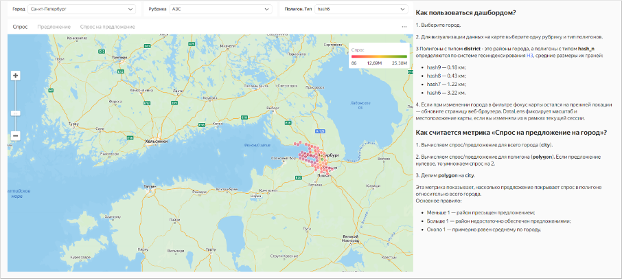
- Select a city.
- To visualize data on the map, select a category and polygon type.
Polygons of the district type are city districts; polygons of the hash_n type are defined using the H3 geospatial indexing system with the following average sizes of their sides:
hash9: 0.18 kmhash8: 0.43 kmhash7: 1.22 kmhash6: 3.22 km
If you select a different city and the map focus remains at the same location, refresh the page. DataLens saves the data automatically: you can always continue from where you left off.
The Demand-to-supply ratio per city measure shows the demand for products and services in a specific city or district. It is calculated as follows:
- Calculating demand to supply ratio for the entire
city. - Calculating demand to supply ratio for the
polygon. If the supply value is zero, the demand value is multiplied by 2. - Calculating
polygontocityratio.
Note
Basic rule:
- A value less than 1 indicates that supply in the district is too high.
- A value greater than 1 indicates that there is insufficient supply in the district.
- If the value is about 1, supply is approximately equal to the average one across the city.
Pay attention to the supply and demand scale in the top-right corner. The greener the area, the higher the demand in the district or your city's hexagon. The colder the color (such as blue or red), the lower the supply.
3. Share supply and demand statistics with other users
To allow another user to open your dashboard, configure access to Yandex DataLens:
-
Invite a user with a Yandex account or add a federated or local user.
-
Make sure the user has access permissions to the dashboard:
-
Open the dashboard.
-
In the Add member field, enter All or the name of the user who needs extended permissions.
-
Go to the Current object section and set the permissions for the dashboard:
- View: Viewing only.
- Edit: Viewing and editing.
- Administration: Viewing, editing, and management.
-
Enable the Linked objects option to grant permissions to other dashboard-related objects (connection, datasets, and charts).
-
The user is granted access to your DataLens and objects with All permissions. You can assign this user individual permissions to objects.
You can send the link to the dashboard from the browser. For more information about permissions to DataLens objects, see the documentation.
4. Make a dashboard or chart public
Data in DataLens is only available to users of a specific instance. If you want to provide unlimited public access to supply and demand statistics, publish your dashboard or a particular chart in DataLens Public.
- Open the Supply and demand dashboard.
- At the top of the dashboard interface, click .
- In the public access settings window that opens, enable Access via link.
- Confirm the publishing and click Next.
- Select the charts you want to publish with the dashboard.
- Copy the public link and click Apply.
- On the navigation page, find a chart, e.g., Demand-to-supply ratio map, and open it.
- At the top of the chart interface, click .
- In the public access settings window that opens, enable Access via link.
- Confirm the publishing and click Next.
- Copy the public link and click Apply.
5. Add a chart or dashboard to your website
You can embed the published charts into a website or app using the iframe element. Proceed as follows:
- Follow the public link to the chart.
- Click in the top-right corner of the chart and select Embed code.
- Copy the
iframeembed code in a light or dark theme. - Embed the code into your website.
Note
You can only embed individual charts. Embedding the entire dashboard is not supported.
FAQ
Why can you only connect with a Yandex account?
Using a Yandex account in DataLens ensures high data security.
Can I edit a standard dashboard?
Yes, you can edit the dashboard and related objects.
I deleted a dashboard accidentally. How do I restore it?
Recreate a connection and the dashboard will expand again.
Why are chart settings so complicated?
DataLens is a full-fledged data analysis and visualization tool. Use its rich set of settings to create different types of visualizations that meet a variety of user requirements.
What else can I use DataLens for?
You are not restricted to using DataLens. You can connect to your own data sources, build charts and dashboards, and share them with your colleagues.