Yandex DataLens release notes: February 2024
- Updates
- Fixes and improvements
- Applying custom palette colors in a combined chart
- Filling table cells with null values
- Gradient filling of table columns
- Displaying errors for dataset fields in a wizard
- Bar chart axis formatting
- Selecting a color for column chart null values
- Chart sorting during split
- Enabling/disabling sum display in QL chart tooltips
- Linking by chart parameters
Updates
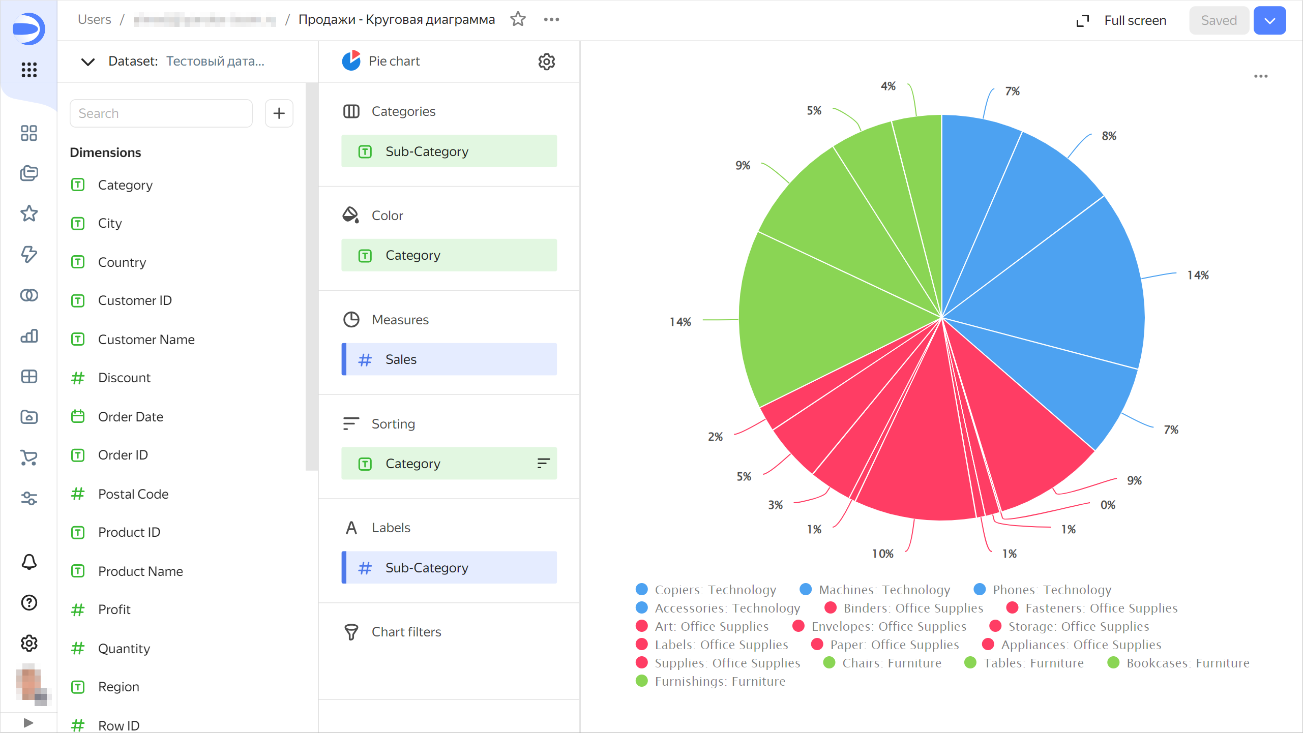
Categoriessection for pie and ring charts
Added the Categories section for pie and ring charts. Now the Categories section is used to group data, and the Color section to color the chart segments.
Pie chart example
Repeatbutton in widgets containing an error
Added the Repeat button for charts returning an error. Use this button to repeat you request to the source. The button is available for most error types.
Opening anchor links in the current browser window
Implemented opening anchor links (starting with #) in the current browser window. Now, in text widgets, you can provide a link to the dashboard header from the table of contents. The page will scroll to that header as soon as you click the link.
Drag-and-drop sorting in manual selectors
In the manual selector settings, you can now reorder the possible values using drag and drop.
Fixes and improvements
Applying custom palette colors in a combined chart
Fixed an error with application of custom palette colors in a combined chart.
Filling table cells with null values
Fixed the error where table cells with empty (null) values were not color-filled.
Gradient filling of table columns
Fixed an error where tri-color gradient coloring was not working correctly in columns containing both negative and positive values.
Displaying errors for dataset fields in a wizard
Fixed an error where, after replacing a dataset, the chart still had fields with a link to the old dataset and the Measurement not involved in dataset linking error was displayed.
Bar chart axis formatting
Fixed the percentage presentation of the bar chart axis. To have axis labels displayed as a percentage:
- Drag a numeric value from the dataset to the X section. Set Format to
Percentage. - For the X section, set Axis formatting to
By first field on the X axis. The X axis labels will appear as a percentage.
Similarly, you can configure the percentage display for the Y axis.
Selecting a color for column chart null values
Fixed the color selection error for null values in a column chart.
Chart sorting during split
Fixed chart sorting when using the Split section.
Enabling/disabling sum display in QL chart tooltips
Fixed an error where it was impossible to disable sum display in QL chart tooltips.
Linking by chart parameters
Fixed an issue where the dashboard link settings did not display a chart-level parameter link between widgets.