Charts

How do I display only the top 10 values in a chart?
- Create a new field with the
rank([name of the field for the TOP N selection]])orrank_denseformula. - Add this field to the chart filters and specify
≤ Nas the filtering criterion.
How do I create labels by dimension in a pie chart (so that measure names become the labels for the pie chart sectors)?
In the chart, add the Measure names dimension to the Signatures section.
Can I hide a legend in charts?
You can configure the chart settings to hide the legend.
- Go to the chart.
- On the top panel, click .
- Disable Legend.
How do I add two measures to the Label section in a line chart?
Add the Measure Values field to the Labels section.
How do I label each column in a column chart that contains multiple measures with its own measure value?
Add the Measure Values measure to the Labels section.
How do I create a grouped column chart?
By default, a stacked column chart is displayed (see screenshot for details).
Follow this guide to display a grouped column chart.
How do I create a column chart grouped by multiple columns?
To display a column chart grouped by multiple columns:
- Drag the Measure Names dimension to the Colors section.
- Drag the Measure Names dimension to the X section. The order of dimensions will affect the grouping order.
How many measures can I add to the Colors section for Table or Pivot table charts?
You can add only one measure to the Colors section.
How do I create a chart with all columns without dragging them all manually?
You cannot add all data fields at once to a chart section. Add each field with one of the following methods:
- Drag a field to the relevant chart section.
- Click in the relevant section (the icon appears when you hover over the section) and select a field.
Is it possible to display a line chart and columns in the same chart at the same time?
To display different types of charts in the same chart at the same time, use a combined chart.
How do I make a signature with both the sector name and percentage in a pie chart?
Create a signature using a calculated field:
[<name>] + ' ' + STR(INT(SUM([<value>])/SUM(SUM([<value>]) TOTAL) * 100)) + '%'
Where:
<name>: Field for the sector name.<value>: Field to show as a percentage.
How does the formula work?
- The
SUM([<value>])/SUM(SUM([<value>]) TOTAL) * 100part calculates the sector's percentage. - The calculated value is rounded by the INT function.
- The value is converted to a string using the STR function to create labels on the chart.
- The sector name, calculated value, and the
%character are concatenated into a string using the addition operator,+.
Alternatively, you can use a formula with an LOD expression:
[<name>] + ' ' + STR(INT(SUM([<value>])/SUM([<value>] FIXED) * 100)) + '%'
You will get the same result as with the first formula. Try both and pick the one that works best for you.
Example
Formula: [Category] + ' ' + STR(INT(SUM([Sales])/SUM(SUM([Sales]) TOTAL) * 100)) + '%'
For more information, see this screenshot.
How do I create a logarithmic scale on a line chart?
To select the axis type:
- Go to the chart.
- Make sure all the fields in the X axis section have the Fractional number type.
- Open the X axis settings.
- In the Axis type field, select Logarithmic.
If you select the Logarithmic axis type and then change the data type to Integer or add fields with a different data type, the axis type will not change.
To select the Linear axis type again, change all the fields in the axis section to fractional numbers, then select the Logarithmic axis type, and go back to the data types you need.
How do I create a signature only for the last point on the chart?
Create a new measure using a formula. To create a signature only for the last point, the formula is as follows:
if(
    max([Order Date]) = max(max([Order Date]) total), --if the point date is the maximum date for the chart
    [Sales], --then output the value of the Sales measure
    null --else, show no signatures for any other dates
)
For a line chart, you can drag-and-drop only measures, including the Measure Values measure, to the Signatures section.
If you move to the Signatures section the same measure as in the Y axis section, you will see labels on the chart (see the screenshot for details).
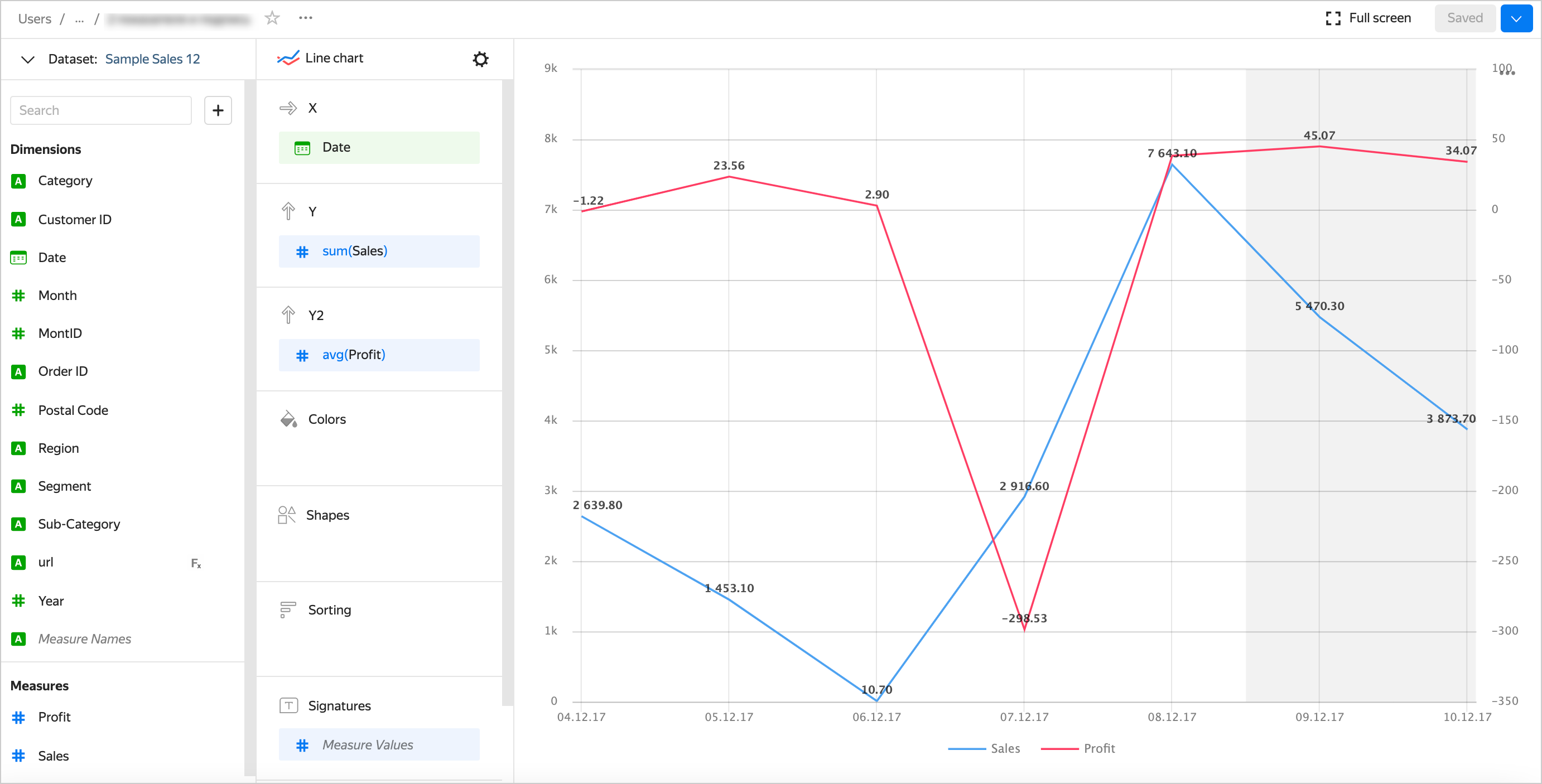
How do I label multiple lines on a chart?
If a line chart only contains a single measure in the Y or the Y2 section, drag this measure to the Signatures section.
If a line chart contains two or more measures in the Y or the Y2 section, drag the Measure Values measure to the Signatures section.
Example of a proper label with the Measure Values measure in the Signatures section
How do I change a column width in a table?
To change a column width in a table:
- In the top-right corner of the Columns section, click (the icon appears when you hover over the section).
- In the Column width window that opens, set up the width of each column.
How do I change a column header in a table?
- Under Columns, click the icon to the left of the dimension or measure name.
- In the window that opens, change the Name field value and click Apply.
Why does a line connect points with missing values in-between and Display as 0 enabled?
If the source data has a row with null for the measure value, this point will not be plotted on the chart with default settings (there will be a gap in the line, or the column/point will be skipped). For example, if the source has a row with the date, 20.07.2022, but the sales total for it is not specified.
You can configure how the chart will display null values in the chart section settings:
- Click in the top-right corner of the section with the measure you want to configure (the icon appears when you hover over the section).
- In Empty values (null), select
Display as 0. - Click Apply.
Now, null values will be replaced by 0 in the chart.
Note
This setting is only available for charts that have at least one X or Y axis:
- Line chart
- Area chart (stacked and normalized)
- Column chart (including normalized)
- Bar chart (including normalized)
- Scatter chart
If a row is missing from the source data altogether, the chart section settings will not change the chart. For example, if the source does not have a row with the particular date, 20.07.2022, nothing will be shown for this date on the chart. The values of fields with missing values in-between will be connected by a line.
For more information, see Configuring the display of null values in a Yandex DataLens chart.
Why do I get null output when creating a multi-dataset chart?
The possible causes may include the following:
- The
nullvalue is saved in the database table. - When joining tables, you get the
nullvalues if one of the tables is lacking the entries that match the other table's entries according to the joining condition.
If values other than null must be displayed for each dataset:
- Make sure you have selected the correct fields when setting up links between datasets.
- Make sure there are no filters in place in the chart or dataset that could limit the resulting selection to data from a single dataset. Remove the filters and check how entries are displayed.
- Check the conditions that are limiting the selection (if an SQL query is used to build the dataset).
- Check alignment between entries from different datasets. Do it by selecting an entry from one dataset and finding a matching entry in the other dataset according to the joining condition. Make sure that values other than
nullare displayed in each dataset in the fields used to build your multi-dataset chart.
How to add regions to a map?
DataLens uses only partner maps and geodata. If your data contains a field with names of cities, regions, or countries, use the geopoint/geopolygon reference by Geointellect, a Yandex partner.
For an example of working with geodata, see this guide.
You can purchase pre-calculated geolayers from partners in DataLens Gallery.